Pastel Paint Colors That Are Just Right Any Time Of Year
These pretty picks are far from precious.

Pastels don’t have to be the cutesy shades expected for nurseries and children’s rooms. With so much color variation and an incredible versatility when paired with a complementary color scheme, there’s no reason why these hues can’t play all year long and in every room of the house. “The very perception of pastels makes us think of delicacy and softness but put them with bolder contrasts and they can feel thoroughly modern and bold,” says Patrick O’Donnell, Farrow & Ball’s International Brand Ambassador.
Finding the complement to your pastel is just as important as nailing down the perfect shade of aqua or the ideal variation of mint. Earthy shades like Farrow & Ball Jitney (No. 293) can ground the space and allow for more color plays without making the overall aesthetic of your home feel chaotic. “[Jitney is] not a natural pastel but a perfectly complimentary neutral to pastel shades if you want a house to flow with colors of a similar weight,” he says. “This earthy soft sand color is an excellent choice to layer with a hybrid of other colors.” Once you’re confident in how to pull off pastel shades in your space, the fun can truly begin.
Best Pastel Blue Paint Colors
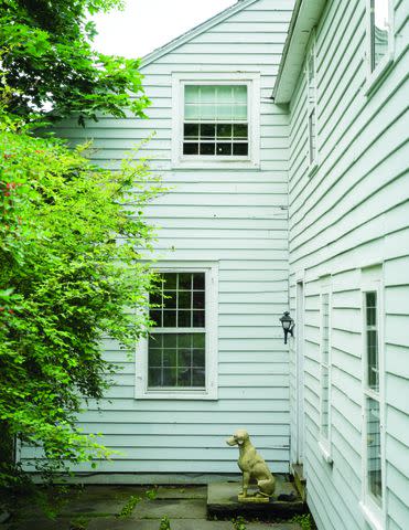
Farrow & Ball Pale Powder (No. 204)
Light shades of blue can sometimes pull icier, but finding a shade that can bring both warmth and crispness to a space can have the ideal effect. “[This] delicate aqua is a dream for an east-facing room as the colors will feel fresh but never too chilly,” says O’Donnell. “This color is also a perfect choice for coastal living when a white can feel too clinical.”
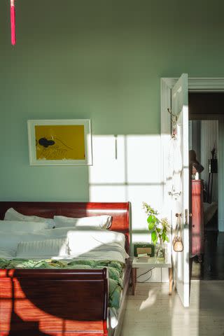
Farrow & Ball
Sherwin-Williams Tradewind (SW 6218)
Of all the colors on the pastel spectrum, Sue Wadden, Sherwin-Williams Director of Color Marketing, says blues remain a popular choice. Just beware of shades that have dominant red undertones as they will read more periwinkle. “Tradewind SW 6218 is the ideal breezy light blue, warmed by undercurrents of green and calmed by gray,” says Wadden. Finding blue shades with a bit of gray will deliver a more sophisticated (rather than sweet) look.

Sherwin-Williams
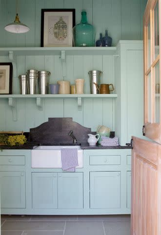
Sherwin-Williams Waterscape (SW 6470)
This dreamy space needed an equally dreamy hue to pull off the effect. The answer was the cool blue of Sherwin Williams Waterscape. It’s a mid-range blue that can pull greener or bluer depending on the space and surroundings. Here it completely envelops the room, with the shelving, backsplash, and cabinets all painted in the shade, but earthy elements like the stone floor, natural wood door, and dark countertop add interest and dimension.
Best Pastel Purple Paint Color
Sherwin-Williams Lite Lavender (SW 6554)
Don’t shy away from lavender. When used in the appropriate space, it can deliver a lively vibe that doesn’t overwhelm. “This beautiful pastel violet with red undertones, which almost feels like a new pink color, is the perfect balance between calm and playful,” says Wadden. Consider this versatile lavender shade a tool you can call on to reenergize a space. For example, Wadden recommends giving it a try in a bath for a dose of vibrancy and energy.

Best Pastel Pink Paint Color
Farrow & Ball Setting Plaster (No. 231)
“Our ‘go-to’ earthy pink has none of the overtly sweet notes one often thinks of with pink,” says O’Donnell. "The underlying brown ‘knocks’ it back a little, creating a color that appears as a gentle neutral when light floods it to something more warming in poorly lit rooms.” If your home is abounding in antiques, this historic-inspired shade might provide the perfect backdrop, but if you’re looking to give it a contemporary edge, the brand recommends pairing with the strong, deep hue of Tanner’s Brown (No. 255).

Farrow & Ball
Best Pastel Yellow Paint Colors
Benjamin Moore Concord Ivory (HC-12)
There’s no need to shy away from yellow, especially when it brings a sophisticated golden edge. Apricot undertones work their magic to keep the color feeling warm. Try pairing with deeper shades like Benjamin Moore Dry Sage (2142-40) or creamy whites like Mascarpone (AF-20).
Farrow & Ball Gervase Yellow (No. 72)
A Farrow & Ball archive pick, this pale-to-mid yellow is brilliant in its subtlety. “It brings a discreet energy to a room whilst remaining calm and elegant,” says O’Donnell. Pair it with green tones like Green Stone (No. 12) and Minster Green (No. 224) or an off white like Wimborne White (No. 239).
Farrow & Ball
Best Pastel Green Paint Colors
Benjamin Moore Kensington Green (710)
For those who aren’t afraid of a little color, consider letting the complementary paint colors take on a more saturated role. The cabinets in this wide-open kitchen are painted in Kensington Green, a cool, blue-green shade that has a soothing quality to it thanks to gray undertones. But it’s the turquoise island (Benjamin Moore Bermuda Turquoise 728) that manages to make them pop.

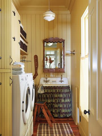
Benjamin Moore Spruce Green (2035-50)
Keep it cool with this minty green that delivers a blueish tinge. It’s the perfect shade to pair in a space like a laundry room where happy energy is needed. Here it’s given a vintage feel when used along with a checkered tile and delicate floral wallpaper. Whatever you do, don’t underestimate the power of a painted trim for furthering the vintage aesthetic.

Farrow & Ball Mizzle (No. 266)
O’Donnell describes this pastel green as a modern pale mint with a calming effect. Pulling it off comes down to what colors you use alongside. “[It] will team well with stronger colors such as our bolder Pigeon or even the charcoal notes of Off Black on kitchen cabinetry with Mizzle as your wall color to temper the boldness of your kitchen units,” he says.
Farrow & Ball
For more Southern Living news, make sure to sign up for our newsletter!
Read the original article on Southern Living.

