Pastel kitchen ideas – 7 modern ways to use playful pastels to inspire a color refresh
- 1/8
Discover how to decorate a kitchen with these softer hues in a way that feels chic and timeless...
Choosing a kitchen color always comes with a slight risk. The 'on-trend' hue seems to be ever-changing – from fresh whites and classic greys to bold blues and deep forest greens. It can be difficult to choose a kitchen color that feels the right amount of trend-led at the time but also has longevity so you aren't redecorating your colorful kitchen every season.
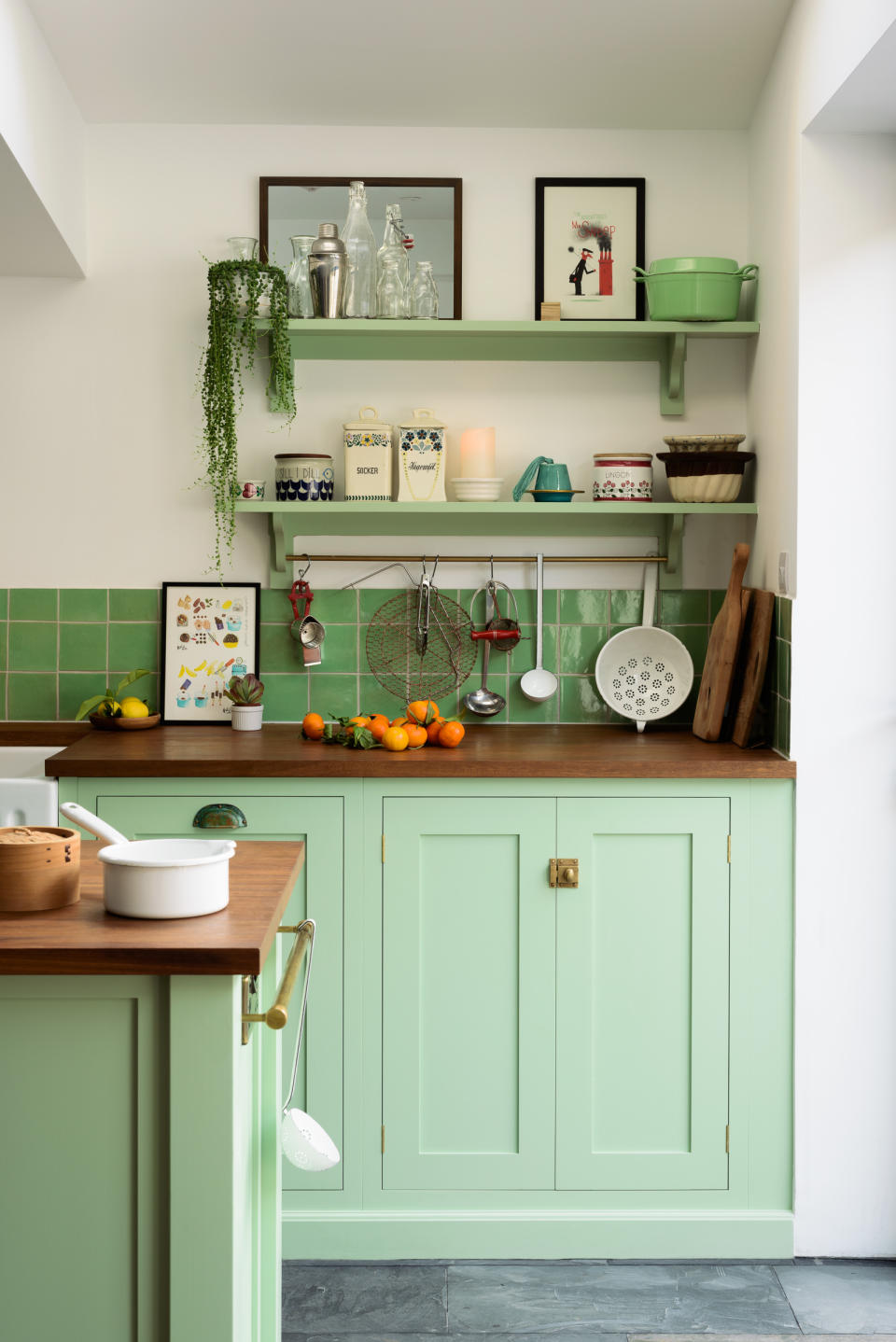
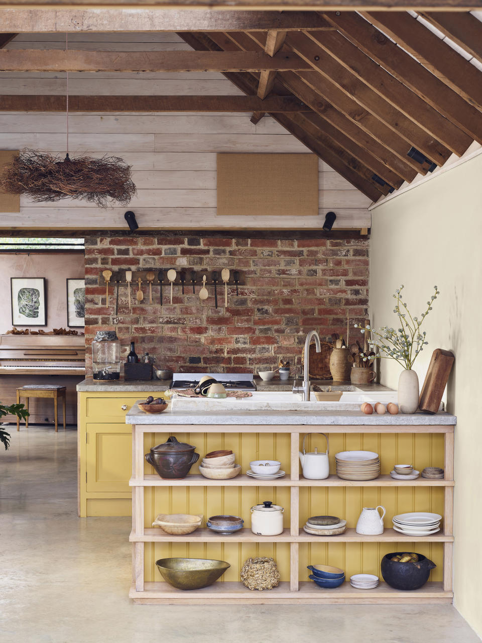
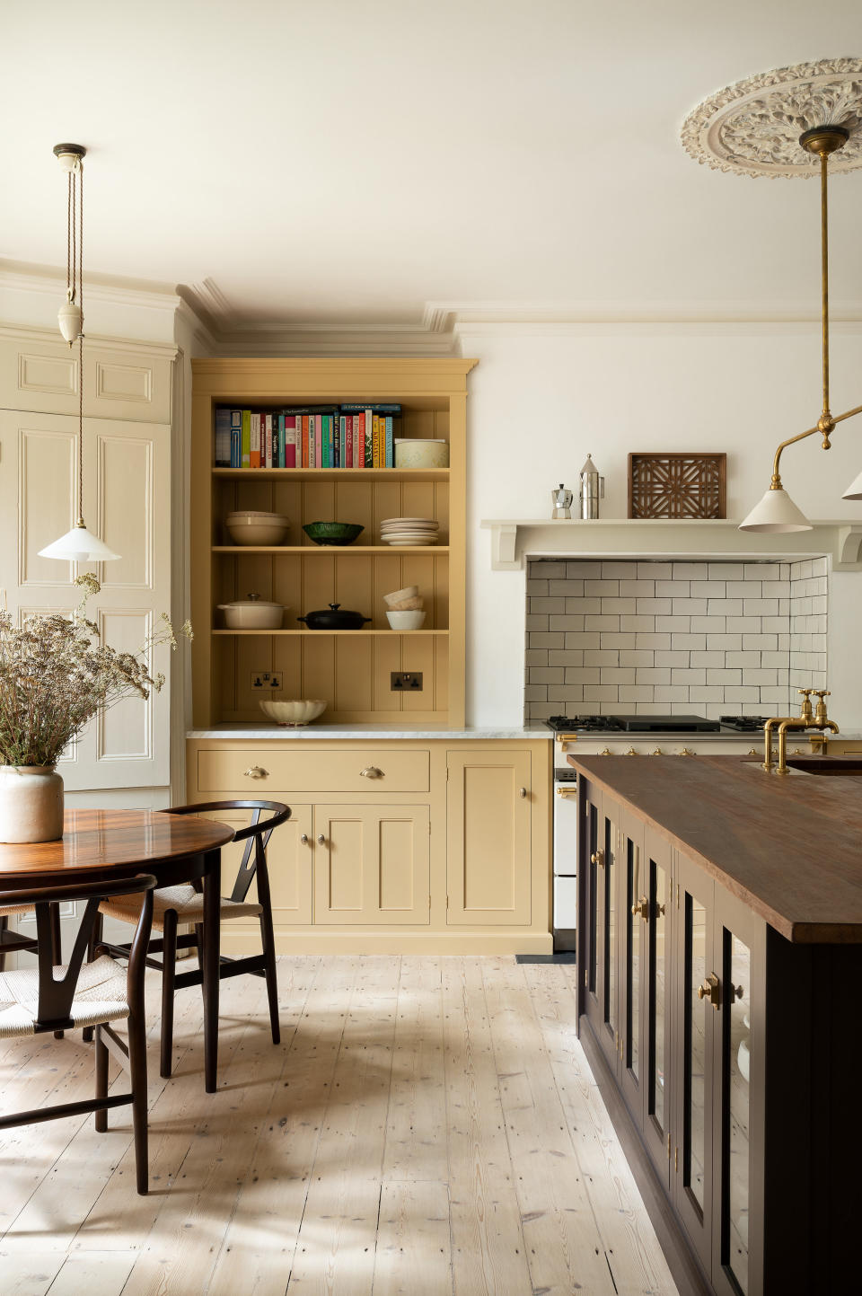
That's why we love a pastel hue in a kitchen. Pick the right shade and they can be timeless. Soft, subtle, and in some cases barely there, colors that add just the right amount of character to a kitchen without the risk of it dating quickly. Or you can, of course, go deeper and bolder with your pastels – they aren't all pale and pretty. There's a pastel color scheme to suit any style – classic country, ultra-modern, rustic farmhouse – it's just about choosing the right shade and where to use it.
'Pastel colors have no black pigment in them, so they are light, playful, and friendly colors. It depends on the amount of white pigment added they can fall into being very soothing.' says Tash Bradley, color expert at Lick.
Our curated collection of the best pastel kitchen ideas will inspire you to give your kitchen a bold new look.
BY HEBE HATTON
deVOL - 2/8
1. Ground a pink kitchen with deep red hues
Pink and red were once a color scheme we saw little of, but with the rising color trend for analogous schemes, these two rosy hues are frequently being paired together. And it works, they are such similar hues but with potentially such different qualities. Plus, bringing a deep and dramatic red into a soft, pastel pink space stops the look from becoming too saccharine, it gives those palest of pink a more grown-up edge, a more on-trend edge.
'There is a lot of imagery floating around regarding pink kitchens, but nothing too sharp or bold, the gentle tones of Setting Plaster offer a perennially liveable option with its gentle, earthy notes on kitchen cabinetry,' suggests Patrick O'Donnell of Farrow & Ball. 'Bring in a bolder accent for a kitchen island or freestanding larder unit, such as the rich brick notes of Etruscan Red. Consider soft blues such as Light Blue, a classic shade that hovers from blue to green to grey depending on the light, and soften with the nuanced off-white of Slipper Satin on your walls, this will be a perfect scheme for a kitchen blessed with abundant light.'
Rachael Smith - 3/8
2. Ditch the wall cabinets
While pastel shades have proven themselves timeless, committing to any slightly braver choice for your kitchen cabinet color can be daunting. And there is that risk that if you go with a more unique color, it can be tricky to bring in any other decor or colors because the focus is really going to be on that cabinet color.
Solution? And this applies especially if you want to go for a pastel hue in a smaller kitchen. Ditch your upper kitchen cabinets. Now, this is a trend in its own right, regardless of color but it makes even more sense when using brighter hues. There's not as much visual bulk and blocks of color if you just stick to base cabinets. There's an opportunity to add other colors and textures to the space. This minty green delight by deVOL demonstrates perfectly.
deVOL - 4/8
3. Pair pastels with natural textures
In their palest, most earthy tones pastel yellows can behave almost like a neutral – a one up from a deep cream. So if you want to dabble in the world of kitchen colors, but don't want anything too bold, yellow is a perfect option.
Plus you can quite easily tone down the brightness by pairing it with lots of natural textures and finishes. This goes for any pastel actually, mix them with woods, exposed bricks, stone, or any natural materials and they go from being these vibrant ice cream shades to soft, muted hues that would work perfectly in a more rustic kitchen.
Morris & Co - 5/8
4. Choose dusty pastels for a sophisticated feel
Pink kitchens are becoming almost as popular as neutral schemes, likely because it almost works like a neutral. But there's a key to decorating with pink, especially in such a frequently-used space. You need the color to be livable, you want to avoid that very 'girly', child-like look that often associates pink with nurseries. And to avoid that just ensure your pinks are more on the dusky side, still light and pretty but with a slight grey or brown undertone.
'The wonderful thing about pastel pink is that it is extremely forgiving. It’s the perfect color in so many different settings because it’s intrinsically warm but doesn’t feel dated if you choose the right kind of pink. Ensure you select a shade that oozes sophistication, such as Farrow & Ball’s Setting Plaster,' explains Irene Gunter, founder of Gunter & Co.
Neptune - 6/8
5. Ground pastel yellow with more dramatic shades
Pastel yellow and aubergine? Not a color combination we would think to put together but just look at how it works. As we have mentioned, in order for a pastel scheme to really work in a kitchen and not date too quickly, you need to pair these pale hues with darker colors. Yellow and purple may sound wild, but both in their more earthy shades complement each other's warmer undertones and create a color scheme that feels both unique and classic.
The small kitchen island is a really obvious place to ground a pastel kitchen, as it sits in the middle of the space, so you are always going to be catching the two colors together. However, if you don't have an island or looking for a more subtle approach than a two-toned kitchen, smaller accents like the hardware or decor can have the same effect.
'You need a grounding color that anchors whatever your choice of pastel. This darker color will stop it from feeling a bit basic and a bit too light. You need to go dark with something, and that could be as small as a dark antique fixture or dark hardware. Something that brings a bit of depth to the room – a picture frame or a rug would do it too,' suggests Tash Bradley of Lick.
deVOL - 7/8
6. Contrast muted tones with a bold countertop
Kitchen countertops are often seen as purely practical, a design decision that's never as exciting as choosing colors or cabinet styles. But countertops make up so much of a kitchen and are as much of a focus as the color – so have fun with them. Use your countertops as a way to bring in colors and patterns and textures. This works especially well in a pastel kitchen to contrast those lighter tones and make the space feel more on-trend.
'When opting for pastel tones we often suggest choosing bold or playful countertops to add contrast to the space,' advises Will Eaves, design coordinator at British Standard. 'In this case, Charlotte Cosby, creative director at Farrow & Ball, contrasts soft and warm tones of Farrow & Ball Setting Plaster Modern Eggshell, with the mottled jade terrazzo and resin counter worktop contrasts creating a dramatic yet welcoming space.'
British Standard - 8/8
8. Mix pastel hues with white cabinetry
Pastel shades look lovely paired with white, as despite being paler colors, there's a really clear contrast there. White gives a pastel scheme a lift and can create a more modern, fresh feel, preventing a pastel kitchen from looking too sweet and twee.
'There has not been so much interest in pastel-hued kitchens since the 1950s, so they are certainly due a comeback. Softy, powdery, sugared-almond shades sit beautifully with white for a clean, romantic look but work equally well with black and bronze for a more contemporary take,' suggests Simon Temprell, Design Manager at Neptune. 'White or soft-grey cabinetry would be ideal against pastel-colored walls and add in brass hardware which works well with all pastels as it brings out the warm undertones. '
Neptune