Are the Paris 2024 Olympic pictograms really that bad?
The Paris 2024 Olympic Games are fast approaching, and design controversies continue to follow the preparations at every stage. After all the jokes about the logo design and the mascots, the pictograms representing the Olympic sports are also raising some eyebrows.
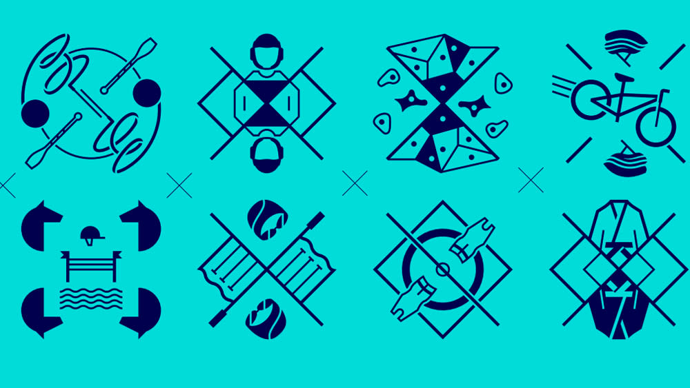
The Olympic Games have set out to reinvent the traditional pictogram with a new approach. While the icons have tended to be quite literal representations of people performing each sport, the new designs are more like badges or crests, with a reflected symmetry reminiscent of playing card designs. The problem is that people can't work out what sports some of them represent (see our pick of the best sports logos).
Pictograms for each sport have been used in the Olympic Games for over five decades. The organisers say that the objective for Paris 2024 was to 'elevate' the 64 Olympic and Paralympic icons "from mere visual aids to striking coats of arms serving as rallying cries for sports fans". They're intended to not only represent the different sports, "but also pride, values, and a large and diverse family."
Each icon has been designed to include a tool from the sport it represents, for example an arrow for archery, along with a depiction of the playing field, be it a target, a pitch or a pool or otherwise. These elements were combined in designs with an axis of symmetry to give them a coat-of-arms-like aspect.
The designs were revealed back in February, but it seems that the internet still can't work out what some of them represent. Some are arguing that the radical departure was poorly advised if the main objective of an icon or pictogram is to be recognisable and easy to interpret.
"I dont know what most of these are – bring back little dudes doing sports," one person wrote on Reddit. "Hmm, let's see: Dunno, Boxing, Cycling?, Canoeing, More canoeing, Diving, horsey, horsey, horsey," someone else wrote.
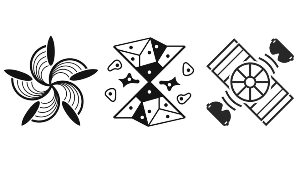
People have suggested that the pictogram for goalball looks like the popular sport of 'sunglasses trivial pursuit' that the surfing icon could represent 'competitive flower arranging' and that the climbing design could be 'space origami'. Others are getting tarot card vibes. "When you have to have a reference for your pictograms, you have failed at design entirely," one person argued.
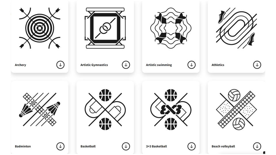
The use of symmetry in the designs does mean that there's a lot going on and that details become small in what are quite busy designs anyway. I think the meaning of some of the symbols is pretty clear, but others are harder to interpret, especially for the lesser known sports or the categories of sport that feature various events, such as the equestrian disciplines (You can check what they really mean and download copies of each design from the Paris 2024 website).
But the designs are also very striking, and I would say do achieve what the organisers aimed for. It's refreshing to see a move away from the typical stick man used in sports icons all over the world. These designs feel like they're more intended to give an identity to the sports themselves, more like a logo or club badge than a mere visual aid.
Whether that's appropriate depends on their use. I have to admit I'm not aware of all of the uses that they will be put to but they will probably often be used in combination with the name of the sport rather than as the only means to identify the sport being played.
This is by no means the first design controversy to hit the Paris 2024 Olympics. People think the new Olympic mascots look like clitorises, and people still find the main Paris 2024 logo design amusing.

