The Ultimate Guide to Using Pantone's Very Peri in Your Home
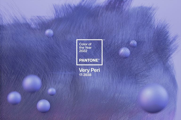
For the first time in Pantone’s history, the global color authority dreamt up a brand-new shade for its 2022 color of the year selection. Dubbed Very Peri (Pantone 17-3938), the dynamic periwinkle blue boasts a warm violet-red undertone and signals novelty in these, yes still, unprecedented times.
“As we emerge from an intense period of isolation, our notions and standards are changing, and our physical and digital lives have merged in new ways,” the company wrote in a press release. “Very Peri illustrates the fusion of modern life and how color trends in the digital world are being manifested in the physical world and vice versa.”
The color—which may look slightly familiar to Microsoft Teams users—blends the reliability of blue and the high energy of red, producing one empowering shade that encourages creativity and curiosity. Perhaps most importantly, the color “places the future ahead in a new light,” according to the release.
How to Decorate With Very Peri(winkle)
In your home, the color may materialize as a pop of color through a bold upholstered chair or small coffee table-worthy object. Should you be on the hunt for a bigger change, an accent wall could do—whether it’s solid or the color appears in a pattern. “This color is so suitable for a special room, like a little jewel box within a house: a party pantry to display a personal collection of beautiful artifacts from your travels or a glamorous bar room with a touch of gold or silver leaf," says Mia Jung, interiors director at Ike Kligerman Barkley.
“Very Peri can be used as a splash of color on a ceiling to draw the eye upwards," suggests Rozit Arditi of Arditi Design. "In smaller spaces, I can really see us incorporating it through accessories and accents to instantly liven them up."
For fabrics, the options are endless. "You can find inspiration from coordinating Sunbrella fabrics such as Majestic Amethyst or Savane Midnight—which can be applied to everything from throw pillows and poufs to larger pieces like sofas and armchairs—to make any space feel positive, uplifting, and dynamic," says Greg Voorhis, executive design director at Sunbrella.
Since Very Peri was announced, designers have incorporated similar shades into their projects. "I just did a showhouse in Atlanta where I worked with cabinetry in Benjamin Moore's Blue Dragon, which has a sensory feel akin to Very Peri," says Joy Williams of Joyful Designs Studio. She adds: "Chocolate browns, black, cream, tan, and yellow worked very well against that particular shade of periwinkle and would work equally well with Very Peri. Coral can be an unexpected complement to it as well."
Williams also recommends pairing Very Peri with deeply saturated blues as she did in the below entryway, which boasts electric blue walls in Commodore by Sherwin-Williams and a wallpapered agate ceiling with hints of periwinkle in it.
We can’t wait to see how designers continue to use Very Peri and similar shades, but let’s not completely forget about all of Pantone's delightful past colors of the year. For a refresher, you can browse the most popular ones here.
Love knowing all the latest design trends? We’ve got you covered.
Follow House Beautiful on Instagram.
You Might Also Like

