How Pantone’s Colors of the Year Have Changed Over the Last 22 Years

Since 2000, the Pantone Color Institute has revealed its predictions for the color of the year based on a myriad of factors.
Pantone’s colors of the year — which have largely been bright, eye-catching hues that range across the entire color spectrum — are chosen through in-depth trend forecasting by the institute. Pantone looks at everything from the year’s mood to fashion, entertainment, art, music, travel and social media, among others, to make its decision.
More from WWD
“Each year, our Pantone Color of the Year is a color we see crossing all areas of design,” said Laurie Pressman, vice president of the Pantone Color Institute. “It’s a color that serves as an expression of a mood or an attitude on the part of the consumers, a color that will resonate around the world, a color that reflects what people are looking for and what they feel they need that color to answer.”
In certain years, Pantone sees socioeconomic or political issues having a bigger influence on its color of the year prediction. For instance, in 2006 Pantone chose Sand Dollar — a neutral beige shade — as a reflection of the nation’s concern about the economy.
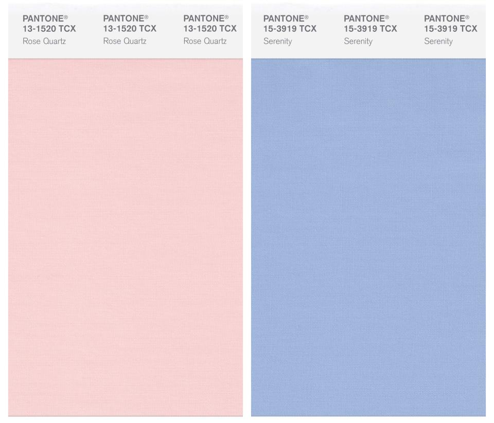
While each year typically has one color of the year, Pantone chose two hues for the first time in 2016. The year’s colors, Rose Quartz and Serenity, were chosen because the combination of the warm rose tone and the cool blue tone were meant to symbolize a “soothing sense of order and peace” heading into that year’s tumultuous presidential election. The two colors were also said to represent the advancements in social movements toward gender equality and fluidity.
Pantone
Pantone chose two colors again for its 2021 color of the year prediction, deciding on Ultimate Gray and Illuminating to represent hope, optimism and stability following the uncertainty and stress caused by the coronavirus pandemic and the presidential election.
“Because the mood or what is taking place in our society changes or evolves from one year to the next, the color we select will always change,” Pressman continued. “Color is a language that expresses what is taking place in our global culture.”
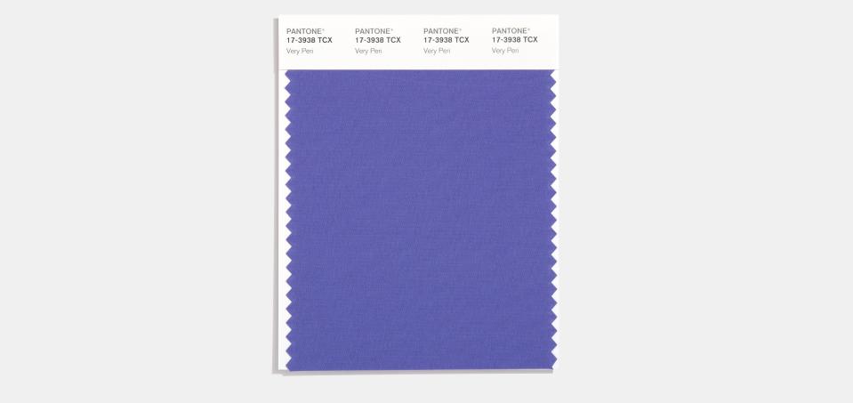
Now going into the third year of the pandemic, Pantone’s color of 2022 is Very Peri, a dark blue-purple hue. Very Peri is described as a “dynamic periwinkle blue hue with a vivifying violet red undertone,” which blends the “faithfulness and constancy of blue with the energy and excitement of red,” according to Pantone.
Courtesy of Pantone
Click through the above gallery to see all of Pantone’s Colors of the Year since 2000.
READ MORE HERE:
All the Biggest Color Trends of 2022 — So Far
How Celebrities Are Already Wearing Pantone’s Color of 2022
Pantone’s Spring 2022 Colors Pop Up at New York Fashion Week
Launch Gallery: All of Pantone’s Color of the Year Predictions Since 2000
Best of WWD
Sign up for WWD's Newsletter. For the latest news, follow us on Twitter, Facebook, and Instagram.

