Pantone Color Trends for 2022 Include These Joyful, Comforting Colors
The global color authority released a sneak peek at its color trend forecast for the coming year. See which shades you can expect to see everywhere in 2022, according to Pantone.
A global authority on color, Pantone is the definitive source for predictions on which hues will define home design, fashion, and other creative industries in the coming months. Its pick for color of the year is considered the ultimate color trend prediction, but as we wait for this highly anticipated announcement, the color experts at Pantone offered a sneak peek at the forecast for the coming year.
The Pantone Fashion Color Trend Report for spring and summer 2022, which was released concurrently with New York Fashion Week, outlines trend predictions for the fashion industry, but the colorful assortment of shades offers tons of home decorating inspiration, too. The report presents ten standout colors expected to make a splash next year and five "core classics" that offer enduring style. The report notes the collection, spanning bold brights, soft pastels, and earthy neutrals reflects the juxtaposition between our need for calm and rest and our desire for spontaneity and excitement.
"Colors for spring/summer 2022 bring together our competing desires for comforting familiarity and joyful adventure through a range of soothing and timeless colors, along with joyous hues that celebrate playfulness," said Leatrice Eiseman, executive director of the Pantone Color Institute, in a press release. Mix and match hues from Pantone's color trend spring and summer 2022 predictions to strike the right balance between serenity and exuberance. Here are the colors Pantone says you can expect to see everywhere in 2022.
Vibrant Primary Colors

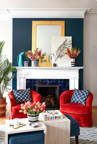
Establish a playful, retro vibe with classic shades of red, yellow, and blue from Pantone's color trend report. Make a dramatic statement with a vivid red named Poinciana, which references a tropical flowering tree, or add a boost of optimism with Daffodil, a joyful yellow that "connects us to the spontaneity of a spring garden." A brilliant royal blue called Skydiver tempers the two warmer colors and establishes a pleasing balance. Experiment with these vibrant colors through easy-to-swap-in accessories and accent furniture, which will pop against a backdrop of crisp white walls.
Familiar Neutrals

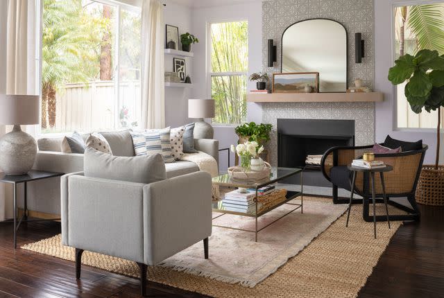
Versatile neutrals, including chocolate brown, sandy beige, and pale gray, will never go out of style. Create a cozy, inviting atmosphere in living rooms and entryways with walls or furnishings in familiar tones like Perfectly Pale, which evokes "the soothing comfort of a warm, inviting beach," or a creamy coffee color called Coca Mocha. Apply dark gray Poppy Seed to walls for a moodier feel in bedrooms and other areas intended for relaxation, or brighten things up with the clean simplicity of Snow White.
Soothing, Nature-Inspired Hues

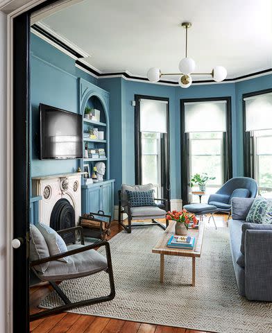
The palette prediction also includes serene shades of blue and green that draw inspiration from nature. For example, a cool, mid-tone blue called Glacier Lake mimics the color of icy water to convey a sense of "serenity and quietude." It's a perfect wall color for establishing calm in a living room or bedroom. A soft, muted green named Basil was chosen to reflect a focus on wellness, so it works well in health-centric spaces like kitchens, workout areas, or bathrooms. For a bit more drama, try the deep teal Harbor Blue on walls or cabinetry.
Playful Pastels

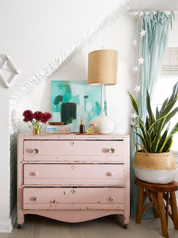
Soft, sweet pastel colors like blush pink and powder blue make delightfully playful accent colors. Pantone's Gossamer Pink brings comforting warmth to bedrooms and living areas, while light-blue Spun Sugar looks crisp and refreshing in bathrooms or kitchens. Apply them in rooms with lots of natural light to enhance their airy feel. To avoid an overly saccharine effect, incorporate plenty of natural textures through woven materials and wood furniture.
false

