Pantone Color Trend Report for NYFW Spring 2024 Is All About Balance
Self-expression, escapism, the need for nature, culinary pursuits and soothing shades may sound like the remnants of the pandemic shutdown, but they are infused in the Pantone Fashion Color Trend Report for spring 2024 New York Fashion Week.
Collectively, the 10 leading colors and five basics serve up a more toned-down palette than in previous spring seasons, but they are also complimentary and can easily be combined. All in all, the Pantone Color Institute’s executive director Leatrice Eiseman said more and more creators in other areas are looking to fashion to get their inspiration.
More from WWD
Gigi Hadid, Naomi Campbell, Adriana Lima Turn Out for Victoria's Secret Fashion Show Tour
Pamela Anderson, Halle Bailey and More Celebrate Pandora's Lab-grown Diamonds at NYFW Party
“These colors are definitely going to be inspirational even for industrial design,” she said.
Regardless of what design area they are in, anybody who works in color should be looking at any other industry and what they are using — whether that be automotive, interiors, technology, films or anime. “Of course, fashion has always been a forerunner — in setting color trends,” Eiseman said. “We’re going to see more evidence next year in terms of electronics and even colors that are used in AI that are going to, if not duplicate exactly, but follow the lead of where fashion [colors] are going.”
In general, the color trends are less about an individual cultural influence and more about an overall multicultural mood. “You’re going to be walking down the streets of Taipei and you will feel the same mood that if you were walking down the streets of Chicago. I’m not seeing anything like Barbiecore pink that is having that strong influence on where fashion is going.”
The spring-summer trend report should appeal to consumers for its overall balance of warm and cool colors, as well as for the potential for individualism that has become more of a priority for many in recent years, Eiseman said. “They have dropped more of the so-called color rules and are willing to experiment. This feeling of release is an ongoing factor. It’s been going on since COVID[-19]. Although we keep reading things about new [virus] variants, the initial huge fear that was attached to it is easing. We’re continuing to allow ourselves to be a bit freer, which opens up the imagination.”
She continued, “That inventiveness comes from sustainability and using what we have. At the same time, we know the human eye is very fickle. We aren’t at the point that people are going to stop buying. We’re like little kids. We still want that sparkly tool to play with. That’s where color really comes on the scene — it piques the eye and makes you want to buy.”
To that point, BMW has developed a Vision Dee concept car that can not only change its color and create a patchwork effect, but e-ink can be applied to alter the vehicle’s grille and headlights. That level of industrial design is one of the most telling signs of color trends, Eiseman said. “If you look at industrial design and concept cars, you’ll see the cutting edge of whatever finish is going to become popular whether it’s matte, pearlized or whatever. Technology enables them to do that. But if you look at clothing fabric, many times you find fabric manufacturers are imitating or trying to emulate the finishes in concept cars. Of course, the price levels then have to come down to become affordable,” she said.
Just as people sometimes use food to revitalize themselves, the spring color palette can be equally restorative. The health benefits of herbal teas, for example, extend beyond personal wellness, according to Eiseman. “They’re restorative in every sense. They’re refreshing to taste, but also refreshing to look at.”
Here, Pantone’s NYFW Spring/Summer 2024 Color Palette:
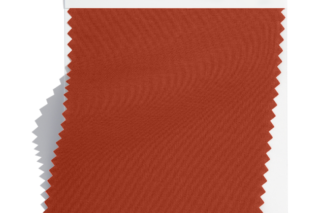
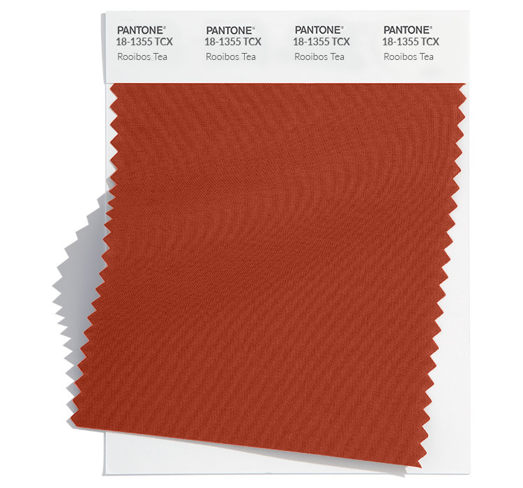
Rooibos Tea 18-1355: This is a full-bodied red imbued with rich, woodsy notes. The toned-down shade has the same effect as the shade of a dress that had been stowed away in a cedar chest for a while, Eiseman said. Gucci, Zegna, Josie Natori, Bally, Emilio Pucci and Markarian’s Alexandra O’Neill are among the early adopters.
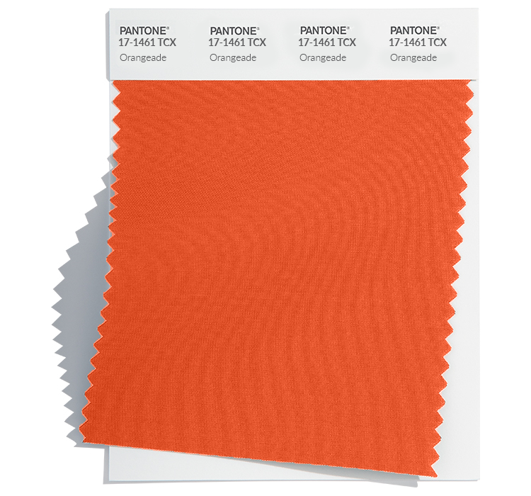
Orangeade 17-1461: A mildly tangy orange hue with a fruity touch, but it is not a strident bright orange. Draper James and Sandy Liang are among its adopters. “These toned-down colors are absolutely a nod to sustainability, upcycling and secondhand clothes. There’s no question — there’s just so much interest. It’s beyond trend,” Eiseman said.
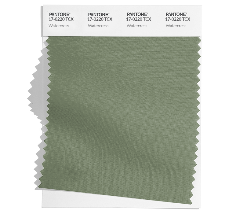
Watercress 17-0220: Watercress, a refreshing peppery green with a sprightly presence, is cropping up in designer collections and athletic brands alike. Under Armour and Kate Spade New York are already onto it.
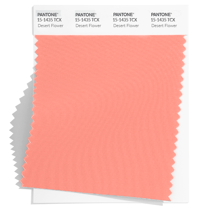
Desert Flower 15-1435: This shade doesn’t definitively say “so long” to all those Barbie pinks, but it signals a step toward the warmer side of pink. Christian Siriano, Jonathan Cohen and Fforme’s Paul Helbers have already embraced the concept. While the pink family is one that people love, Desert Flower offers a different, warmer slant than the bluer pinks that have dominated in the past few seasons. The name alone says it all, but it also is nurturing.
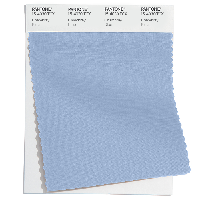
Chambray Blue 15-4030: The return of the Canadian tuxedo — denim-on-denim — and many consumers’ everlasting fondness for faded Y2K-friendly jeans have helped to revive this blue. With a dash of vibrancy, Chambray Blue has bit more life to it than basic denim, Eiseman said. Talbots has used it for sweaters. It was also used in the Yayoi Kusama inflatable structure outside of the Louis Vuitton flagship in Paris.
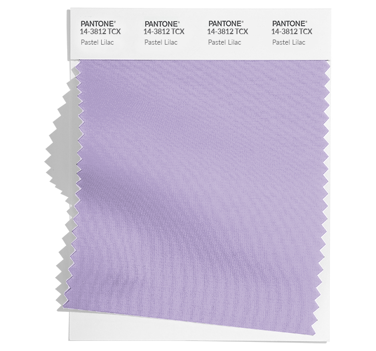
Pastel Lilac 14-3812: Without question, this powdery lavender is an homage to the past since it relays a sense of nostalgia from Pantone’s point of view. LoveShackFancy’s Rebecca Hessel Cohen and Tibi’s Amy Smilovic seem to agree with that. Many people refer to lilacs as sweet because they associate it with a sense of taste, Eiseman said
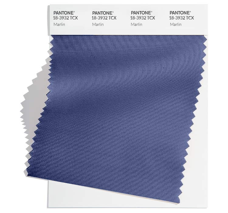
Marlin 18-3932: This aquatic blue isn’t just one that the Key West-loving types like Ernest Hemingway and Jimmy Buffett favored. This tropical tone is like “immersing yourself in temperate waters,” Eiseman said, “Again, we have to think about climate change and heat. There is a recognition that this color is going to cool you off.”
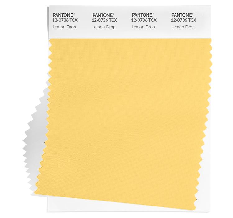
Lemon Drop 12-0736: Filled with zest, this Lemon Drop yellow has a slight tint of green that has a refreshing quality. Adeam’s Hanako Maeda is already onto it, as is Mirror Palais’ Marcelo Gala.
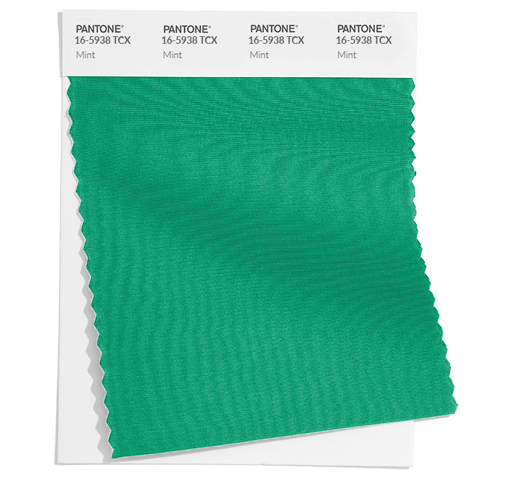
Mint 16-5938: Like Marlin, this cooling mentholated green offers a breath of fresh air as the planet continues to heat up, Eiseman said. Acknowledging some of the food-related named colors, Eiseman said, “Thinking in terms of the climate and climate change, this is certainly the summer that we need a lot of colors to cool us off. Maybe looking forward to next spring, that will be something that we need to think about too.”
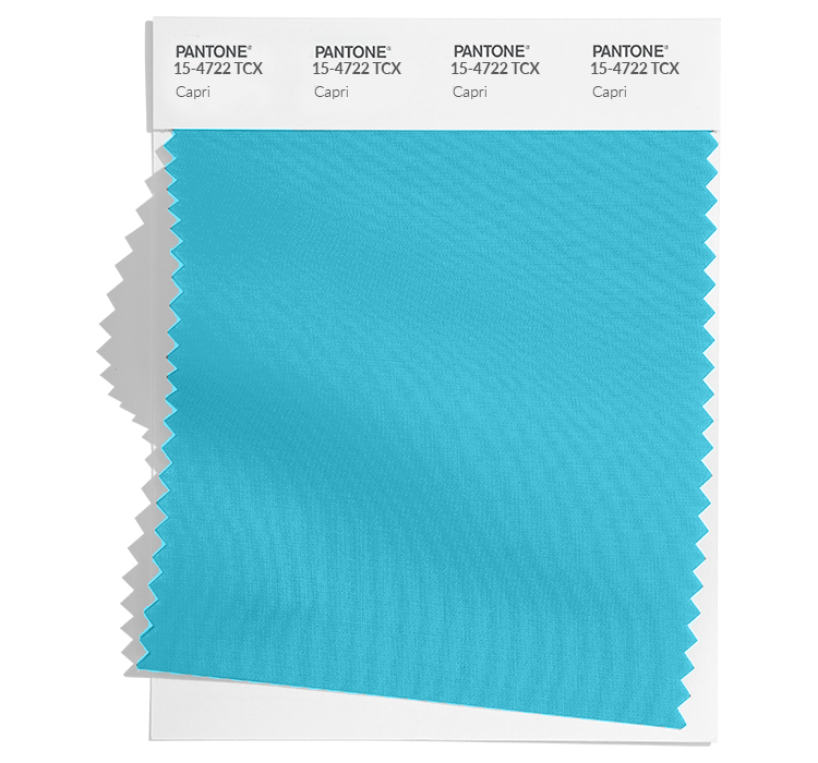
Capri 15-4722: Like the azure-colored waters of a blue grotto, there is no question that this vibrant Capri is “a consumer favorite.” It also has an undercurrent of escapism with many wanting to retreat from the real world. Even the hue’s name — like the island in Italy’s Bay of Naples — is suggestive of that sentiment. “Even though we know air travel has its challenges, people have a bit more freedom scheduling-wise. There is also the realization that life is short and people want to take advantage of it now. We don’t know what the future holds,” the color aficionado said, adding that, “anytime you get into the blue-green family, it’s hard to make a mistake. They are just so popular and with everything else in this palette, it’s a perfect complement to the warmer shades in the palette.”
NYFW Spring/Summer 2024 New Classics:
Not just reliable core tones, these colors offer a contemporary edge even when worn monochromatically. The classicism associated with each means they will be long-lasting closet staples.
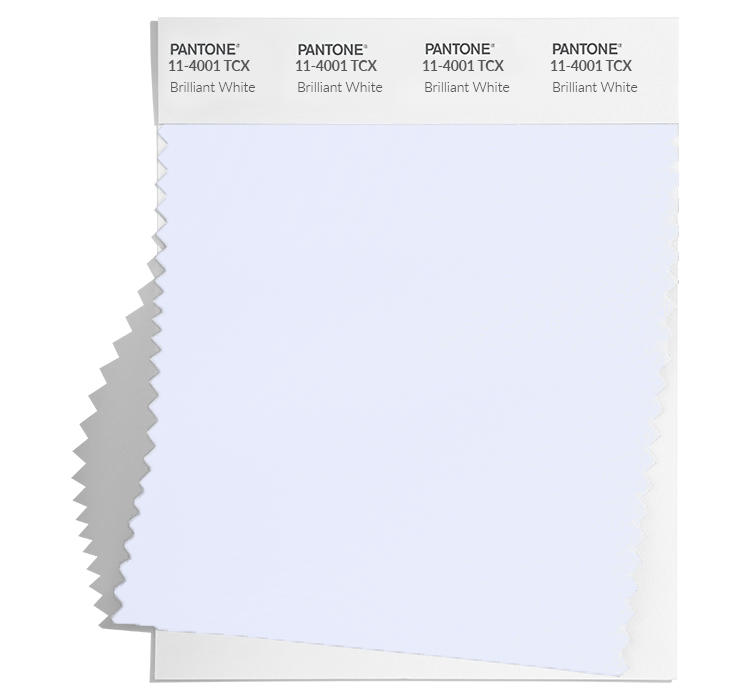
Brilliant White 11-4001: Clean and crisp, Brilliant White marries well with any of the other colors in the palette “with a gorgeous contrast,” Eiseman said. Tory Burch grasps that concept. “It’s simplicity but at the same time, it’s modernity.” That can translate with such basic colors through the very clean silhouettes.
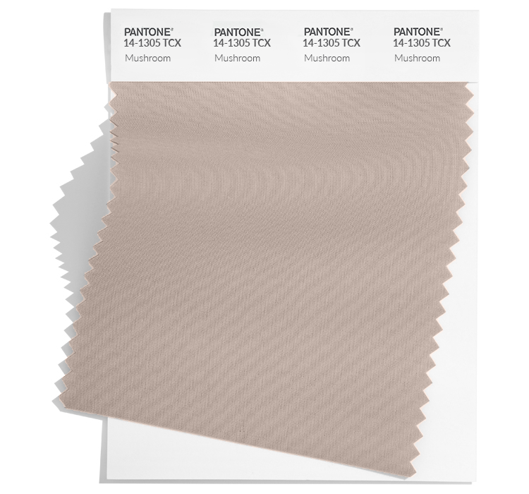
Mushroom 14-1305: This from-the-ground-up taupe offers a modern edge and practicality. Equal parts beige and gray, Mushroom serves up versatility. Bruno Cucinelli needs no convincing and Montblanc is a fan too. “People are thinking a bit more about how they are spending their money. They want to invest more in neutral colors because they know they will last more. That’s not to say they aren’t going to buy color because color is the ultimate tease. That’s what gets your attention online, or in a store window,” Eiseman said.
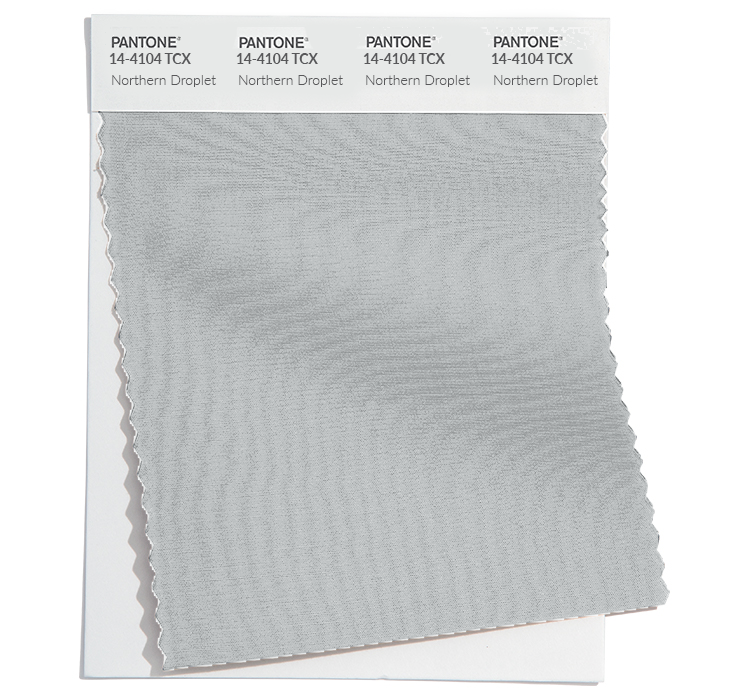
Northern Droplet 14-4104: Like a rainy day, this gray offers quietude. Like its fellow gray Quiet Shade, North Droplet is dependable, shadowy and protective. Palomo Spain’s Alejandro Gómez Palomo is on board with that.
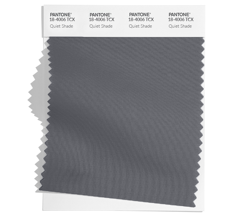
Quiet Shade 18-4006: Quiet Shade is a shadowy gray that offers a protective shelter. Newcomers like Sami Miro and established designers like Thom Browne and Dennis Basso are fans.
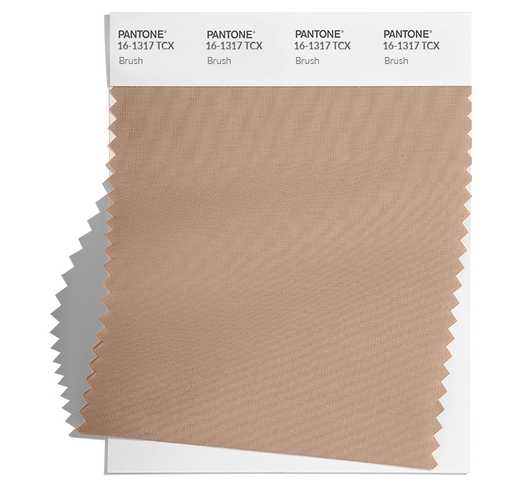
Brush 16-1317: A utilitarian khaki hue, Brush provides a natural blend to its surroundings. Clare Waight Keller used it for her Uniqlo collection and Jane Siskin infused it into her Cinq a Sept designs.
Best of WWD

