Paint Your House Anything But White: Kitchen Edition
We asked a designer for some colorful options—and she found a hue for you, whether it’s greige, chartreuse, or something in between.

If you can’t seem to shake the idea of a kitchen that isn’t white, take comfort in knowing that you’re not alone: the perpetual popularity of white kitchens boils down to the few advantages the color offers. First, there’s the shade’s ability to make a space feel larger, brighter, and more inviting. Secondly, white walls are less likely to clash with non-white countertops, backsplashes, or appliances you don’t want to hide. Then there’s a matter of accessibility: stroll into any home improvement retailer and you’ll find numerous tried-and-true white paint colors that come highly recommended by experts who can quickly describe the difference between eggshell and ecru without the assistance of Google.
Despite the obvious perks of a white kitchen, there’s some ongoing speculation that the color is losing its footing as top choice. And understandably so: It can come off as cold, sterile, and boring, plus it shows dirt and stains easier than darker colors. There’s no telling when or if white kitchens will ever experience a fall from grace, but before you find yourself living with an outdated kitchen paint color (the horror!) take a look at a few of our expert recommended non-white kitchen paint colors that are equally stylish and pleasing to the eye, along with tips for confidently selecting a shade of anything other than white, courtesy of Atlanta-based interior designer Leah Alexander of Beauty Is Abundant.
Look at what you’re working with
When considering a non-white kitchen paint color that’s perfect for your space, take stock of the existing shades and use them as a foundation for a fresh color scheme. That collection of all-black appliances? Start there! Happen to be the owner of a particularly dashing range in an amazing color? Select a few shades that either contrast or match the appliance (depending on your personal preference) and narrow down the options. Also, don’t overlook the lighting in your kitchen. Keep in mind that natural lighting and the direction from which it enters the room can affect the way the paint color shows up. For instance, if you’re working with incandescent lighting, expect cool colors to appear duller and warm colors to look warmer.
While measuring the moodiness of the ambient lighting against your prospective color choices, don’t forget to get creative, says Alexander. She recommends tapping into your personal belongings and social media trends for inspiration. "Don’t overthink color. If you love colorful clothing or gravitate toward colorful Instagram posts or Pinterest pins, go with what feels a little risky or exciting," she says. And instead of catastrophizing about all the things that could go wrong with your paint choice, keep an open mind and an adventurous spirit. "Go with the answer to the question: ‘Wouldn’t it be cool if….?’ And don’t look back," Alexander adds.
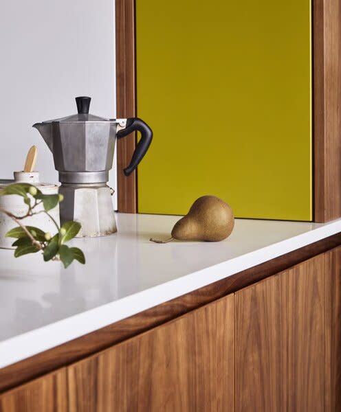
As for her current kitchen paint color faves, Alexander names Chartreuse by Sherwin Williams, a versatile lemon-lime hue that skews cool or warm depending on the shades it's paired with, and any terra cotta hue, which she aspires to use in a future kitchen project.
Think (a little) outside the box
When it comes to finding a compatible paint color, kitchen size matters. For spaces that lean more shoebox-sized and less palatial, the general rules of thumb still apply: darker shades will shrink the space whereas lighter alternatives will open up the room and make it feel roomier (even if your countertop is cluttered).
If you live in a modern or minimalist interior, the mere suggestion of a non-white kitchen paint could induce panic as those aesthetics practically go hand-in-hand with white and white-adjacent hues. But worry not: even if the thought of bold color terrifies you, there are options. Consider not-quite-white tones like beige and greige as well as more vibrant alternatives that still feel neutral, like warm earth tones, rich greens and navies, deep reds, dark grays (almost black, but not quite), and pastels. Any of these choices are pigmented enough to freshen up a space—a quiet green like Backdrop’s Rococo will still give small spaces the illusion of appearing larger but is subtle enough to maintain the clean, simple look that appeals to modernists and minimalists.
While neutrals are tried-and true choices for minimalist interiors, Alexander cautions against remaining committed to those shades. Instead, she recommends casting a wider net on color choices and trusting that modern or minimalist finishes like colored plumbing fixtures or neutral backsplashes will help to uphold the aesthetic. And if there is a major concern about a rich hue instantly transforming a kitchen from modern to maximalist, match your paint to your cabinet color for a seamless, sleek blueprint. Alexander encourages color-seekers to revamp design details instead of sacrificing color in the space. "Consider eliminating hardware or push-to-open cabinets to achieve a modern look in any color," she says.
Lean in!
If your kitchen is already an electric shade of lime or a punchy Frida Kahlo blue, never fear: interiors that are already on the more vibrant side can still benefit from non-white paint. It may be tempting to add some white-ish paint to bring balance to a space that’s saturated in color, but even if your kitchen is maximalist-leaning, don’t shy away from adding even more lively paint colors into the mix. "Go crazy," Alexander says, but do employ limits. "Avoid colors that pull from existing colors so that the space isn’t overly matchy."
Accomplish this color-contrasting feat by playing with shades that coincide with surrounding patterns in a way that creates visual interest and connects the kitchen with adjacent rooms. For example, a green that compliments a neighboring black-and-white striped dining room accent wall or a teal that’s one shade lighter than the living room throw pillows is a great way to let your color-happy freak flag fly.
If you find yourself overwhelmed with all the alternative options, don’t throw up your hands and resort to what’s familiar (read: white paint). Do call that friend who has a great eye for color, draw straws, call an expert, get your spouse’s opinion or even try your hand at recreating your favorite famous sitcom homes, but don’t play it safe. That pleasant plum that you love could instantly elevate your kitchen from boring to the next best brunch spot.
Top photo by Jim Stephenson originally found in Before & After: A Faux Mountain Inspired by Disneyland Caps This Riotous Renovation in London
Related Reading:

