How to paint with four values in Procreate
In this tutorial I will show how I paint with four values in Procreate and Photoshop, I will be using just four values to bring a monochrome painting to life. I first read about contrast and values years ago in Andrew Loomis’ classic book Creative Illustration. Inside were four odd-looking boxes of various values, which the author claimed to be important when creating a strong illustration. (If you need inspiration, read our guide to the best art books.)
My definition of values has changed since then. I mostly associate them with describing a form, but they also serve another key role, and that’s to govern contrast. Here, contrast refers to how an object stands apart from another. It’s how we distinguish an object from its background. (Read our Procreate review to find out more about this Apple-exclusive software, and how guide to the best iPad for drawing if you've yet to upgrade.)
Why this is this important? It’s basically how we look at things, or how certain objects become noticeable when they have a strong contrast. And by incorporating them into our work we can visually control how objects are read – or not read – by their roles in an image. If they’re important then you should add contrast, which makes them stand out. Objects of lesser importance need to retain their low contrast, so a viewer know it’s there but won’t be distracted from the focal point of the image.
This approach emphasises the relationship of contrasts between values, rather than to describe form. If done correctly it’ll result in a strong image with clear readability – you can see the end result at the bottom of the page to judge for yourself.
Paint with four values in Procreate: my brushes
Custom brush: Flat_round

Without a flat solid brush such as this one, your limited values can mix and you’ll end up with a lot more than just four.
Paint with four values in Procreate: tutorial
01. Why use four values?
(Image: © Min Yum)
There are many variations on painting with contrast. Many artists use three values, which results in a bold painting. Others use five because the final art is slightly more forgiving. Yet it’s not important how many values you use – the key thing to understand is that you have to use values to create contrast for better readability, rather than describe a form or lighting setup.
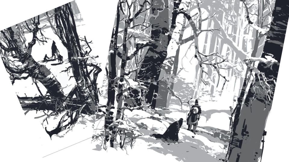
This will free up a lot of values and give you an opportunity to think about the effect of controlling contrast. This also helps you to prioritise focal points over less-important details. These two images show how the focal point is emphasised through the use of limited values.
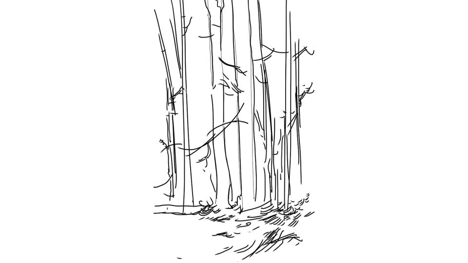
02. Get sketching to test my ideas
(Image: © Min Yum)
I always start with sketches, and Procreate’s Sketch brushes are ideal for this stage. The drawing helps me to see where I’m going. It’s a quick way to confirm if an idea will work or if I need to take another approach. It’s much easier to make adjustments and explore visual ideas now, rather than during the later stages of a painting, where it’s time-consuming to make even the smallest of changes.
03. Planning with simple values
(Image: © Min Yum)
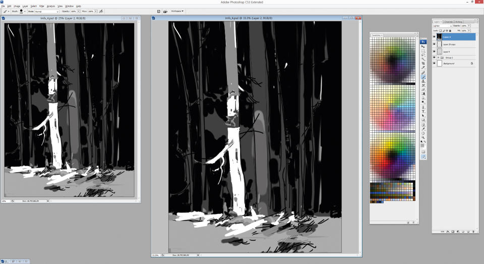
I now switch to Photoshop. It’s always best to work from big to small as you paint. My plan is to show the large, key shapes without details and see if they can be read. My biggest concern is that since my darkest value (black) is tied to the background, I’m left with three values to describe the rest of the scene. It’s going to be a challenge, but at least this gives me an idea of the problems that lie ahead.
04. Compositioning options
(Image: © Min Yum)
Because I'm actively thinking about how this image reads, this should result in a good composition. Large contrasts in values needs to be placed next to the focal point, to ensure that I grab the viewer’s attention.
Subtler adjacent values such as dark grey and black could be used in details that may not be important, but need to be present to support the main idea: in this case a small group of trees within a forest.
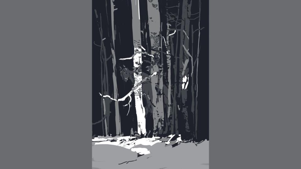
I want to show strong, vertical trees with a hint of a large silhouette within the treeline. It’s going to be a little flat, but there’s a good opportunity to explore rhythmic shapes and patterns.
05. Creating an optical illusion

(Image: © Min Yum)
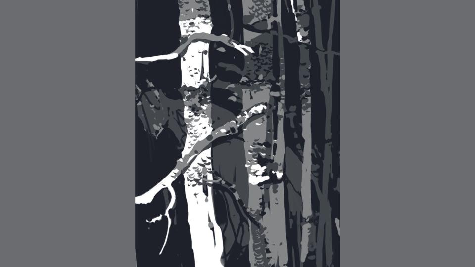
Although four values are never really going to be enough to describe much, they’ll behave differently depending on their surroundings. For example, a light grey on a white background will appear darker than the same grey on a black background.
This is a well-known optical illusion called simultaneous contrast, and I know that if I use it correctly I can describe a lot more values by tricking viewers into thinking they’re seeing more than just the four I’m using.
An example of how I’ll use simultaneous contrast to show more values is in the tree details. The darker trunk has light grey patterns and the same light grey patterns are present in the white bark, but will appear slightly different from each other.
06. Working with silhouettes
(Image: © Min Yum)
When it comes to the details, it’s really all about describing silhouettes. Here’s a close-up of a tree and a branch sticking out. They’re both in light greys, but if I were to keep the start of the branch in the same light grey then I’d eventually lose its silhouette.
I could reinforce it with a hint of black as a shadow, but I need it to read better and it requires more details, too. I add white to the branch until it’s not set against the end of the grey trunk. Then I finish the rest of the branch in grey
07. Developing patterns for details
(Image: © Min Yum)
With limited values to show form and depth, I need to find other means to create visual interest. I add some patterns to suggest textures, which also helps viewers identify cropped branches or trunks. This makes the silhouettes of branches in different values look more natural.
08. Describing form
(Image: © Min Yum)
I need to think how I can describe form in this arboreal scene. Without form the treescape would be too flat and devoid of space. Here I use black to show the shadow region, but the trick is to place a darker grey tree next to it, so the black shadows don’t dissolve into the background.
09. Adding background details
(Image: © Min Yum)
The outer areas of the paintings don’t require much attention, so very little contrast is used. I feel the treeline needs more foliage to be read as a forest at the moment. Unfortunately, I’ve allocated black as the background default colour. I introduce foliage in a darker grey in the background so they can free up the black to work as branches and trees.
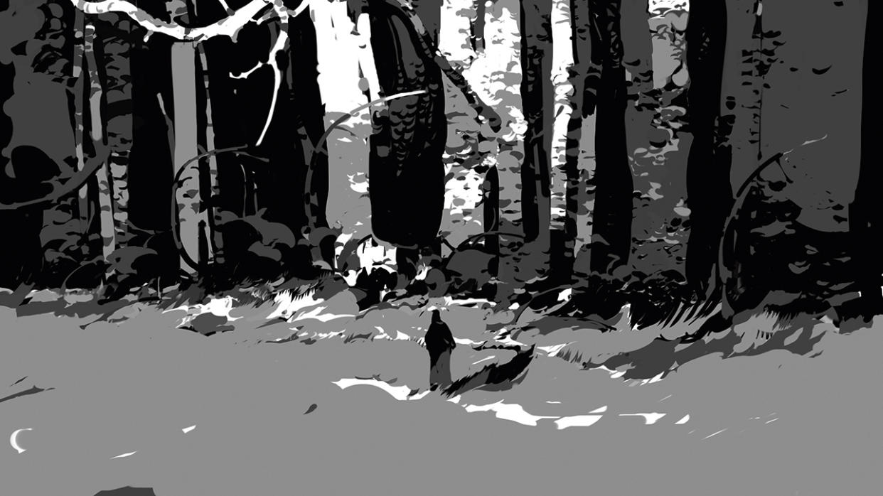
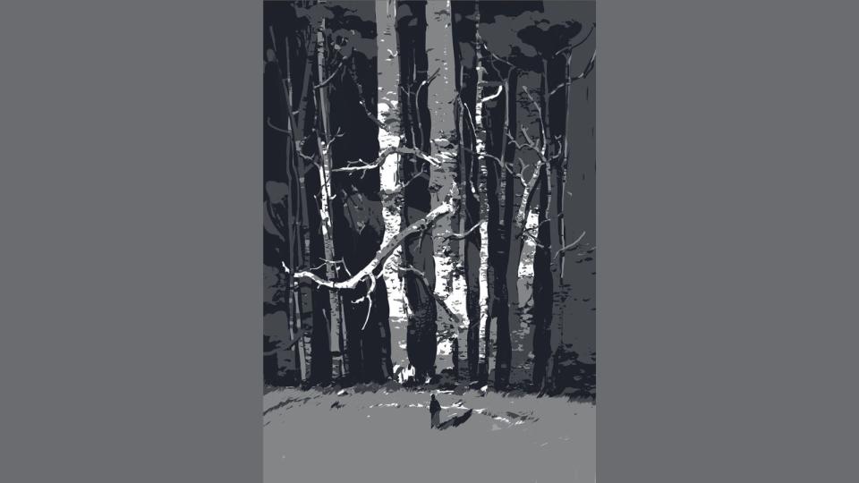
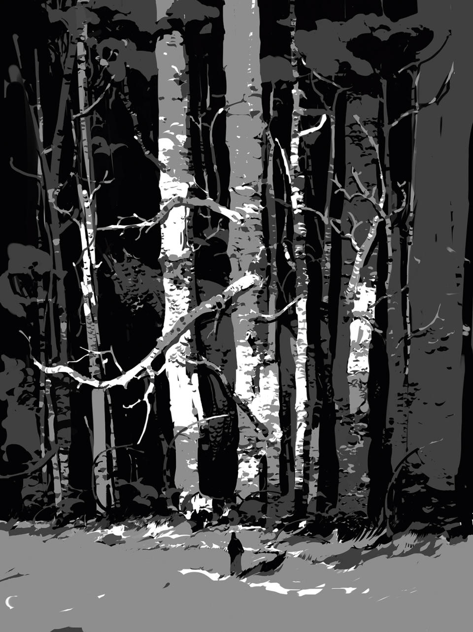
10. Suggesting scale and story
(Image: © Min Yum)
A human figure will help immensely when indicating the size of the trees. A viewer will instantly understand the scale of important objects, relative to the figure. It also helps me to tell a story. Originally, I had a more lighter ground, but it was creating too much contrast so added more neutral grey to knock it back a bit.
11. Final touches
(Image: © Min Yum)
I still want this image to tell a story even with all the technical limitations. So this is where I focus more on the overall look, making sure that I’ve kept the initial feel of the painting and forest is looking natural. I also adjust my details: sometimes it’s more important to sacrifice details for the sake of a better image overall.
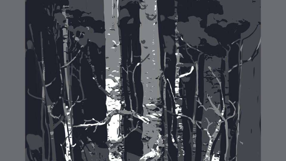
12. Wrapping things up
(Image: © Min Yum)
Using limited values has helped me notice many fundamentals in paintings that I might have otherwise overlooked, such as strong composition, better readability, prioritised details and more options for effectively describing objects.
The number of values isn’t that important; it’s more about getting to know their role when working with contrast, and how this knowledge can eventually be carried into colour work and tackling more complex paintings.
Get more Procreate tutorials in ImagineFX
This content originally appeared in ImagineFX magazine, the world's leading digital art and fantasy art magazine. ImagineFX is on sale in the UK, Europe, United States, Canada, Australia and more. Limited numbers of ImagineFX print editions are available for delivery from our online store (the shipping costs are included in all prices)
Alternatively, you can access us instantly through our digital options:
• Apple app (for iPad or iPhone)
• Pocket mags (multi-platform app, great for Android users)
• Zinio (multi-platform app for desktop or smartphone)

