From beige to magnolia: the paint colours that could wreck your marriage

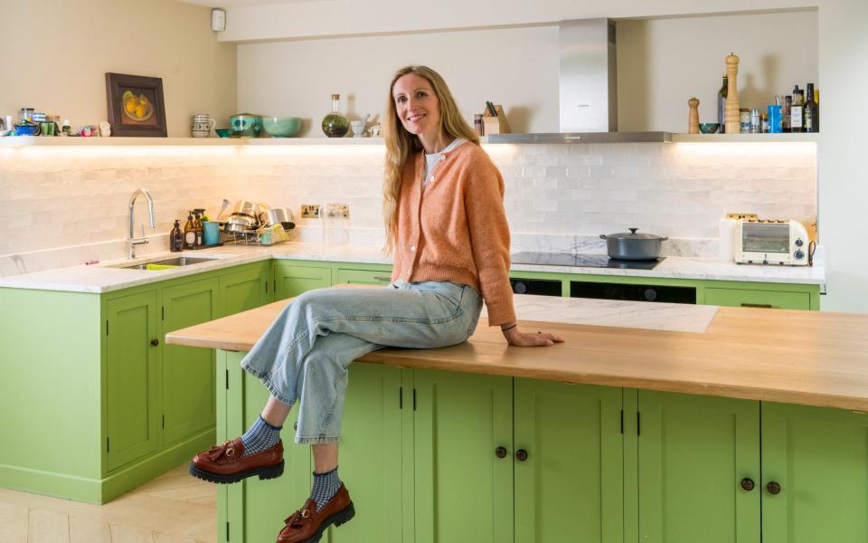
It wasn’t the dust, the noise or the soaring costs that came between my husband and me during our 18-month kitchen renovation, but the colour of our kitchen cabinets. My husband wanted the zingy and botanical Grenada Green from Benjamin Moore; I preferred the almost identical yet fractionally darker Buckingham Gardens. The cabinetmaker, eager to start painting, rolled his eyes when neither of us would back down – this was clearly not the first time his clients had bickered over paint.
Indeed, new research from Dulux suggests that more than a quarter of Britons fall out over paint colours when decorating their homes, with neutral shades being the most divisive. “While we often think of neutral colours as a safe bet when creating a calming space, they’re the hues that cause the most quarrels,” explains Marianne Shillingford, creative director at Dulux, reminding me of the time my husband insisted on painting over the pale grey colour I’d chosen for a shed door in pale beige.
With so many paint charts, aspirationally named colours and design inspiration on social media, I don’t think it’s any wonder that we find it hard to agree on paint. According to the Dulux study, friends and housemates are even more likely to fight over paint than couples, particularly if they’re under the age of 34. Shillingford puts this down to the fact we express ourselves through our homes. “If you’re in your twenties or early thirties this might be your first opportunity to explore interior creativity and style – you’re going to have a strong opinion,” she says.
What we don’t count on, though, or at least I didn’t, is that others living in the house might have equally strong opinions. Kelly Lang from south London, who’d always considered herself the interior designer in her marriage, was astonished when her husband forbade her from painting their “horrid brown” front door a “beautiful duck-egg blue”. The stand-off went on for months, before she took matters into her own hands, ordered the paint and painted the door herself. “It looks great. He was eating humble pie for weeks,” she says.
Lang’s strategy was risky, though; Suzanne Duckett, co-founder of design studio Onolla, insists that you have to tread carefully, as spats over paint can get messy. She advises her clients to strive for compromise, rather than dictating to one another, which can lead to all-out war. This is what happened to Katie, a public relations consultant, who admits that friction over paint colours caused her to end it with her last boyfriend. “I couldn’t believe how stubborn and unreasonable he was being,” she tells me. “He wasn’t listening to me at all; I wanted the house to feel calm and his colours were loud and unsubtle. I couldn’t help seeing it as an insight into his personality.”
It’s true that the colours we like reflect our individual perception and experience, says Duckett. There are also studies that show men and women see colours differently due to the way our brains process details; men see orange as redder than women do, for example, while grass appears yellower to them. Plus, colours can trigger both positive and negative memories and responses, which is why we should try to be empathetic to our housemates’ opinions, Duckett adds.
Jessica Moray, from north London, for example, found that the icy-blue colour her husband had insisted on for their bedroom made her feel so unsettled that she couldn’t sleep. When he agreed that she could repaint it a warm pink, her insomnia disappeared. Magnolia, the off-white colour that was popular in the 1980s and is now enjoying a comeback, is particularly divisive, according to interior designer Lucy Breton of Studio Breton, as it brings back childhood memories of smoke-stained living rooms. She subtly reminds her clients that they live in a shared home and have to bear in mind each other’s preferences. “There’s no point redecorating unless all parties are happy,” agrees Duckett.
While one would hope that turning to an interior designer or colour consultant would make colour selection easier, paint is so contentious that meetings often turn into counselling or mediating sessions, admits an interior designer, who prefers not to be named. “We get drawn in a lot,” she says. “They say ‘My husband/wife won’t listen to me but they’ll listen to you – tell them that my colour preference is the best possible outcome.’”
She tries not to take sides and instead gives diplomatic, professional advice; Duckett’s approach is to work with her business partner, Sharon Duncan, to represent both parties’ interests: “We each take one under our wing and cheerlead for them to help them find a colour collaboration.”
Where to find a colour to please everyone
The simplest way to find a compromise is to settle on what interior designers call an “everywhere colour” that is both calm and punchy. These tend to be warm neutrals – which happen to be on trend at the moment. Greys in particular are an excellent compromise, according to Shillingford, as they’re flexible, working with a wide variety of other colours and decorating styles.
To prevent arguments, she’s developed a new “compromise palette” of nine neutrals for Dulux, which includes three greys along with a white, three beiges, a green and a blush. “These shades unify walls and woodwork with colourful furniture, art and decor – especially helpful if you prefer a minimalist look, while your decorating foe is more ‘cluttercore’,” Shillingford says.

Meanwhile, Breton’s everywhere colour is Dimity by Farrow & Ball, a plaster colour, which she says works equally well in light and dark rooms, whether big or small, and creates a warm base that feels considered. She also uses Whitening by Little Greene, a chalky white that complements deep blues and greens, while Lena Dahnjo, colour consultant at Edward Bulmer Natural Paint, often suggests Clove as a compromise – an earthy blush, available in different strengths.
How to reach a compromise if you can’t agree
For some couples and housemates, however, the “compromise colour” isn’t the answer. Either they can’t agree on one – according to the Dulux study, 22 per cent of colour clashes are beige-related – or they both end up hating their compromise. The “safe green-grey neutral” Lang and her husband agreed on for their hall, for example, turned out to be a slime colour that they both loathed. “We clearly don’t collaborate well,” she says. “In less than a year we’d repainted it pale grey, which I selected.”
It can work well to give one party the job of colour consultant and the other the role of art and furniture stylist, Breton says, or to allow each to design different rooms. If one party is insistent on a particular bold colour, she’ll suggest it’s used in the downstairs loo. “The loo is a great bargaining chip. It’s a place all guests frequent so it’s certainly not a fob-off. But it’s also a funny, separate, anything-goes space where you can let your partner or housemate go wild, knowing the door stays closed most of the time.”
Another useful tactic, according to Amanda Tapp of Edward Bulmer, is to keep the names of the paint hidden until you’ve agreed on the colour. Rather like book covers, paint names can distract from the product itself, which is presumably why Dulux chooses bland, diffusive names for its Compromise Palette: White Cotton; Tranquil Dawn; Pebble Shore.
Tapp says that Lilac Pink is Edward Bulmer’s most divisive colour as some people (my husband included) run a mile when you suggest pink. “They think of pink as being sugary, but as long as there’s enough yellow in it, it can be a timeless and warm neutral which can hover from plaster pink to warm beigey brown. Lilac Pink is actually a warm neutral that glows on the wall without being either lilac or pink; if we show the couple the colour first without the name, they always love it,” Tapp says.
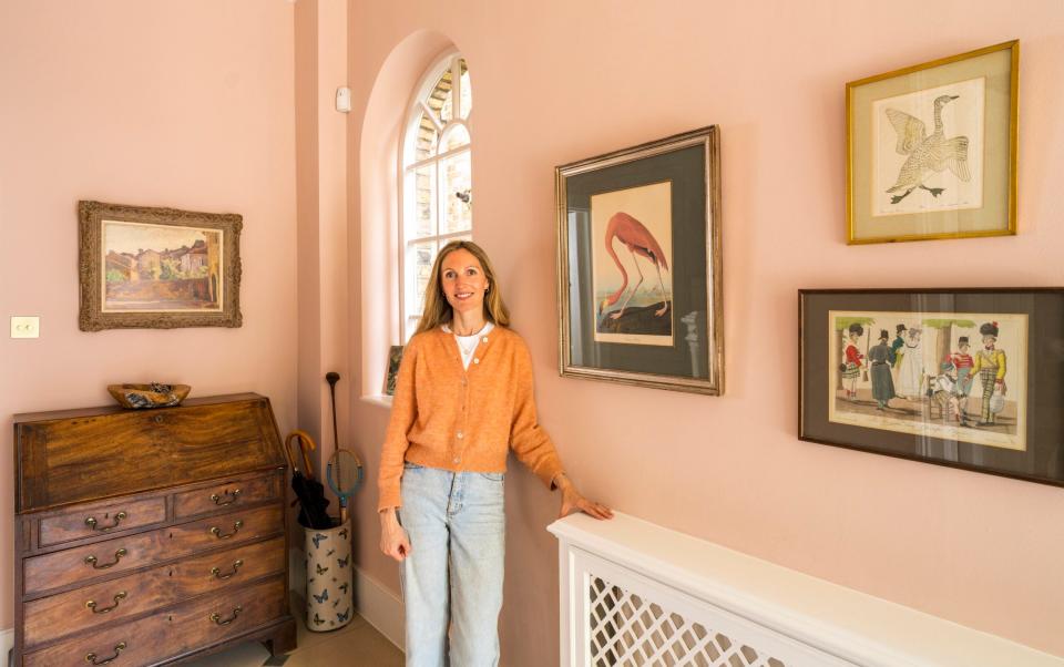
In other cases, however, the name can work in your favour, adds Milla Elder of Edward Bulmer; I’m certain the only reason I got away with painting my hallway pink is because my husband liked the name Cuisse de Nymphe Emue (thigh of an aroused nymph).
If you’re at loggerheads over paint and can’t compromise, Shillingford advises using Dulux’s visualiser app, which allows renovators to project any paint colour onto photographs of their rooms, with suggestions for harmonising colour schemes. Edward Bulmer runs a virtual colour consultancy, as does Farrow & Ball. Or you can do what the professionals do and put together a mood board for the room, featuring the paint colour, your fabric choices, and floor and tile finishes.
This is what I decided to do to prove to my husband that he’d made the right choice in agreeing to go for my colour, Buckingham Gardens, for our kitchen cabinets. To my shame, when I saw the paint alongside all the other aspects of the kitchen, I immediately realised that he’d been right all along. Cue, an awkward call to the cabinet maker.

