'Use one for focus, one for filling in' – this interior designer's trick for balancing colors is one I'm going to remember
Designing a home that's full of personality and color is great in theory, but it's another layer of complexity to get right. The best color schemes aren't just thrown together – there's nuance to them that helps them feel sophisticated, and it's all about how they're balanced.
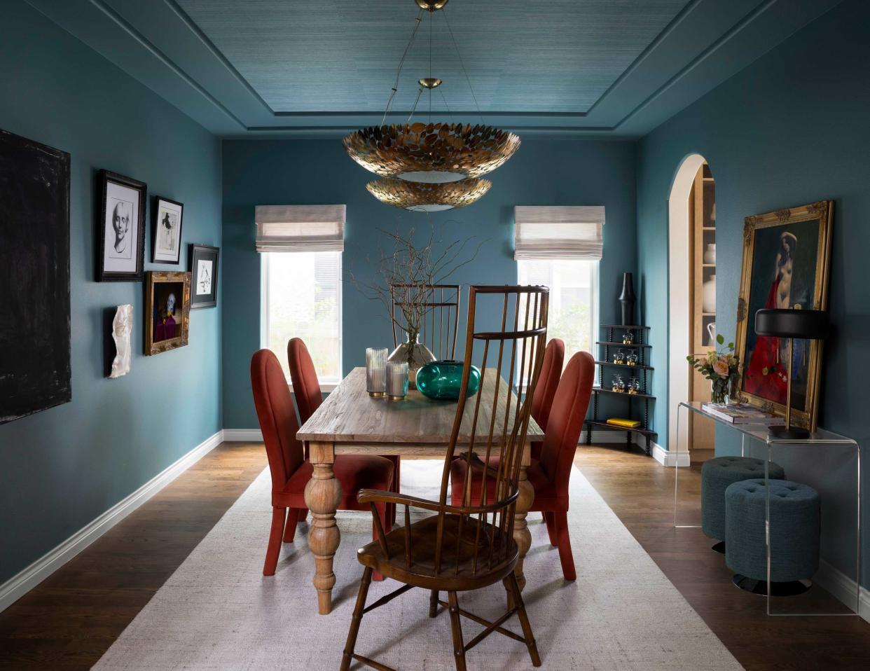
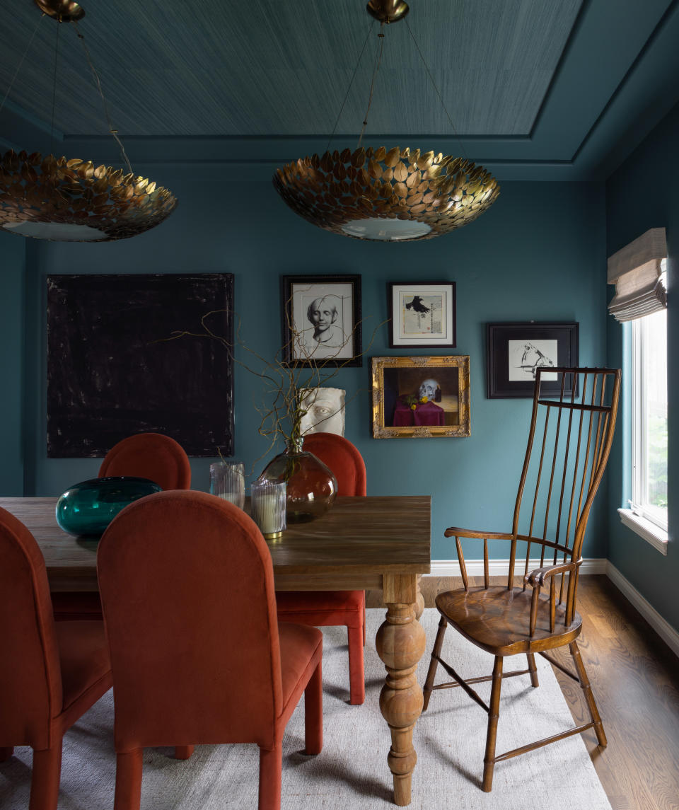
'Finding that harmony is really important,' interior designer Julee Wray of Truss Interiors, and it's something that perfectly describes the remodel of the first floor of this modern home in Denver. Despite a bold color palette of reds and blues, that stretches across the kitchen, entryway, powder room, living room and den, the result of these renovations is a home that feels eclectic and spirited, but never chaotic. 'The spaces feature a variety of the clients' collected items throughout their travels, peppered in with unique furnishings and finishes that tied the spaces together cohesively,' Julee says.
But it's in wielding the colors throughout the home that Julee has created spaces that feel all-at-once unique, but cohesive. Here's how she did it, and the approach to using color she used.
Striking the right balance
When using such a strong palette, balance was always going to be crucial to making the scheme work, but Julee has a guiding color rule for how she combines warm and cool shades. 'We always strive to create a feeling of warmth and comfort in each space, so we try to use more warm tones on areas of focus as you walk into each room, and filling in with the secondary cooler tones,' Julee tells me.
It's a great way to think of building a palette – cooler tones, like the rich, dark blue Julee used, tend to be those that are more recessive anyway, while warmer tones are full of energy that could be a little overstimulating if used in too broad strokes.
There's no magic formula for making this work, however. It's an approach to color that relies on your instincts about what creates that harmony. 'I really rely on going with my gut on a room-by-room basis when it comes to balancing cool and warm tones,' Julee says.
The mixing of warm and cool colors is the 'red thread' that ties each of the schemes of this ground-floor renovation together, without them feeling too purposefully matched. And these colors have a harmony of their own.
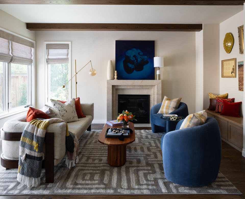
'Blues are calming and rusts are rich and grounding,' Julee says. 'When you combine the two it creates a feeling that’s magical.'
While the living room is light and airy, with blue and rust accents, the dining room has been color-drenched in the moody blue shade, flipping the color ratios for a completely different feel.
'We used grasscloth from Phillip Jefferies on the ceiling to create texture and movement, while coating the rest of the room in Riverway from Sherwin Williams. The combination made the room seem bigger yet moody.'

Bali Blue seagrass wallpaper
Price: $98.98
Type: Removeable faux grasscloth
A continuing thread
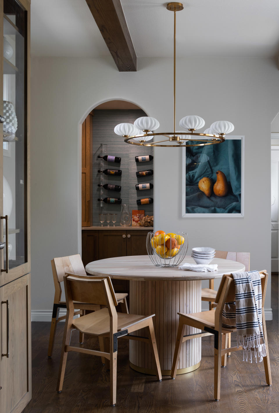
In the heart of the home, where such a bold color palette may have felt a little heavy-handed, hints to the rest of the home have been introduced in the styling that helps the ground floor feel connected.
In the open plan kitchen's breakfast nook, an artwork picks up the colors of the living and dining rooms, while a wine storage room beyond, 'to promote drinking wine in an ever so stylish fashion' according to Julee, reintroduces the grasscloth wallpaper.
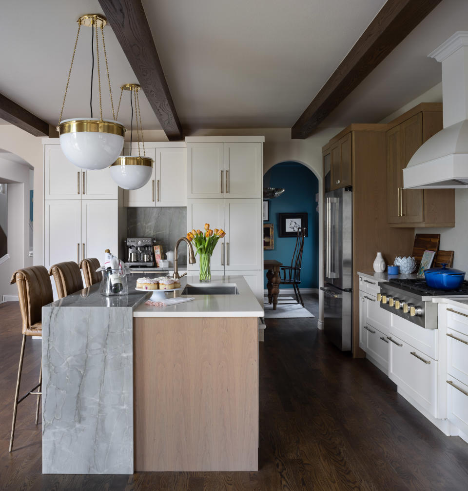
The modern kitchen borrows other elements from the adjacent rooms, such as the polished brass lighting and kitchen hardware, while retaining a more neutral palette.
'We used some amazing exotic granites mixed with more simple quartz to emulate a mix of classic yet modern vibe,' Julee explains of the kitchen's countertops.

Moonrise indoor pendant light
Price: $180
Size: 11.5"x 11.5" x 60.48"
Committing to a color scheme in multiple rooms in your home is something to be wary of. It can, if mishandled, feel too thought out and over-designed. However, the rewards are often worth the risk.
In a home like this one, it's the colors that lead you from room to room, each one surprising with a different approach to the color palette that offers just enough variety, while also cementing a cohesive quality that makes these individual spaces feel like one home.

