How to give old reference drawings new life

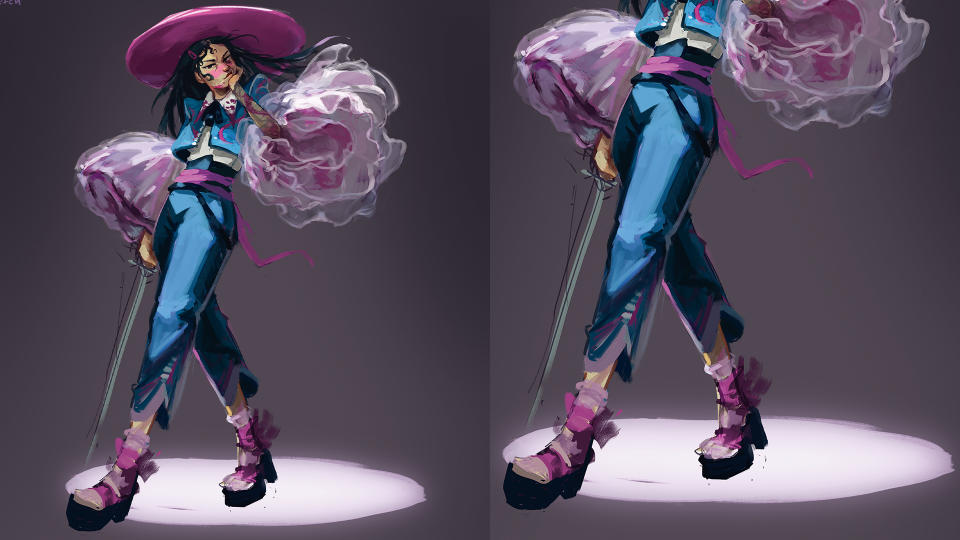
When I paid a visit to the Legion of Honor museum in San Francisco, I wasn’t prepared for the abject beauty and craftsmanship on display at Guo Pei’s Couture Fantasy exhibit. So much so that I spent three hours moving from piece to piece, drawing frantically until my iPad died. I wanted to do a fully fledged illustration inspired by what I’d seen, but crucially they weren’t my designs. However, it wasn’t like I was lacking in reference. One search into my Google Photos led to a wealth of potential directions with personal experience, I just needed a solid shove to actually use them.
In this tutorial, I’ll be going through my thinking and painting process for Midsummer Tournament of the Well, directly inspired by one of Guo Pei’s incredible designs. I’ve worked as an artist in games and animation for almost nine years, and recently founded my own games studio Electric Saint, but my process is still ever changing and developing, so I hope you can find something useful, or at least commiserate as I repaint a leg for the fifth time.
If you have a study you’d love to jump from into a world-building project, or an overflowing camera roll of things you swore you’d paint later, consider this a draw-along to get you going. To get you started check out our collection of the best digital art software and let’s start making some interesting new paintings!

01. Identify what most excites you about your study or sketch
(Image: © Anna Hollinrake)
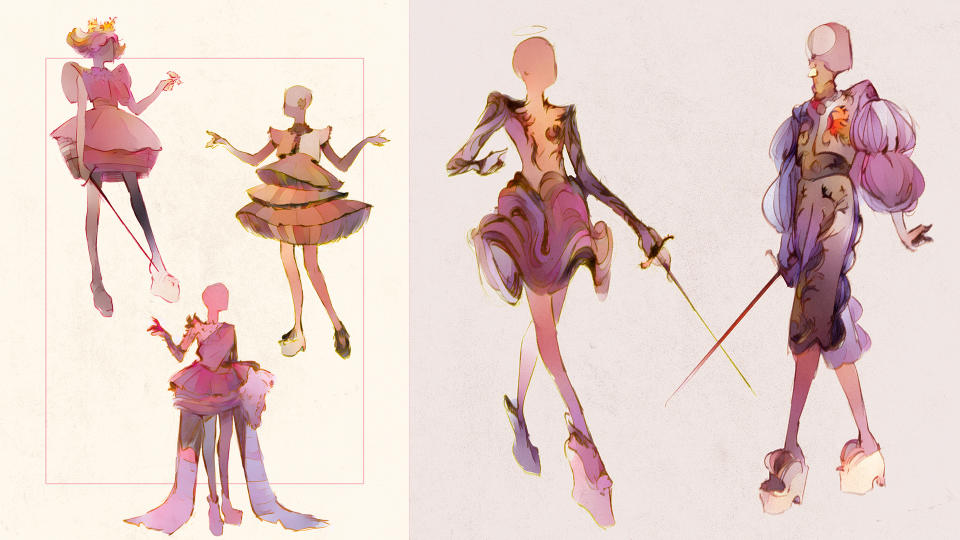
At the Couture Fantasy exhibit, I drew sword girl after sword girl. This makes this step relatively easy for me, as I want to take a high-fashion sword girl into a full illustration, but also making sure I’m creating something new. If you don’t have as clear an idea, for example if your study is of a landscape or loose sketch, try to think about what might be challenging or unusual to mash up with other references
02. Expand your world with reference and add contrasting themes
(Image: © Anna Hollinrake)
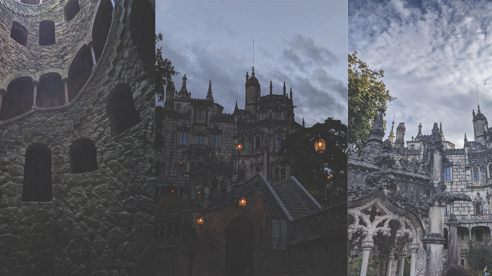
If I’m working from a character, I’ll usually look for an environment I’ve previously visited to spark some ideas, and vice versa. I tend to keep my mood boards more pared back nowadays to avoid my clarity of vision getting muddied, so I always try to find a specific location to contrast with my sketches.
The outfit that I’m working from is very light, airy and clean, so I start with thinking about adding some grit to the high fantasy look. I loved the cropped jacket and trousers that could almost have been from a uniform, and stumbled upon my photos from Portugal, where I visited the Quinta da Regaleira.
It’s a beautiful gothic castle with a weathered fairytale look, but also has a garden full of strange sculptures, and a foreboding spiral of carved steps that leads deep into the ground called the Initiation Well. This gets me thinking about a wealthy finishing school with beautiful uniforms but a dark secret; dangerous duels that happen in murky chambers deep underground.
03. Start sketching, but think about character
(Image: © Anna Hollinrake)
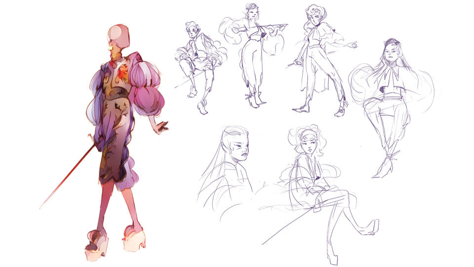
It can be easy when approaching a fashion-based piece to not think about character portrayal and instead just pour lots of effort into costumes. I want to avoid that! I start sketching some potential characters with dynamic poses and expressions.
I’ve accepted I’m just not a silhouette person; I both think in line and prefer to be more playful with who my characters are early on. I start quite close to the reference, and then gradually branch out. I end up choosing a girl with long, dark hair and a malicious glint in her eye. There’s something fun in creating a haughty, Mean Girls-esque Regina George type of character.
04. Refine your sketch
(Image: © Anna Hollinrake)
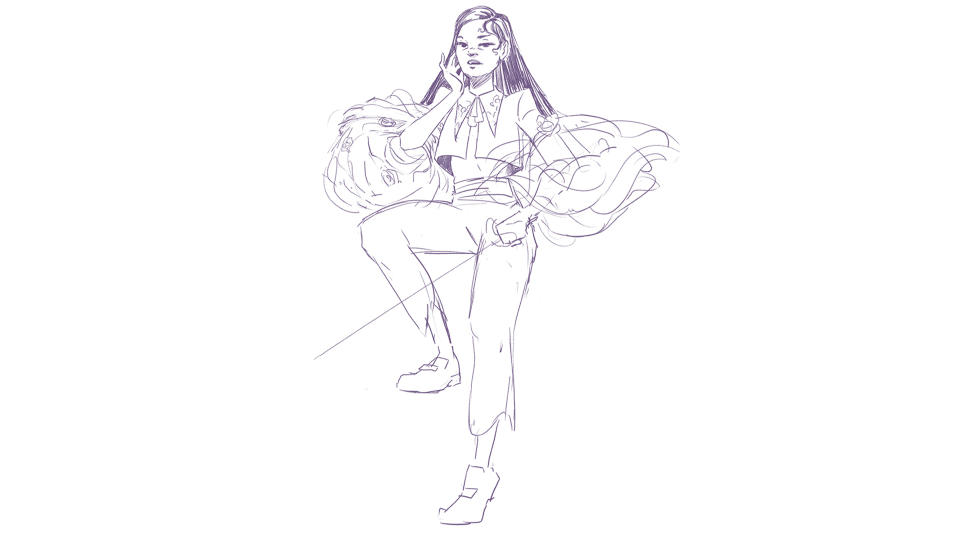
I want to focus on what the main features of this character are, so I take a piece a little further. Not much further, but I think about her facial expression and some of her costume details a little more. As I’m doing this I’ll be making up a story in my mind about her; how she talks to people, how she feels about duelling.
While they don’t necessarily feed into the image, it helps me build out an image of her in my mind, and I find it’s easier to solve costuming problems at this stage rather than in the final image, although that’s something I have a bad habit of doing because it seems easier in the moment. That almost never turns out to be the case!
05. Start the piece
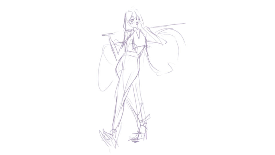
(Image: © Anna Hollinrake)
Now that I have my character, I want to tell a story with her movement. I want to reference the runway strut I saw in a lot of the mannequins into her pose, but I want it to be both threatening and confident. I try to capture the in-between point of movement rather than at the beginning or the end as it feels less static, and I’ll often act out the movement myself to get a feeling of where the weight of the character should be.
With this piece, I liked the idea of her striding toward the camera after a fight, pushing her jaw back into place. Is she gearing up for her next challenge? Is she swaggering away from her latest battle? Either way, I start with a sweeping line of movement and build my sketch from there.
06. Begin to block out your shapes
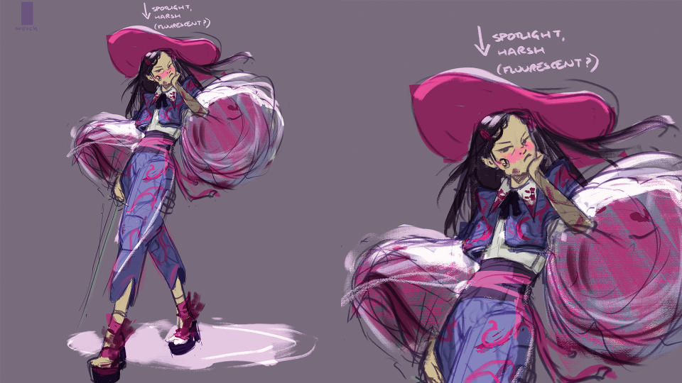
(Image: © Anna Hollinrake)
After adding in the costuming elements, I go to colour immediately because working in greyscale isn’t very fun or interesting to me, no matter how hard I try. When I do this, however, I try to make a conscious decision to think about my lighting early on so that it’s not just an afterthought, or ends up looking muddy and flat.
Her head is also getting lost, so I add a hat to balance the shapes. I’m not entirely sold yet, but it helps draw the eye directly to the face rather than getting caught in the sleeves. Make a checklist when preparing to jump into the painting phase of an image. Have you decided on lighting? Have you got a rough idea of your colour palette? Are you happy with your silhouette?
07. Put a background in early and keep it simple
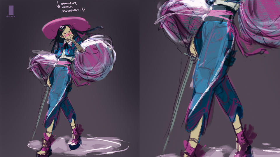
(Image: © Anna Hollinrake)
When doing character illustration it’s so easy to just ignore the background as an afterthought, but I encourage you to keep it in your mind! I want to capture a dingy chamber underground with harsh overhead lighting, so it’s hardly complex. However, even if it’s just some quick shapes and gradients, it will feel a bit more tangible than a flat colour and can help with your thought process.
Also, don’t be afraid to simplify; over-detailing can be such a problem and designs are rarely ever sold by just painting in increasingly more granular detail. While I liked the idea of having brocade embroidery on the trousers and jacket, I was finding that the patterns were really competing with the sleeves and the face.
08. Consider expression in your facial details
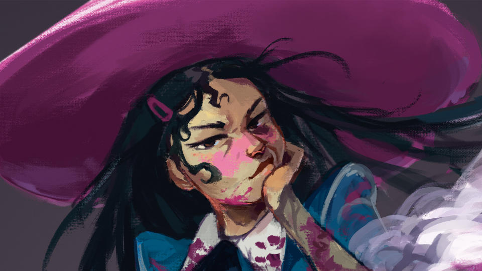
(Image: © Anna Hollinrake)
I’m the most guilty of drawing blank-faced characters staring into the middle distance. However, that doesn’t make for as compelling an image, especially when we’re trying to give our character some bite. Don’t be afraid to twist expressions and play with angles, as it makes for interesting art. I decided to really push her sneer into something a bit unflattering; it gives her much more personality.
09. Get more reference when you need to problem solve
(Image: © Anna Hollinrake)
I’ve never painted tulle material before, so this became an opportunity to do a mini study. I found that it was much more opaque at the edges, and creased in almost gravity defying ways much more than I anticipated. Don’t try to brute force your way through figuring out how a material, expression, or atmospheric effect looks when you can just Google it.
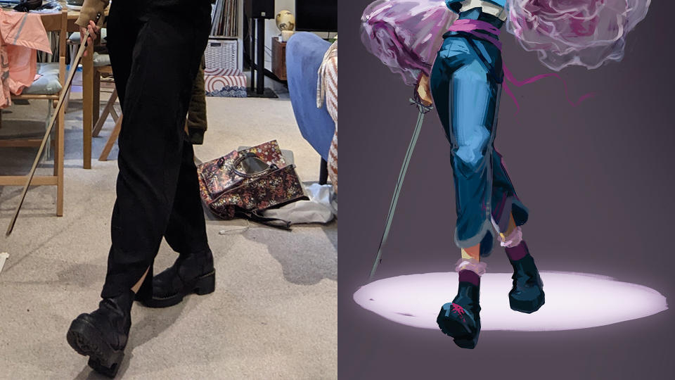
10. Don't be afraid to be your own reference
(Image: © Anna Hollinrake)
I could not for the life of me figure out this front leg and foot moving toward the camera in a foreshortened perspective, redrawing it multiple times over. I was also finding that the detailed heel was just far too complicated and was competing with the rest of the image in regards to contrast and visual detail.
I also acknowledge that while this was a fantastical finishing school, having extremely complex heels be part of the uniform challenged my suspension of disbelief, and eventually I looked for some inspiration close to home, taking a photo of myself wearing my platform Doc Martens and holding my violin bow. This really helped! Whenever possible, get in front of your mirror or phone camera and enjoy feeling extremely silly as you do it.
11. Solve new design problems off-image
(Image: © Anna Hollinrake)
As I mentioned earlier, when possible, solve design problems away from your main image. I didn’t have a clear idea of the look of the sword; no sketch, no reference. I ended up noodling and painting over it multiple times, which was a bit dumb and a waste of my time. A Biro sketch in a lined notebook is a much better option.
In addition, I think I could have taken the sword further. I love adding personalisation to accessories, and even though it’s a weapon, it still belongs to someone at a school. I’m almost certain that the students would customise these items, such as adding charms, however impractical, or colourful grips. That’s another vote tallied for sketching designs in advance rather than trying to just get something there.
12. Tell a story with your background
(Image: © Anna Hollinrake)
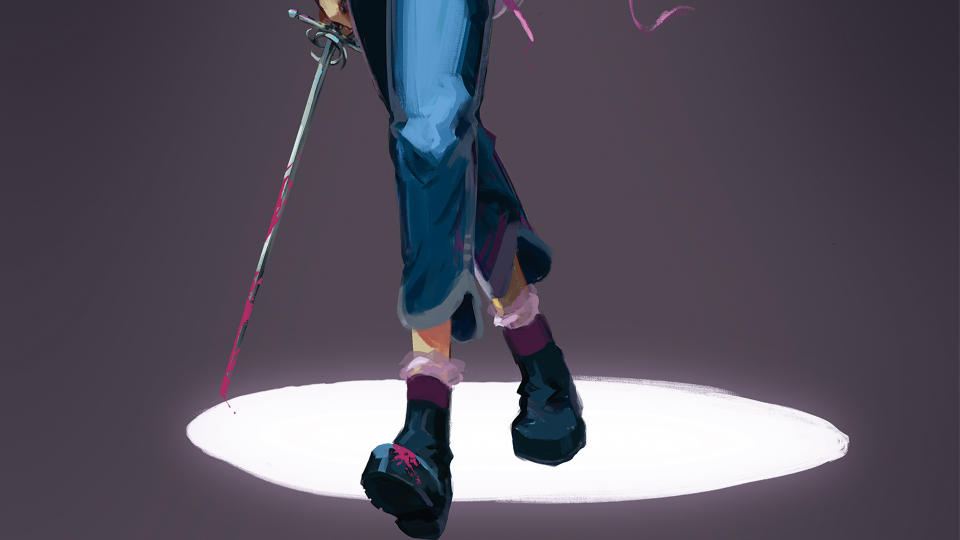
Now for painting the background. I’m drawing upon the textures in my reference here; dark, weathered stone, and dust. As you might have guessed from the title, I’ve imagined that these duels take place at the bottom of a well, which could also be an explanation for the circle of light, so I keep it all simple and murky.
However, I want to suggest a bit of formality to these duels by putting markings on the floor. There’s also a sinister implication there that this has been happening for a long time. What has happened here in the past? Have people died? It doesn’t hurt that the diagonal lines and circular sweeps add a bit of depth to the scene, too.
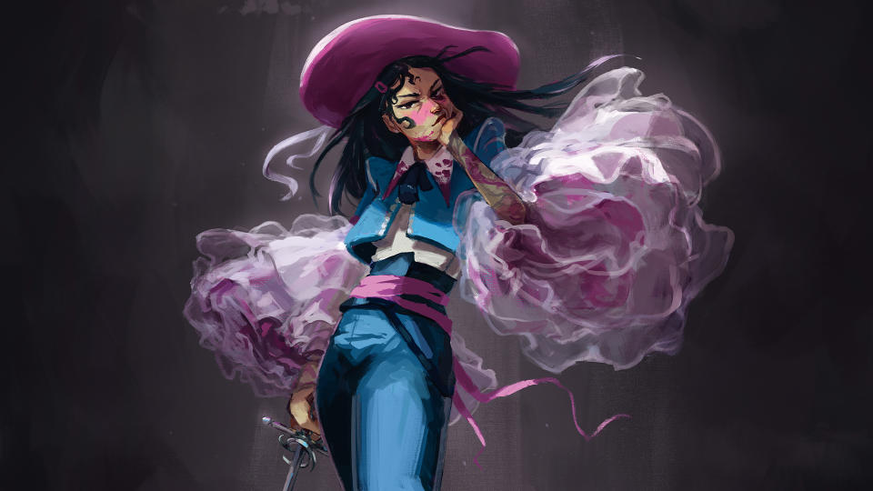
13. Begin to harmonise the image
(Image: © Anna Hollinrake)
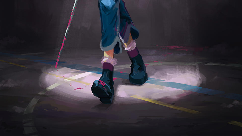
To tie everything together, I increased the darkness of the shadow on the face and body to match with the overhead lighting, and also put some shadow on the tulle that fell outside of the spotlight. Looking at an image for a long time, you can become desensitised to contrast and saturation, so it’s worth checking your values, flipping your canvas, and looking at the painting on different screens.
Concentrate on your main focal points. Don’t crank up the contrast and saturation on everything, it’s okay to let lower-priority parts have lost edges or similar values. In addition, think about the mood and tone you’re trying to set in your image.
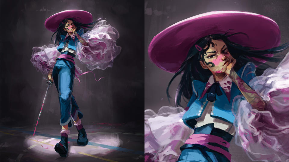
14. Give your work one final pass
(Image: © Anna Hollinrake)
Let your painting sit for a day or two before you decide it’s done; what I like to call the marination pass. I’m a big believer in spending an extra 30 minutes polishing a painting after you’ve slept on it, because your fresh eyes tend to forgive overcritical 1am thoughts, or notice obvious errors you were too busy to notice.
Here, I really didn’t like the size and stiffness of the hat, and wanted something that felt in-keeping with the rapier sword design. I reduced it down and added a ribbon for a little more movement, which sits together better now.
This article originally appeared in Imagine FX issue 231. Buy the magazine from Magazines Direct.

