This is not the new Coca-Cola logo
Designers have been lamenting the shift towards minimal (read: boring) logos for years now, but the trend is showing no signs of slowing down. Pretty much every week, we see a brand eschew its established cursive logo in favour of a utilitarian wordmark (with a few notable exceptions).
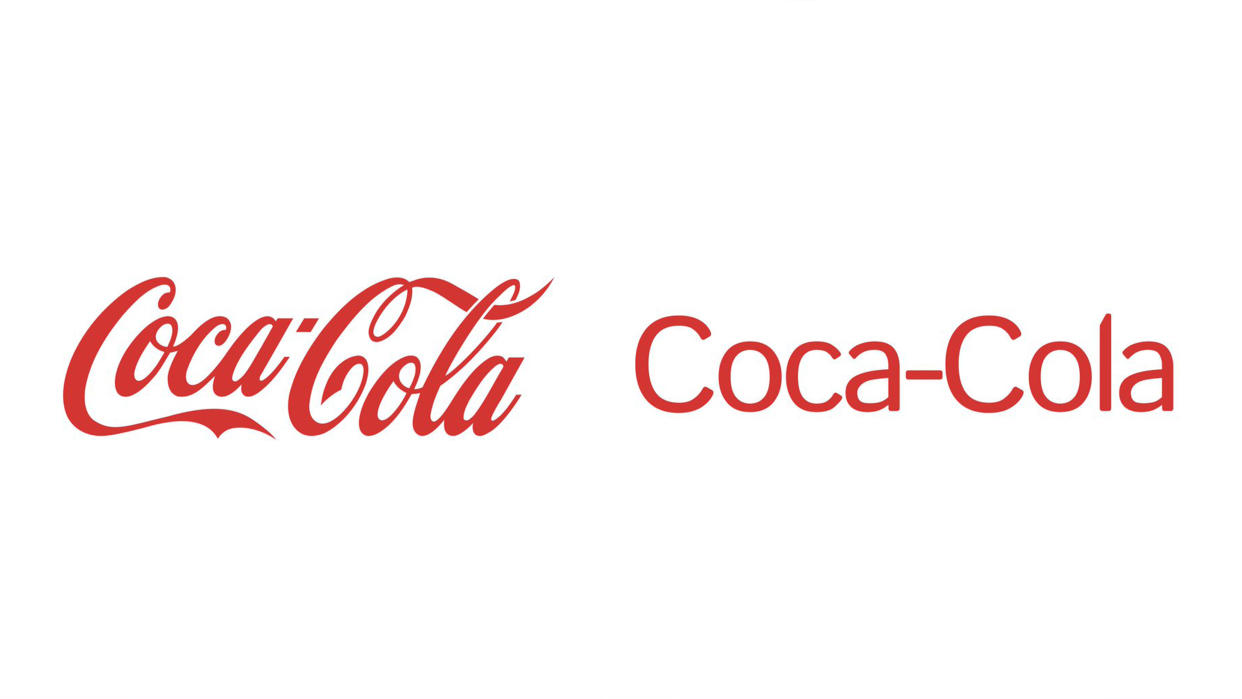
But there's one cursive logo we never expect to see receive the sans-serif treatment. Coca-Cola's is one of our best logos of all time, and the oldest on our list, dating back to 1886. Which might explain why a satirical 'redesign' has caused such dismay – and received over 4M views – on Twitter (nope, not calling it X).
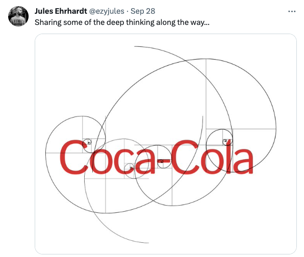
Mocking the trend towards boring logos, the concept by designer Jules Ehrhardt (above) imagines, quite plausibly, what the Coca-Cola logo might look like if the company decided to opt for a clinical 'modern' style. Ehrhardt also shares a pretty hilarious parody of brands' ridiculously complicated, golden ratio-heavy design process (which, to be honest, isn't anywhere near as ridiculous as the actual Pepsi logo document.)
And demonstrating just how accustomed we've become to dull logo redesigns, plenty of Twitter users actually seem to believe this is real. "I’m trying to see the vision but I just can’t. This is the worst logo redesign I have ever seen in my life. An absolute abomination," one user comments, while another adds, "Really ripped the personality right from it. This is an abomination."
But while this one is pretty clearly a joke, it wouldn't be the first classic cursive logo we've seen turn into a soulless wordmark. From Johnson and Johnson to countless fashion brands, logo design can feel like a homogeny of boring type in 2023. No wonder people are asking whether logos all look the same now.

