The Nickelodeon logo: a history
The beloved children's television network, Nickelodeon, has left a lasting mark on entertainment history – and at the heart of its journey lies its vibrant logo, which has evolved along with the channel.
In this article, we will look at Nickelodeon's history through the lens of some of its logos (some of which are up there with some of the best logos overall). We’ll explore each iteration of the channel's logo, decoding its meaning and unravelling the reasons that led to its changes.
The Genesis of Nickelodeon: (1977-1979)
During its early days, Nickelodeon was known as the C-3 channel within Warner Cable's QUBE system. During this phase, the network exclusively aired an educational show called Pinwheel, leading to C-3 being commonly known as the 'Pinwheel Channel'. The logo is basic but functional, but it feels like it missed a trick not being in the shape of a pinwheel. (Get inspiration for your logo with the best logo designers.)
The original Nickelodeon logo: (1979-1980)
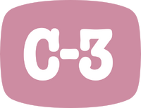
On April 1, 1979, C-3 gave way to Nickelodeon and became an official children’s TV channel. The network derived its name from 'nickelodeons', a type of movie theatre that charged five cents (nickel cents) for entry. This also inspired its original logo. The initial logo design showcased an elegant and sophisticated aesthetic, featuring the company name in a sleek black font.
The focal point of the logo was a captivating visual element – a man peering into the first letter of the company name, resembling a projector. Completing the composition, the company's tagline was positioned below the wordmark.
The second Nickelodeon logo: (1980-1981)
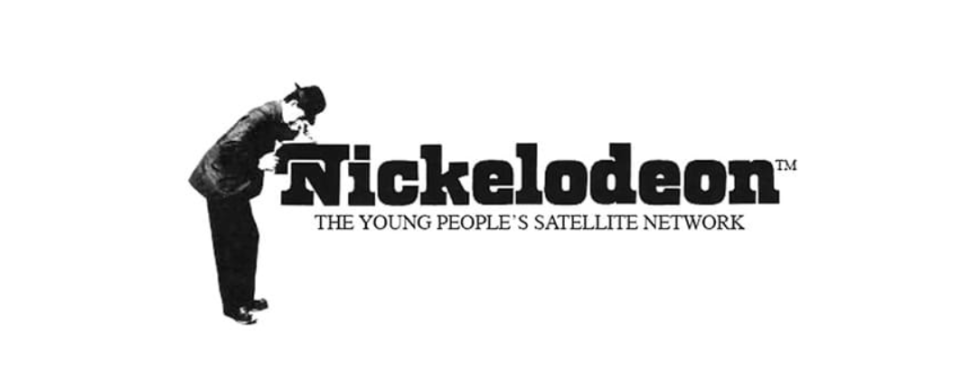
The OG logo was short-lived, and Nickelodeon had a makeover within a year. In 1980, it opted for a modified version of the Windsor Bold typeface, giving its wordmark a simple yet elegant look. The new logo design stripped away all visual elements, leaving only the company name. The only artistic touch remained in the form of a curved tail on the letter 'N'.
This bold departure from the previous logo proved to be a successful choice, exuding a refined and sophisticated vibe. During this period, the network's station IDs also used to feature a mime engaging in various activities against a black background, accompanied by an instrumental rendition of the song 'Put That Little Nickel In'.
The complete redo: (1981-84)
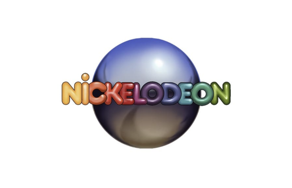
In 1981, Nickelodeon probably realised it needed a more child-friendly logo. Its new logo was designed by Lou Dorfsman, and would become the face of the company for the next three years.
The logo showcased the network's name spelled out in rainbow-coloured letters, using the Frankfurter font. Behind the lettering, an illustrated pinball, created by Bob Klein, served as a playful backdrop. The colourful letters against the backdrop of a 3D pinball captured the essence of the company, while the bold and chunky font effectively conveyed its playful nature. The station IDs started using the pinball theme during this period.
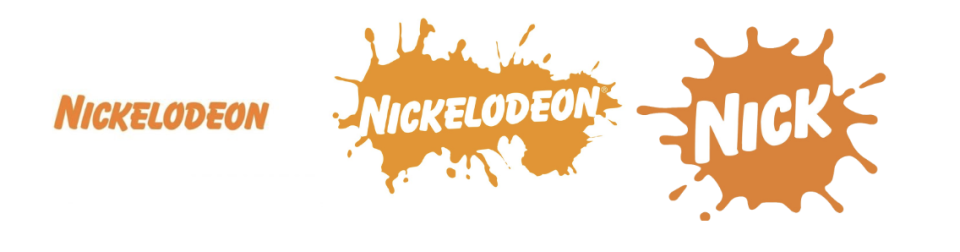
Nickelodeon’s signature splat is born: (1984-2009)
Starting in 1984, Nickelodeon embarked on a visual identity transformation, ultimately settling on the vibrant orange and white colour palette that would become its permanent trademark. This was an attempt to connect with its target audience and adopt a playful brand identity.
The first logo in this era featured a bold wordmark in the Balloon Extra Bold font, set against an orange silhouette representing various objects like an aeroplane, bone, car, taxi or star. The design was the collaborative work of Tom Corey and Scott Nash. From 1984 to 2009, Nickelodeon experimented with various versions of its logo, all incorporating the distinctive orange and white colour scheme.
In 2003, the logo shifted with the introduction of the iconic 'splat', originally symbolising the trademark slime associated with the Canadian sketch comedy series 'You Can't Do That on Television'. The orange splash with white lettering was particularly popular with the audience and Nickelodeon tried several different versions of the splat over the years.
A minimalistic take: (2009-2023)
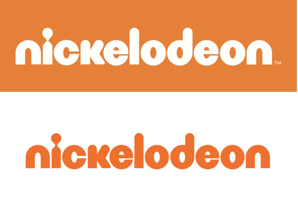
In 2009, the channel decided to clean up its logo and let go of the iconic splat that tied it to the 80s and 90s. It surprised its audience with a simplistic logo that retained the signature orange and white.
The standout feature of the new logo was the letter 'I', which resembled a keyhole and drew immediate attention. The unique font showcased rounded lowercase letters that exuded a sense of fun and artistic flair. This minimalist and iconic logo was widely acclaimed and received recognition. Audience reception, however, was lukewarm, as the splat was synonymous with Nickelodeon.
Nickelodeon’s current logo (2023-present)

In 2023, Nickelodeon announced a new brand identity and people's beloved 'splat' made a comeback. The channel decided to retain the font and minimalistic style of the previous logo while the newest splat addition gave it the pop and fun that is remains synonymous with the brand.

