The New Neutrals: What Are They And How Do You Decorate With Them?
Who said neutrals have to be boring? When it comes to decorating, a neutral palette doesn't always start and end with beige. Just ask designers Sasha Bikoff, Henriette von Stockhausenand Anne Hepfer, who agree that certain colors can create a pared-down look that's anything but austere. Read on to see how these experts design using these "new neutrals."
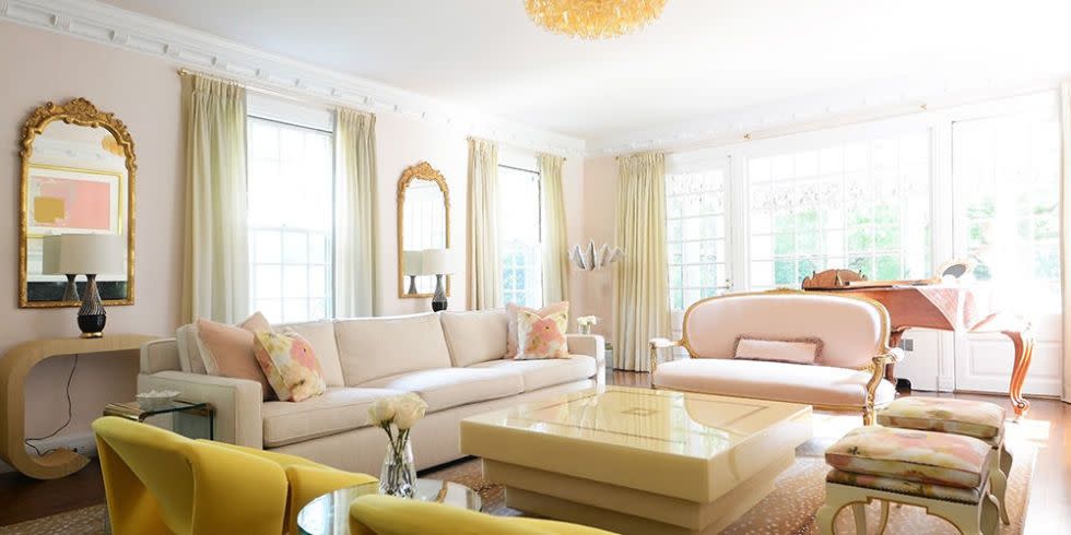
BLUSH

For New York-based designer Sasha Bikoff, pale pink is easy on the eye but still packs a punch. "I consider certain pinks neutral because of their nude, almost skin-like quality," says the designer.
Blush has a cream and yellow base that makes it a neutral, as opposed to pinks with purple undertones, according to Bikoff. "The light blush in this living room works great as a backdrop to other neutrals and pops of color, like canary yellow, which complements the blush in a beautiful, unassuming way."

"By using such a simplistic neutral, I could incorporate an array of exciting prints, such as the animal print rug and floral throw pillows."
SILVER

In this Georgian townhouse, UK-based designer Henriette von Stockhausen of VSP Interiors used silver to give this family home a clean, streamlined look without compromising elegance. Henriette chose a silver leaf grasscloth to bring texture and weight to the dining room walls. "As light changes throughout the day, silver takes on different hues and reflects what is happening outside, and is most wonderful by candlelight during dinner parties," says the designer. A silver mirror frame, door handles and drapes add sparkle to the neutral scheme.

In the master bedroom, von Stockhausen used silver to create a calm yet glamorous space. She chose a cherry blossom wallpaper with a silver leaf background to create a cool shimmer, while a soft pink loveseat, champagne satin drapes, and blush notes throughout round out the neutral scheme. "A subtle layering of neutrals creates a comfortable and enveloping space," says the designer. "A few contrasts in the same hue create a gentle juxtaposition that's harmonious with the design."
PALE BLUE
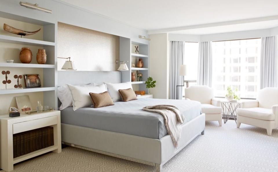
Canadian designer Anne Hepfer used a pale blue-gray to create a neutral, soft palette for the master bedroom in this Toronto apartment. The abundant natural light tempers the blue, which was used only on the wall shelving, bedding and drapes to prevent the hue from overwhelming the design. "I created a landscape using a paler shade of blue, and juxtaposed it with contrasting accents like earthy browns and metallic golds to offset the palette."
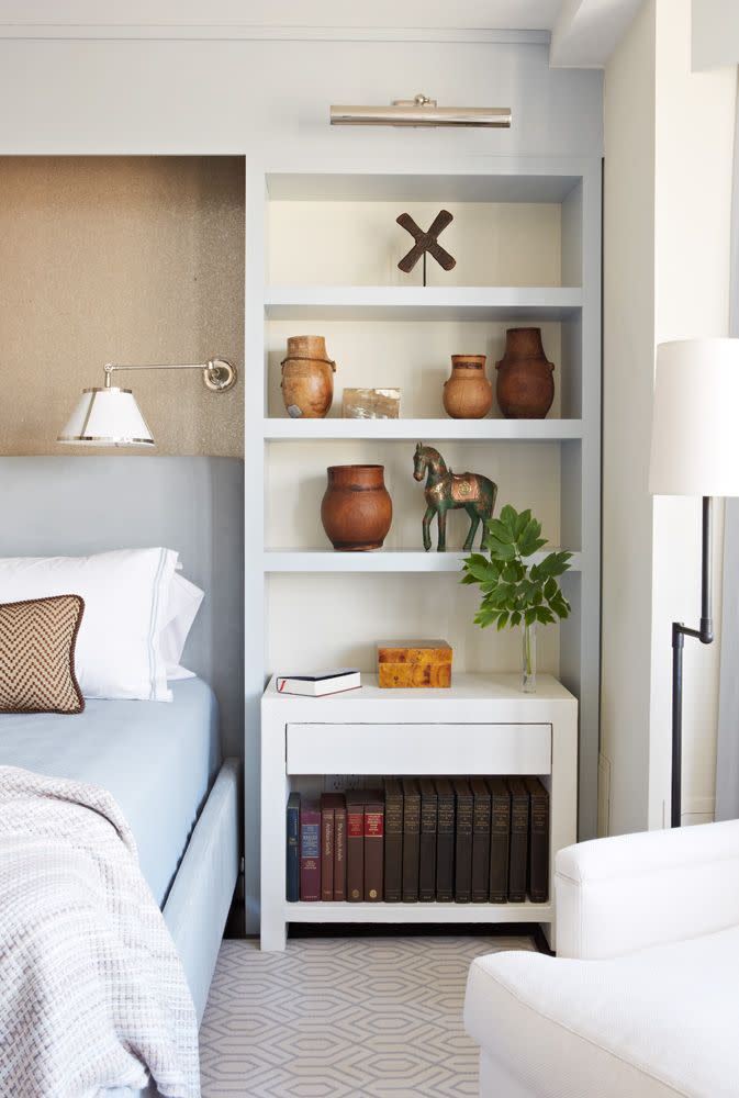
Texture is key to prevent a neutral room from looking dull, advises Hepfer. "Focus on layering many different types of textures, from suede, linen and wool to mohair and cashmere," she says. "Then add interest and polish by mixing metals. Polished nickel looks fresh and modern, while polished or satin brass is so on trend."
Inspired? Check out more gorgeous neutral rooms here.
You Might Also Like

