What Your Go-To Neutral Paint Says About You, According to Real Estate Pros
There’s a good chance you have that one trusty neutral — the paint color you never test on the wall before painting and always recommend to others (whether they asked for a recommendation or not). It’s your signature shade and, for better or for worse, part of your personality. But what does it mean?
You’re about to find out, thanks to Sarah Yeager, staging consultant at Mombo Interiors, and Nicci Pucci, Realtor and interior designer. Just brace yourself for some (playful) psychoanalyzing. Here’s what your go-to neutral paint color says about you.
Tricorn Black by Sherwin Williams
“You’re up for taking risks, are opinionated, and love bold, moody colors,” Pucci observes about your personality. If you use it on trim, she says, “you’re a traditionalist at heart and know how to balance other light, neutral tones.”
Yeager admits that every real estate pro will tell you Tricorn Black is fine in moderation, but “if you choose this for your exterior, you must be a rebel because at least three other blogs and designers told you to choose Black Fox instead.” Get down with your bad self.
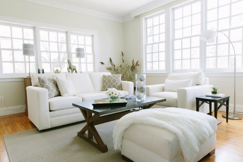
White Dove by Benjamin Moore
Yeager calls this the “Switzerland of white paint colors” because of its versatility and universal appeal. Her assessment of you? “Your mother-in-law probably loves you, and you never forget a birthday.”
When it comes to your style, Pucci says that you likely “love a clean base and want the backdrop of your home to appear restful and sophisticated.” You’re a minimalist who appreciates an eclectic combination of old and new.
Agreeable Gray by Sherwin Williams
“You are warm and welcoming with a contemporary style and love for versatility,” Pucci says of Agreeable Gray advocates. “You gravitate towards earthy neutrals and love wood tones but prefer a beige undertone to gray.” But why?
Yeager insists it’s because they were scarred by their parents’ decorating decisions, like white walls and plastic on busy floral furniture. “Agreeable Gray feels like a soft place to land with a modern vibe, and most importantly doesn’t trigger a childhood trauma response,” she explains.
Revere Pewter by Benjamin Moore
One of Benjamin Moore’s historical colors, Pucci and Yeager agree that Revere Pewter is actually less stuffy than you might expect. Chances are, “You are always evolving and adding creative touches to your home,” Pucci suggests. “You value balance and a space that works as a canvas for personal expression.”
In fact, Yeager says, “The thought of plain white walls makes you feel basic and boring.” This warm color, on the other hand, “makes you feel at home amongst your vintage housewares and thrift shop finds.”
Hale Navy by Benjamin Moore
Hale Navy lovers live on opposite ends of the spectrum — one of which is preppy. “You grew up with your initials monogrammed on your sweaters and polos, and you can play all the sports at the country club,” says Yeager. “This color makes you feel sophisticated enough to not have imposter syndrome when you pull out Granny’s fine silver and Spode china for Taco Tuesday.”
On the other side, Pucci insists, is the individualist: If Hale Navy is your go-to, she predicts that you are bold and confident with a spirit for adventure. “You love unexpected thrills and enjoy that your home leaves a lasting impression on visitors.”
Decorator’s White by Benjamin Moore
Another controversial neutral (who knew that was a thing?), proponents of Decorator’s White typically have one of two styles: ultra-modern or completely classic. Yeager believes in the former, while Pucci is all about the latter.
According to Yeager, this is “the white paint for the edgy modern homeowner who wants art studio white walls. They know every coffee shop that sells a killer cold brew, although they recently switched to matcha.” Pucci insists on the opposite: “They have an affinity for the classics and enjoy timeless pieces that exude elegance and sophistication.”

Accessible Beige by Sherwin Williams
“This warm and fuzzy paint color feels like a hug from your walls — it’s not white, and it’s not gray,” says Yeager. “You might be a bit of a people pleaser.”
Pucci agrees with this assessment, adding that “you are practical and down-to-earth. You want a sense of comfort and serenity in your home.” With Accessible Beige, those feelings are, well, accessible.
Alabaster by Sherwin Williams
One representation of Alabaster? “You love simplicity. Your home is a place of peace and relaxation,” Pucci says.
Yeager’s interpretation is a little more nuanced: “Remember when your parents told you not to say anything unless you had something nice to say? That’s Alabaster,” she insists. “You may have ordered your Cobb salad without tomatoes, but you’d never send it back, and Alabaster is that polite paint that never complains.”

