Neil Packer interview: Peter Hatch, a bold illustration style and Shakespeare
- Oops!Something went wrong.Please try again later.
"I wouldn't want to be an illustrator starting out now, I think it's incredibly difficult," quips artist Neil Packer, an illustrator who has Harry Potter and Dante on his CV, as we discuss his latest work for the The Folio Society's beautifully illustrated 400th anniversary of Shakespeare’s first folio, The Complete Plays. He is, of course, joking. "I don't want to put people off because it is a great job," he adds, with a broad smile.
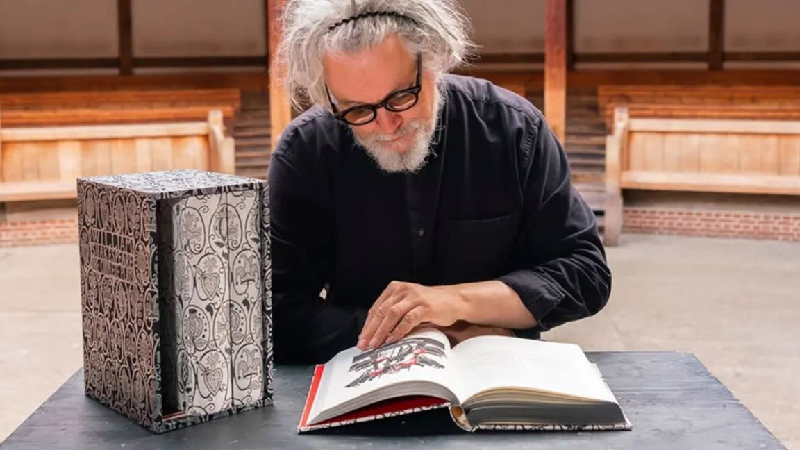
Neil Packer is a refreshingly honest and passionate person, who's love of art, the texture and the process of working with inks, watercolour paints and materials comes through as we discuss his latest project, creating 39 illustrations, one for each of Shakespeare's works within the new Folio (see more at Neil Packer's website). From comedies to historical epics, Packer was tasked with bringing all of Shakespeare’s plays together, unifying them under one style, his style.
"I'm aware I have a style, but depending on the job, I'll try and reinvent it. I like that because it keeps it fresh, it keeps you on your toes," he tells me. The idea of having a style, or honing a style, is something Packer considers, and tells me: "It's not about skill, I wasn't a great student. I never had myself down as particularly good in terms of drawing, but what I did have was an insane desire to do this, to the point where it's almost a condition, it's a compulsion. I'm not happy if I'm not drawing every day. It literally keeps me sane. And so that in a way, will probably sustain you better because if you draw that much, you'll get good at it and your style will come."
How Neil Packer works
The way Packer talks you'd think he'd be an artist with cupboards of sketchbooks, but, "no, I don't really keep sketchbooks," he says, "it's in here," Packer prods his temple and continues: "Ideas are weird; I think I've recently realised that ideas are all around, hidden in plain sight, and they're going in all the time, but you don't know that they're an idea. It's life experience, basically. It's that simple. But I tend to remember particularly visual things. I'm very visual, a visual learner. So it goes in, and then when it comes time for an idea, maybe some of those will resurface."
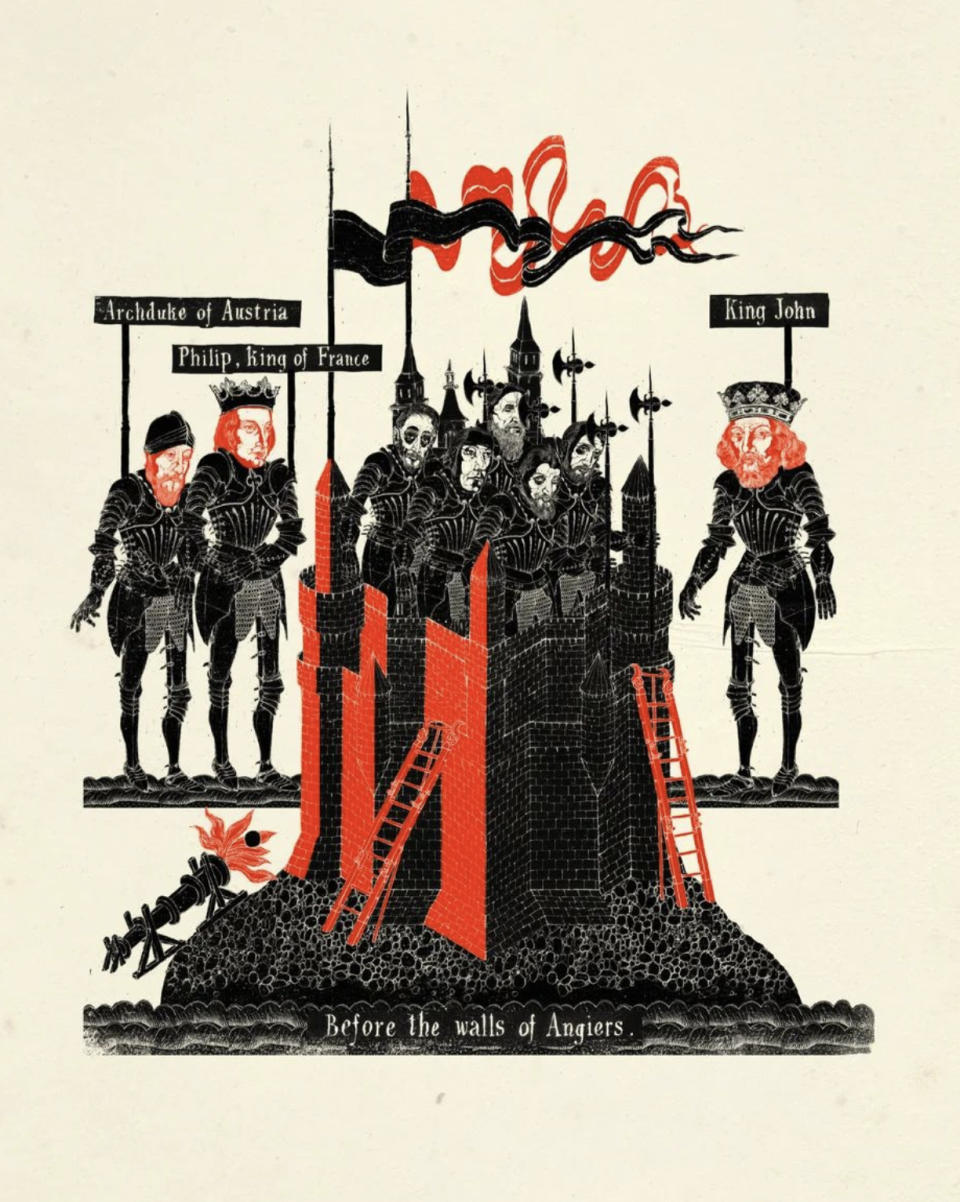
Packer's life-experience-drives-style approach bears fruit in his work for the The Folio Society's Shakespeare project. It's a blend of influences from traditional woodblock printing to typography and graphic design. Packer's first job was working for acclaimed graphic designer Peter Hatch. "In a way it's at the heart, still at the heart, of what I do," he says. "I love typography, I love design. I'm so grateful that I learned how to make a page sit; look nice graphically. All that stuff I use every day, still."
He will also wander around the V&A "looking at plates and all that stuff", loves mediaeval books, spending hours in museums and just absorbing influences anywhere, at any time. "It all goes in," observes Packer, offering some advice: "Don't just look at other people's work or what's current. Look at other things, like labels. If you absorb enough of it, it'll come out at some point in some fashion."
What makes good llustration?
Packer tells me his style, a look he's finally happy with, didn't come until "about 2000" when he finished illustrations for The Folio Society's In The Name Of The Rose. "At the point where I thought, okay, now I'm happy. Now I think I've nailed it. This is where I want to be. I'm really happy with this style," he says.
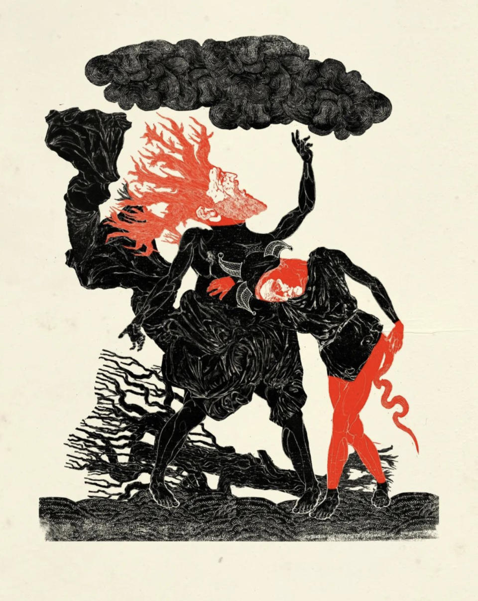
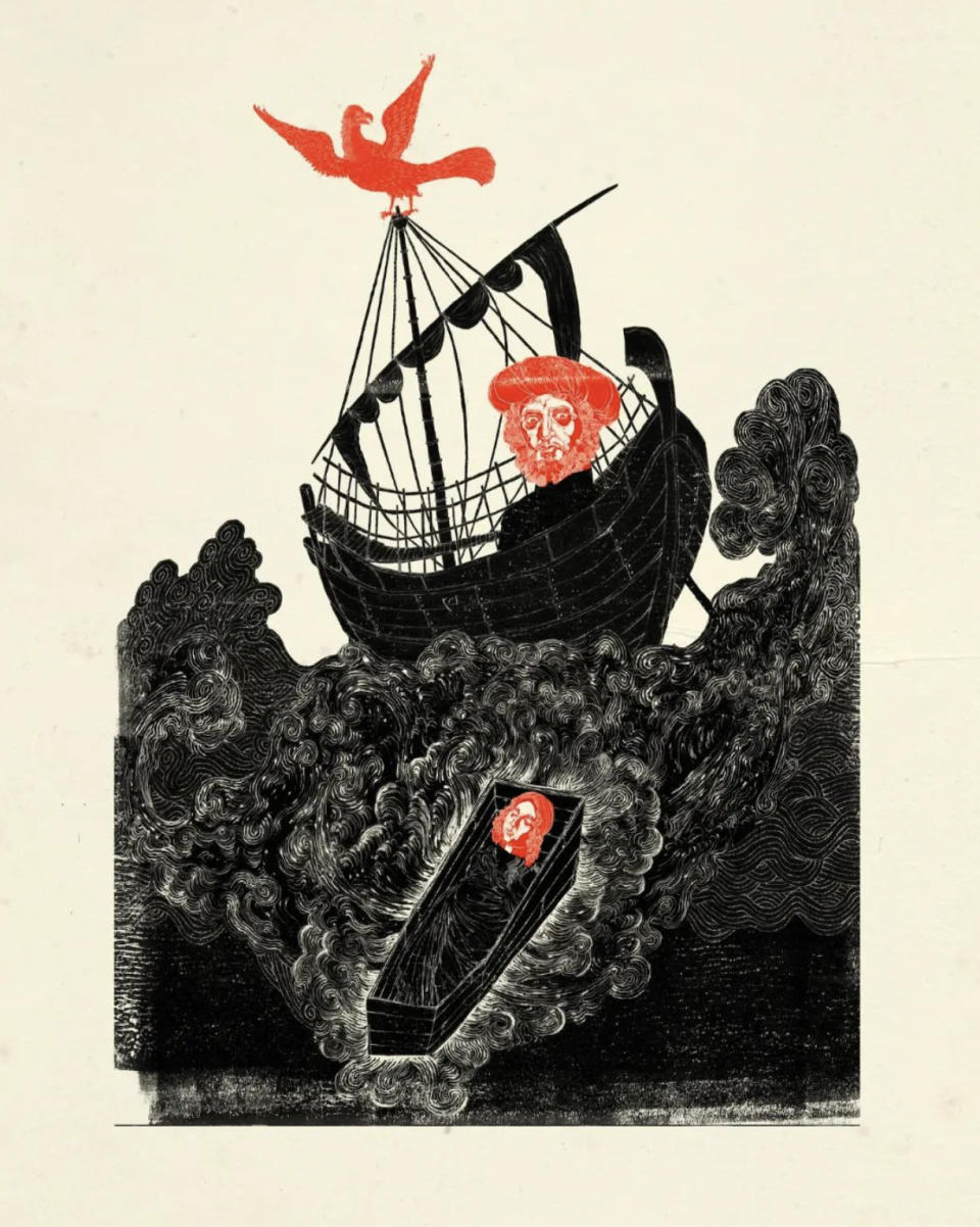
We're talking a lot about style because Packer's work is so evocative of an era, an age, while also remaining timeless. His work reduces detail, simplifies silhouette and uses colour sparsely, he's always editing downwards, reducing to make the story emerge. Packer tells me good illustration is about "just telling a story quickly, and in a way, the simpler the better. You want a nice shape, you want something that has character, and that dances on the page, and is different from everything that went before, which seems fairly easy, but it's actually not."
For the Shakespeare Folio this meant creating illustrations that echoed Elizabethan artwork but felt contemporary, but not too modern. Packer had to tread a fine line between appealing to today's reader and remaining truthful to Shakespeare 1623 heritage. He says, "because this is a celebration of the First Folio from 400 years ago, it needed to really tie into that brief".
Harry Potter to Shakespear
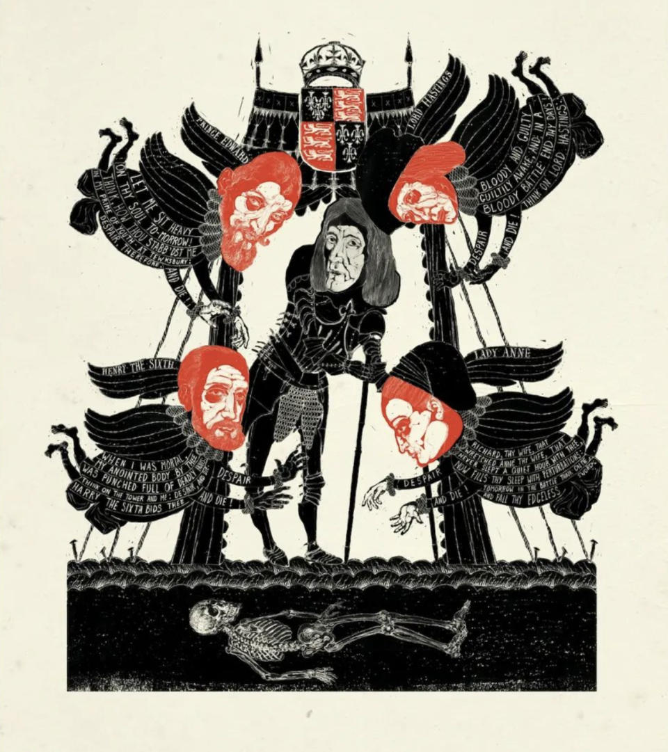
The illustrator drew visual inspiration from the 16th-century woodcuts, playbills, and the distinct look of Elizabethan woodblock, to achieve historical accuracy. But look closely and you'll see mid- and turn of the century styles, a nod toward Victorian design and even Regency periods.
Packer wanted his illustrations to transcend being mere visual aids for the plays. He emphasises, "I don't want to be clever with Shakespeare because you can't… I mean, it's those beautiful, beautiful words. I mean, they need to stand alone." Packer's minimalist approach allows the text to shine, and his illustrations serve as markers for the beginning and end of each play, creating a visual pattern that respects Shakespeare's words.
He's learned to hone his style and approach, and with illustrations for over 56 books, including Harry Potter, The Divine Comedy, The Odyssey, and Catch 22, he has a lot of experience to draw from. Depending on the work, Packer tells me how he "tries to reinvent" his style, saying, "Shakespeare actually, it's not that dissimilar to Dante with Harry Potter in the middle; that was different again, in fact, even within the works in Potter, I had to sort of reinvent myself depending on the illustration."
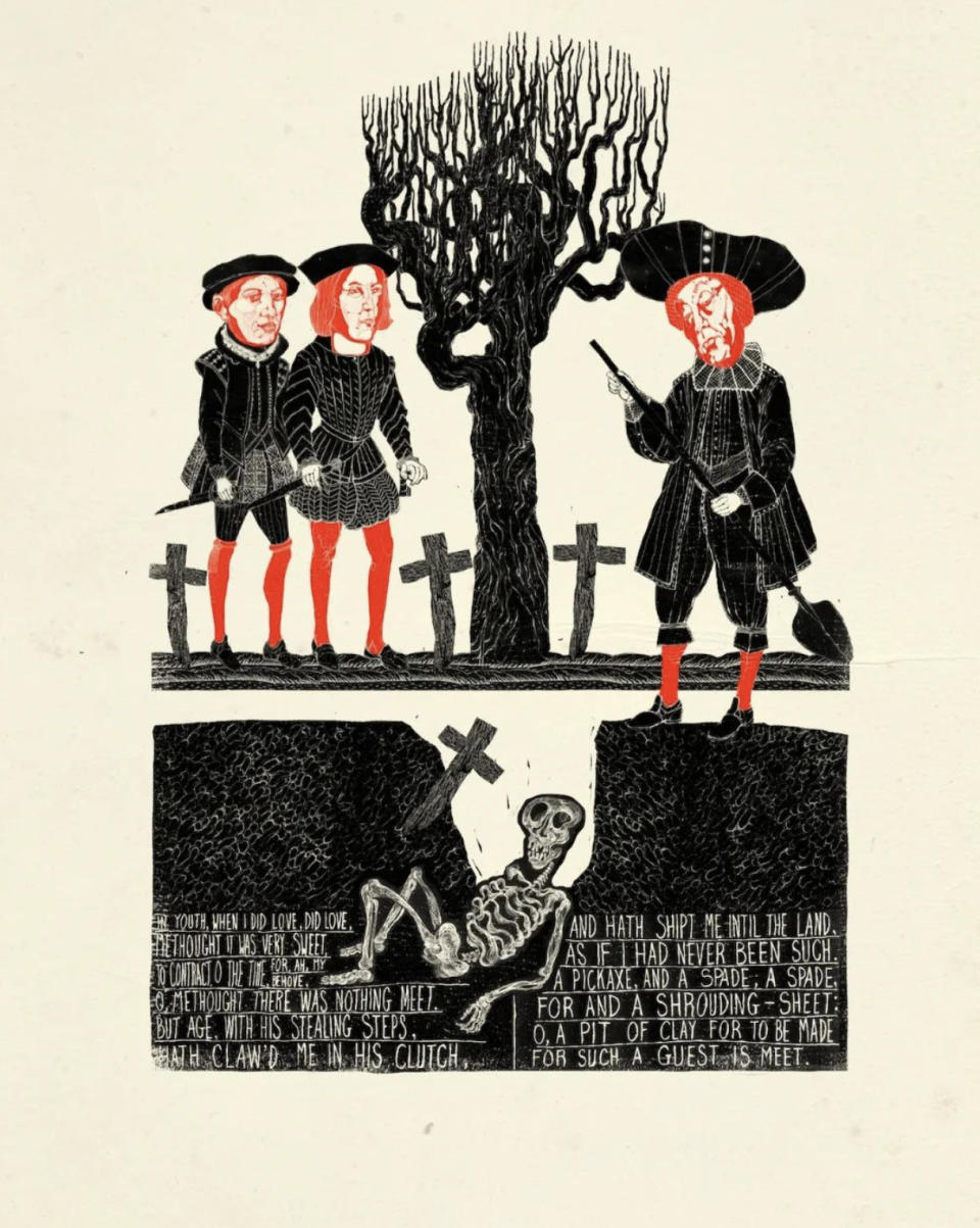
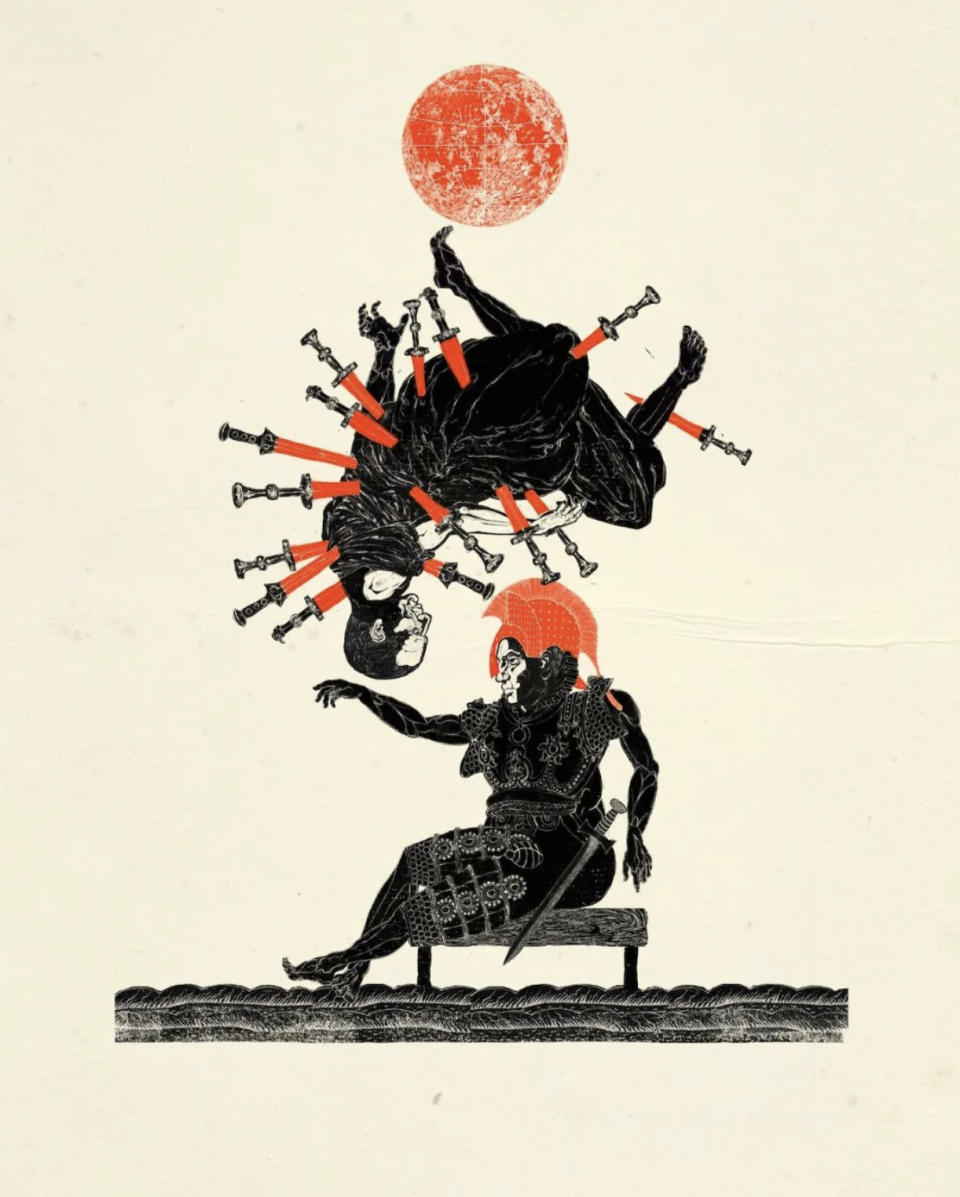
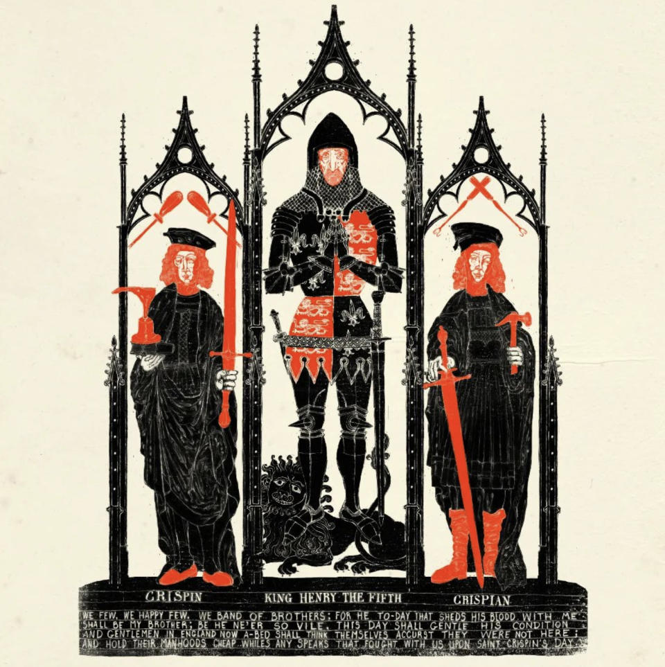
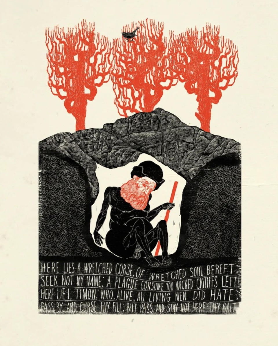
Deciding which character or scene to illustrate to represent a play required research, and reading. Lots of reading. He chose some iconic moments – how could he not include the balcony from Romeo and Juliet? – but also played with themes and characters to offer something new, but art fans will instantly recognise.
"Each image had to not look like another image in the book," which considering there are 38, one for each play, this was a tall order. Packer got creative, for example with The Two Gentlemen of Verona he honed in on the dog, as this is the only Shakespeare play to feature man's best friend.
Packer works in a unique and meticulous way. "Everything is done by hand. I try to stay away from the machine as much as possible," Packer says, explaining how he uses pencils and fine-point pens to create his initial sketches on tracing paper. "Then it's scanned and put into Photoshop, where I have a lot of textures that I make myself," he adds. This process ensures that the final art retains a handcrafted, almost woodcut-like quality, as if pulled through time.
Though he uses Photoshop, Packer is not a big users of digital art software, "I've learned a tiny little corner of Photoshop deliberately," he laughs, telling me he just uses layers, undo and simple tools, "which keeps the algorithm of the machine out of the process", resulting in an engaging blend of digital and analog.
Using Photoshop has enabled Packer to stay closer to the art, using less process and tracing paper layers. He would look at old sketches and think, "The lines here are pure and better, this is a better drawing than the finished wash. By scanning that and then working with that in a slightly different way, I had something that was a bit more alive."
The more we talk the more I come to understand Packer lives in his own world, one of paper and ink and a celebration of his surroundings. "I'm not aware of, I'm not into, trends," he confesses. "I mean, there are illustrators who I love and adore, and there are a lot of really interesting contemporary illustrators too, but that's not necessarily where I'm drawing from."
He draws from life around him, using experience to infer his illustration. Right now that world he inhabits is in boxes, lots of boxes. As we talk his life is packaged up behind him. Packer is moving from London to village life, and this will likely have an influence on his work. He's already moved on from Shakespeare and has two new projects on the go, meaning more ideas, more tracing paper.
As we leave I ask about his original art, all those sketches and scribbles on tracing paper, he must keep them, right? "No," Packer tells me as he gestures how its all been scrunched up, crumpled, torn and thrown away."People can't believe it when I tell them that," he laughs, "I keep nothing, I move on". For someone who loves the past, celebrates the artisan styles of history, Packer has little space for old ideas and past work.
The Folio Society's limited run illustrated Shakespeare Folio is out now, but there are only 1,000 hand-numbered editions, and they're selling out. If you're inspired by Neil Packer, read our guide to the best art sketchbooks for artists, how to download Photoshop, and the best drawing tablets.

