The NBC logo: a history
The National Broadcasting Company (NBC) was founded in 1926 and launched America's first permanent radio network. From 1939 onwards, it ushered in a new era of TV, and went on to host some of the country's most popular shows. It currently broadcasts the longest-running live-action series in US prime-time history, Law & Order: Special Victims Unit.
Despite the rise of cable cutting and a shift towards streaming, NBC continues to generate both profits and critical acclaim. And while that's largely down to the quality of its programming, its powerful branding has also played a part in this century-long success story. Today, its famous 'Peacock' logo is arguably more instantly recognisable than any one show.
It's so well known, in fact, that people are often surprised to learn just how many other NBC logos there have been over the years. In this article, we'll look at the evolution of the NBC logo, including both the company's best logos and some that have been more quickly forgotten. (If they inspire you to create your own logos, check out our list of the best logo designer software.)
NBC logo history: 1926
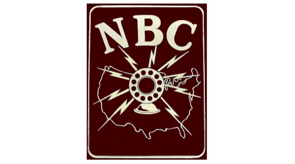
NBC debuted as a radio network in 1926, with this graphical logo that shows exactly what it was about. A microphone surrounded by lightning bolts is superimposed over a map of the nation, clearly showing its USP as the first to broadcast across the entire continental United States.
NBC logo history: 1931
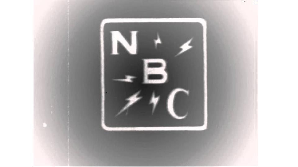
Five years after its launch, the public was familiar with the idea of a national radio broadcaster, and the logo no longer had to be so intricate and literal. In 1931, it made sense then to introduce a new streamlined logo, based around a square with a diagonal text. The lightning bolts remain, but they're much more minimal. Simplifying the logo also had the effect of future-proofing the logo, allowing it to be used in 1941 to represent newly formed NBC television network.
NBC logo history: 1943
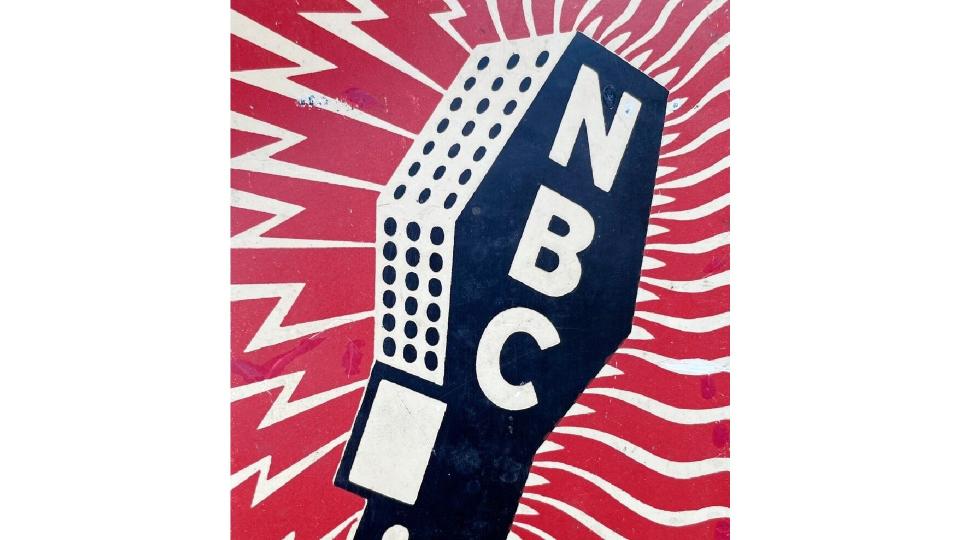
Two years after the FCC first allowed commercial television broadcasts, this new media was starting to settle in with the public, but radio remained the main game in town. To symbolise the brand's new dual identity, a new logo featured lightning bolts on the left. representing radio, while the waves on the right represented television. Lightning bolts were a common design element at the time; they also appeared in the logo of NBC's parent company RCA, and one-time sister company RKO Pictures.
NBC logo history: 1946
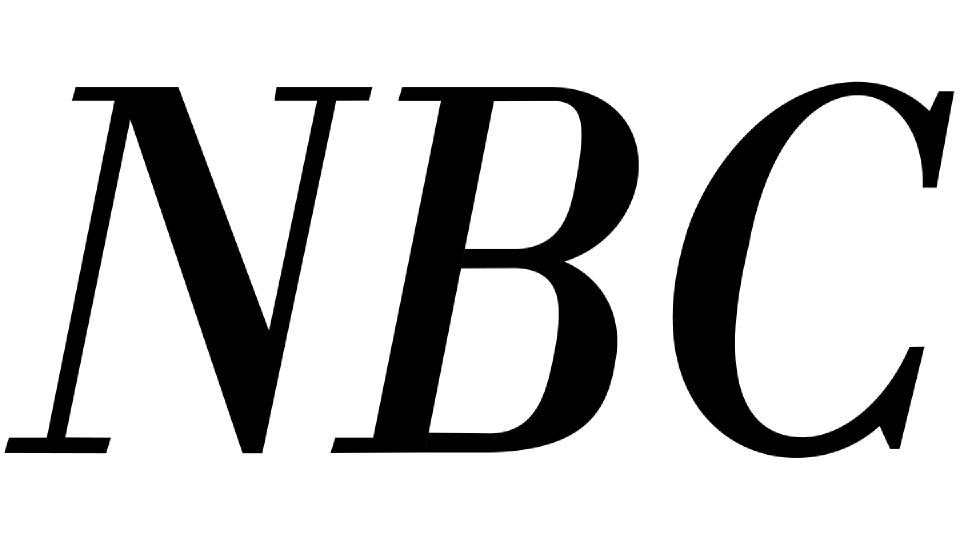
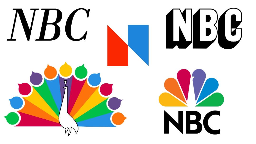
By 1946, people had got used to the idea of television and the logo no longer needed to be graphically descriptive. So NBC shrank it down to a simple wordmark. In retrospect, it's not the most visually inspiring logo in the company's history, but it was certainly clear, simple and recognisable.
NBC logo history: 1952
In 1952, the network decided to beef up its wordmark, giving it a little more shape and depth. It wasn't a huge departure from its predecessor, but it was at least a little bit more eye-catching.
NBC logo history: 1953
By 1953, television in the United States was no longer a niche, rarefied technology, but increasingly seen as part of normal middle-class life. In line with this trend, NBC introduces a much cosier logo based on a stylised xylophone and mallet. The significance was not lost on the audience, who now instantly associated the brand with the NBC chimes. This seven-tone sequence had been ever-present on NBC radio since 1927.
NBC logo history: 1956
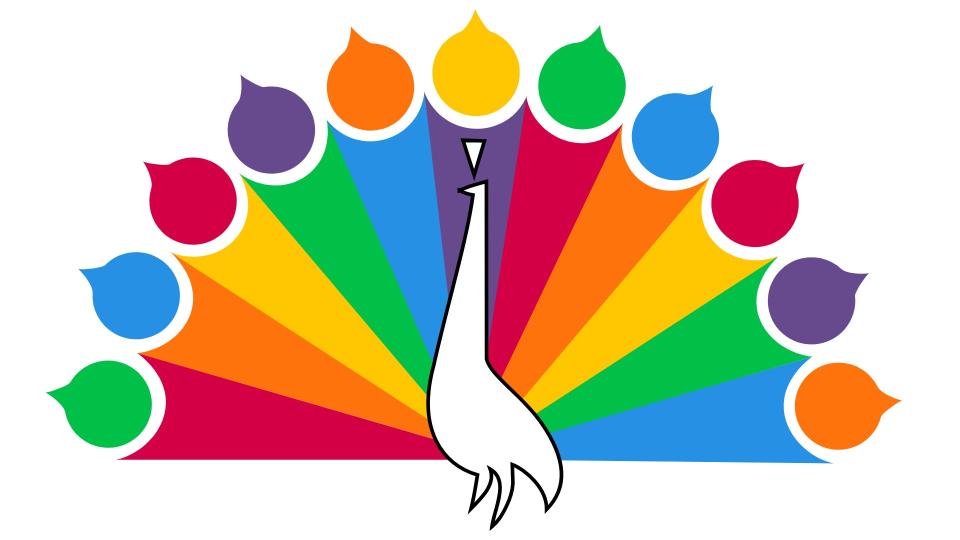
The next big evolution in media was colour television, and what better way to symbolise it than a brightly hued peacock? John J. Graham created this abstraction of an eleven-feathered peacock to evoke the rich hues viewers could enjoy with a colour set (NBC's owner, RCA, manufactured them, so this was a win-win for the company). The original design was a still image, which then became animated in the summer of 1957.
NBC logo history: 1959
Starting in September 1959, NBC had an added animated logo join the Peacock at the end of every show. This stacked typographic design became affectionately known as the snake logo, as each letter seems to grow out of the other. This logo was also designed by John J. Graham.
NBC logo history: 1975
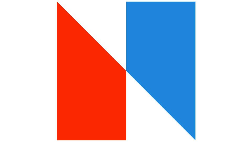
NBC made a dramatic change to its branding in 1975 with this bold, bright and super-abstract design consisting of two trapezoids – one red and one blue. More reminiscent of the French flag than anything to do with television, it's difficult to see in retrospect what this logo was trying to achieve. And worse still, it led to NBC being successfully sued for almost a million dollars by Nebraska ETV, which had a virtually identical logo.
NBC logo history: 1979
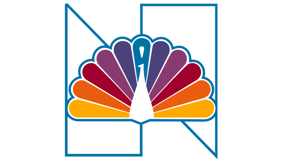
Research conducted in 1977 by Peter H. Kliegman from NBC's corporate planning department recognised the Peacock's value in identifying its brand, and recommended its use once more. So in 1979 a new logo crafted by Lippincott & Margulies combined it with a geometric cut-out of the 1975 logo to construct a striking new design. The bird itself was also simplified, with the teardrop tips removed, and a simpler colour scheme used for the feathers. In retrospect, it's a bit of a hodgepodge, but at least it was a step forward from the 1975 logo.
NBC logo history: 1986
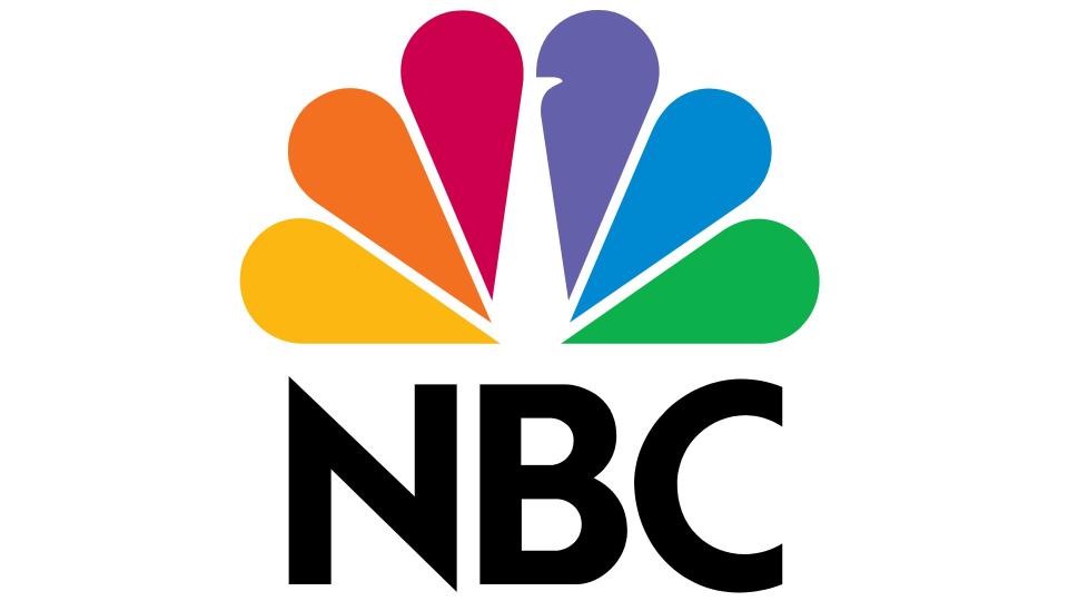
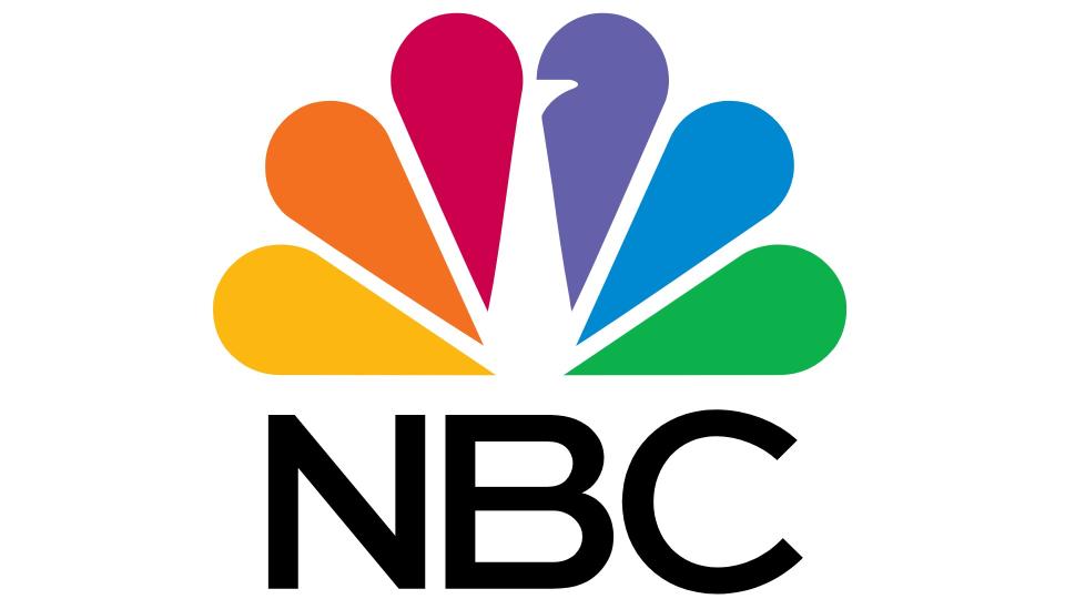
In 1980, just a year after the release of its previous logo, NBC hired renowned Chermayeff & Geismar to create a new one. The result was a design that, with only tiny changes, has represented the brand ever since.
This iconic logo was created by Steff Geissbühler and simplified the brand mascot even further. The 11 feathers were pared down to six, and featured each of the primary and secondary colours in the RYB colour palette. The use of negative space to depict the bird's head and neck was a masterstroke. And note also that the head has been flipped from the left to the right, to show the brand is looking forward to the future, not back to the past.
NBC logo history: 2013
The 2013 iteration of the logo is only sightly modified. The NBC letters appear in different font, the beak is now a little bigger, and the feathers are slightly thinner.
NBC logo history: 2018
Used from 2018 until 2022, this modified variant changed the font to NBC Tinker.
NBC logo history: 2022
This latest iteration of the logo, introduced in November 2022, boldens the letters and sightly widens the spacing between them. We've included it in our roundup of subtle logo tweaks that made a big difference.
For more logo histories, see our Apple logo history, the Google logo history, NBA logo history and MGM logo history.

