The NBA logo: a history
- Oops!Something went wrong.Please try again later.
- Oops!Something went wrong.Please try again later.
The NBA logo is an institution all of its own. For the majority of fans, the striking white silhouette of ‘Logoman’ dribbling the ball is the first image that comes to mind when thinking about the National Basketball League.
Like a lot of the best sports logos, the NBA emblem has proved its well-deserved iconic status simply through endurance. While the NBA was first founded in 1946, its early years were uncertain and marked by competition with the American Basketball Association (ABA). Ultimately, the NBA won out, with the ABA effectively ceasing to exist following a merger in 1976. There’s an argument to be made – and plenty of people have made it – that the strong brand identity created by the debut of the iconic logo in 1969 helped propel the NBA to the dominance it still enjoys today.
The story of how this logo came to be, and how it has reflected the changing identity of the League in the decades since, is a fascinating one, and a true testament to the enduring power of good design. Let’s take a closer look at the history of the iconic NBA logo – and don’t forget to check out our rundown of the best logo designers if it puts you in a creative mood.
1969: a legend is born
In 1968, a designer named Jerry Dior spent an afternoon with some marker pens and came up with a classic. Not the NBA logo though – Dior was in fact responsible for the iconic redesign of the logo for Major League Baseball.
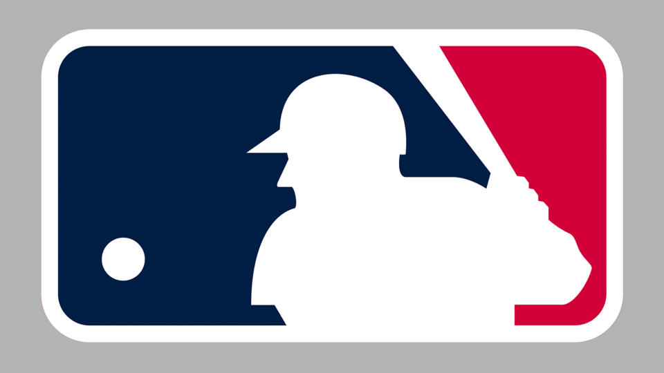
It’s a devilishly simple and effective design. Consisting entirely of all-American red, white and blue, Dior’s MLB logo uses negative space to carve a silhouette of a batter at the precise moment before his swing. Dior’s supervisor at the time, a branding guru named Alan Siegel, recalled in an interview with NPR that they took the design to the heads of the baseball committee for approval, and received it more or less instantly.
J. Walter Kennedy, commissioner of the NBA at the time, took one look at this striking redesign and decided he wanted the same for his league. He went to the source, and enlisted the help of Alan Siegel, who had actually been an accomplished basketball player in high school, though had made the decision to study at Cornell rather than pursuing the sport any further.
According to Siegel, the NBA "was having a lot of trouble with their reputation at that time", and Kennedy felt that associating the league with the popular, all-American MLB might help give it a bit of an uplift.
Siegel had no plans to mess with what had already worked – a white silhouette on a red and blue background would do just fine. The challenge was going to be finding the silhouette. So, Siegel got in touch with his good friend Dick Schaap, the editor of Sport Magazine, and asked to dig through his photo files. After looking through countless images of various NBA players in all kinds of poses, Siegel came across an image of shooting guard Jerry West playing with the Lakers, captured by photographer Wen Roberts.
"I was attracted to it because it was nice and vertical, and it had him leaning and dribbling … had a little motion to it," Siegel later recalled.
‘I looked at some logos where there were hands up around the net and the ball. I looked at Kareem Abdul-Jabbar’s hook shot. I looked at Wilt Chamberlain, Tom Havlicek, Tom Gola and a few others that I remember. The one with West just really worked."
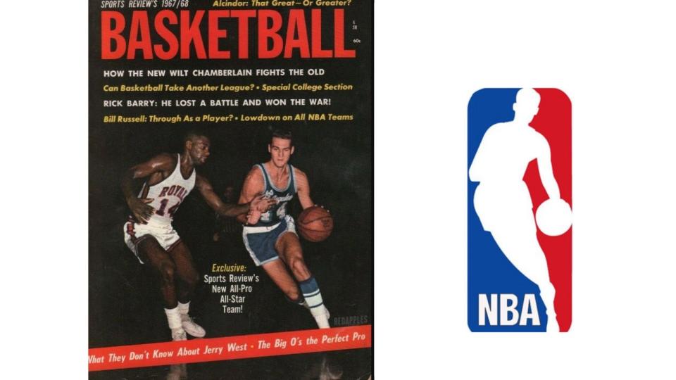
Siegel worked up a design and presented it to the NBA, not mentioning that it was based on West, just that he had used a reference photo of a player. "When I showed it to Kennedy, he accepted and it was done. Maybe took 30 minutes," Siegel recalled (anyone currently involved in logo design probably felt a real sting of jealousy there).
Instantly iconic, this dynamic rebranding helped the NBA ward off its spirited competition from the American Basketball Association (ABA), and become the unquestionable home of American basketball. The elegant fluidity of the figure, the sense of anticipation created by the position of the ball – all of it adds up to an utterly sublime logo – one that has now lasted, virtually unchanged, for more than half a century.
Siegel says that even decades later, after having designed hundreds more logos, many of them award-winning, he still gets introduced to rooms as the designer of the NBA logo. His response? "I’m OK with it."
Though not everyone is. Jerry West, the player behind the silhouette, has made no secret of his reluctance to be associated with the logo, and has expressed a wish that the NBA would change it. "I wish that had never gotten out that I'm the logo," he said in an interview. "I really do... I don't like to do anything to call attention to myself."
The NBA have long agreed, and indeed have historically been very reluctant to acknowledge that the logo is West – in official material he was and still is often referred to as ‘Logoman’, despite practically every basketball fan and their mother knowing who he is. Siegel once recalled being on vacation and bumping into David Stern, who was commissioner for the NBA from 1984 to 2014, and Stern making it clear that he did not feel West should be officially acknowledged as the basis for the logo.
The reasoning behind this lack of forthrightness from the NBA has never been clear. Perhaps they were afraid of potential copyright issues. Or, as Siegel has speculated, they were worried that Jerry West might ask for a payout – though his behaviour in the years since is enough to indicate that he almost certainly wouldn’t.
But regardless of some of the stranger points in its history, the NBA logo is an unquestioned classic. It helped catapult the league to the dominant status it enjoys today, and the fact that it has barely been changed more than fifty years since its inception makes it a textbook example of why you don’t mess with perfection.
2017: the most minor refresh possible
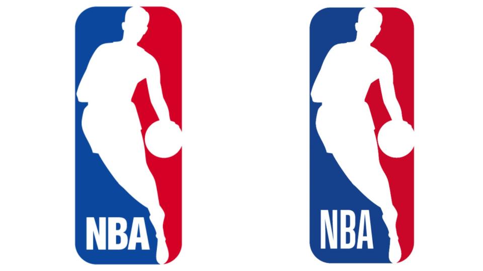
It took 48 years for the NBA to feel the need to change a single thing about Siegel’s logo. In 2017, the League announced that it would be conducting a minor refresh of the logo across all its channels – and we really do mean minor.
The core of the logo remained exactly the same – with West’s silhouette front and centre. The typeface for the letters ‘NBA’ underwent a minor change, being transposed into a "modified version of Action font, customised for the league".
This typeface was a little taller and leaner than it had been before. The league also took the opportunity to refresh the colours a little, with slightly deeper hues in the blue and red. While you probably wouldn’t notice a difference unless you looked at the two side by side, the reason for the change was to make the logo more visible across digital brand assets.
2020: the logo change that wasn’t
One of the more significant moments in the recent history of the NBA logo involved no change at all – but a proposed one that gathered a lot of attention. In January 2020, retired NBA superstar Kobe Bryant was tragically killed in a helicopter crash along with eight others.
In the aftermath, a movement started to gather momentum among fans to immortalise Bryant as the new NBA logo. A design mockup by artist Tyson Beck (below) was widely shared, a change.org petition to make Bryant the new logo was signed by more than 3.2 million people, and other NBA players like Kyrie Irving added their voices to the call.
Ultimately though, the NBA’s historic reluctance to ever associate its logo with an individual player (remember how cagey the League has historically been about Jerry West’s involvement) meant the idea was likely always a non-starter. The unfortunate spectre of the 2003 sexual assault case against Bryant, which was ultimately settled out of court, may also be a factor for the decision-makers at the NBA.
2021: 75 years of the NBA
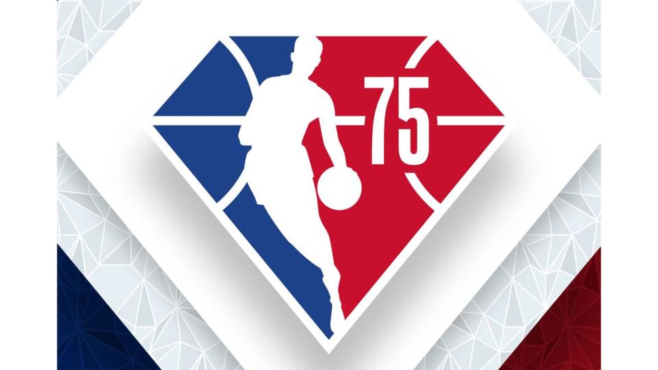
In 2021, the NBA celebrated its 75th anniversary and commemorated the occasion with a temporary refresh of its logo. A diamond is the symbol associated with a 75th anniversary – well, it’s more commonly associated with a 60th anniversary these days, but what the hell, it meant we got this glorious reimagining of the classic Siegel design. Even if the NBA did still inevitably insist on referring to Jerry West as ‘Logoman’ in its official announcement.
With striking white lines that call to mind the lines of a basketball court, and the ‘75’ sitting next to West (sorry, ‘Logoman’) in that stylish Action font, this diamond version was an exciting addition for the 2021-22 season.
While we may see more of these kinds of temporary refreshes as the NBA celebrates more milestones, it’s safe to say that Siegel’s classic logo won’t be going anywhere anytime soon.
For more on sports logos, see the Eagles logo history, the NFL logo history and the best NFL logos.

