These Are the Most Popular Paint Colors from 5 Top Paint Brands
TABLE OF CONTENTS
On This Page
Benjamin Moore
Behr
Sherwin-Williams
Clare Paint
Farrow and Ball
When it comes to paint colors, the options are truly limitless. If you just don't know what to choose or where to even begin, it helps to reference favorites of interior designers, family members with a penchant for decorating, or even neighbors with enviable interiors. Once you start, you might find there's a lot of overlap. And if you don't want to deep dive? Don't worry. We've done the research for you. Keep scrolling to find some of the most popular paint colors from five major paint brands.
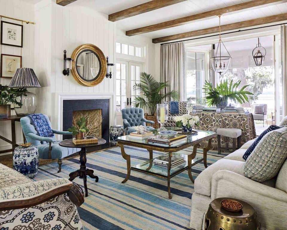
Benjamin Moore
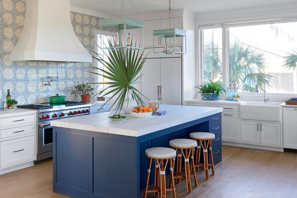
Photo: J. Savage Gibson; Styling: Heather Chadduck Hillegas
Benjamin Moore Hale Navy (HC-154)
Rich, saturated, and nautical (but not too much so), Hale Navy is a classic that serves as both a dose of drama and a versatile neutral. This blue expertly balances everything a space can be in one striking color.
Pictured above: Island in Hale Navy.
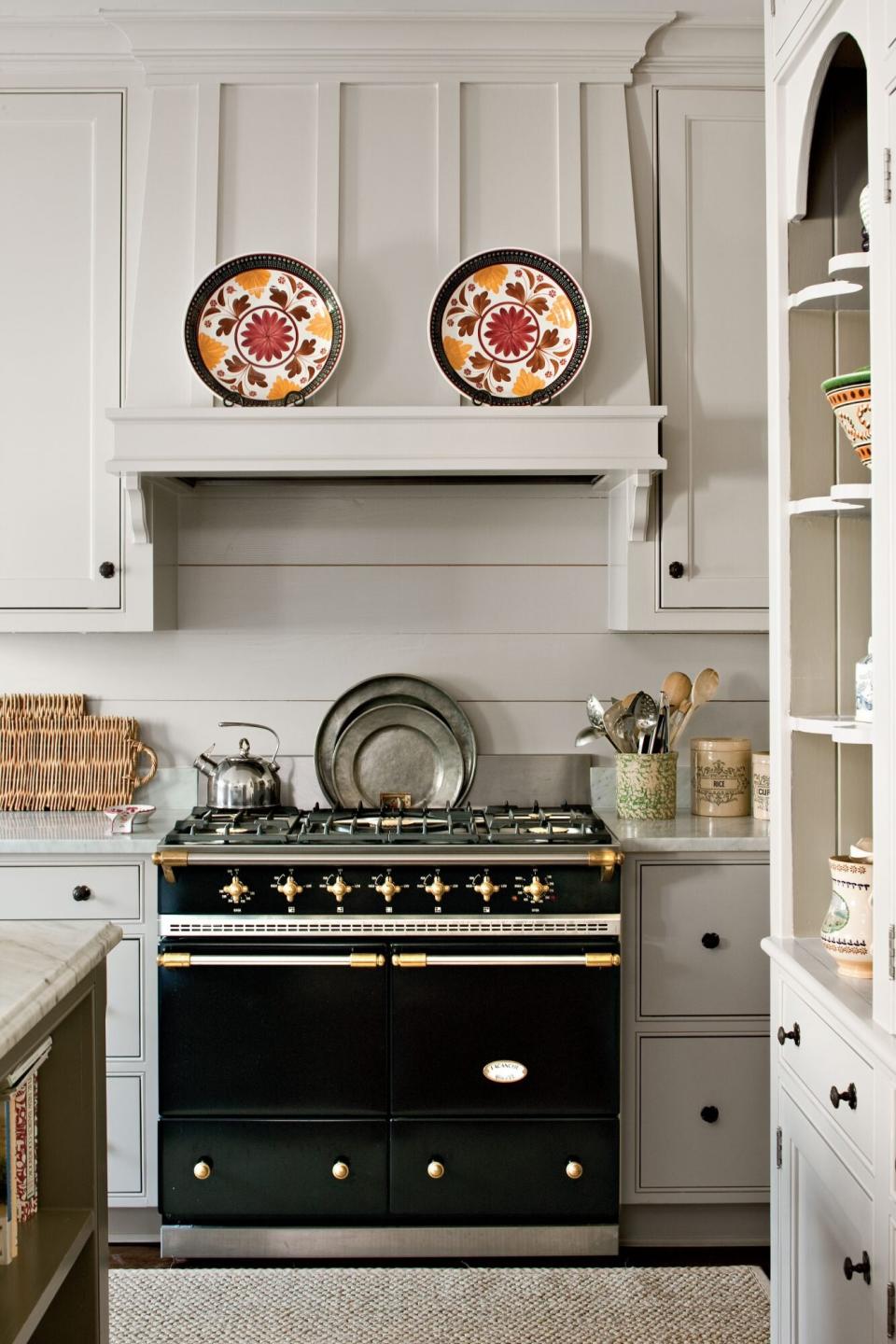
Photo by: Laurey W. Glenn Cabinetry and wall paint:Revere Pewter (HC-172); Benjamin Moore.Island paint: Chelsea Gray (HC-168);
Benjamin Moore Revere Pewter (HC-172)
Perfect for open floor plans because of how well it plays with other colors despite not being white, Revere Pewter is a mix of gray and beige with a defined warmth that creates a polished earthiness.
Pictured above: Revere Pewter cabinetry and wall paint.
Photo: Laurey W. Glenn; Styling: Matthew Gleason
Benjamin Moore White Dove (OC-17)
Our first (and favorite!) white of the bunch, this soft shade perfectly balances warmth with brightness, creating a dynamic white. Use White Dove to elevate molding, trim, large spaces, and pretty much everywhere else too.
Pictured above: Siding in White Dove.
Charles Walton IV / styling Todd Childs
Behr
Behr Swiss Coffee (12)
An off-white with hints of ivory, Swiss Coffee warms up whatever space you put it in while still allowing the rest of the room to pop. This creamy shade is best complemented by other warm earth tones.
Pictured above: Trim in Swiss Coffee and exterior in Benjamin Moore Cliffside Gray.
Behr Burnished Clay (PPU18-19)
Warm up with this combination of beige and gray, featuring slight cool undertones. Burnished Clay appears differently depending on the time of day or light source, making it extra versatile.
Pictured above: Walls in Burnished Clay.
Behr Ultra Pure White (1850)
Never has there been a more accurate name for a paint color than Ultra Pure White. It's the whitest white of them all: crisp, clean, and highly reflective.
Pictured above: Walls in Ultra Pure White.
Sherwin-Williams
Sherwin-Williams Aleutian (SW 6241)
Muted but not muddy, Aleutian is a pale blue-gray that instantly calms down a room. Reminiscent of a stormy sky yet creamier, this color feels neutral and natural while still bringing dynamic pigmentation.
Pictured above: Doors in Aleutian.
Laurey W. Glenn; Styling: Liz Strong
Sherwin-Williams Pure White (SW 7005)
A rental favorite for a reason, Pure White is exactly what it claims to be: white that's not too warm or too cool—it's just right. This versatile hue is fairly low-risk, making it a good option if you need to pick a paint before getting a chance to test it.
Pictured above: Pure White (SW 7005) ceiling and Light Buff (SW 0050) walls.
Photo by Nancy Nolan Essential Upgrade:Painted the dark-stained cedar ceiling pale gray to open up the space Comfort Zone: Furnished with a pair of comfortable bench-cushion sofas and slipcovered chairsCustom Detail: Fashioned a one-of-a-kind coffee table from a salvaged steel propeller and a 5- by 5-foot glass topWorthy Splurge: Rolled out a barefoot-friendly gray sisal rug that matches the shade of the concrete floors so well it almost completely disappearsGet the Look: (L to R) Pillow fabrics: Cliffside in Sky and Goldeneye in Soft Grey by Lulu DK. Sofa fabric: Vintage Linen in Cement by Verellen. Wall paint: Agreeable Gray (top) by Sherwin-Williams
Sherwin-Williams Agreeable Gray (SW 7029)
This color is often considered the perfect "greige"—combination of gray and beige. Free from any significant undertones, Agreeable Gray is another rental favorite for its easy versatility.
Pictured above: Agreeable Gray walls.
Clare Paint
Clare Paint Current Mood
This rich and dynamic paint never stays the same color for long (as the name suggests), which is exactly what makes it so popular. Current Mood brings the drama, shifting from a dark teal-gray during the brightest part of the day to an intense, moody green when the sun goes down.
Pictured above: Cabinets in Current Mood.
Clare Paint Whipped
Clean, cozy, and creamy are just a few of the words used to describe this warm white. Recommended to solve the lack of natural light in north-facing rooms, Whipped brightens without overwhelming.
Pictured above: Whipped on walls and cabinets.
Clare Paint Headspace
A match for serene, natural sea glass, Headspace is soft and airy. Able to pass as a neutral, this hue brings just enough color to add visual interest without being oversaturated.
Pictured above: Walls in Headspace.
Farrow & Ball
Farrow & Ball Wimborne White (No.239)
This color is only a whisper away from pure white, achieved by adding a touch of warm yellow to the mix. Wimborne White's timelessness and sophistication is magnified when combined with Farrow & Ball's signature velvety finish.
Pictured above: Walls in Wimborne White.
Farrow & Ball Hague Blue (No.30)
The slight green undertone of this rich shade sets it apart from others, elevating its drama into full-on glamour. Paint Hague Blue in rooms without much natural light, smaller spaces, and outdoors.
Pictured above: Door in Hague Blue.

