A Monochromatic Color Scheme Is the Designer Trick You Could Be Using More
Table of Contents
Whether you’re determined to color wash your walls in one specific hue and carry it through your furnishings, or you’d like to decorate with different shades of the same color family from light to dark, you’d be using a monochromatic color scheme — even if you’re unaware of it. Designers love to work with monochromatic colors because they’re a simple but surefire way to make sure a room feels cohesive, since you’re pulling from a single shade to create an entire palette.
One color doesn’t have to mean one dimensional, though; monochromatic rooms can be bold or neutral, and it’s possible to create tons of depth by varying the intensity of a single shade and layering in pieces with contrasting textures. And a monochromatic color design scheme isn’t just a design school invention, either. There’s precedence for this in nature, too. “You can see the monochromatic colors in a plant, ranging from deep green on old growth and lighter shades in new growth,” designer Pamela Nast explains. Maybe this is why a monochromatic room can be so visually soothing.
So if you want to know more about using monochromatic colors in the home, you’ve come to the right place. Here, designers are breaking down exactly what you need to know about monochromatic colors, how they differ from complementary colors, and how you can achieve a sophisticated monochromatic look in your home.
Monochromatic rooms are instances in which an entire space is drenched with variations of one singular color, be it red, blue, yellow, and so on. It’s likely that you’ve already encountered instances of monochromatic colors even outside of the home.
Characteristics of Monochromatic Color Schemes
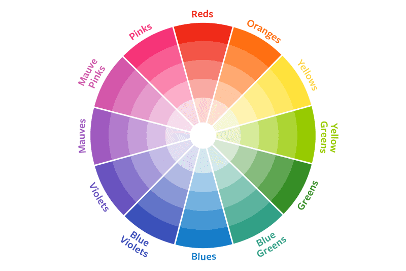
A monochromatic color scheme uses variations of a single color and is characterized by four components: hue, tone, shade, and tint. Any color on the color wheel can be used to create a monochromatic color scheme; you just need to adjust it with tones, shades, and tints.
Hue
When speaking about monochromatic colors, “hue is the heartbeat — the purest form of a color that sets the tone for the entire composition or room,” explains designer Kate Haynes, the founder of Noble Studio Interiors. Everything else, as described below, is derived from the hue.
Tone
Tones are what results when gray is added to your hue.
Shade
Shades are what results when black is added to your hue.
Tint
Tints are whitened versions of your hue.
To better illustrate how these elements can work together, Haynes provides the following example. “You might paint walls a coral red, then pull in a toned-down version of that red for depth and subtlety on the upholstery,” she says. “That bright red coral wall color gets diluted in a persimmon-tinted linen curtain. It’s as though you choose a paint strip from the deck and worked your way down, pulling in various strengths and vibrancies of the same hue.”
Why Use Monochromatic Colors in Your Home?
There are many reasons why interior designers find using monochromatic colors in a home to be beneficial. For some, intentionally filling a room with just one hue can make it “feel instantly more chic and sophisticated,” as Haynes says. “Much like my personal go-to trick of frequently choosing black-on-black outfits, the power of this move is in the cohesiveness,” she adds.
“Monochromatic vibes instantly elevate an outfit or space to something more elegant than it actually is.” Nast agrees, noting, “Consistently monochromatic color schemes are luxurious and make a ‘loud’ statement quietly.”
You might also choose a monochromatic design scheme because it’s visually quiet and calming, thanks to its simplicity and the use of color repetition. “When entering a monochromatic room, there is an impulse to relax — everything flows and invites you to sit down and enjoy,” Nast says. Decorating can be easier for this reason, too, since everything in a room has to adhere to a single color. Selecting furnishings can be easier when you’re essentially eliminating the rest of the color wheel.
Lastly, using monochromatic colors in a space can be an ideal way to shift focus to another key element within a room. “This also adds value to highlight any special items, like a collection of art or textiles,” says designer Julia Lauve, the cofounder of WORKSHOP | studio. “Any deviation from a monochromatic color palette would really shine.”
How to Use Monochromatic Colors in Your Home
Want some pro tips for using monochromatic colors in your home? Below, you’ll find five designer-approved ideas for making your space sing.
Vary Your Shades
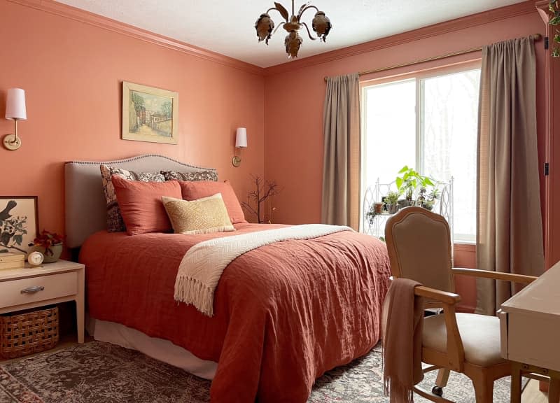
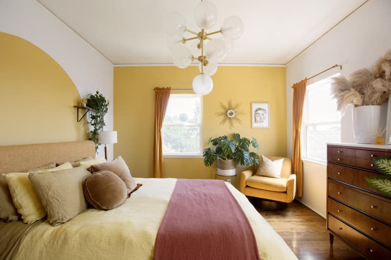
For a well-balanced room, Nast recommends incorporating “at least five tints, tones, or shades within the base (hue) color.” She once did a home in a brown monochromatic color theme and found success by going both light and dark. “It almost seemed like you were entering a decadent box of chocolate truffles, from the dark chocolate to the creamy insides,” she says. “It was sublime.” You can see this idea at work with yellows in this geometric bedroom.
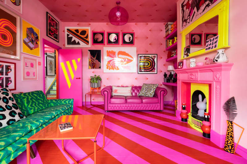
Use an Accent Color
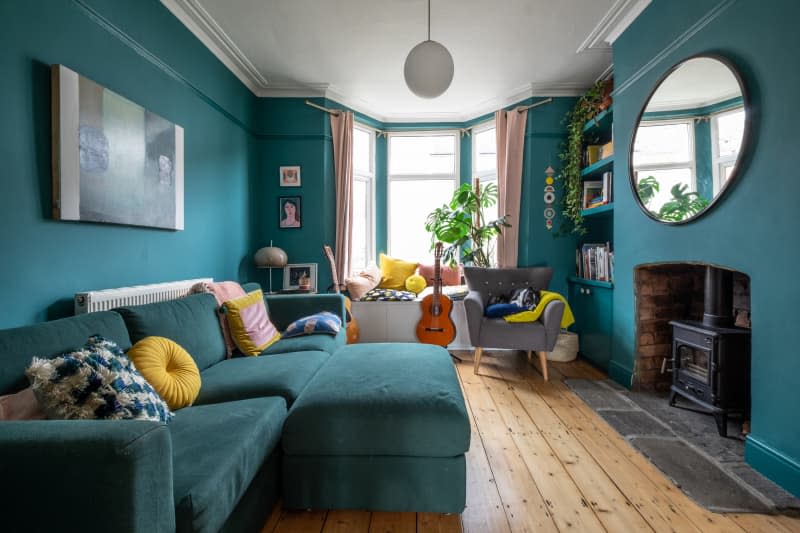
There’s no rule that says you can’t weave an accent color into a mostly monochromatic room. Doing so “continues the harmony,” Nast explains. Consider using a complementary color for extra contrast, similar to what you see here, with this teal living room. Complementary colors are pairs that are opposite each other on the color wheel, so they add contrast and variety to a room’s design scheme.
Incorporate Texture
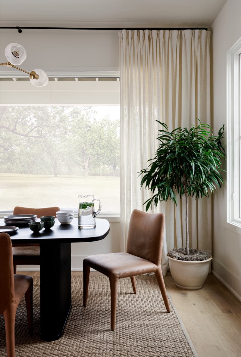
Monochromatic spaces should still feature plenty of textural touches, Haynes says. She and Nast recommend bringing in metal, wood, marble, stone, and more to add dimension and warmth.
Embrace Light
Light — in all of its forms — shouldn’t be an afterthought in any room, particularly a monochromatic one. “Play with natural and lamp light to create moments of shadow and light,” Haynes says. This will create even more variations of your base hue.
Think Beyond Neutrals
Don’t be afraid to go bold in a monochromatic space. “We might think this means neutral tones, but we can also do strong colors like red: Think Diana Vreeland,” says interior designer Jackie Terrell.
