The New MoMA Uses Farrow & Ball Paint to Impact How We See Art
Visitors to the recently-redesigned Museum of Modern Art in New York might be surprised to not be met with a string of white-walled galleries showing art grouped by time period and style. In fact, the museum began its recent renovation with a conversation about how to disrupt traditional modes of representation. "Just because things have been a certain way for a long time, doesn't mean that's the only way, or even the best way, to do them," Sarah Suzuki, MoMA's curator of drawings and prints says of the new exhibition layout. Working together, the museum's curators and design team attempted to defy didactic modes of categorization (i.e. linear chronologies and medium-by-medium divides), and, instead, to allow abstract ideas to shape the narratives of each gallery. One big way they did so? Paint. And no, we don't mean on canvases.
Because color plays such a pivotal role in our visual experience—particularly in the context of art—the paint color selections became the lifeblood of the renovation, shaping the innovative galleries throughout the museum. On a private tour of the new galleries, House Beautiful learned more about how the museum's creative team used Farrow & Ball paint colors to revolutionize the way we see, feel, and interact with the world's most influential and poignant art.
Nineteenth Century Innovators
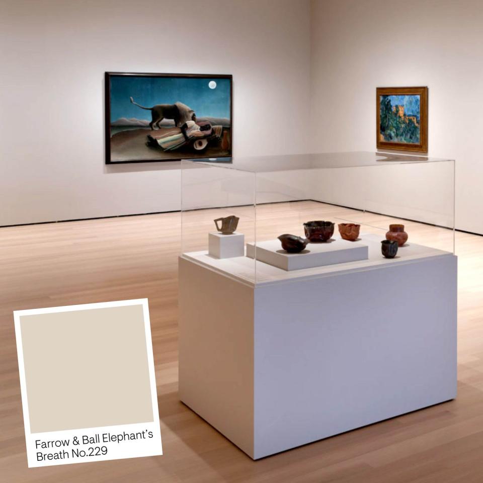
It's immediately clear that you won't find a classic white gallery box here. As the fifth floor opens into the Impressionistic gallery, you'll notice a light gray paint color instead: Elephant's Breath. The designers and curators tell us they chose this a backdrop because it stands its own ground and vouches for itself even behind a masterpiece like Vincent van Gough's Starry Night while still being gentle enough with the softer, more domestic works of Mary Cassatt. "Elephants breath helps enhance the works instead of just putting them against a white backdrop where they don’t really speak to each other," explains Lana Hum, MoMA's director of design and exhibition.
Early Photography and Film
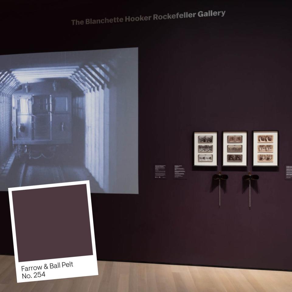
Directly adjacent to the Impressionist gallery is a subversive take on the traditional black box theater with a deep, emotionally charged shade of aubergine: Farrow & Ball's Pelt. "If Elephant's Breath was breaking down the white box, here we're breaking down the black box," Suzuki says. Again, instead of the default choice, the paint functions as art itself, enhancing and marrying the exhibitions. Specifically, it brings out the sepia tones of a 1906 film as well those in the surrounding mixed media and photography pieces that were also evolving at the time. Both visually and thematically, Pelt reflects the rapid developments in technology unfolding alongside the impressionist paintings—now they speak to each other cohesively. "We wanted to dissolve the idea that film can only be seen in a black box," Hum echoes, adding that "the new LED light fixtures are much more sophisticated with a lot more range of light levels and spread."
Around Les Demoiselles d’Avignon
In this gallery, artists of different backgrounds and media are in conversation, once again against Elephant Breath. Visotors' eyes will instantly be drawn to Pablo Picasso's cubist magnum opus Les Demoiselles d’Avignon, which sets the tone for the other groundbreaking works on display, from Faith Ringgold's Race Riot to Louise Bourgeois's sculptures. They each reflect the various formal and thematic innovations of Les Demoiselles d’Avignon. And, fun fact: Ringgold used to immerse herself at the MoMa with Picasso, speaking to its direct influence on her own work.
Artist's Books and Prints in Russia
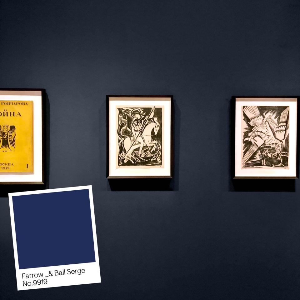
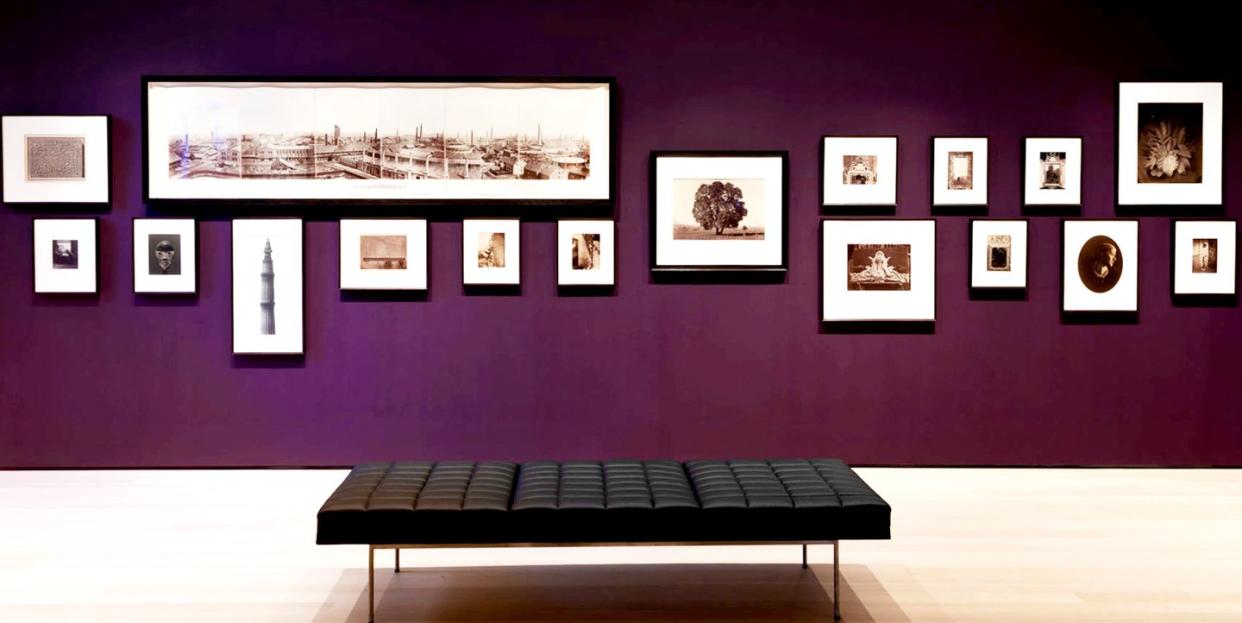
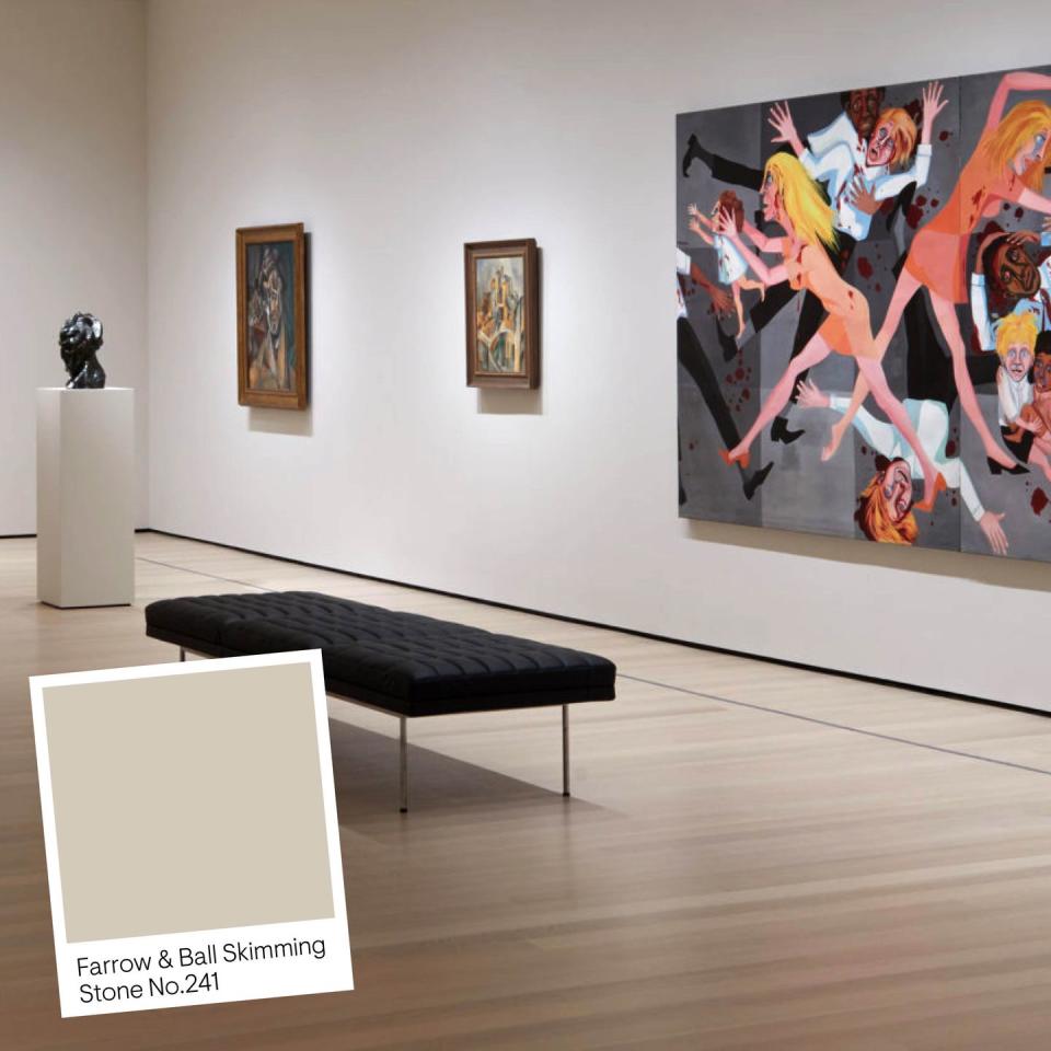
Throughout the museum, paint colors also function as interruptions throughout the space (where interludes and vestibules are painted in Skimmed Stone) to prevent a visit from feeling like an endless march through a maze of glaring white galleries. This room, for instance, is a small, more intimate deep-dive into the homemade books and prints of Russian Avant-Garde artists during and following World War I. They opted for Serge, a deep, deep blue to establish a nook-like environment.
Florine Stettheimer and Company
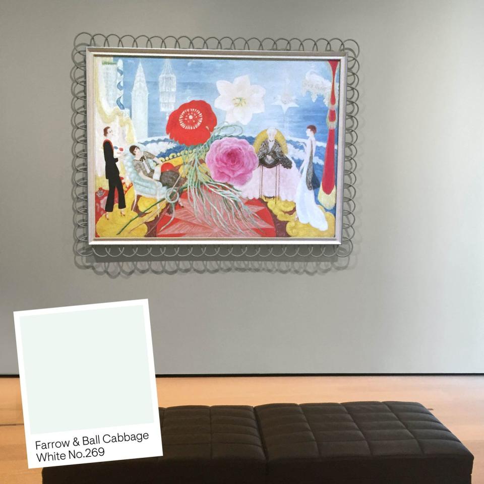
While brainstorming plans for this more whimsical, lush, and decorative room where Florine Stettheimer's work hangs, the curators sat in a big room tossing ideas around about mood. One designer described the desired color "as if blue could blush." Their selection? Farrow & Ball's Cabbage White, a white with a tint—or blush—of greenish blue.
Claude Monet’s Water Lilies
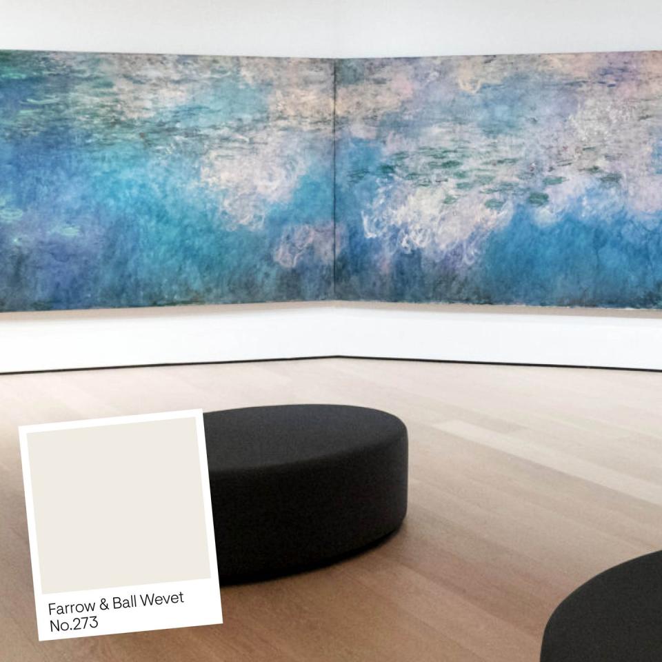
The curators knew this space needed to feel immersive and circumambient, but every color they experimented with felt too opaque. That is, until they found Wevet, which is radiant, almost luminous. "Wevet is almost not a color. It seems to invoke light. It actually captures the light and is the best expression of the sun-dappled light at Giverny," explains Hum. Like all Farrow & Ball paints, the color's nature seems to adjust and transform to complement its surroundings. The floorboards are also wider in this room to orchestrate the movement throughout the space, and to queue the visitor to know they are in a special place, "as if you're having an intimate moment with an old friend, but also still feel open enough and have movement," notes Suzuki.
A Surrealist Art History
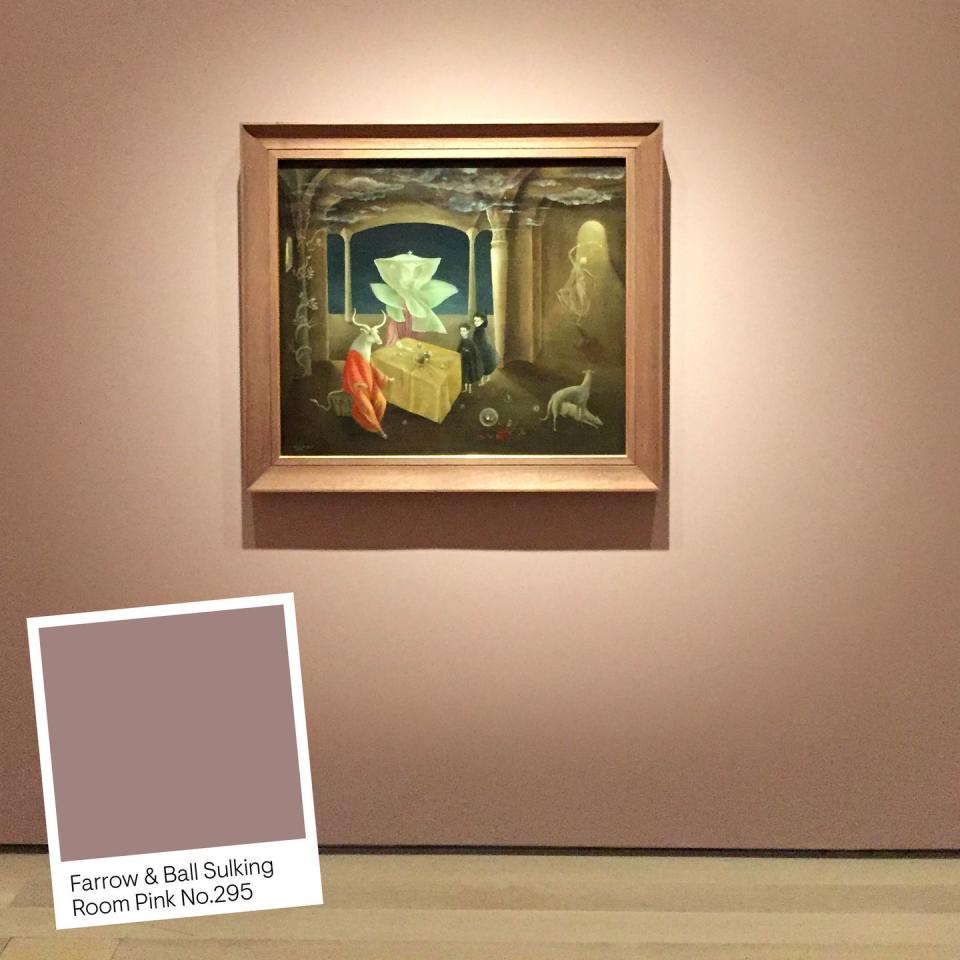
The surrealism gallery is reminiscent of a labyrinth, with surprise displays tucked into corners and different mediums intensifying one another. Far from accidental, this structure reflects the concepts and ideas being wrangled with in surrealism. It invites discovery and encourages the patron to embrace the feeling of being a little "off," almost as if they are inheriting the unease of unreality expressed in the artwork. Farrow & Ball's Sulking Room Pink (from the brand's latest collection) makes for the perfect backdrop, and is further emboldened by the moody lighting.
Responding to War
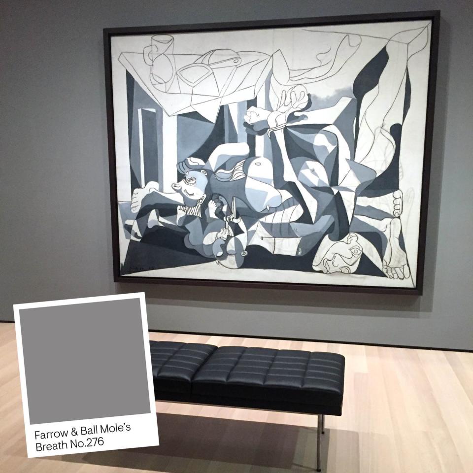
And here we are, ending our virtual tour of the MoMA's fifth floor on a somber note with the war-themed gallery. Walking through the galleries on the fifth floor is meant to concertize the buildup of a crescendo, and it reaching a climax here. The room houses a mix of allegorical works and some that feel more visceral, like sculptures. The design and curatorial teams initially used another color but felt it wasn't right, so they repainted it at the last minute with Mole's Breath. This shade of gray-brown is undeniably sullen, bringing a weight to the room. Evoking the smoky aggression and violence of the battlefield, it effectively replicates the gravity of war represented in the artworks, from pieces by José Clemente Orozco and David Alfaro Siqueiros to Picasso's response to the horror of World War II in The Charnel House.
Feeling inspired to paint your walls something other than a classic shade of white?
Follow House Beautiful on Instagram.
You Might Also Like

