Michael Schumacher logo jump-starts amusing design debate
- Oops!Something went wrong.Please try again later.
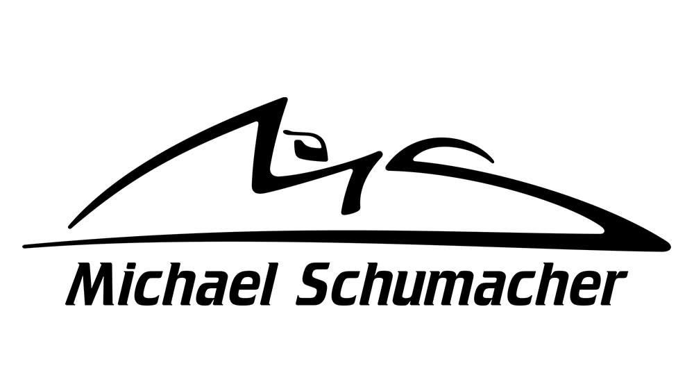
You might not know it, but the retired German Formula One racing driver Michael Schumacher has a logo. And that logo is revving up some quite intense design debate.
The design appears on Schumacher's official app, his social media accounts, his online shop, and really anything he puts his name to. But some people aren't too sure about what it actually shows (see our pick of the best logos for more inspiration).
Michael Schumacher's branding design - Initials forming the outline of a Formula 1 car from r/DesignPorn
Schumacher is a joint record holder with his seven Formula One World Championships wins. His phenomenal career saw him compete for Jordan, Benetton, Ferrari and Mercedes. Although he has been absent from public life since a skiing accident nine years ago, he remains and will remain a sporting legend.
But away from the race tracks, a debate is raging about the driver's logo design. Featuring on merchandise, the design, we presume, is intended to look like a signature with Schumacher's initials cleverly forming both the outline of a racing car, or at least the cockpit of a racing car. Some think the design is doubly clever, also representing the shape of a Formula One racing circuit from above. But others see something else completely, mainly due to the lack of wheels.
"It kinda depicts a shoe which makes sense with his surname," someone else suggested," one person wrote on Reddit. "More like a bobsled," someone else suggested, while others think it looks like mouse and others the Pizza Hut logo. "All I see is Pizza Hut," is one contribution. "Actually formula 1 cars have been designed to look like the outline of his signature," someone else quipped.
Merchandise featuring the mark can be bought at the Michael Schumacher shop. Wondering what you can do with your own signature? See our pick of the best graphic design software, or check out the best current prices on Adobe's Creative Cloud below.

