The Miami Dolphins logo: a history
The Miami Dolphins logo is as old as the team itself, having been in place since the very beginning, debuting with the team’s founding in 1966. It was and is a remarkable piece of design, using only two colours and and two key elements to create something highly distinctive. While the logo has evolved over the decades, as we’ll see in this piece, one thing that’s remarkable about it is how the basic concept of a dolphin overlaying the Florida sun has never really changed.
The Dolphins’ logo, like all the best sports logos, is a piece of design that has stood the test of time. And while these days the Dolphins don’t enjoy the same kinds of successes as they did under legendary coach Don Shula from the 1970s to the late 1990s, thanks to icons like Shula and Hall of Fame quarterback Dan Marino, their place in NFL history is similarly assured.
So, join us on a trip through history as we take a look at how the Miami Dolphins’ logo has evolved over the team’s long, storied history. If it gets you in a designing mood, you may want to take a look at our run-down of the best logo designers – but for now, let’s take a look at the history of the Miami Dolphins logo…
1966-1973: The original
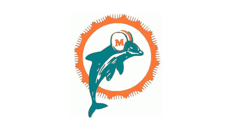
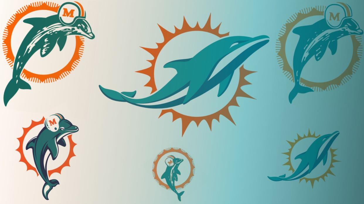
The first Miami Dolphins logo was a marked case of getting it right the first time, though unfortunately, history has failed to note the name of the designer responsible. The two key elements of the logo – the leaping dolphin and the circular sunburst – have remained consistent throughout the history of the team ever since. That’s 57 years, which isn’t bad going, all things considered.
The dolphin sits with its head in the centre of the sunburst, sporting his natty Miami Dolphins helmet and facing to the right. The two colours used in the logo are aqua and coral, the latter being a tribute to the incredible coral reefs of Biscayne Bay, a sub-tropical lagoon that extends from North Miami Beach to the upper Florida Keys, which these days is sadly under considerable threat due to man-made pollution and rising sea temperatures.
1974-1989: Moving the dolphin
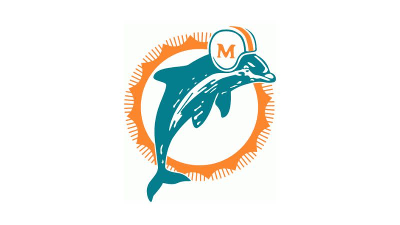
The eponymous dolphin of the Miami Dolphins had already moved a little around the logo throughout the 1960s. However in 1974 the team settled on a more central placement, with the dolphin’s head cutting across the sunburst in the top right. The colours were also lightened, with the original coral giving way to more of a pale orange. This version of the logo would stay in place for fifteen years.
1989-1996: Deeper aqua, more tail
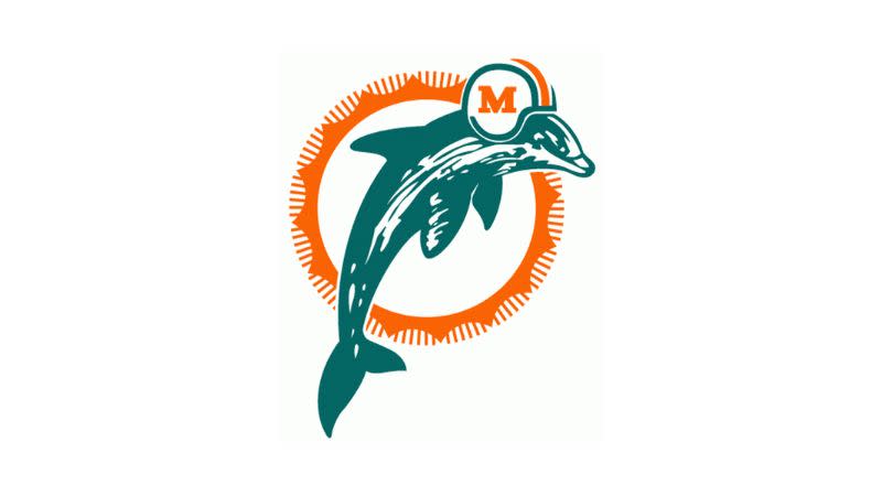
Another fairly minor but notable refresh of the Miami Dolphins logo took place at the end of the 1980s. The aqua colour of the dolphin itself was deepened to a more intense hue, while the orange of the sunburst was darkened once again, closer to the original coral colouring. The dolphin is slimmer than it was before, and while it’s not obvious at first glance, if you look at the bottom left, its tail has been significantly lengthened compared to previous versions.
1997-2012: Game face
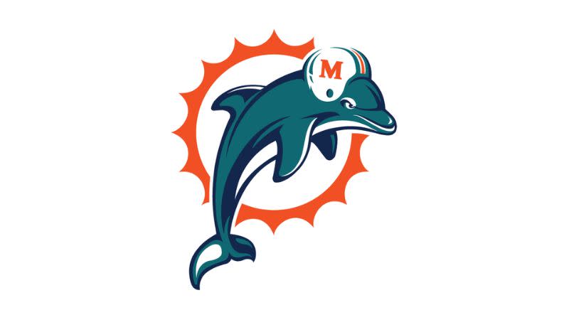
For the 1997 season, it was time for a change, and the Miami Dolphins announced the most significant redesign of the logo since its inception. While the basic concept of dolphin and sunstar remains in place, the dolphin itself has had a complete makeover. The busy, somewhat realistic detailing of previous versions has gone, and in its place is a much more distinctive, cartoonish design, with significantly improved legibility. Also in probably the most immediately noticeable change, the dolphin has a real game face on. Look at that mug. No one’s getting past him.
Colour-wise, the logo is darker than it has ever been, with a deep shade of orange for the sunstar and an intense aqua heavily accented with navy shadows for the dolphin. The design of the sunstar has also been simplified, with the hash marks around the edges being eliminated for a much cleaner look. Straightforward and effective, this really is an excellent redesign – and it stayed in place for fifteen years.
2013-2017: ‘The marine mammal’s trajectory’
Evidently the Dolphins’ 1997 exploits gave them a taste for more dramatic redesigns, because in 2013, the beloved logo got an even bigger overhaul. The dolphin lost its anthropomorphic elements like the helmet and the game face, but in an even more significant change, its position was completely changed.
Previously, the dolphin had always been pictured at the apex of a leap from the water, back arched and tail curved. The 2013 redesign wound the clock back just a few seconds, depicting the dolphin just at the moment before it breaks the surface of the water, at the very beginning of its leap. As the team said at the time, this is ‘the moment of most power in the marine mammal’s trajectory’, and it gives the logo a gorgeous feeling of flow and movement from left to right.
Complementing this free and breezy feel, the colours of the logo were also lightened considerably, following their dark apotheosis in the late 90s. The sunstar is a similar shade of pale orange to the 1974 version, and while the cross-hatching is still absent, its points now vary in length in a non-linear pattern. This makes it look less like a big orange cog of some kind, and a lot more like, well, the sun. The dolphin too has been lightened, and the navy accents reined in a bit for a more subtle effect.
The team said that this new logo was developed in a process that spanned a year and a half, and ‘incorporated input from ownership, members of the organization, former players and the franchise’s loyal fans.’ It’s safe to say that all that work paid off.
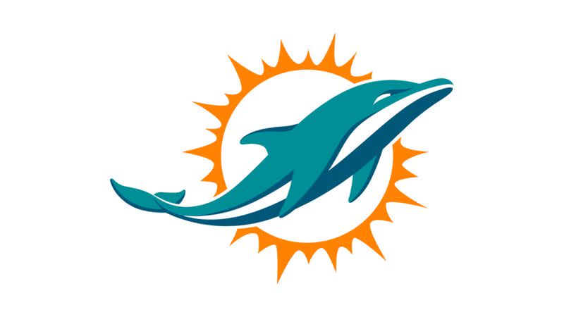
2018-present: Full circle
Finally, we reach the present day, with just one postscript to add to our story – a minor refresh of the Miami Dolphins logo in 2018. This retains all the design elements of the successful 2013 version, including the variable sun-points and the smooth, stylish dolphin positioned just at the point of breaking the water. However, it darkens the colours very slightly, returning the logo to the aqua and coral colour scheme that had first characterised it all the way back in 1966.
With this final change, the sun-washed colours of the 1960s blend with the modern design ethos of the 21st century, resulting in a logo that’s distinctive, dynamic, and dare we say it, timeless.
For more on sporting logos, read our NBA logo history, the Eagles logo history, the NFL logo history and the best World Cup logos.

