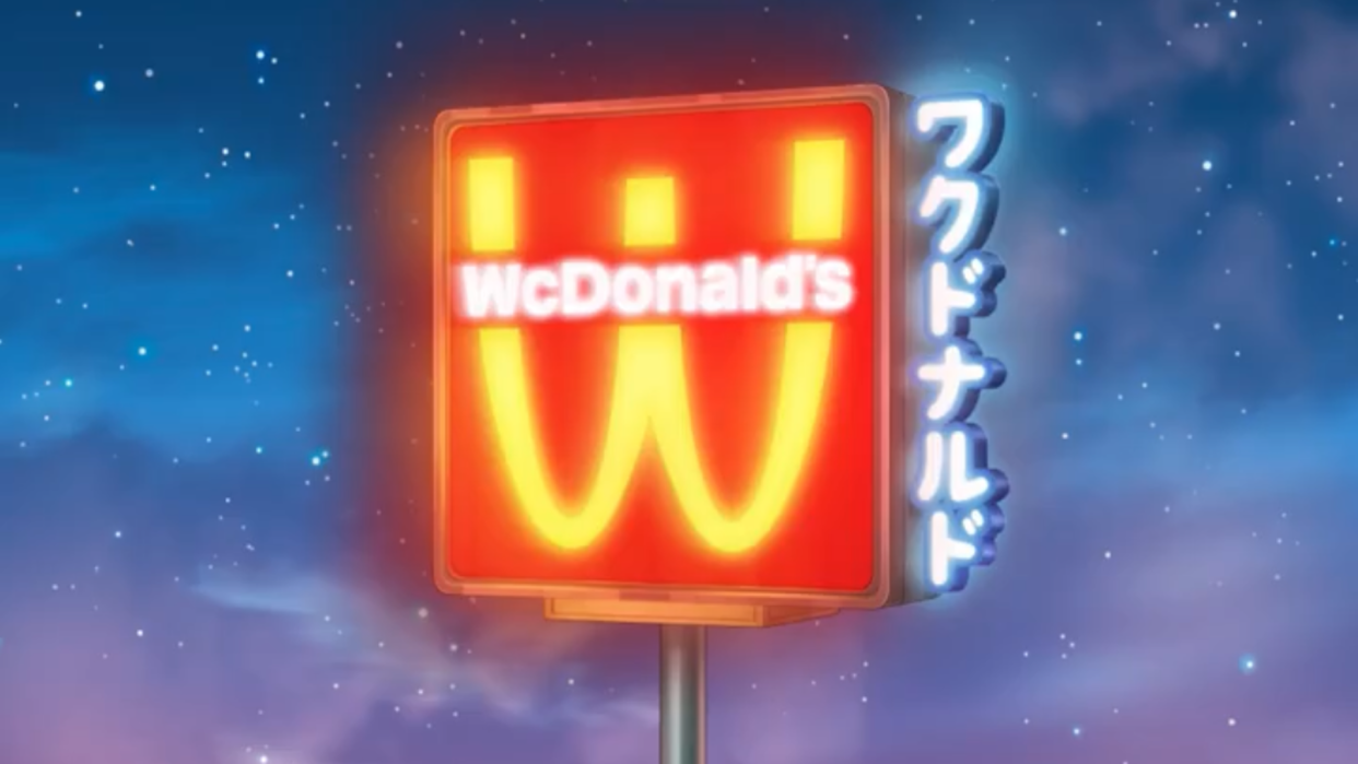
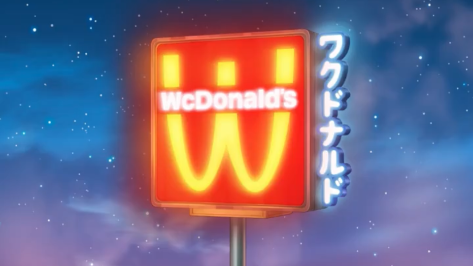
McDonald's turns its logo upside-down in ingenious new anime branding

McDonald's has been teasing a new campaign in which its iconic golden arches are turned upside-down, and we finally know what it's all about. And if you're an anime fan, the whole thing might be a little familiar.
'WcDonald's' first appeared as a fictional fast food restaurant in anime series Cat's Eye in 1981, and since then has appeared in dozens of anime shows. And it seems that, rather than take umbrage with the hilariously overt similarities to its own name and branding, McDonald's has finally decided to lean into it. (Looking for design inspiration? Check out the best logos of all time.)

On 26 February, McDonald's has announced that it will officially become WcDonald's, complete with upside-down arches. During the campaign, a bunch of limited edition items will be available, all with exclusive packaging. The Big Mac will even become, of course, the Big Wac.
What's more, McDonald's has teamed up with famed Japanese animation company Studio Pierrot to produce 4 mini episodes and short mangas, unlockable via QR codes on 'WcDonald's' products.
“Anime is a huge part of today’s culture, and we love that our fans have been inviting us into the conversation for years," McDonald's shared in a press release. The WcDonald’s universe is a reflection of what fans have created. It honors their vision and celebrates their creativity, while authentically bringing it to life in our restaurants for the first time ever.”
The brand's senior marketing director Guillaume Huin added, "This campaign is another example of the brand's commitment to "share the pen" with fans and celebrate the cultures we've been a part of organically. Seeing the anime world take over our 13,500 stores is something I cannot wait for."

