How we made Pie, the sexy new tax app
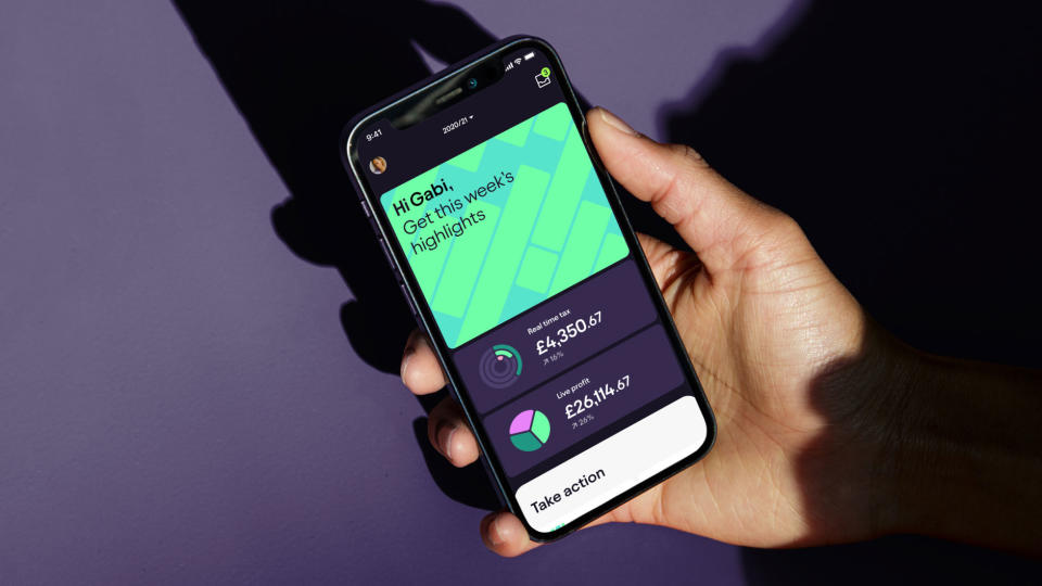
Taxes are boring and hard to understand, right? Well, not so much anymore, as new app Pie aims to tax easier for everyone, by giving knowledge usually reserved for people with financial advisors. The app is simple to use, personalised and rewarding, helping its users to take control of their taxes, driven by the promise, 'it's your money, claim it'.
That this new game-changing app is so user friendly and so visually appealing is testament to the team at Studio Output, who worked on the brand strategy, visual identity and the design of the product itself.
"Tech clients often focus on building their product or finding investment first, but Pie wanted to launch a finished brand and product experience from day one," says Studio Output's Mark Robbins. "This gave us a huge opportunity to create a really compelling and consistent narrative across the whole brand experience," adds his colleague Sam Hodges.
To find out more about the process behind the app, we spoke to Robbins and Hodges...
This article is part of our How we made series, where we go behind the scenes on creative projects.
How does the visual language reflect the service Pie offers?
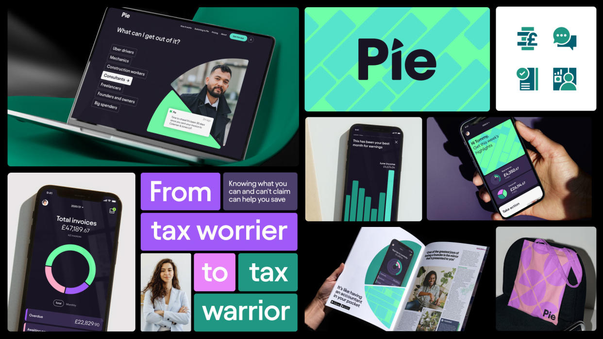
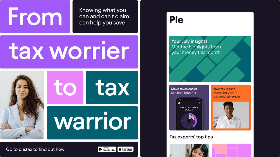
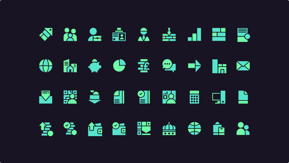
The identity is built from a simple idea: the divisible nature of a pie chart. As well as being the company’s name, it’s a key visual tool when understanding earnings, expenses and tax.
The Pie design language gave us a flexible system to guide all aspects of the brand and product: from assets and iconography, to layouts, components and the digital product language. It’s a functional, but expressive, system with a clear link back to the brand.
In designing the app, we found it needed to work hard to represent information in a simple and functional way. So Pie’s design language supports more memorable moments, right through to hardworking components in the core product experience.
What inspired you?
Being familiar with the pain of doing our accounts while freelancing, we remembered how difficult and unappealing it was each year! We wanted to make it easier and more engaging, and also liked the idea of democratising financial knowledge, which is usually only available for a select few.
With everyone now having to use the (UK) government’s new ‘Making Tax Digital’ scheme, we knew that was going to be hard for a lot of people too. We hoped we could make a tax app that people use proudly, that saves them money and helps them feel on top of their finances.
How did you work together on the project?
Output has two design disciplines in the studio: brand design and digital design. The teams work in tandem, testing one another’s solutions and often challenging each other to push the work further. It really helps to ensure what we’re creating is distinct and compelling, but also functional and engaging too.
What challenges did you come across?
Everything had to start with, and return to, the product. We were being challenged to create the brand and marketing but, first and foremost, had to support the design of a really usable and engaging app, differentiated from every other tax app on the market.
The brand concept needed to be simple enough to work throughout the product and scale right up into a campaign. The brand needed range, and it needed to enable really functional product design systems.
What's your favourite part of the finished piece?
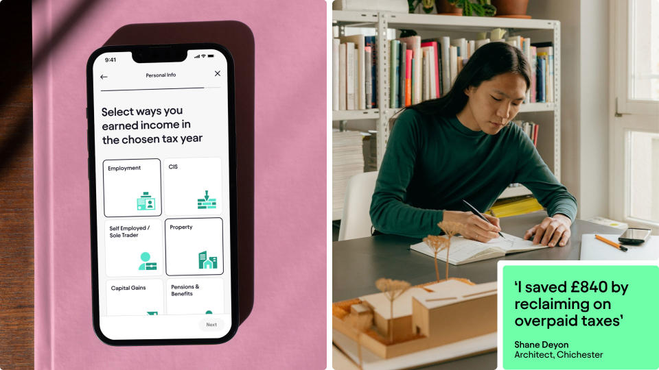
It was satisfying to create something compelling that had to work really hard. Brand systems aren’t always stress-tested enough, but this was an exacting process. We also managed to personalise tax through the website and product, by showing which features are most relevant to different people.

Which part of the process did you enjoy most?
The back and forth between two teams with different disciplines. The Pie design language is built from a simple concept led by the brand team, but it became a comprehensive system once we collaborated with the digital teams.
We challenged each other to push the system further, constantly iterating and improving it. Brand designers were encouraged to think really systematically and functionally: ‘How could your ideas improve the user experience?’ And the digital team were pushed to create something truly memorable and distinctive.
How accessible is the new identity?
Developing a more accessible experience raises the standard of usability across the sector, and everyone benefits from that. All the digital work we do is AA compliant (WCAG) as a minimum, so that’s a requirement for every brand we build. When working with development partners, we go beyond this to ensure that from an experience perspective we’re pushing further to support users.
How do you think this branding helps the app stand out?
To drive engagement and differentiation, we looked outside the sector to apps people use daily, like music streaming and sports tracking, to make an experience you want to keep coming back to. We didn’t want the lasting impression to feel like a cold accounting app, it should be something you really enjoy using.
Learn more on the Pie website. And read more about Studio Output via its website, and with our interview with partner/creative director Johanna Drewe.

