How we made LeShuttle's new identity
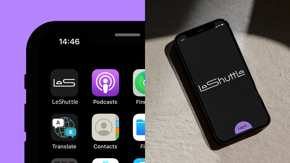
LeShuttle is the railway shuttle service that transports passengers and vehicles between France's Coquelles in Pas-de-Calais, and the UK's Cheriton in Kent. Earlier this year, it rebranded, getting a new name (it was previously Eurotunnel Le Shuttle) and a new identity, with a typographic wordmark at its centre.
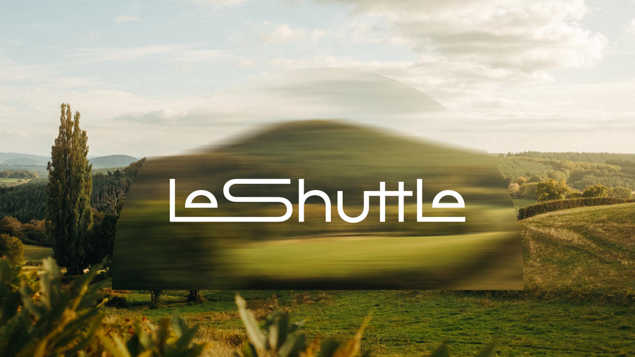
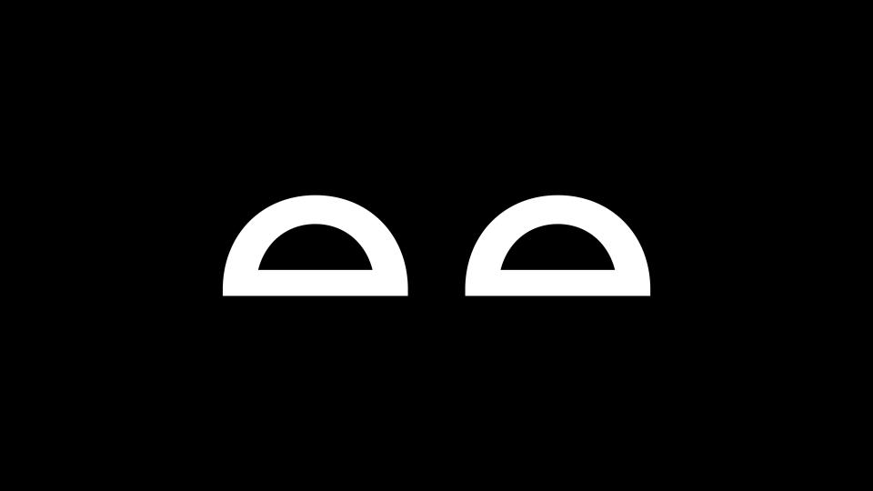
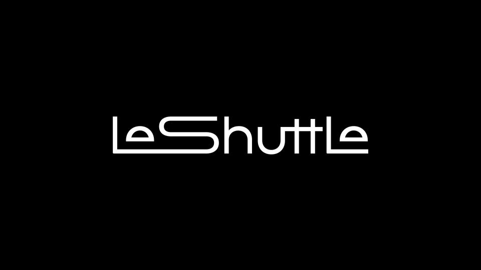
The new wordmark sees the 'L' and 'S' joined, with the letter 'e' shaped like a tunnel at either end of the word. In some applications, the 'S' is stretched out to convey a sensation of motion through said tunnel.
"LeShuttle’s new identity is based on the joy of travelling ‘your way’," Graham Sykes, executive creative director at Landor & Fitch tells me. "Since the Channel Tunnel opened in 1994, the experience of travel has changed, often for the worse," he explains. "We are promised freedom on our travels but are regularly denied it. Through the concept of ‘your way’, we wanted to demonstrate that with LeShuttle, this promise is kept, that people, businesses can travel their way, with whatever they want and whomever they want."
To find out more about the identity, which got people talking on its release, I spoke to Sykes and Landor & Fitch's senior designer Michelle Baron.
What was the creative process like?
Michelle Baron: Reversing low brand awareness of LeShuttle drove our creative process. We needed to create a brand identity that appealed to a new generation of travellers that didn’t know the difference between Eurostar and Eurotunnel LeShuttle, or even The Channel Tunnel. From this, we knew an identity that highlighted the benefits of travelling on LeShuttle was necessary, particularly speed, sustainability, and convenience.
With LeShuttle approaching its 30th anniversary next year, we also recognised the need for a big and bold new identity to usher in a new era for the brand – and travel.
Did you incorporate any existing elements into the new brand?
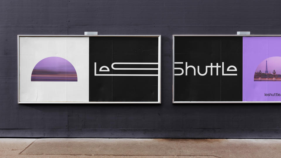
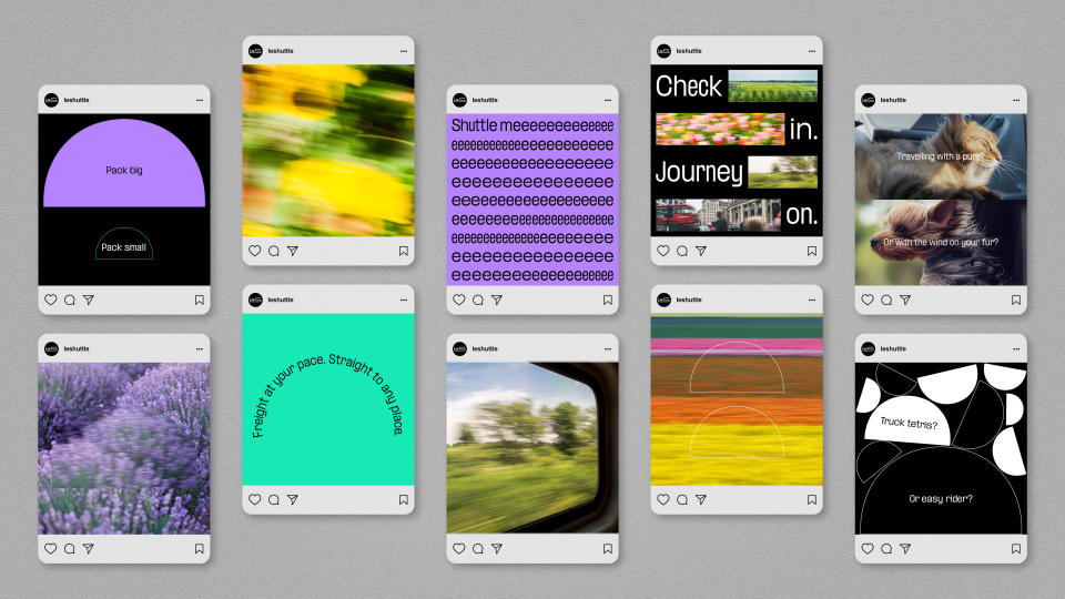
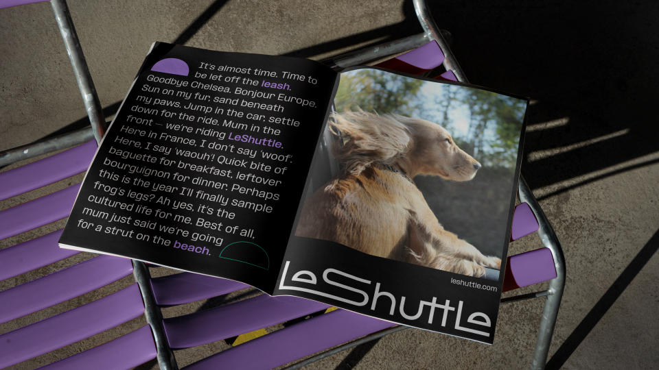
Graham Sykes: The rebrand was extensive as we reimagined LeShuttle as a premium service brand for today’s world. Colour is a clear example of this. We overhauled the traditional nationalistic sensibilities and infrastructure semiotics represented in the red, white, and blue. Instead, with black and white as a strong base we added Electric Lavender and Aqua colours to create a sense of innovation and optimism in both passenger and freight communications.
How did you work together on the project?
MB: Landor & Fitch was asked to take part in a competitive tender process for the project, having been involved in creating the previous identity for Eurotunnel Le Shuttle back in 1996. After a successful pitch, we worked with the LeShuttle team on an extensive redesign during a ten-month creative collaboration process. From start to finish, the rebranding project has been a close collaboration between client and agency that has created dynamic work.
What challenges did you come across?
GS: Developing a new wordmark which matched our ambition to create a futuristic and dynamic new identity was our biggest creative challenge. Several early designs just didn’t feel progressive enough or align with the story of travelling ‘your way’ from entry to exit, and beyond. The final mark you see today was an instant hit with the team and required us to change approach from the traditional travel industry method of pairing icon and wordmark, to create a typographic image that imagined the journey of the traveller.
How did you create a smooth transition between old and new?
MB: Throughout the creative process, we were respectful of the fact that LeShuttle is an enduring symbol of the UK and France’s longstanding relationship. While we underwent an extensive rebrand process, we wanted to retain the brand’s iconicity, and worked closely with the LeShuttle team to achieve it.
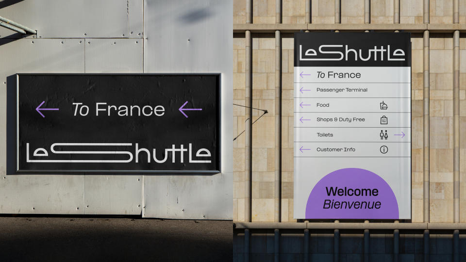
The tunnel itself remains a ‘feat of engineering’ and while we separated the service, we wanted to ensure the optimism, excitement and sense of wonder was restored. This led to the creation of one of our sacred assets in the form of the semi-circle tunnel shape.
We have also made clear that Eurotunnel is and remains the name of the infrastructure but that we are giving a clear role to the Eurotunnel and LeShuttle names respectively. When you buy a ticket and travel, you will interact with LeShuttle. LeShuttle runs on and through infrastructure and operations provided by Eurotunnel.
How did you ensure the brand identity resonates with the consumer?
GS: LeShuttle’s new brand identity was developed in direct response to consumer feedback and confusion about the LeShuttle brand. We wanted to introduce the brand to new generations, to tell the story of what makes it special and different, clearly distinguish it from Eurostar and to renew the brand with an identity that gives LeShuttle more personality, spirit, and optimism. These objectives underpinned our work throughout the creative process.
What is your favourite part of the finished work?
GS: I think everyone is proud of how widespread the rebrand is across channels, whether on trains or on TV, we can see the impact of our work across every single touchpoint.
Which part of the process did you enjoy most?
MB: Finding out more about LeShuttle itself. While we were aware of the service generally, it was rewarding to discover more about what an engineering masterpiece it is, as well as the logistical and environmental advantages it has over other modes of transport. It motivated the team even more to help LeShuttle regain its relevance to a new generation.
How do you feel the identity reflects LeShuttle?
GS: LeShuttle’s new identity reflects its position as the easiest, speediest, greenest way to cross the English Channel. The designs are completely unique to the LeShuttle experience, crafted to tell the story of travelling ‘your way’ from entry to exit, and beyond. For example, the conjoined 'L' and 'S' in the final mark captures the varied nature and free spirit of the many different types of LeShuttle journey, as well as the excitement which comes from entering and exiting the world’s longest underwater tunnel.
How accessible is the new identity?
GS: We believe accessibility sits at the heart of all modern design, so this was very much the starting point. We collaborated with PangramPangram on typography, creating a variable dynamic typeface. We spent considerable time working in colour profiling, across all digital touchpoints in collaboration with the LeShuttle team and their partners. Our process involved detailed iconography development to aid wayfinding and unite online and offline touchpoints.
How important is motion to the new identity?
MB: Motion was a crucial element in designing LeShuttle’s new brand identity. The updated colour palette, for instance, was strongly influenced by the rich diversity of colours seen on the European landscape when travelling by train. The tunnel itself was also woven into the new wordmark to represent the start and end of a journey, serving as a portal to memories of previous trips.
Art direction captured the moment traveller memories are formed – while on the move, from the window of the car, when surrounded by the atmosphere of a destination. We wanted to capture the almost dreamlike state of these memories, not represent travel and destinations in a faux, air brushed fashion.
How do you think this branding helps LeShuttle stand out?
We strongly believe LeShuttle’s new brand identity is a brave, beautiful piece of work that captures the story of travelling ‘your way’. Its futuristic and dynamic designs will help to attract new audiences, particularly younger ones looking for simpler, more sustainable services that care about giving people and businesses the freedom to travel their way.
The move to rename from ‘Eurotunnel Le Shuttle’ to ‘LeShuttle’ will also help the service stand out by avoiding confusion with Eurostar and giving more space to tell its own story of speed, care, and convenience.
To find out more visit LeShuttle or Landor & Fitch's website.

