M/M (Paris) Decipher Their World in Latest Tome
PARIS – Mathias Augustyniak and Michael Amzalag have spent the past three decades translating the world into a diversity of graphic alphabets for contemporary artists, musicians, fashion designers, brands and magazines.
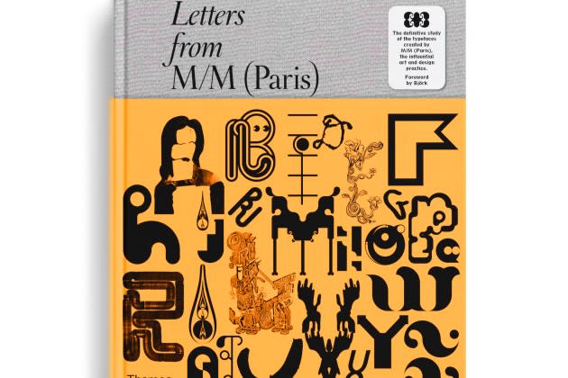
With their latest tome, the design duo behind M/M Paris has created the dictionary to help people read it.
More from WWD
Inside Louis Vuitton's '200 Trunks, 200 Visionaries' Exhibition Celebration
Louis Vuitton's 200 Trunks, 200 Visionaries: The Exhibition in NYC
“It’s quite strange, we’ve always created worlds we invite people into, but it’s the first time we’ve given people the keys to how they were built,” said Augustyniak during an interview.
“Letters from M/M (Paris)” is their third book from Thames & Hudson.
Augustyniak and Amzalag perceive their work as the construction of a visual language. While they describe their previous two-volume monography, “M to M of M/M (Paris),” as an “atlas” of their work, this publication explores the meaning — and creative process — behind it.
Out now in Europe and to be published Stateside in January, priced at $75, it catalogs 90 of their fonts in chronological order. A first section explores the history of each, a second features typographical plates and a third highlights the realizations for which they were used.
A separate collector edition of three individual books — allowing them to be observed in parallel, for example — is set for next spring in a limited print run of 300 copies.
Augustyniak and Amzalag had been thinking about the project for a number of years. “It’s something we have sensed for a long time, but we never had the time to realize it, and we hadn’t found the right person for the job, which is that of a historian or archeologist,” Amzalag explained.
That person came by way of Paul McNeil, a graphic designer, writer, educator and a specialist on the history of printing, author of “The Visual History of Type.”
“Exceeding the conventional limits of the field of graphic design, M/M’s studio practice might be more accurately described as a semiotic laboratory,” McNeil wrote in his introduction to the work. “Since the beginning of their partnership, Amzalag and Augustyniak have been ardent explorers of the universe of signs.”
The process of putting the book together has taken five years, the design duo said, and has been a little like therapy.
“He forced us to do a lot of inner work that was very intense, it was almost like psychoanalysis, with weekly sessions,” said Amzalag.
That involved confronting their memories of each of the typefaces and characters, and how and why they were created.
“It’s a relief in a way, because before, all of that information was in our heads. It allows us to exteriorize it all,” Augustyniak commented.
The typefaces featured include one-off artistic commissions and visual identities for luxury brands including Byredo, Loewe and Louis Vuitton. They range from Monotrash, created in 1992 for eDEN, a fanzine celebrating electronica, house music and the French rave scene of the time, to the geometric alphabet designed as the visual language for Galeries Lafayette Champs-Élysées when it opened in 2019, informing both its interior design and its communication materials.
Björk, who has collaborated with the design duo regularly over two decades, wrote the foreward.
“They are kinda like font-psychics, they tune into each project and become that, they are the method actors of letters and transform seamlessly from one award-worthy role to another reading clairvoyantly what shape of A, B and Cs are needed in each play,” she said.
