Lacoste Gave Its Iconic Crocodile Logo a Snappy Makeover for New Capsule Collection

For Lacoste’s spring 2018 85th anniversary show in Paris, the label transformed its name into a runway installation. Now Mathias Augustyniak and Michael Amzalag of graphic design duo M/M Paris have created a capsule collection with the label’s artistic director, Felipe Oliveira Baptista. It’s based on their graphic reinterpretation of the Lacoste logo.
They have ingeniously reconfigured the letters in “Lacoste” in the shape of its famous crocodile — backwards. So the E represents the jaws, and the L is the tail.
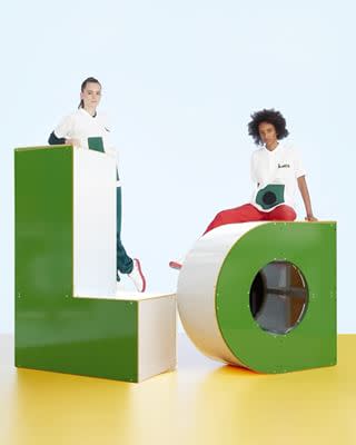
The collection features clothing and accessories with the new graphic geometry replacing the croc logo on polo shirts and sweaters, and there’s even a crocodile-shaped sports bag. A pair of white L.12.12 sneakers feature the new logo on the side and also come with a bright red sole. This is, for the record, unlikely to be confused with a Louboutin.
M/M Paris team has created the visual identities and graphic vocabularies for brands including Yohji Yamamoto and Balenciaga under Nicolas Ghesquière. They currently work with Jonathan Anderson on both Loewe and his eponymous JW Anderson brand and are also official graphic artists for Björk, said Felipe Oliveira Baptista of the duo, “I admire their work, which I find very personal and rich. I like the alchemy which takes place between their freedom of tone and the strictness of their creations.”
This collection is available on lacoste.com and from Nov. 15 in all Lacoste stores worldwide.
Related stories
This New Coffee Table Book Tells the Most Important Stories in the Sneaker Industry
These Limited-Edition Adidas Boost Shoes Are Releasing at Only Two Stores in the World Next Week
Get more from FootwearNews.com: Follow us on Twitter, Facebook, Instagram

