The ingenious LSO logo still has people talking
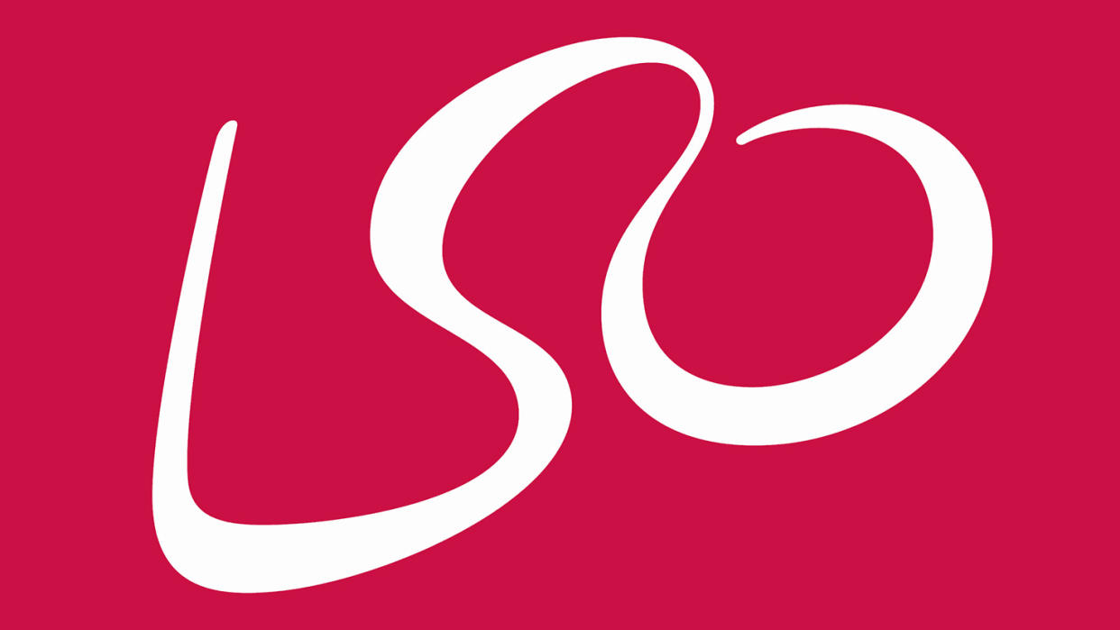
The London Symphony Orchestra logo has been around for a while. It was originally created by The Partners (now Design Bridge and Partners) and subsequent updates to the identity as a whole have won various awards, including Best of Show award at our very own awards, the Brand Impact Awards, in 2017 and in 2022.
The logo consists of 'LSO', written in cursive script. But look a little closer and you'll find another detail, the outline of a conductor – the baton is on the left if you're struggling to see it. And whether or not this logo secret is genius or plain difficult to see has got people talking on Reddit.
The London Symphony Orchestra’s logo is both a conductor and “LSO” in cursive text from r/DesignPorn
This is one of those logo Easter eggs that can be hard to spot, but once you see it, it seems obvious. The Reddit thread on the subject consists of people complaining they can't see the conductor, they can't see the 'LSO' or protesting that they don't really like it. As one Redditor put it, "I swear, this subreddit is never satisfied with anything." And to be honest, we're inclined to agree.
Adding a detail into a logo that isn't immediately obvious can be a smart move, because people feel special and excited when they do see it, and it becomes a talking point. After all, if there wasn't a conductor hiding in this logo I doubt anyone would be talking about it over a decade since its release.
If you want to get your own ideas for a new logo, see our free logo makers post to get you started. And if you've created some standout branding this year, and want to go up against the likes of Design Bridge and Partners, then why not enter the Brand Impact Awards?
Enter your best branding at the Brand Impact Awards

