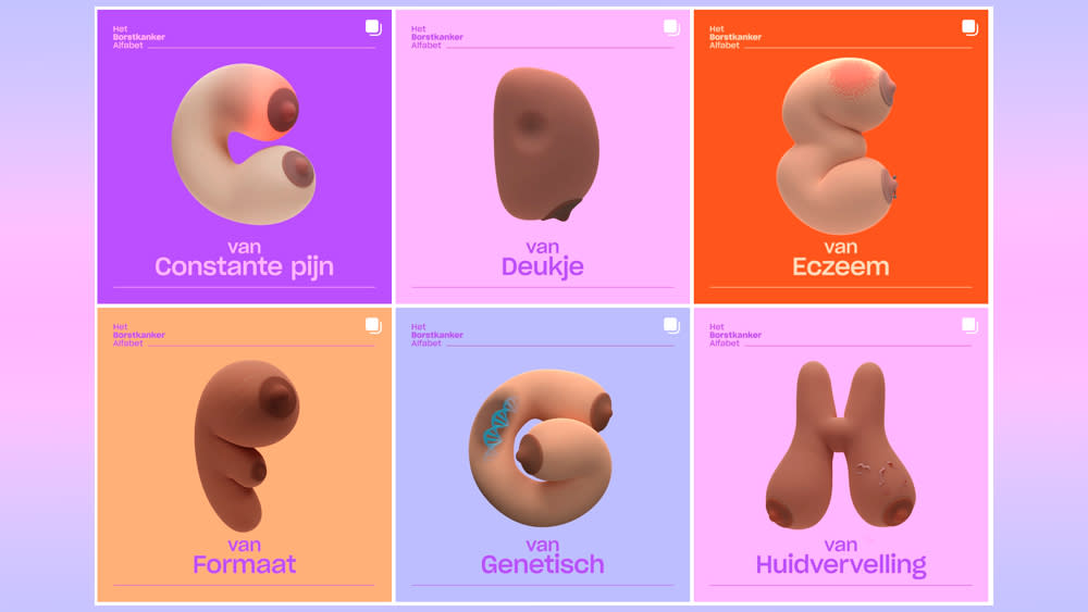
Ingenious campaign turns breasts into typography

We love innovative typography at Creative Bloq (see our guide to typography design), and this new campaign has taken a particularly novel approach to creating an alphabet. But it's one with an important message.
The Breast Cancer Alphabet comprises illustrations in the form of every letter from A to Z, and all of them represent potential symptoms of breast cancer. The letters, which have also been animated for digital use, aim to show that there is more to breast cancer awareness than checking for lumps alone)
The unique Breast Cancer Alphabet was conceived by Amsterdam-based agency TBWA\Neboko for the Breast Care Foundation and Alexander Monro Hospital to coincide with Breast Cancer Awareness month in the Netherlands. The unusual forms are visually arresting, especially in the animated typography, but they're also educational.
The power of the campaign is that by focusing on all 26 letters of the alphabet, it draws attention to lesser known symptoms of breast cancer. It raises awareness of what to look for and emphasises how important it is to get an early diagnosis. The campaign is designed to connect with younger people aged under 50, who account for 20 to 25 per cent of those diagnosed with breast cancer in the Netherlands each year.
Hannah Sterke and Nina Mispelblom Beijer, creatives at TBWA\Neboko, said: “During our research, we discovered how few people are familiar with the symptoms of breast cancer. We all know the infamous lump, but there are so many more symptoms and factors to pay attention to. Enough to create an entire alphabet apparently. The Breast Cancer Alphabet gives both men and women in the Netherlands an accessible tool to educate themselves."
The Breast Cancer Alphabet has been published in Dutch on Instagram and on a dedicated website. It will be shown in 600 medical practices across the Netherlands and the posters will be sent to universities and hospitals. Several publishers, brands and media outlets have offered free advertising space to promote the alphabet.
For another recent animated type project that we liked, see the Free Syria's Disappeared logo. And for more arresting type projects, see our pick of the best kinetic typography. For resources for your own projects, see our picks of the best free fonts and the best free webfonts.

