I'm really into this insurance rebrand
Insurance companies and beautiful branding don't necessarily always go hand in hand. But with its new brand strategy and visual identity for insurance company Marshmallow, Ragged Edge has shown us how it's done.
Marshmallow is a bit of an anomaly in the insurance world. It prides itself on covering people who have been typically tricky to price – like the one million (plus) people who have migrated to the UK from all over the world. Ragged Edge's new identity perfectly encapsulates this difference, and celebrates it.
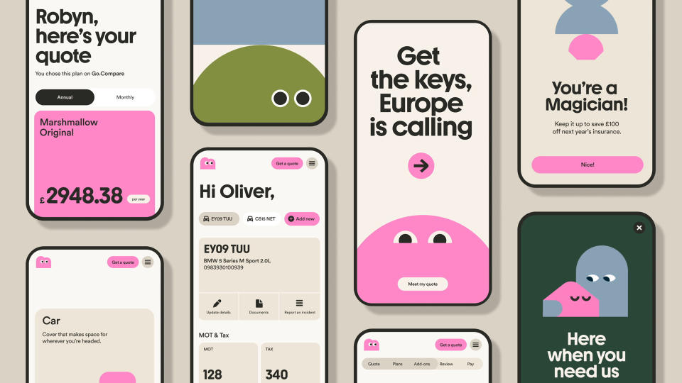
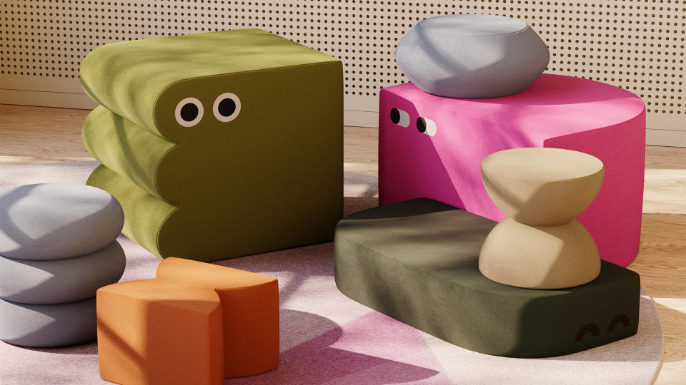
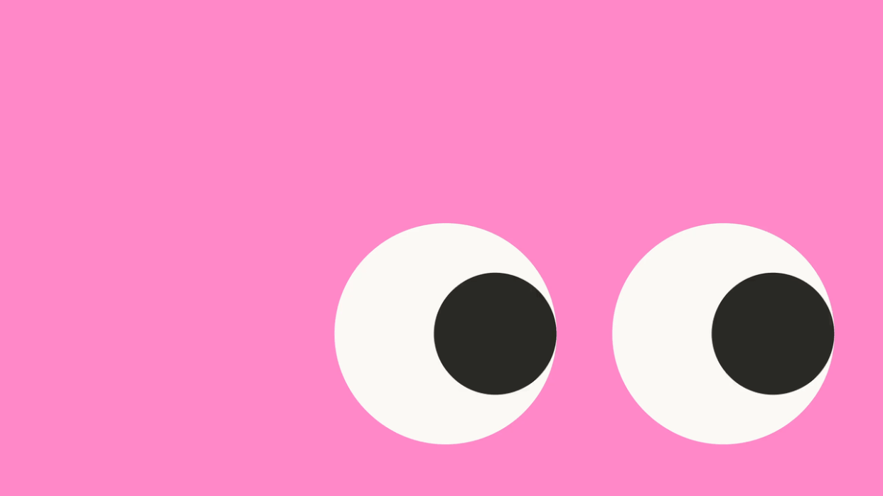
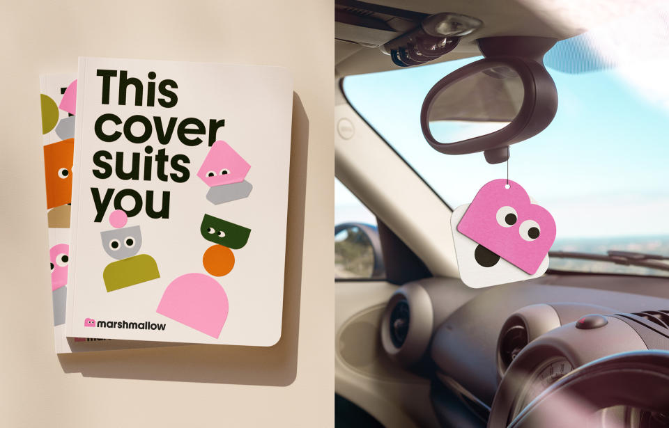
To bring Marshmallow to life, Ragged Edge created a modular system, with a library of characters, or Marshforms, that can be used in various fun compositions and are designed to be as different in shapes and size as the customers they represent. A logo mascot, in a cute marshmallowy form, brings warmth to the scheme, and it also makes the company stand out further among the competition.
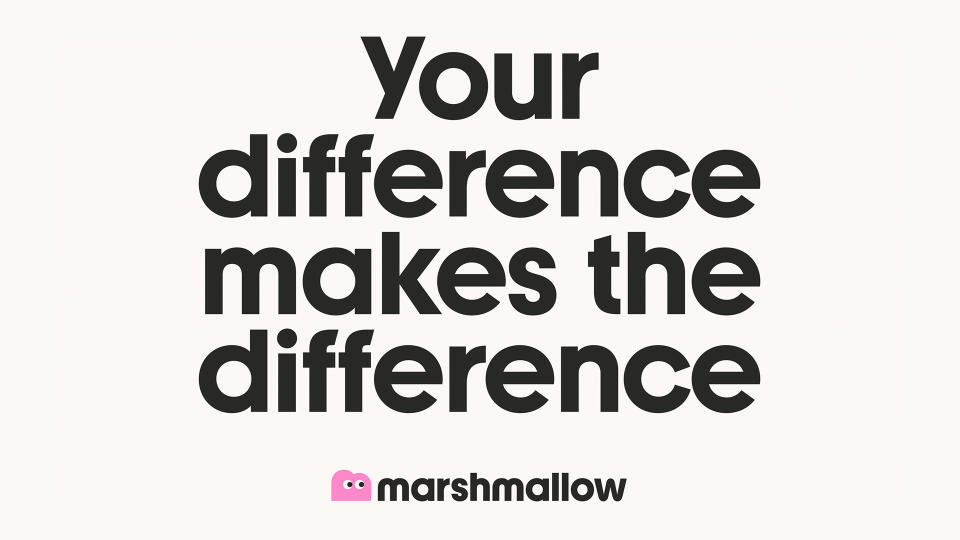
"We built the brand around 'valuing difference' – an idea that’s as distinctive as it is relevant to an audience who are consistently penalised for their diverse backgrounds, experiences, and circumstances," says Ragged Edge co-founder Max Ottignon. "The new identity celebrates infinite variation in everything from the design to an empathetic tone of voice."
Jessica Bong, design director, explains how the team came up with Marshforms. "Once we had the idea [of valuing difference], we needed to express that while building affinity with people. Creating an endless variety of Marshforms that each had character and personality felt like the perfect solution."
Marshmallow's new tone of voice is clear and inviting, the language has been made as inclusive as possible for people with varying levels of English proficiency, and the typeface is a customised version of Youth by AllCaps foundry. "We worked with the foundry to make some updates that helped increase readability, making it accessible for all," explains Ottignon.
There's so much to love about this scheme. The character designs manage to be representative of different types of people, without resorting to stereotypes, and the way the shapes are used across different touchpoints – from mobile animations to air freshener and furniture – shows the strength and flexibility of the identity.
I asked the Ragged Edge team what they are most proud of, and Bong said: "That’s a hard question! We love it all. But really, we’re proud to have built an identity that values the diverse backgrounds, experiences and circumstances of an audience that is generally penalised for those very things." And did we mention it looks good?
To find out more, visit Ragged Edge's website

