This new identity just made school branding cool
School branding isn't something that usually gets a lot of attention, most of it is fairly un-noteworthy and many of us don't wish to be reminded of our school uniforms or colours. But a new identity for The Archer School for Girls in Los Angeles by Design Bridge and Partners is changing all that, and already feels like an instant classic.
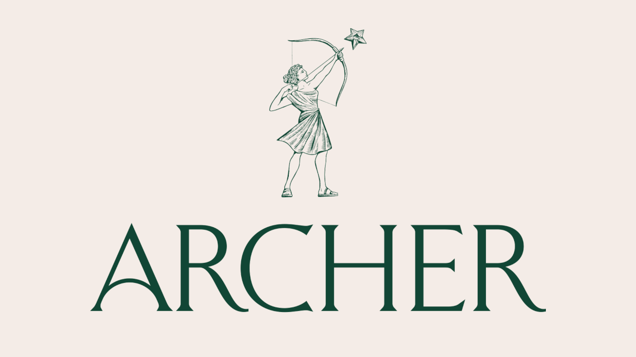
The school positions itself firmly between the traditional and the modern, but had in the past struggled to articulate its identity clearly. At the core of the new look is The Archer, inspired by Artemis, and symbolising the students, reaching for their goals. The school icon changes (see above), reflecting the breadth of possibility Archer offers its students. (If you're after branding tips, see our best branding books.)
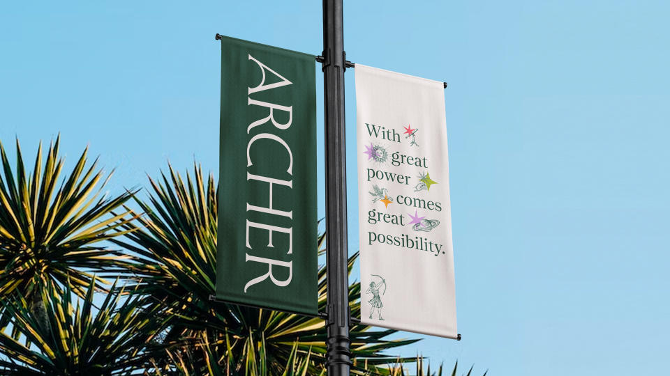

Elsewhere, there's a system of illustrated icons based on constellations, underpinned by vibrant stars. This is Emma Fontaine, senior designer at Design Bridge and Partners' favourite element of the identity: "This aspect of the identity holds immense potential for personalising the brand and allowing students to express themselves," she explains.
"Archer is a sanctuary for young girls to embrace their authentic selves as they transition into adulthood, something that is often rare in our education system. The ability to customise and express individuality through these elements in our brand resonates strongly with the Archer mission. It signifies that the students are not just attending the school; they are an integral part of it, and this identity reflects that beautifully."
The colour palette is muted with pops of colour, and is feminine without being fussy. "We wanted the colours to feel grounded and institutional, but also fresh and modern," explains creative director Marlee Bruning. "We looked to Ancient Greece and the story of Artemis for the foundational colours and we looked to Los Angeles for that hit of vibrant modernity."
Bruning describes the project as a "dream branding project", and adds that "the blend of modern and classical style, the vibrancy, the dynamism – all that has always existed inside Archer. This was the opportunity to translate it into something that people outside of Archer could experience, too."
Lily Thaler, strategist, also enjoyed the project, "From our early conversations with Archer, it was clear that they weren’t your typical private school, and it was inspiring to work with a client that was already so invested in building the experience of their brand in accordance with their values and beliefs."
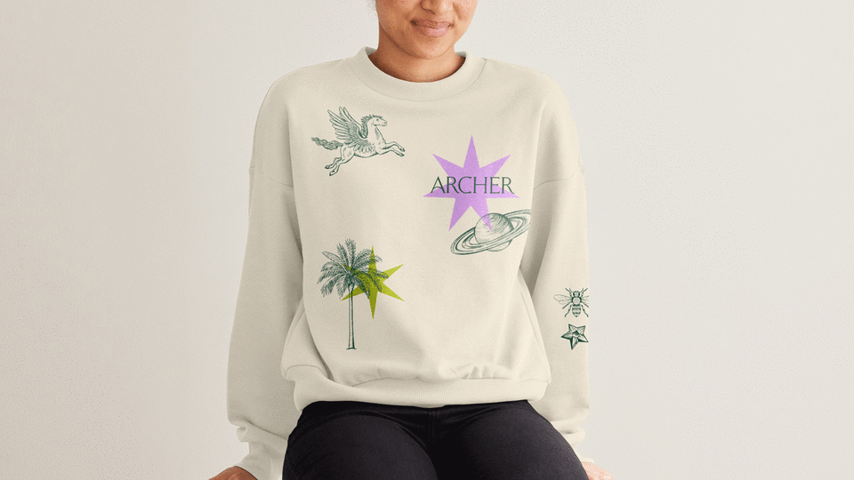
With this new identity, it really feels like The Archer School for Girls is leading the pack in terms of design in education. I'm particularly taken by the jumpers (see above), which are a far cry from the itchy bottle green sweatshirts I wore at school.
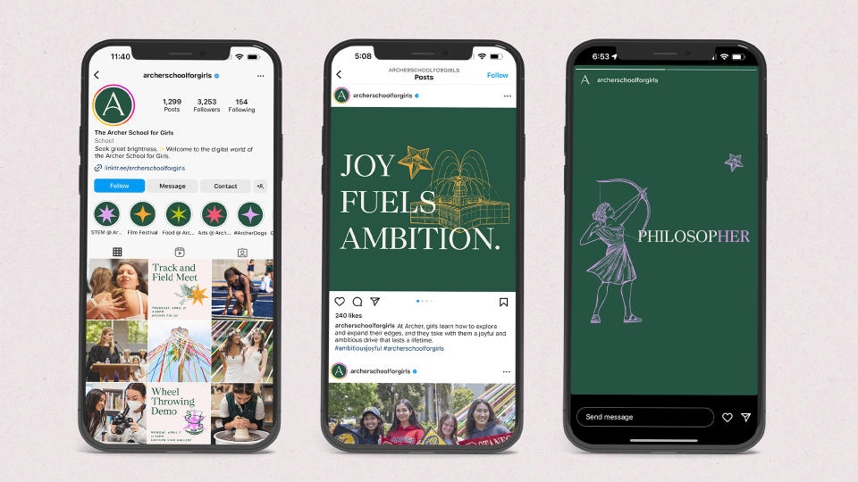
"Throughout this project we heard time and time again about the warmth and magic you feel when you walk the halls," says Alexa McPeak, senior strategist. "Once we were finally able to explore campus, have intimate sessions with groups of students, teachers and parents, we saw exactly that. I’m so proud that 'striking brilliance' we saw in the girls came through in the rebrand."
Design Bridge and Partners are just one of the agencies who won at our awards scheme this year, find out more with the Brand Impact Awards 2023 winners post.

