"I'd never touch Apple or Nike" – Fabian Arbor on his famous logo redesigns
One of the most common self-initiated projects we see from graphic designers is the famous logo redesign. Designers both seasoned and fledgling love to tackle an existing design, but the results can be mixed – after all, the best logos of all time are iconic for a reason. But one designer who never seems to miss is Fabian Arbor.
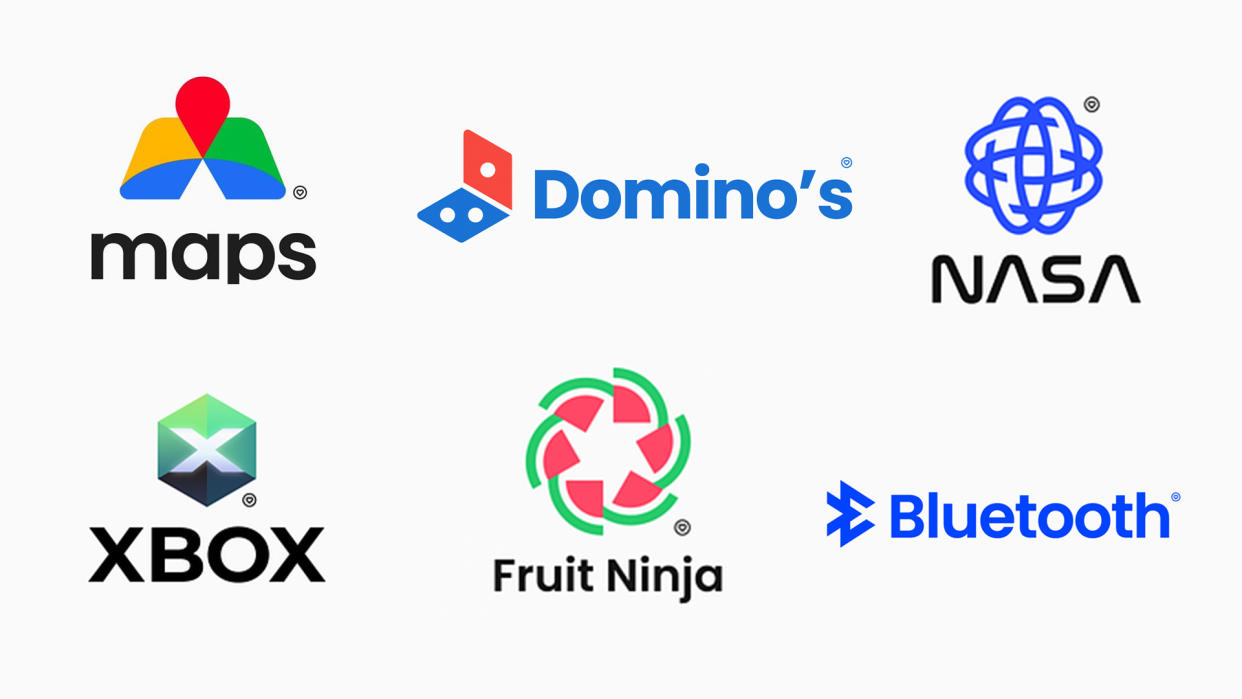
From his brilliant Dominoes rebrand to a much-need refresh of the Google Workspace icons (seriously, Google, take note), we've encountered Fabian Arbor's big brand redesigns several times over the last few years. We talked to the designer about how he approaches redesigning symbols that are often already beloved – and why there are some logos he'll never attempt to redesign.
Which is your favourite of your logo redesigns so far?
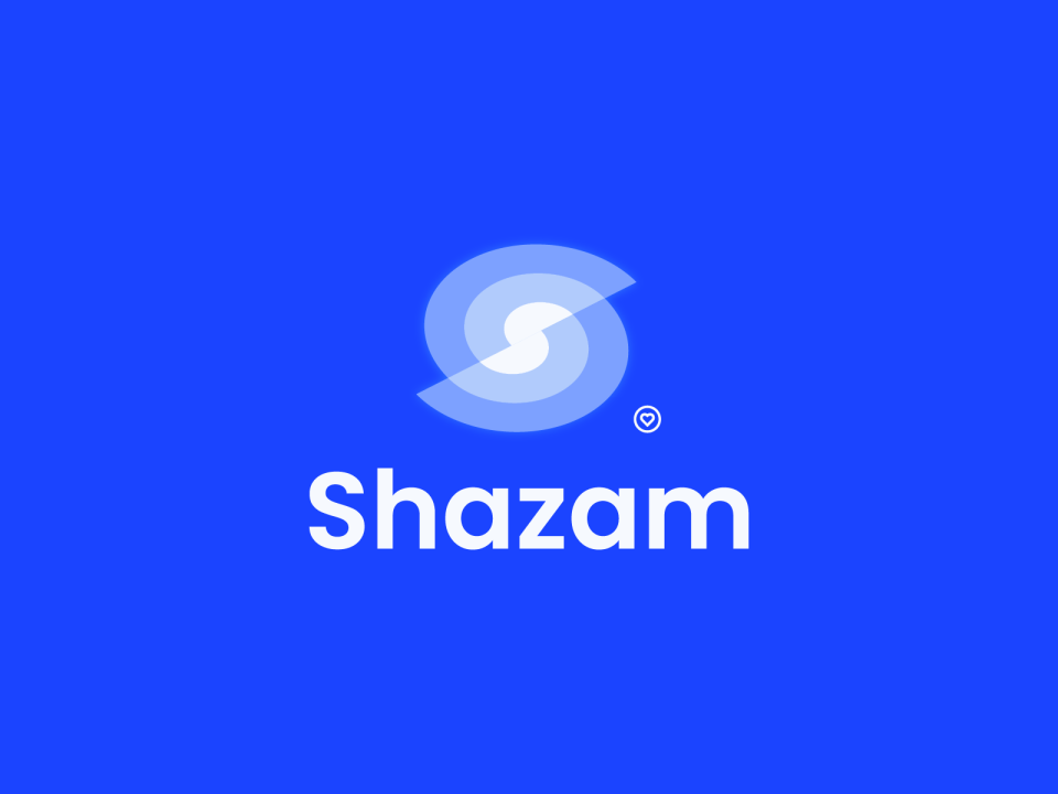
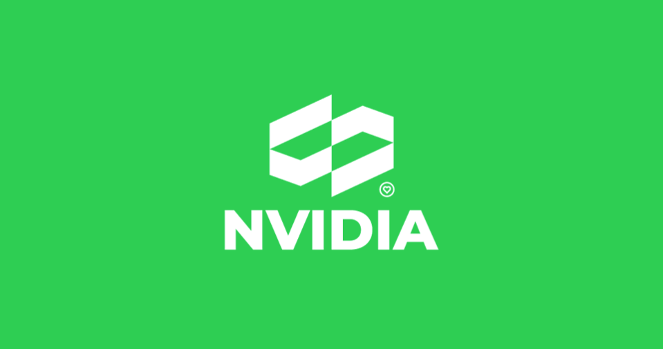
It's between Nvidia (2023) and Shazam (2022). I honestly believe that both of them have the potential to *almost* work as an official logo, which I think is very rare with my redesign concepts. More famous versions such as Domino's or Google Maps are, in my opinion, more fun ideas rather than actual good identities.
How do you approach the process of creating a new design?
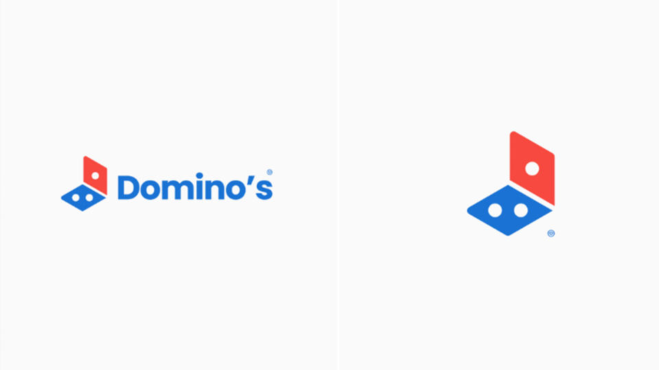
When it comes to these concept redesigns, it's 100% play. I try not to put pressure on myself to actually sit down and force out a design. Usually, they're born out of iterations of other, real, logos. I could stumble across that two squares aligned in a certain way kind of looks like a pizza box and thus the Domino's redesign was born.
Which redesign have you found the most challenging and why?
I'd have to say the TikTok redesign. I've explored the concept of their logo so many times, but it never really seems to click. There's something about that music note, it seems easy in my mind to improve it but it never is. I actually completed and made a version of it not that long ago, but I'm not really satisfied with it.
How much does the existing design influence your own version?
A lot. But many of the redesigns I personally like the most (Greenpeace, French Open, Fruit Ninja, Shazam) look nothing like their current versions. However, I think a lot of people react more when it looks like the current design, just that something's a bit off with it. Small but significant changes.
Is there any existing logo or brand identity you think is already perfect and can’t be bettered?
I'd never for the life of me attempt to redesign a logo like Nike or Apple. Literally anything other than the current versions would just look wrongful and taboo.

