The Hidden Message You're Likely Missing In The Hershey's Kisses Logo
A logo can hold a lot of meaning — whether in the color palette, the font choice, or the graphical elements. When carefully crafted, many logos have the power to "wink" at consumers via hidden-in-plain-sight imagery. For instance, the logo of Hershey's Kisses, one of America's most beloved chocolate products, holds a subtle yet intriguing secret. Beyond its apparent simplicity, a closer examination (and a slight head tilt) reveals a cleverly embedded icon.
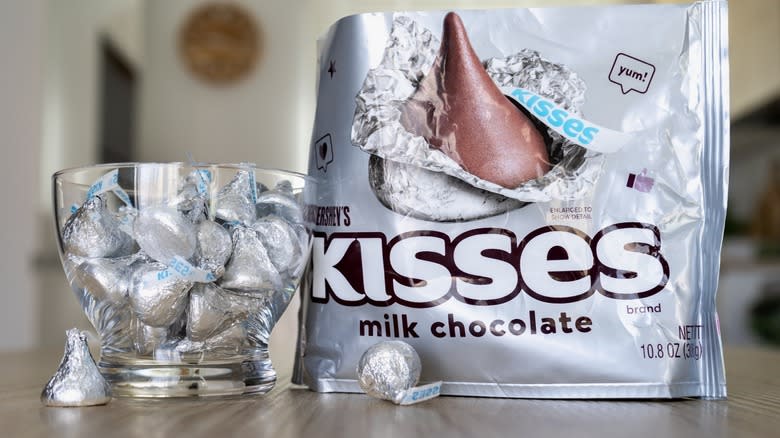
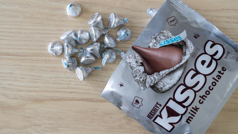
At first glance, the candy brand's logo sports a minimalistic look. The letters forming the word "KISSES" are capitalized and elegantly spaced, maintaining a clean aesthetic. However, the negative space, the blank area between and around the letters, conceals a secret for those with a keen eye. Upon scrutinizing the gap between the "K" and the "I," an unmistakable silhouette emerges — the distinct outline of a single Hershey's Kiss.
This unexpected design is understated yet deliberate, offering a delightful surprise for observant consumers. The Hershey's Kiss is an iconic confectionery characterized by its teardrop shape, signature foil wrapping, and paper "plume" that makes opening the foil easier. The witty incorporation of this symbol artfully represents the legendary bite-sized chocolate.
Read more: 12 Popular Ice Cream Brands, Ranked Worst To Best
There's A Kiss In The Kisses Logo
The creative genius of the hidden image in the Hershey's Kisses logo lies in its unpretentiousness and seamless integration. Even if just for a brief moment, the Easter egg creates a sense of discovery, fun, and connection with the brand. Once it has been discerned, the 90-degree-rotated Kiss can't be unseen; It transforms the marketing emblem into a cunning piece of art that invites consumers to engage with the product on an even deeper level. Think of the logos for renowned brands such as Starbucks, McDonald's, and Baskin-Robbins — all of which were strategically designed to be eventually figured out.
Beyond its aesthetic appeal, the charming and thoughtful Hershey's Kisses logo contributes to the brand's storytelling and gives weight to its identity. It encapsulates the essence of the product — a sweet surprise waiting to be unwrapped. This semi-camouflaged detail aligns with the joy and anticipation that come with indulging in a Hershey's Kiss and serves as a metaphor for the memorable experience that awaits consumers when they enjoy the chocolate treat.
Read the original article on Mashed.

