The Hidden Meaning Behind the "Don't Worry Darling" Set Design
Don’t Worry Darling has a lot going for it—from its high-profile cast to the dreamy midcentury filming locations. But perhaps the best part of the psychological thriller is the set design, which heavily drives the plot. The bright color palette and custom-made furniture give the illusion of a pristine 1950s life, but hidden elements prove otherwise. To dissect every detail, we tapped production designer Katie Byron for an inside look at how the film's sets came to life.
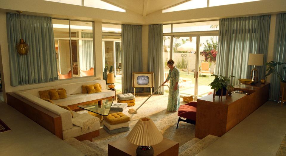
For starters, the movie isn’t a true period piece—meaning there was flexibility in the design. At the beginning of production, it was decided that unique items from the ‘60s and ‘70s would be hidden among the true 1950s decor. The blend invokes the subtle feeling that something’s off. “The world build should be accurate enough to fool the viewer into thinking that it’s a true 1950s depiction, but in actuality, Frank’s world build of Victory would be made according to his own rules,” Byron says. “We didn’t necessarily see him as an absolutist in terms of period accuracy but someone who really felt confident that his taste was superior to others.”
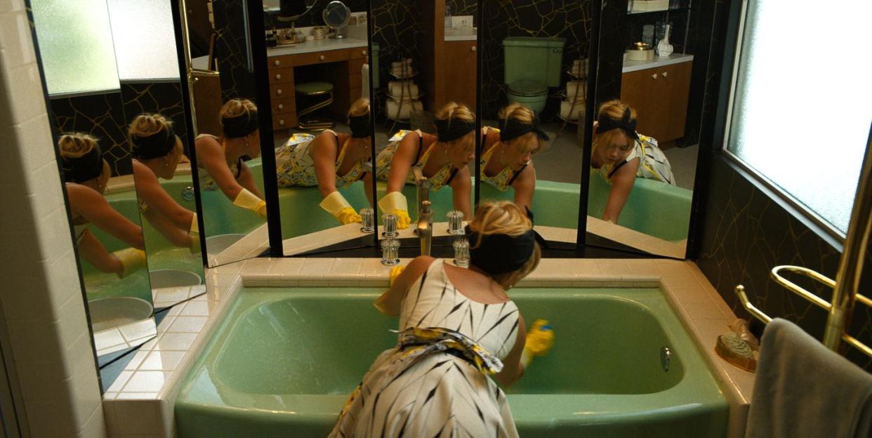
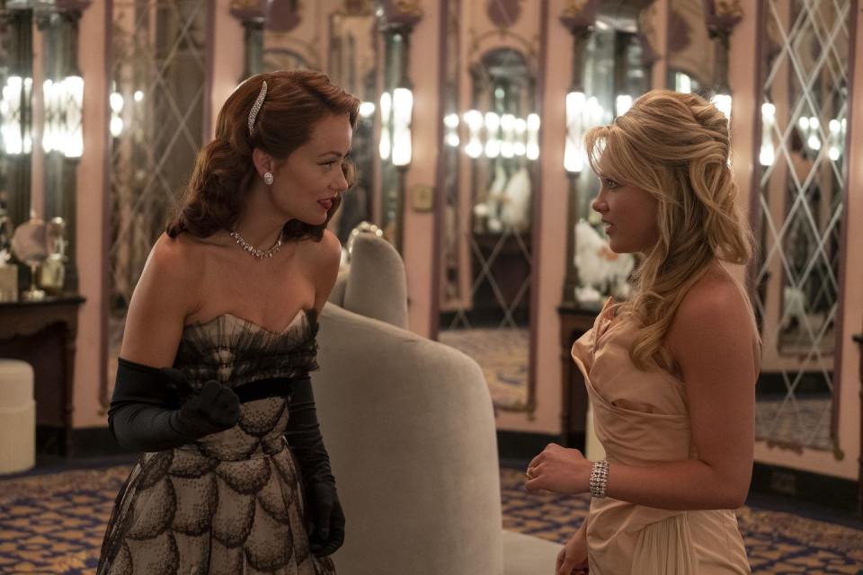
Throughout the film, the seemingly dazzling yet disorienting string of events Alice goes through is heightened by a repetition of mirrors and the use of glass—a decision inspired by how the video game industry operates. “My boyfriend works in video games and one thing that we’ve come across is that when there’s a new design technology available, it is often overused,” Byron says. When highlights were made possible in game design, they were used everywhere to create shiny mountainsides and wet city streets. So Byron imagined mirrors, colored glass, and refracted light as features that would be spectacular if achieved in games and emphasized them. The opulent details are also often set up in a prismatic way to enhance an uneasy feeling. “Alice Through the Looking Glass is a concept that I didn’t immediately start with, but it’s 100 percent there,” Byron adds.
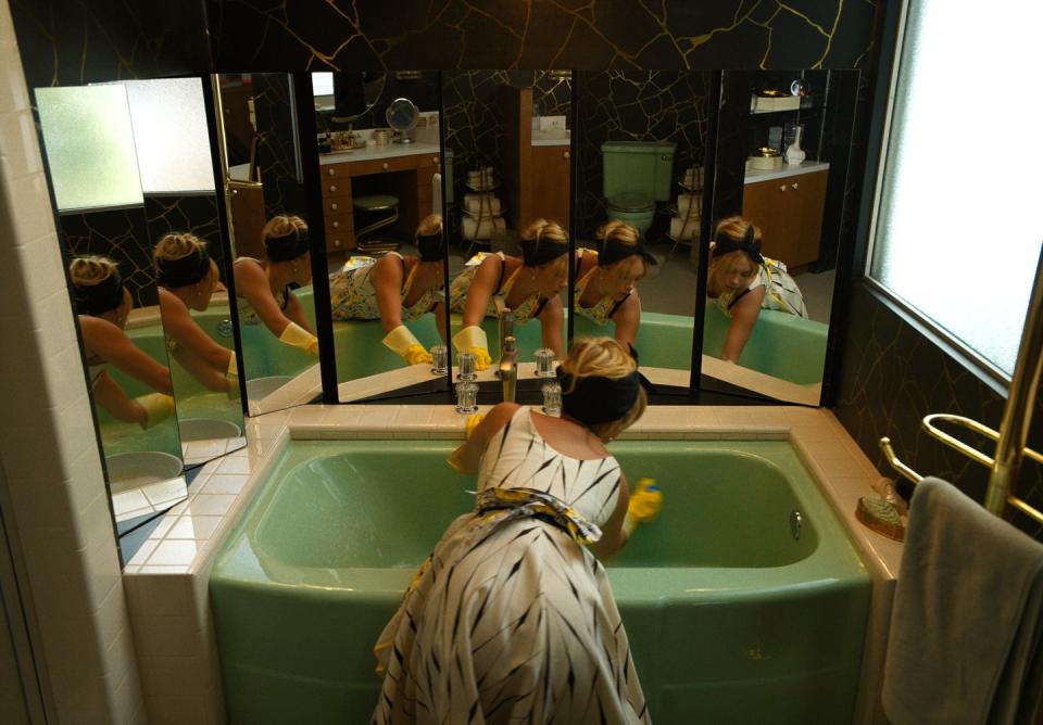
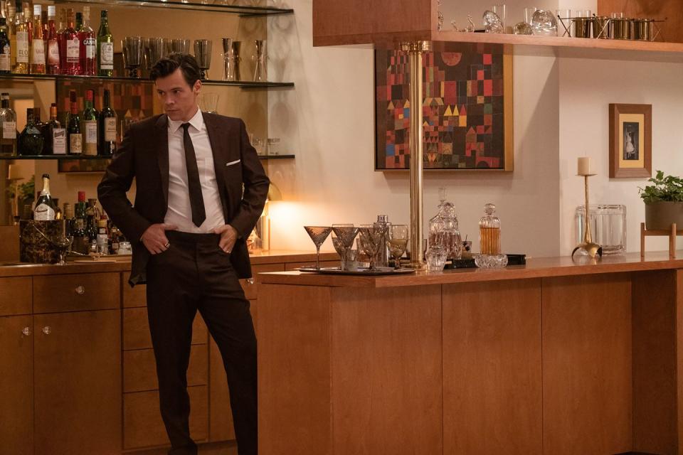
The teal color that’s repeated throughout the film was inspired by Albert Frey, one of the main architects who shaped the design of Palm Springs and who Byron hopes “gets more mainstream love out of all of this.” You can see the color in everything from Jack and Alice's curtains to their bathtub. It's even on a spiral seat in the bathroom during Alice and Bunny's verbal fight scene (and it resembles the hill that leads to the Volcano House, aka the exit out of Victory). Other iconic influences for the decor and furniture include architects Richard Neutra, who built the Kaufmann House, and Alexander Girard.
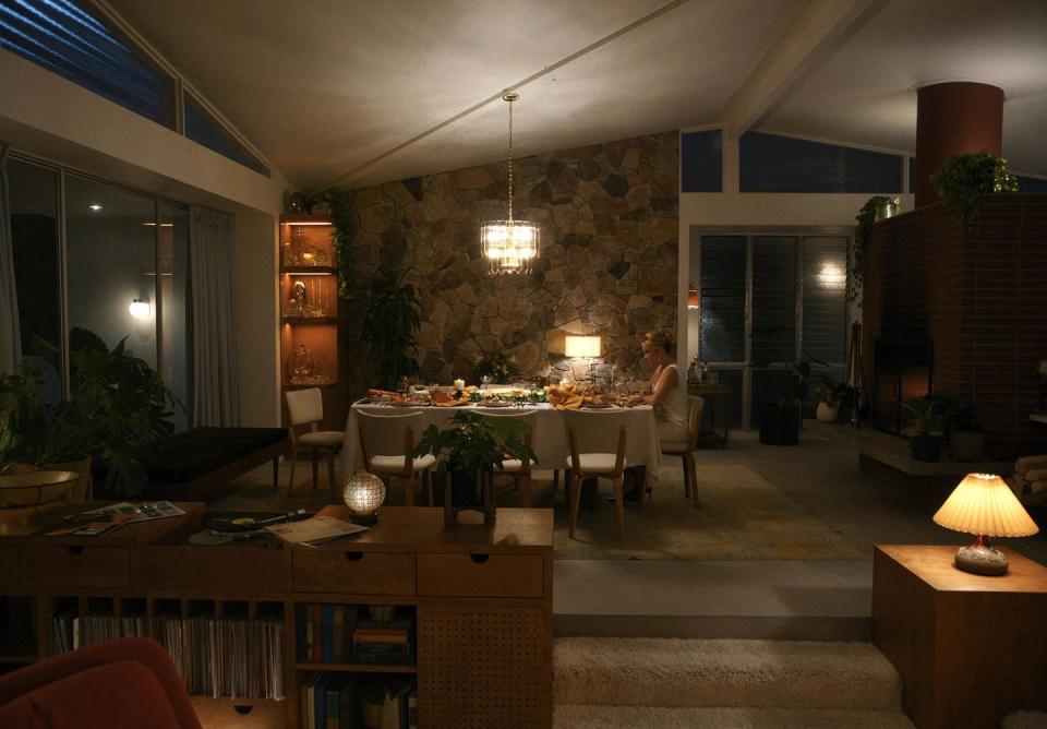
While the film’s pastel color palette feels more attached to 1950s advertisements than real life, it also includes plenty of dark and iridescent elements, like smoked glass mirrors and rich black-and-gold wallpaper with a cracked pattern, which hint at its darker reality. “Victory is a utopia, but it isn’t the quaint idyllic conservative quiet version," Byron says. “It’s a utopia built on debauchery, cocktails, and hedonism.”
You love set design. So do we. Let’s obsess over it together.
Follow House Beautiful on Instagram.
You Might Also Like

