HGTV Home by Sherwin-Williams Released the 2024 Colors of the Year
The bright-yet-earthy shades will inspire you to infuse more color into your home.
HGTV Home® by Sherwin-Williams
The results are in: Bold color is the new minimalism. And the new 2024 Color Collection of the Year from HGTV Home by Sherwin-Williams is here to prove it. While last year's collection centered around nostalgia and vintage comfort in more muted tones, this year's collection is brighter and bolder—yet still feels approachable for any home.
"The Renewed Comfort Color Collection is restful and restorative with an expressive touch to showcase unique personal style—bringing a sense of comfort into the home with a new, refreshed outlook," Ashley Banbury, HGTV Home® by Sherwin-Williams color marketing manager, says. "The shades in our 2024 Color Collection of the Year feel familiar and dependable, yet versatile, with the ability to be reshuffled to create a custom look for your home."
The 2024 collection consists of 10 shades that were curated as a twist on traditional color combinations. (Think nature-inspired colors with the saturation turned up a bit.) The colors include warm, earthy oranges, yellows, blues, greens, and more that can all be mixed and matched. Below, see our five favorites from the collection, including the 2024 Color of the Year.
Related: How to Incorporate More Color Into Your Home and Life
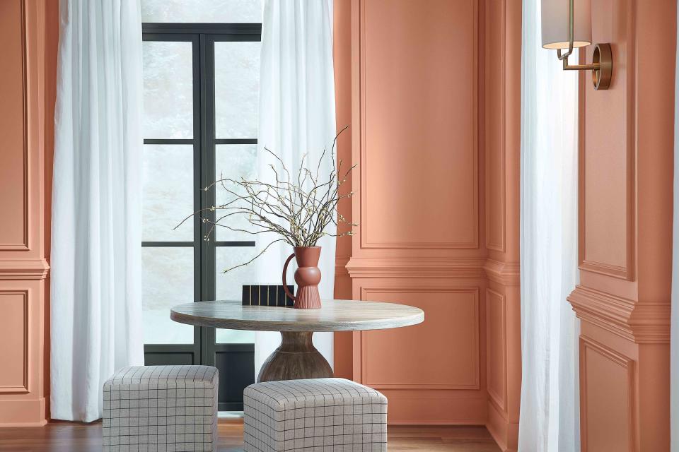
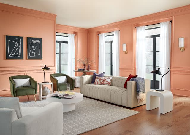
2024 Color of The Year: Persimmon
HGTV Home by Sherwin Williams
HGTV Home by Sherwin-Williams' pick for 2024 Color of the Year is a refreshing and energetic orange shade. Named after the persimmon fruit, the shade is the boldest color in the collection, but the earthy terra-cotta-like tone makes it easy to pair with other natural tones. "Persimmon balances the energy of tangerine with grounded neutral undertones, making it perfect for spaces like living rooms and kitchens as it promotes positive relationships and conversation," Banbury says. "The beautiful shade helps rejuvenate a space while bringing unique design visions to life."
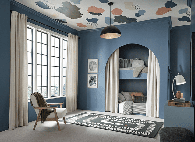
Waterloo
HGTV Home by Sherwin Williams
Another refreshing tone, this deep-yet-soft blue is like a rejuvenating dip in the ocean. As a cool tone, Waterloo can pair well with other cool neutrals, like grays and blacks, but it can also be balanced with other warm shades from the collection, like Persimmon.
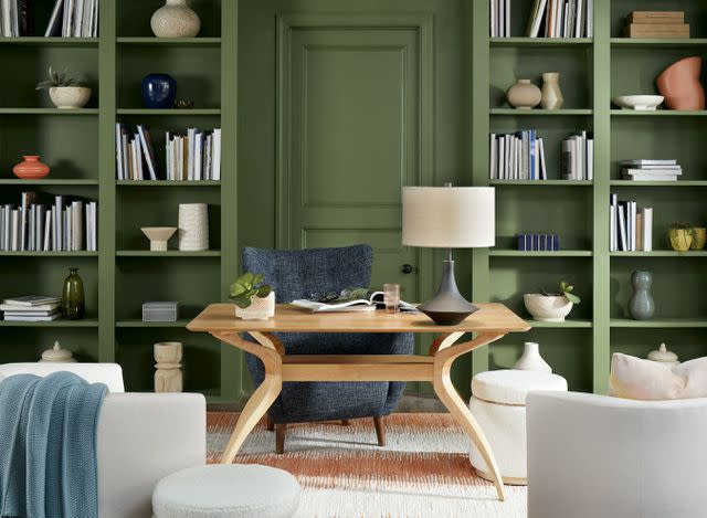
Oakmoss
HGTV Home by Sherwin Williams
Our love for green shades around the home will never go away—and Oakmoss could be used in so many different ways. Whether you're painting the kitchen cabinets for a trendy green kitchen, or painting your home office to breathe some nature into the space, this deep moss green is a great pick.
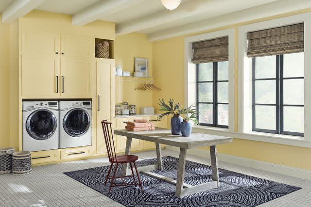
Friendly Yellow
HGTV Home by Sherwin Williams
As the name implies, this soft yellow shade is warm and inviting. While it may seem intimidating to yellow-skeptics out there, this color can actually be quite versatile. Pair it with rustic furnishings and accents for a charming cottagecore effect, use it to give a small bathroom a big energy lift, or combine it with retro appliances in the kitchen for a vintage look.
Dark Auburn

HGTV Home by Sherwin Williams
On the moodier side of the collection is this deep Dark Auburn. While it may seem like an unexpected choice among all the softer and lighter shades included, we think it's a great example of the ways darker and brighter tones can be paired together to balance and complement each other.
Related: How to Choose a Color Palette for Your Home
For more Real Simple news, make sure to sign up for our newsletter!
Read the original article on Real Simple.

