Here's Why Costco's Kirkland Brand Butter Has That Colorful Text On The Box
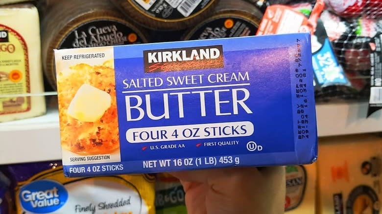
Yellow, magenta, cyan, black, spot blue. If you open up your Kirkland sweet cream butter package, you might see those words printed (in their corresponding color) on the inside flap. (No word yet on whether the grass-fed Costco butter ever says the same thing.) But why? Is it a coded message? Artistic statement? Cows' names? Sadly, the actual answer is pretty boring. It's a list of dyes used in printing.
Printers often use the CMYK model to add color to packaging. (Technically, they're subtracting color from packaging, but that's a story for another day.) Most colors can be approximated by mixing cyan, magenta, yellow, and black (aka key). And when a color is too difficult to achieve with CMYK printing, they can use a method called spot printing to get the right match.
So the list of dyes makes sense. Yellow, magenta, cyan, and black are all used to print food packaging. The spot blue is probably a custom-blended blue ink, which makes perfect sense when you realize Kirkland's signature color is, well, blue. But why would Kirkland need to print a list of its dyes in the first place? To understand that, you have to dive deeper into the world of food packaging.
Read more: All The Benefits Of A Costco Membership
The Possible Explanation Behind Kirkland Butter's Mysterious List Of Colors

So why does Kirkland print a colored list of five dyes on its butter packaging? It's hard to say for sure without barging into its print shop. But it is most likely a way for printers to double-check they are doing their job right. Confused? Keep reading.
Have you ever seen a bunch of colored circles on your packet of potato chips? Those are called process control patches. Printers use those as an easy quality control check: They can glance at them to ensure each color is printed clearly and correctly. But if a printer was colorblind, they might have trouble distinguishing cyan, magenta, yellow, black, and that custom Kirkland blue. Printing the word "cyan" along with a patch of cyan ink would mean they could double-check their work.
It might also be an easy way for a printer to check they're using the correct printing plate with the correct ink. You wouldn't want to print the cyan plate with magenta ink. The printed "cyan" may be a quick way for the printer to be sure they are, indeed, using the cyan plate.
What Packaging Quirks Tell You About Your Food
Has this butter mystery got you wondering about other secret messages your food is trying to send you? There are a few more you can look out for. One looks like a target or crosshairs. Those are called register marks, and they "help make sure the colors are aligned," according to General Mills spokesperson Bridget Christensen (via Slate).
A U inside an O is the Orthodox Union's stamp of approval, which is a sign that the food is kosher-certified. When shopping for kosher meat you should look for OU-M or OU-Glatt. A green logo with Arabic script and English letters spelling out "halal" means -- you guessed it -- the food is halal as certified by the ISA. An 'e' does not reflect a religious dietary requirement you haven't heard of yet. It's just a sign that the food was packed and measured according to EU regulations.
As thrilling as these little letters are, you could find a real letter in your food. According to the Coal Region Canary, residents of Eastern Pennsylvania have discovered strange rants inside packages of Belvita and other foods for the past three years. Who knew your meal had so much to say?
Read the original article on Daily Meal.

