Heavy metal band brilliantly bucks logo design trend
It's fair to say that heavy metal logos have a certain aesthetic. Generally, they're a veritable smorgasbord of tattoo-ready spikes and gothic typography – the harder to read, the better. We say generally, because occasionally a band bucks the trend. But none have bucked it quite as heavily (no pun intended) as Party Cannon.
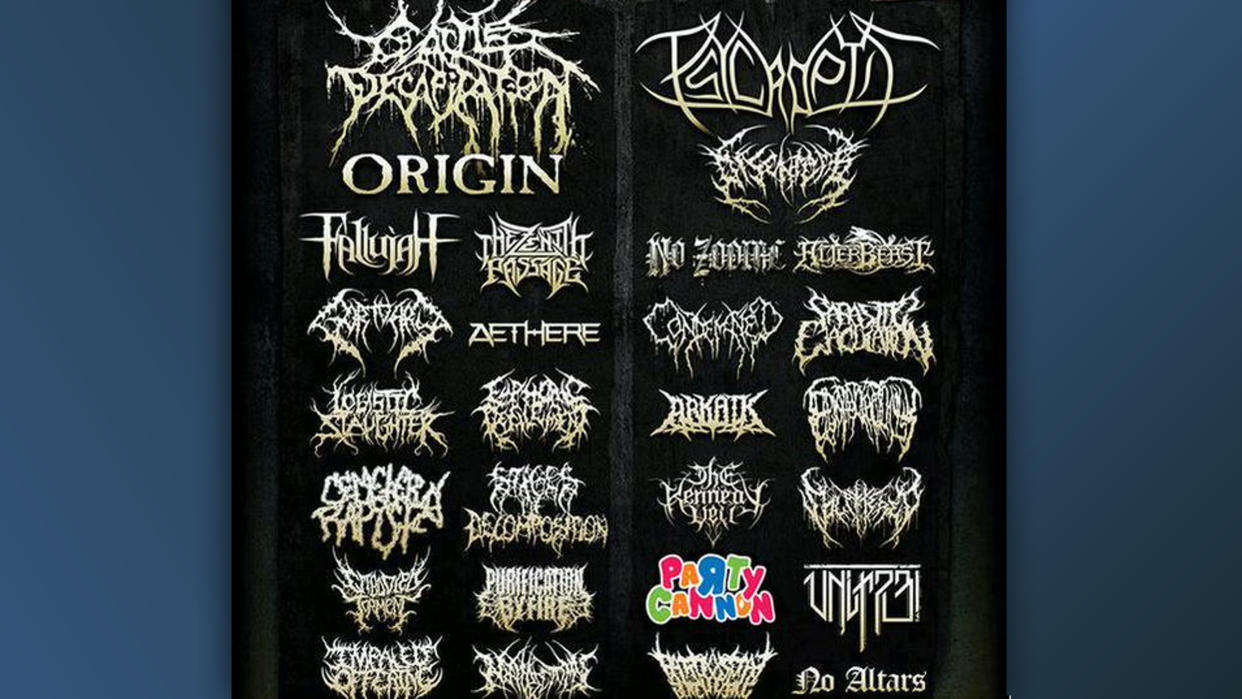
The "brutal death metal" band from Dunfermline, Scotland, seems to have turned to children's birthday party invitations for logo design inspiration. And when placed alongside dozens of other, more traditional metal band logos, it stands out brilliantly – and somehow manages to look even edgier than the rest.
Once again, the poster design for 2015's 'Bay Area Death Fest' (which, as the name suggests, was a death metal festival based in San Francisco's Bay Area), has gone viral. The entirely monochrome festival poster features various ridiculously similar logos, but is punctuated by one single splash of colour: the Party Cannon logo.
"It definitely stands out in the field... which, I suppose, is the point," one Redditor comments, while another adds, "Good. For a music genre that presents itself as subversive, there is a lot of conformism." Another simply declares, "Nothing more metal than that."
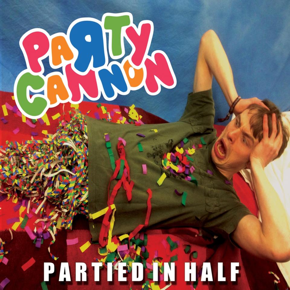
But if you think the logo is wild, wait til you see their albums. Allow us to introduce you to the cover for 2013's Partied in Half:
And their design has clearly worked - here Reddit is, talking about it, and here we are, talking about that. For more design inspiration, take a look at our roundup of the best logos of all time.

