Happy colours for living rooms – avoid sad hues for a mood-boosting space
What's the definition of happy colour for living rooms? One that makes you feel good. While the science of colour psychology does link certain hues to specific emotions – for example, red for excitement or energy, blue for tranquillity or yellow for optimism – ultimately, even the experts say that our happy-colour palette is purely personal.
'Users of the space, their preferences, psychological and physiological states, cultural backgrounds and colour meanings are important factors while deciding on colour combinations and for setting the whole mood of the place,' explains Dr Douha Attiah, an academic, colour expert and interior designer.
That said, there are ways to pin down your personal colour choices and turn them into a happy decorating scheme for your living room ideas. We asked interior designers and decorating experts for their go-to rules for avoiding sad shades and creating your happy lounging place at home.
1. Trust your colour intuition
You know that feeling when you walk into a room and immediately feel at ease? That's the way we want our living room – the space where we hang out with family, cosy up for film night, or chat with our friends – to feel.
According to Michelle Ogundehin, design expert and host of Interior Design Masters, we can take our cues from the spaces we love outside our home, and then try to recreate some of that magic in our own decor.
'I encourage people really to really around when they go somewhere like a restaurant,' she advises. 'Do you like the way the chair feels when you're sitting in it? What colours are you drawn to in a clothes shop?'
'You have to bypass thinking what's the latest trend and get right into that intuitive sense of you. Your body knows and yet we disregard it because we're taught that it's woo woo. But we need to listen to the messages our body and senses are sending us.'
Your heartbreak palette is another way to think about: that is, the colours you instinctively turn to for comfort and joy when life feels tough.
The takeaway: if a colour doesn't give you all the feels, put the paint pot back on the shelf and pick up another one that makes you smile inside.
2. Pick calm colours for a tranquil vibe
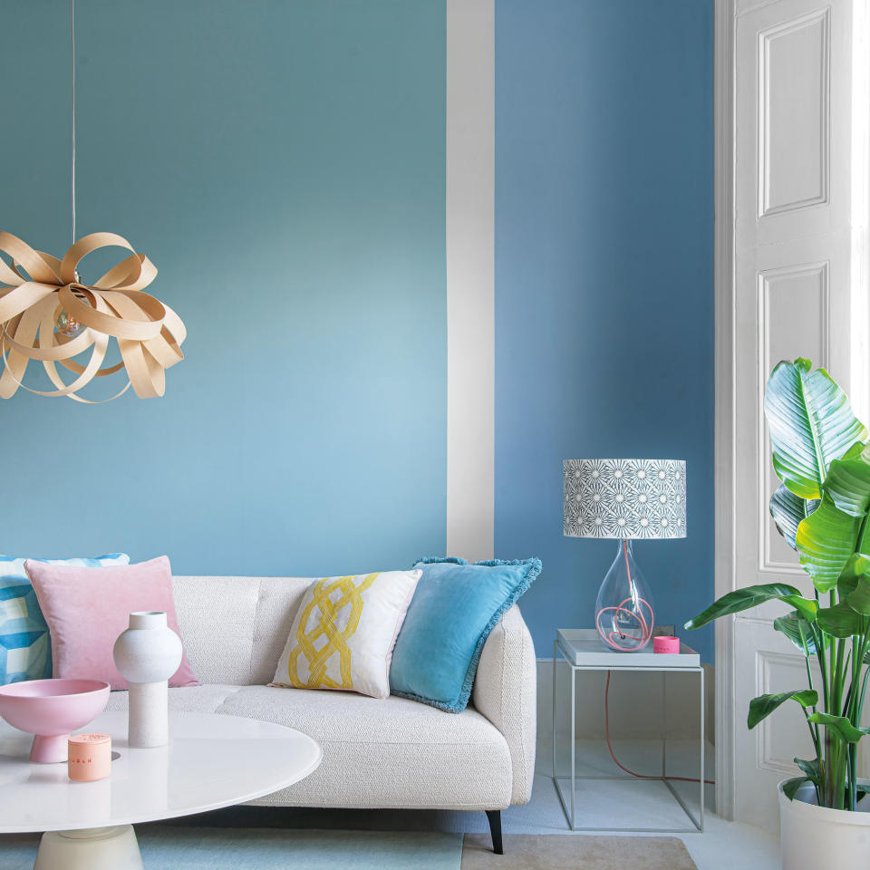
For some of us, happy colours promote feelings of peace and serenity – they're the chilled-out antithesis of the bright and busy world outside our home. Louise Bradley is one interior designer who says she prefers calm colours for living rooms.
'I lean towards a colour palette that is calm, warm and neutral and use different textures and raw and natural materials to inject a feeling of serenity into the space,' she says.
'I suggest using accent colours such as soft greens, warm golds and subtle pinks to lift the space. These tones can be brought in through furniture or accessories. I also love using houseplants such as ferns and flowering shrubs as a way to bring life to a space.'
'Additionally, introducing layered tones and delicate textures can add depth to the space, without the need for bright colours, creating a timeless and elegant home,' continues Louise. 'Refined forms, tactile materials and attention to detail will result in a living space that is light, harmonious and balanced.'
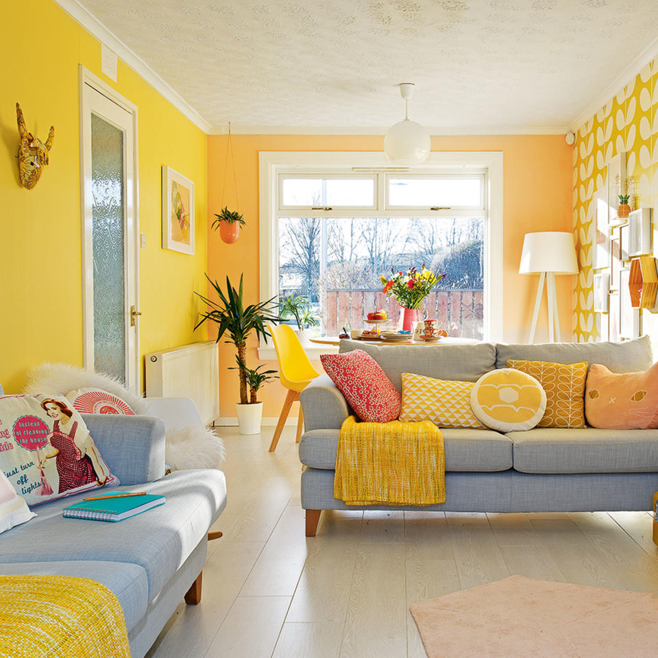
3. Pick bright white to boost natural light
Natural light is one of the biggest mood boosters available, promoting feelings of wellbeing and happiness. For some of us, dark spaces can feel depressing, so colour choice is even more important.
Deeper, matt colours absorb light, making a space feel gloomier (or gloriously cosy, if the dark doesn't bother you). White and other light shades reflect light, making a space appear brighter – giving you a lift if you're someone who thrives in sunlit rooms.
When it comes to white living room ideas, painting the walls and ceilings of your space in a light and bright colour is a simple way to invite more light into the home. 'Colours may dull a bright place and brighten a dark place,' says Hataish Kumar, interiors expert and director at RugKnots.
'White is the brightest colour that you can choose. If you're not a big fan of bright white, but you still want to invite more light into your home, choose off-white and pale neutral shades for your living room.'
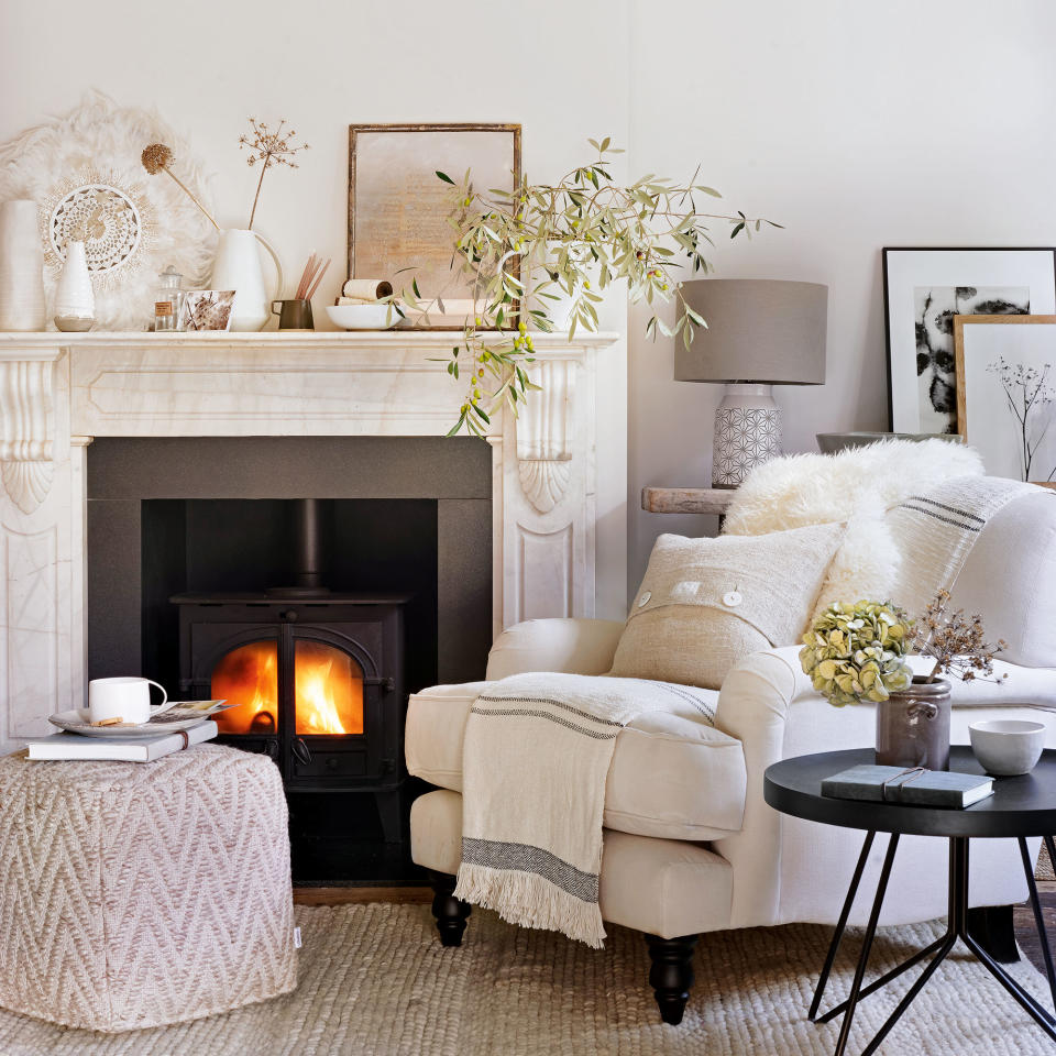
4. Choose warm colours for a cosy vibe
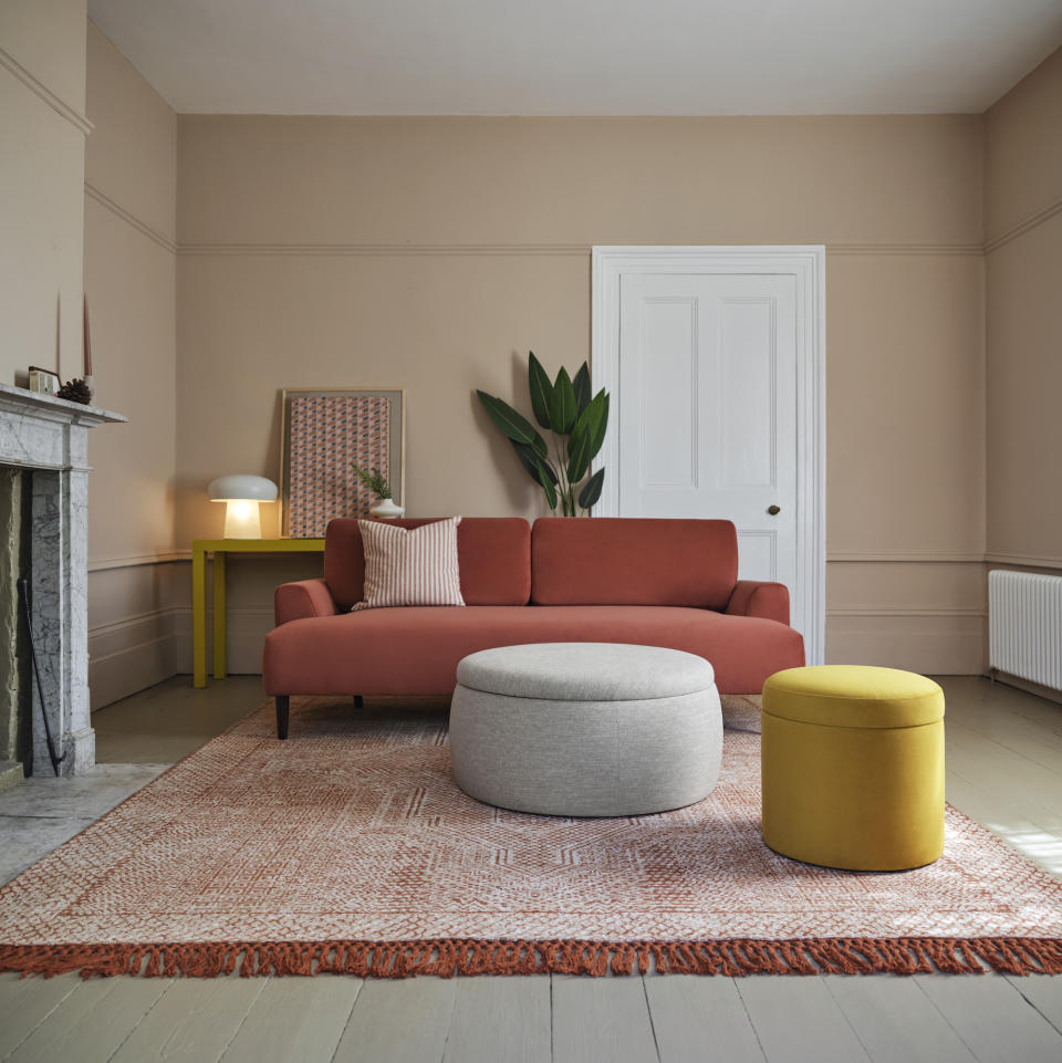
If you're a snuggle-up-on-the-sofa kind of person, then cosy colours associated with comfort are likely to warm your heart – think shades of caramel, chocolate, toffee and mocha, with a touch or warm red and deep pink in the mix.
'Warm browns, terracotta, rust, henna and brick bring a super-calming vibe in your living room,' suggests Swyft’s interior designer, Kelly Collins. 'Using naturally occurring hues like this is a great option for those who really want to inject a bit of colour, but don’t want to make the commitment of an in-your-face statement shade,.'
5. Use your compass as a colour guide
If a favourite colour doesn't work in your living room, it could be affected by the light
coming in from outside. The direction a room faces changes the quality of light coming into the space, so it could mean that choosing a warmer or cooler tone of your favourite hue fixes the problem.
'When planning a room, the main thing to think about is which direction the room faces – a north-facing room needs a warmer colour than a room which faces in any other direction,' explains Ann Marie Cousins, founder of AMC Design.
'In northern Europe, the light tends to be on the cool side, so always choose colours with warm undertones. When colours don’t seem to work at different times of the day, it will be because it has the wrong undertone. If it has a cool undertone, a yellow sitting room might look lovely on a warm sunny day but too harsh on a cool winter’s day, or when it’s dull and cold. If it has a warm undertone, it will feel like a burst of sunshine on a bright day and like a welcoming cocoon on the greyer days.
'If you’re not sure whether a colour is warm or cool, paint large samples (about A1 size on a piece of lining paper or stiff card) and look at it at different times throughout the day. If it makes the room feel warm, you’ve chosen a warm colour and you’re on the right track. If not, it might be worth considering some more welcoming tones.'
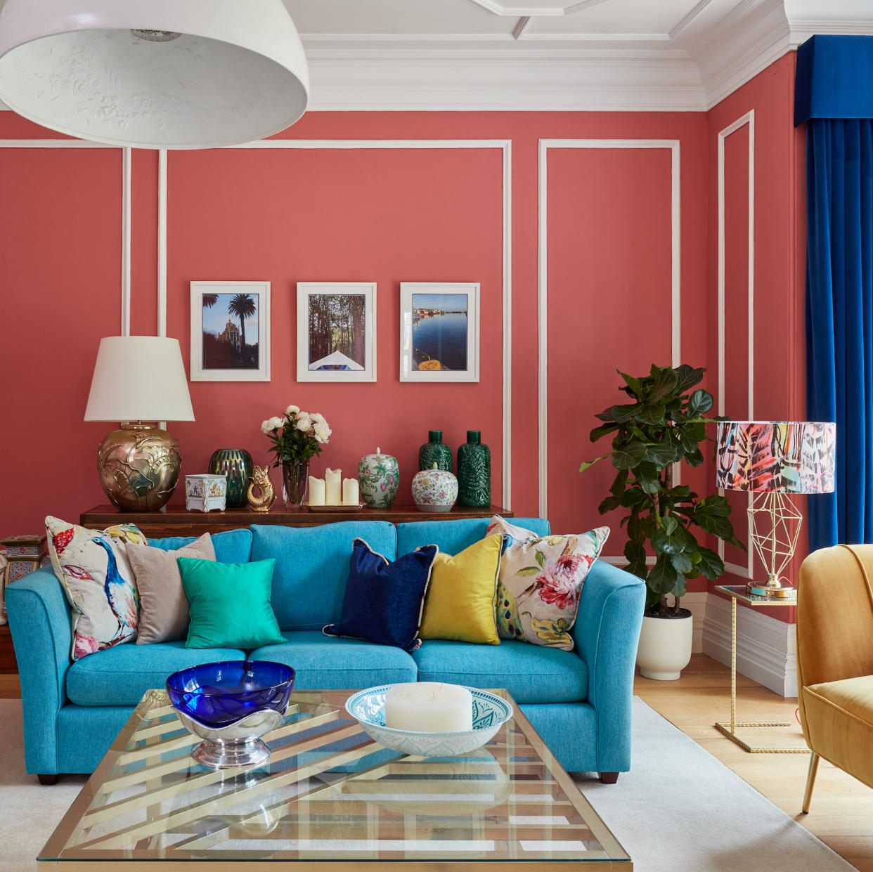
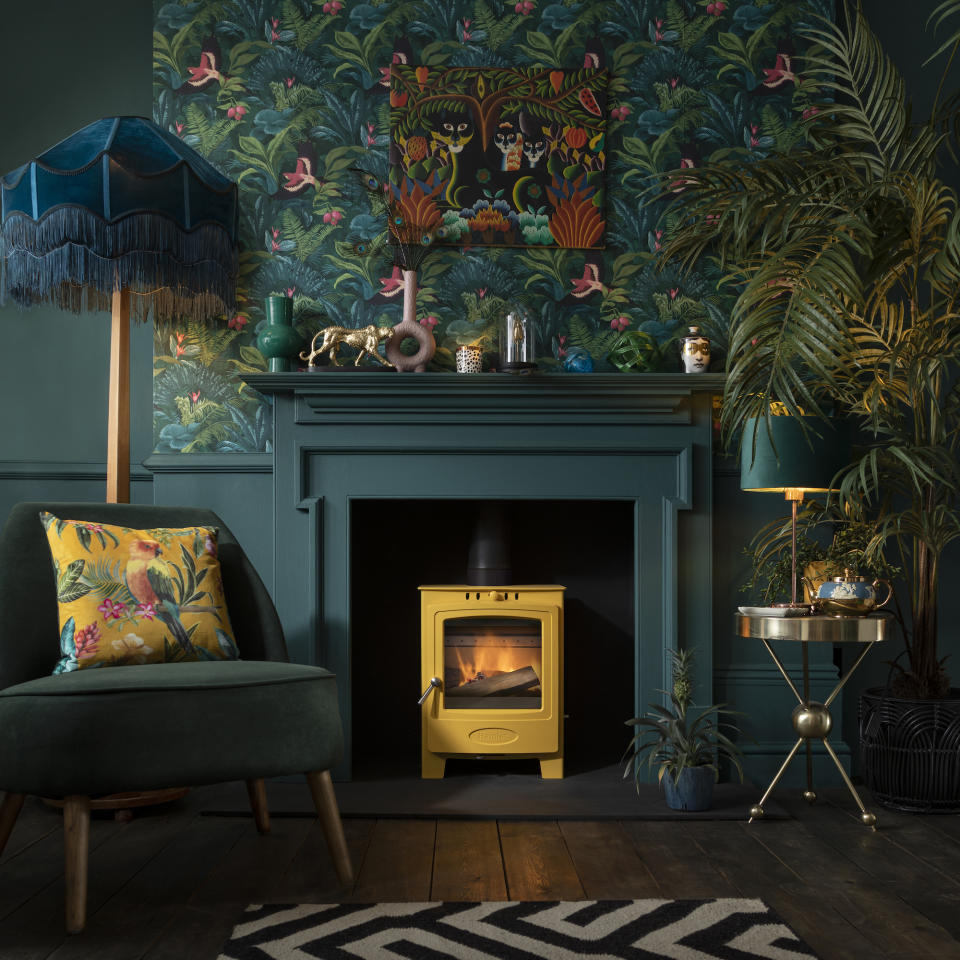
6. Get a happiness dose with dopamine brights
'If you’re someone who gets a bit of the winter blues, or you just love tonnes of colour, dopamine decorating is definitely one to try,' says Kelly Collins from Swyft. 'This approach is all about using colour, pattern, texture and accessories that make you feel happier in your space. It’s playful, joy-inducing stuff.'
Alongside bright colours, Kelly detects a sense of anxiety-soothing nostalgiacore in this decor trend. 'I’m seeing lots of vintage and retro items being used as decor, especially anything that’s quirky and very of its time – think rotary phones and lava lamps. Basically, anything with lots of nostalgic good vibes.'
'If dopamine decorating is an interior trend you want to try out for yourself, start by choosing colours you’re drawn to that make you feel happy,' advises Kelly. 'In your soft furnishings and furniture, choose textures that make you feel safe and comfy. Then, bring the look together with accessories that spark joy or bring back happy memories. Your home interior has so much power to make you feel happier – dopamine decorating is the proof.'

