Halo Top's Old Packaging Is Practically Unrecognizable

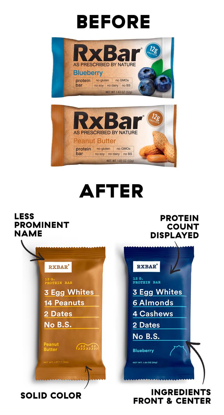
It took three years for the cofounders of RXBAR-the trendy, egg white-fueled protein bar that's made its way into grocery stores, gyms, and airports-to realize they had an ugly baby. "As the business started growing, they were able to take a step back say, holy cow," laughs Megan Marshall, RXBAR's Director of Communications. The original packaging was created on PowerPoint and looked nothing like the bold, clean package you see all over Instagram today.
Instead of a dull tan and white wrapper, bars are now packaged in a colorful hue that matches the flavor inside: cobalt for Blueberry, sea foam green for Mint Chocolate, fuchsia for Mixed Berry. "As prescribed by nature" was removed, as were the photos of food, to make room for the formula you see today. During the revamp, RX did what practically every expert told them not to: put every core ingredient on the front of the package, instead of contained in a small box on the back. In an even bolder leap of faith, they added "NO B.S." beneath. It paid off: A few months after RX’s redesign, the brand scored its first national distribution at Trader Joe’s.
The supermarket is filled with products you know, trust, and buy-most of which come from brands like Kraft-Heinz, Kellogg's, Nestlé, and General Mills. So for a newcomer to outshine-and maybe even outsell-their competitors, they have to make a statement. It's not that what's on the inside doesn't matter (have you ever tried an RXBAR?), it's just that the packaging is what ultimately makes you pick one item off the shelf instead of the other.
"We have the ability to see about 10 million images at any given time, but we can’t comprehend that many," Debbie Millman, Chair of the Masters in Branding program at NYC’s School of Visual Arts, explains. "We can only comprehend about 40." So when you stand in front of the cereal aisle or an ice cream display, not knowing which one to buy, it's often color or shape that makes the decision for you.
Chief among food brands’ concerns, then, is finding a way for their product to jump off the shelf-hence RXBAR's bold overhaul. For Banza (that chickpea-based pasta line your gluten-free friend is obsessed with) that meant going for a bright, red-orange box that would stand out in a sea of blue ones, the brand's Chief Marketing Officer Mike Tarullo said.
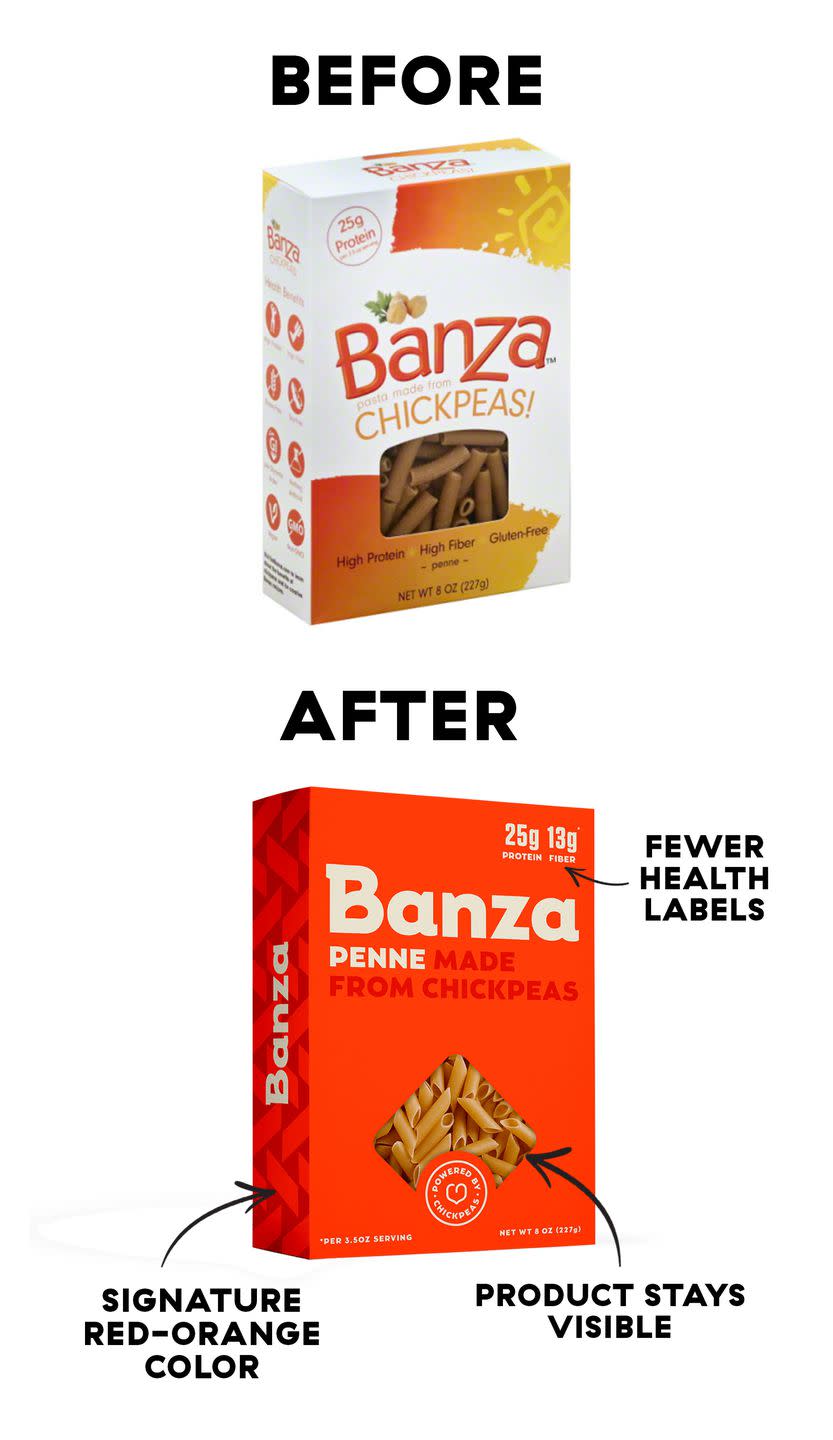
Another goal: telling their story-in essence, another gluten-free pasta-in a more succinct and appealing way than their predecessors were able to do so. Before the 2016 redesign, Banza's boxes were loaded with health claims. "We realized we kind of had to show, not tell, and focus more on conveying a feeling." To emphasize the fact that their product looked and tasted like pasta, they kept the plastic window that showed the noodles inside and stripped 'Gluten-free' and other claims from the front in favor of just two key nutrition facts: protein and fiber count.
"We didn’t want to talk about there being less of something. We wanted to talk about having more good things, and we didn’t want to spend too much time trying to communicate 'Buy me, I’m healthy,'" Tarullo explains.
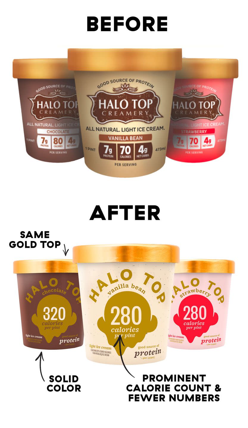
Halo Top's inaugural label wasn't designed on Powerpoint like RXBAR's, but it was an "amateur effort, to be honest," founder Justin Woolverton admits. You’d hardly recognize the OG pint: At the time it was created, Woolverton was still working as a lawyer. He hired a freelance marketer to put together the design, while his small team focused on the flavor.
Keep in mind, this was long before 'healthy ice cream' filled half the frozen aisle. In an effort to paint a full picture of what was inside these low-cal pints, the label hit you with a ton of information upfront: protein, calories, net carbs, plus the FDA-mandated "good source of protein." What you see today has one clear message: the number of calories per pint displayed front and center (and the same note about protein).
"Halo’s redesign was genius," Millman said. "They put the totally unique selling point front and center. No one else can deliver that." The brand's growth coincided with the rise of Instagram, something the company was keenly aware of when changing up their look. They wanted it to be "something you’d want to carry around in your basket," Woolverton says-and then maybe post a picture of after that.
While it’s difficult to point to one specific thing that changes the trajectory of a company, Woolverton says Halo Top's makeover was without a doubt a key component. "When people ask me 'How did Halo Top pop?'," he elaborates, "it's those three things that I say: It's the packaging that we changed, it's the product that we reformulated a little bit, and it was that GQ article. They all, to me, played a central role."
Perhaps more indicative of the redesign’s success: “I’ve never met anybody who has not said that the packaging looks better now.”
The switch paid off for Banza, too. Their redesign was completed just before Expo West, a trade show for buyers, in 2015. "Shortly thereafter, we got our first test at Target, and we got a couple more regions at Whole Foods," Tarullo recalls. “To be fair, there were a lot of factors aligning at the same time-we opened our own manufacturing facility, so all sorts of good things were happening-but the new look of the brand definitely played a role in helping people get it and recognize it and look for it."
For RXBAR, a brand developed by two CrossFit buddies looking for a snack that wasn’t "full of shit," the change pushed the bars out of a small but mighty CrossFit community and into the mainstream. In a sea of protein bars, the brand’s differentiating factor was-and continues to be-its short, easy-to-understand ingredient list. Today, that’s exactly what the front of the bar conveys.
"They capitalized on a trend of transparency," Millman says of the new look, and did so in a clean, modern way that’s now central to their brand identity. As their product line has expanded to include on-the-go and jarred nut butters, each category's look has followed the same formula.
All three of these brands-RX, Banza, Halo Top-share a common thread: They had little to lose. Sure, they were all seeing success in their own niche markets, but they weren’t playing in the big leagues yet. The companies had room to grow, and it was only natural to pair product reformulations and line expansions with design overhauls. The redesigns were part of what got their product in front of more eyeballs in the first place.
"It’s very rare to see a revolutionary design from an established brand," Millman says. "All three of them took advantage of the one thing that you can do when you’re that small, which is take a gigantic risk."
Conversely, when Tropicana changed its design in 2009, people were up in arms. They couldn’t find the jugs in stores, didn’t know which ones contained pulp, and were generally averse to the change-a common problem designers and marketers face.
"I often joke that the only people that are excited about package design changes are package designers," Millman says. Shortly after the switch, Tropicana returned to their original packaging, and it hasn't changed again in well over a decade.
Millman cites Starbucks as an example of a big, established brand changing their look in a way that made sense to customers. Every so often, Starbucks redesigns its cup (not counting the holiday cups that come out each year). In the last go-round, the corresponding advertising campaign showed the four iterations of Starbucks’ cup over time. "So there was a clarity to the fact that this is a brand that changes from time to time, and it’s still the same brand that you love," Millman explains.
While bigger brands often face pushback for design changes, there are ways established brands can follow suit-so long as they have a good story to tell. "Unless there’s a real significant improvement, and I mean significant, most people are going to look at those changes and feel that they are unnecessary, unwarranted, and unappreciated."
Chobani is one such brand that managed to toe the line. The company was well established by the time they revamped the yogurt's packaging in 2017. And as a leader in the category, they "were convinced that it had to be done," Chobani’s Media Lead of Corporate Affairs John Kell says. "We were imitated to such a degree that our packaging was less distinguished and differentiated on shelves. That’s a place no one wants to be."
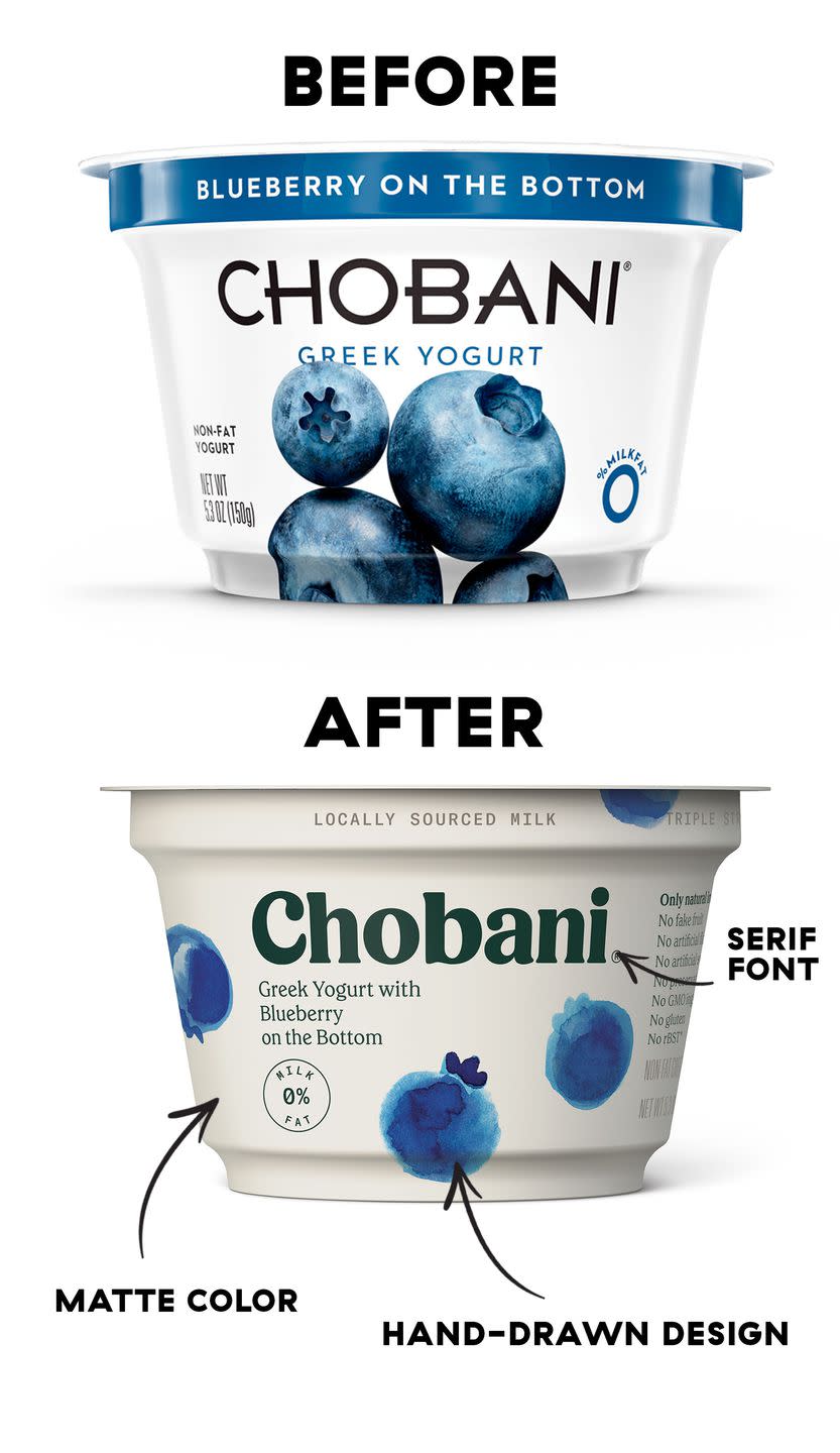
To set themselves apart from other Greek yogurts, Chobani redesigned its entire product line to look more natural. They swapped out a harsh, medicinal white for something creamier "that felt like a white you might find in nature," Kell says. The photo renderings of fruit became hand-painted images so you could see a "human touch" on the packaging.
While the difference is noticeable, it wasn't met with the same harsh reaction as the Tropicana debacle. The overall look was similar enough so as not to be confusing to customers-nothing extreme was changed about the way people interpreted the product. The revamp brought attention back to the brand, Kell says, and hopefully "renewed peoples' excitement for a category thats been around for 10 years."
So the next time you see your favorite seltzer, bag of chips, or pint of ice cream look a little different, know that there was a clear intention behind each and every color tweak, font change, and shift in messaging-and it's undoubtedly meant to attract your attention.
"People see things in a very specific order for packaging," Millman explains. "They see color first, then shape, then numbers. And then if you still have their attention, they’ll read it."
That's why you'll see primary colors like red, yellow, and blue in almost every aisle. The brighter, the better-something Banza, Halo Top, and RXBAR all used to their advantage. And in terms of numbers and claims, less has proven to be more.
"At the end of the day, we often eat with our eyes," Kell says. When it comes to packaged goods, shoppers are most definitely judging books by their covers.
('You Might Also Like',)

