The new Google Authenticator logo is brightening up my life
Authenticating apps is an annoying but seemingly necessary feature of modern life. Lots of apps now require it and various apps are trying to get us to use their authenticator services. All except Facebook (sorry, Meta), who recently told us that users can no longer authenticate via its own app (which didn't work anyway) and that we'll need a third-party authenticator. That's where Google's Authenticator comes in.
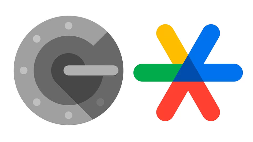
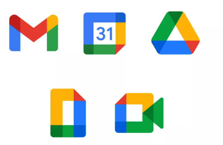
The Google Authenticator app was previously grey (see above, left), showed Google's 'G' with a lock, and was, let's face it, on the dull side. Although it was an outlier when compared to Google's other apps, which many have complained are too similar looking (see below).
The new design for the app was announced recently and the fresh design (see above, right) is now rolling out across devices.
The new logo is in line with Google's colour palette, but is distinct enough to stand out on my homescreen. It consists of three interlocking lines, with two 'v' shapes in the same colour, one red, one blue, and the remaining 'v' consisting of one green and one yellow line. The design detail of the colour overlap pleases me, and crucially, differentiate it from the Slack logo (see below).
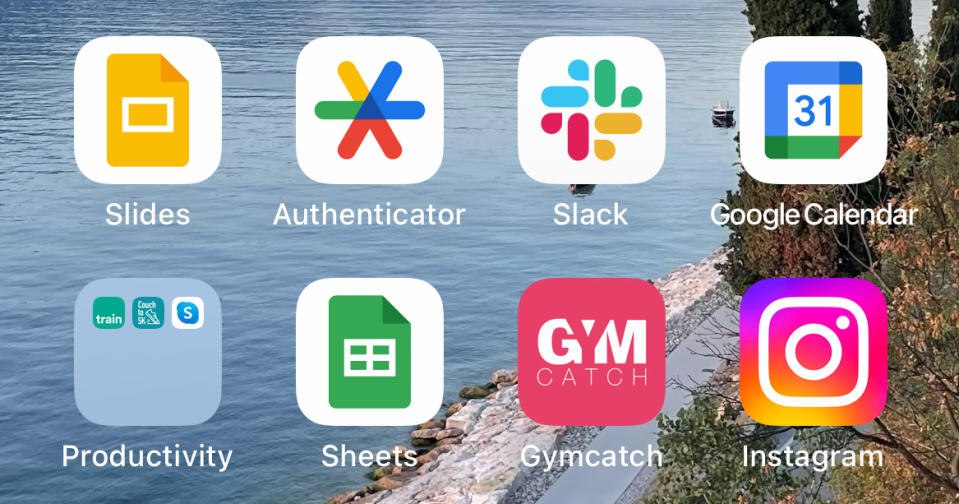
Is The Authenticator logo in a similar vein to the Slack logo? Yes. But does it brighten up my homescreen and make authenticating apps just a little bit more exciting? Also yes. Does this improve my life? Yes, a little bit. It's marginal okay, but I'll take it.
For more on Google's logos and design language, you can see Google's Material You series of videos, the first of which is below.
For advice and insight into what makes good UI/UX design, sign up to our UX Design Foundations course.

