The new Glassdoor logo has an ingenious design secret

The world loves a logo with a hidden secret, and the new logo design for the recruitment site Glassdoor fits the bill. Even if at first glance it might look like it's a mistake.
The new logo looks like a simple type-based design with the company name set between single quotation marks in reference to how its site allows employees to rate their employers in reviews. The opening quotation mark appears to be the wrong way around... but it's no mistake (see our pick of the worst design fails for that).

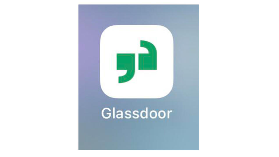
The reason for the design decision becomes clear in the accompanying new animated logo and the reduced version of the logo, the latter of which serves an icon for Glassdoor's new app. There we see that when they're brought together, the quotation marks are a lowercase 'g' and 'd', representing the initials of the brand's name.
The rebrand is the work of the creative studio Koto, which also created the new logo for the e-commerce company Bolt. The 'g/d' quotation marks can be used to flank other text as well as the wordmark, with text appearing in a custom sans serif, Glassdoor Sans, designed by Giulia Boggio. Koto says the typeface features quirky characteristics inspired by office vernacular.

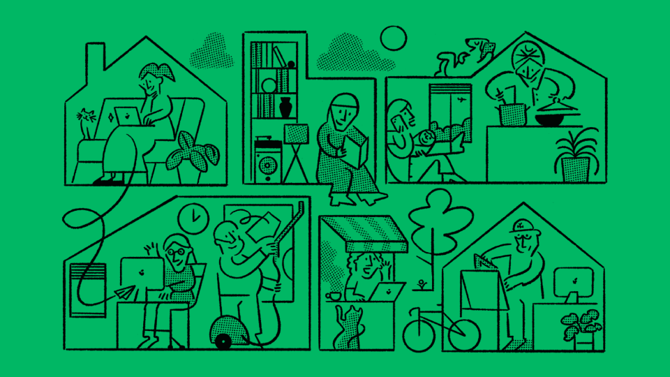
The animated version of the logotype slides open as a reference to Glassdoor’s name. Meanwhile, the broader branding system includes a library of playful icons illustrated by Josep Puy. Designed for product and marketing, they revolve around the brand's themes of conversation, diversity, anonymity and collaboration. The icons feature intentionally missing pixels, intended to symbolise transparency and openness.

Koto says that during the project it "embraced an inclusive design process". After each presentation, Koto curated a “Glassdoor Open Design” forum to encourage discussions and receive feedback from Glassdoor employees and members of the design community.

"Our work with Glassdoor was focused on creating a holistic brand that exudes confidence and open-mindedness, amplifying users' voices through transparent conversations and real workplace insights," Koto creative director Deanna German says. "We wanted to represent the evolution of Glassdoor from being a destination for insights, to a thriving community for real workplace conversations."
The quotation mark resource takes people a while to notice, but then it hits. "I just observed myself sitting and trying to find out what kind of icon it was meant to be when it hit me that they were individual letters and I audibly went 'ooooh that is neat'," one person wrote on Reddit. Meanwhile, some people are also convinced that there's a hidden secret in Elon Musk's new xAI logo.
