In This Geometric Echo Park Kitchen, a Clean-Lined Reno Proves It’s Hip to Be Square

Yoshihiro Makino
In a successful renovation, no one gets exactly what they want. A project is filled with compromises big and small, left and right, back and forth. The only constant—besides, perhaps, the sheer persistence of dust and noise—is that change must occur. Principal Patrick Maziarski of Beau Geste Interior Design was aware a shift was imminent even before he was hired for the job.
“The owners, Josh and Johnny, and I are all members of the same gym,” he says. “I had previously visited their home for social events, at which they did not hesitate to express their desire to remodel. Before long, they approached me in an official capacity to help.”
The couple bought their home in 2021 for its potential. It was built a century prior in the Los Angeles neighborhood of Echo Park, where the flat basin of downtown meets the hills that make Hollywood famous. Johnny works in project management while Josh is a partner at an art gallery, and they hired Patrick to strike a balance between a formidable collection of contradictions. The kitchen was set in the central part of the house, forcing light to compete with shadows. Walls clearly defined the room, but nothing anchored its core. And while the pair respected its rare bits of history, they also hoped to enjoy surroundings that were decidedly now.
“The existing kitchen was essentially a ‘no man's land,’” Maziarski says. “We wanted to add many more countertops, remove a partial wall to open it up, and upgrade all of the appliances and millwork. It’s a modest kitchen, so we sought to make it as fresh and functional as possible.”
The couple asked that their renovation feel “contemporary and clean-lined” but requested that the original Douglas fir flooring remain. They agreed that an island was needed for everyday meals and casual hosting, and suggested that the doors leading outside didn’t take up as much square footage. So as the partial wall separating the refrigerator from the oven was removed, and the French doors were replaced with a single frame, the contractor took their goal of simple geometry rather literally.
“The main issue with any home that’s over a hundred years old is framing: What’s original is likely not going to be plum,” Patrick says. “In designing a more modern kitchen, this proved to be difficult in a few areas, especially where we integrated the fridge beside the new door.”
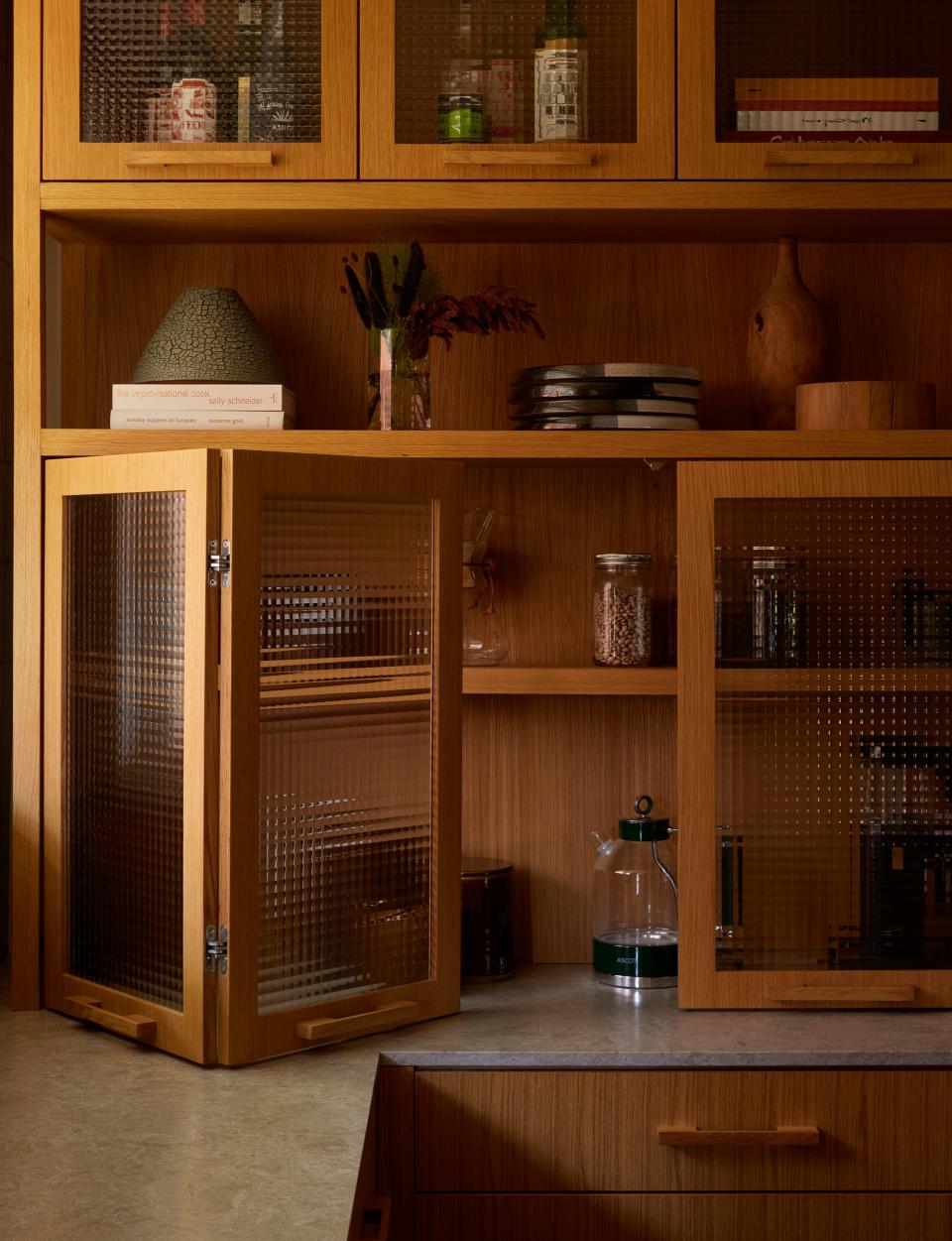
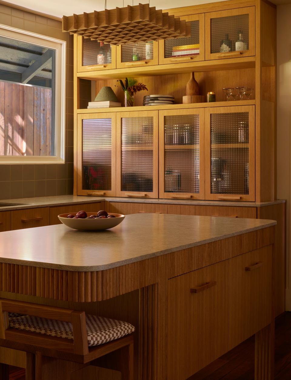
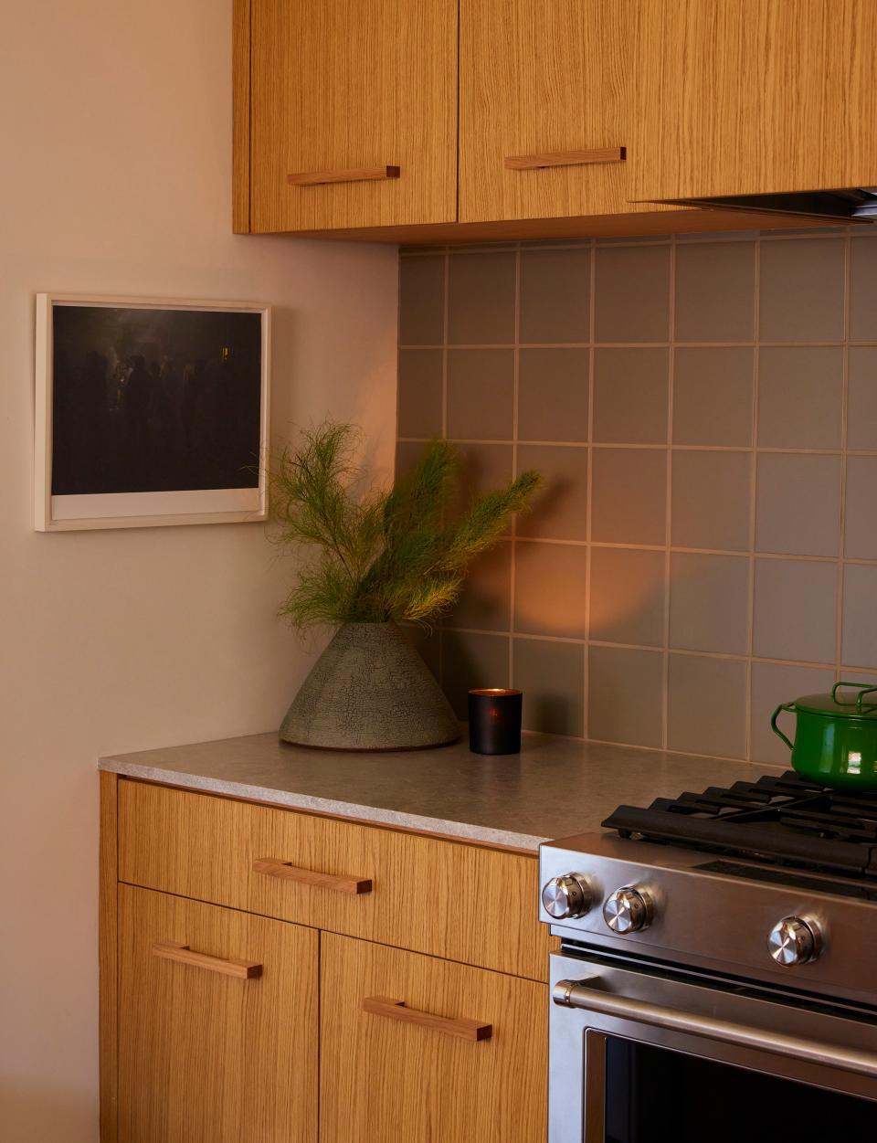
The updated design positioned the island as a focal point, with seating on one end and storage on the two longest sides. The refrigerator stood in the corner by the door outside, facing an L-shaped block of cabinetry that had open shelving above the sink and glass cabinetry on the far wall. An oven was set in its own nook on the third wall, and the entire room was unified by sage green square tiles and white oak from top to bottom.
“The decision to use white oak was reached for two reasons,” Patrick says. “One, to fulfill the contemporary style they were after, and to not darken an already tucked-away space. The kitchen can be quite shaded at different times of day, and with the floors already being so rich, the white oak adds some brightness.”
Of course, no one disagreed that this kitchen had a lot of wood, which is why they devised a handful of details to provide some much-needed layers. Johnny and Josh came up with the idea to accent the island in fluting, while the pros installed cross-reeded panels on the glass cabinets to complement the grid of the backsplash and pendant above the island. “The square-grid motif was also the reason why we decided to have coordinating white oak pulls for the millwork,” Patrick adds. “From certain angles, the wooden pulls create an almost morse-code pattern, peppering the length of cabinetry.” Heck, even the upholstered fabric of the island’s seating has a grid.
As for the last blank expanse in this kitchen, the one beside the refrigerator, it made sense all around to choose an art piece to go there. “Not only does the scale fit perfectly, but its organic and abstract nature shakes up all that geometrical precision,” Patrick notes. “The warm, reddish hues also complement the green tile beautifully.”
It took about seven months to complete this renovation last summer, and Patrick feels as though collaboration made all the difference. “One thing is for sure: Josh and Johnny know what they liked and didn’t like, which made for quick decisions,” he says. “The firm and I really pride ourselves on allowing clients’ suggestions to guide certain aspects of the project, because it always ends up being successful.”
Originally Appeared on Architectural Digest
More Great Stories From Clever
The Very Best Sectional Sofas, Tested and Reviewed by Our Editors
In Coastal Maine, a Writer-Carpenter’s Restored Home Is a Vision in Yellow
Korean Minimalism Is Inspiring a New Generation of Creatives
Color Drenching: Everything You Need to Know About This Monochromatic Trend
Browse the AD PRO Directory to find an AD-approved design expert for your next project.
Not a subscriber? Join AD for print and digital access now.

