How to Frame Art the Right Way, According to Designers
When decorating a space, it’s easy to overlook small details that can make a big impact. Take the walls, for example. While you might think that finding the perfect piece of art is the key to adding intrigue to a room, how you display said art makes just as much of an impact. In fact, many designers believe that the way you frame art can enhance or detract from the piece itself.
With this in mind, we chatted with a few home design experts, plus one very prominent photographer, to determine the best way to display art on your walls. Ahead, learn how to choose a frame like a designer, and uncover secrets to picking the perfect mat, as well as tips on how to hang pictures like a pro.
How to Frame Art the Right Way
As simple as it is to find a frame and mat you love and earmark it for every piece of art in your home, Meredith Owen of Meredith Owen Interiors says it’s better to take an individualistic approach.
“It’s so important to take each piece of art into consideration when it comes to selecting a mat and frame combination,” she says.
On one hand, the mat and frame may not fit your specific piece of art, particularly if you’re working with prints, as they’re often sold in unique sizes that call for custom matting; on the other, the color of the art and the medium used, as well as where you plan to hang the piece, all play a role in how you should frame it.
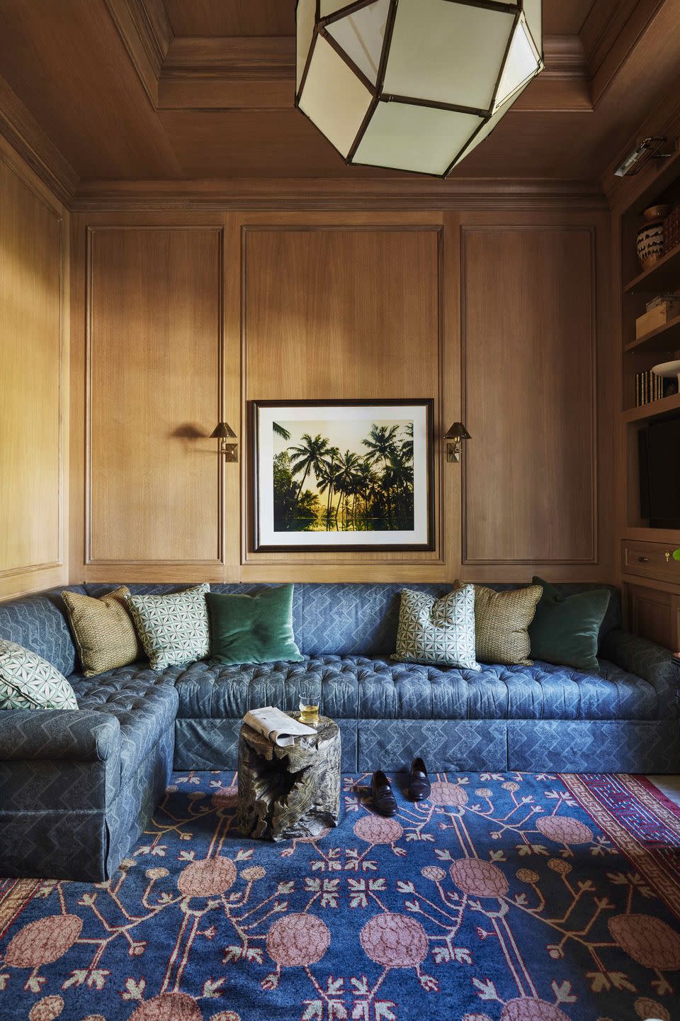
The Mat
Let’s begin with mats. Before selecting a frame, you’ll need to know the size of your art, as well as your desired mat thickness, to determine the necessary frame size. Mat thickness refers to the ply of the mat, or the depth. The higher the ply, the more the art will look embedded into the mat. Mats are sold in 2-, 4-, 6-, 8-, and 12-ply, though 4-ply (which is more affordable) and 8-ply (which is more expensive) are the most popular. Where 4-ply is roughly 1/16” thick, 8-ply is 1/8” thick.
Mats are also sold in varying widths, as well as custom options, typically ranging from 1” to 5”. Typically, 1” to 2” mats are reserved for art measuring 5” x 7” to 8” x 11”, while 2.5” to 5” mats are popular picks for art measuring 11” x 14” to 18” x 24”.
Logistics aside, there’s no “right way” to go about mat selection, as it all boils down to personal preference.
“I personally prefer mat-less options more times than not, however, if using a mat I prefer it to be a play on scale, such as a very thick mat enveloping smaller art,” says Lauren Sullivan of Well x Design.
Meanwhile, Bethany Adams of Bethany Adams Interiors typically forgoes mats altogether, with the one exception being photographs. “They look much more polished with a mat,” she explains. “I always choose a simple black frame with a white mat for black and white photographs and for color photos, I'll generally choose a white frame with a white mat.”
In the instance of prints, world-renowned photographer Gray Malin recommends aiming for consistency. “I usually like to keep my art consistent with white matting for a more elevated look, and keep it on the smaller size so the print can be the prime focal point, while allowing room for a signature and edition number,” he says. Specifically, he typically sticks to mats between 1” to 1.75” for his best-selling prints, such as Pool Day, The Colony Hotel ($949).
Beyond mat thickness, you’ll want to consider the color palette of the art, as well as the space you intend to hang it. “Mat colors should always complement and not distract from the artwork itself—think of the artwork as the leading lady and the mat as the supporting role,” Sullivan says.
While mats are sold in many different colors, Owen prefers neutral mats or something with a touch of texture, such as a linen or silk mat. This helps keep the focus on the framed art, as opposed to the surrounding mat and frame.
The Art Palette
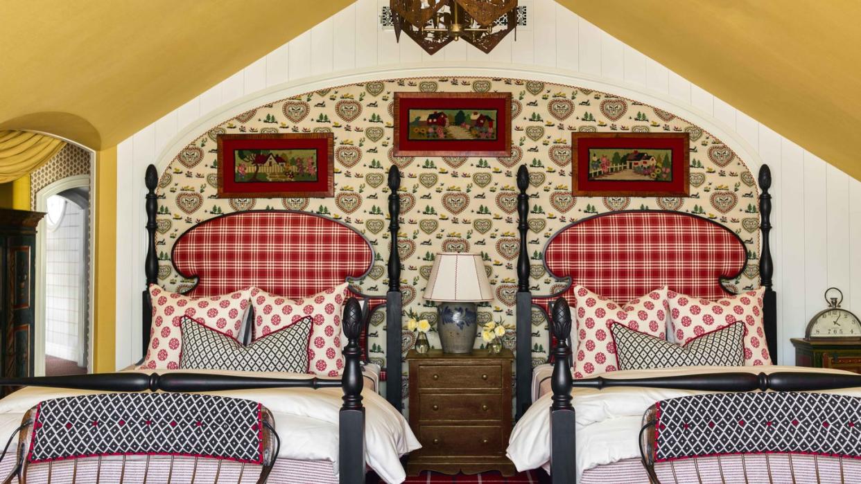
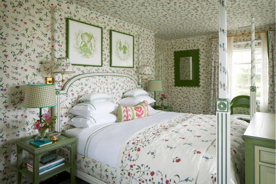
When selecting a frame for a piece of art, take a moment to notice the colors at play. Even if you’re set on only using neutral frames—think: black, white, or brass—coordinating them to the colors in the artwork can really make the piece pop, Adams says.
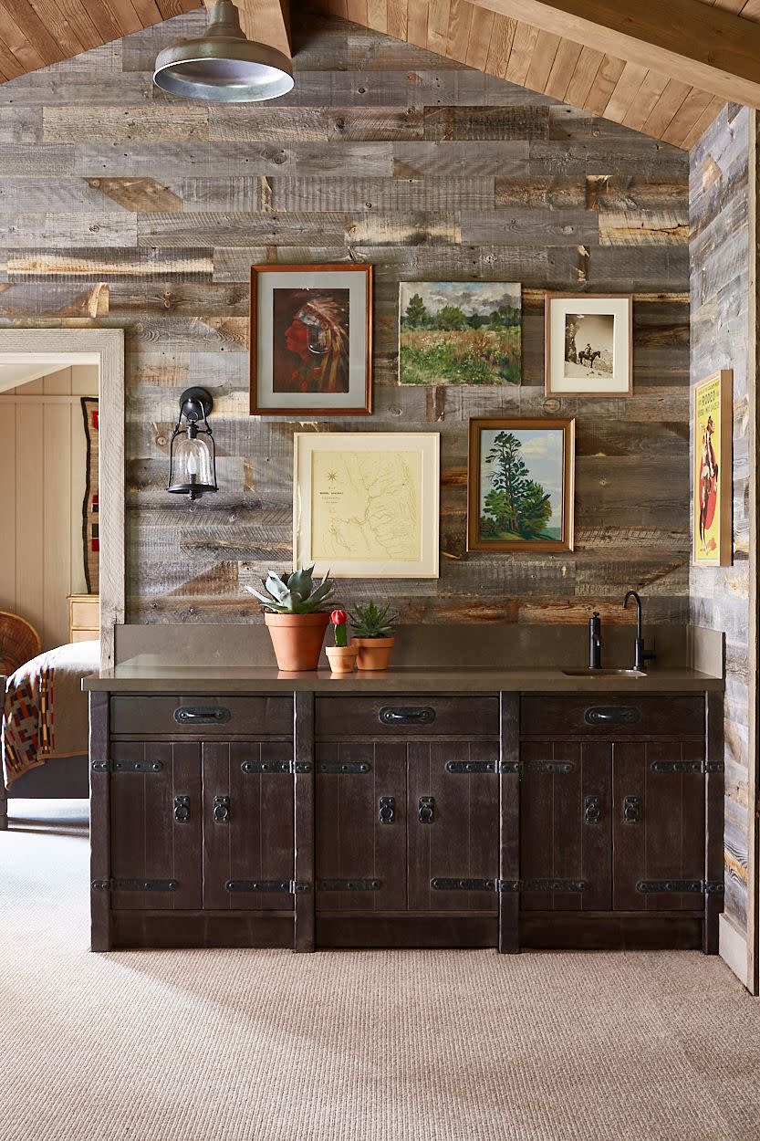
“I use white or off-white frames for light and bright pieces and black for moodier works,” she shares, noting that a very thin brass frame works well with most abstract paintings. Meanwhile, if you have your heart set on a light wood grain frame, she says that they’re best reserved for more casual spaces, like a beach or lake house. “[I’ll use them when] I'm trying to incorporate art in a more relaxed way,” she says.
While brass frames are top of mind, let’s not forget the beauty of ornate options—they’re not off the table. “I especially love a gold gilded frame around a vintage oil painting,” Sullivan says.
Of course, neutral frames aren’t the only ones to exist. “Quality framing can absolutely make, and transform an art piece,” Malin says. “Over the past year, I have been experimenting with different frame colors with specific prints of mine, and have loved seeing how adding a pink or navy blue frame to a print truly transforms the piece.”
The Medium
While photographs and prints look beautiful in matted frames, Adams says that many other pieces of art can forego mats altogether.
“Even in more formal or traditional spaces, my preference is for the artwork to be the main event—not the frame,” she says. “To that end, I'll usually forgo a mat for works under glass and frame them in the simplest possible way—a 1" square-edged white wooden frame for smaller pieces, up to 1.5" for larger works.” If the piece is unusually shaped, she'll float mount it on a background mat that matches the frame color. “This helps the artwork itself to jump off the wall and into your scheme,” she explains.
The Space

Remember: You’ll also want to think about where you plan to hang the art, as the space itself could call for certain frame styles and dimensions.
“Consider the scale of the piece and the scale of the room you plan to display it in,” says Annie Downing of Annie Downing Interiors. “To make a small piece stand out, forgo a mat and float it in a larger piece of glass with a smaller frame; if the piece is colorful, you may want to let the art do the talking and select a frame that complements the piece in tone and is more subdued.”
Another pro tip? Flat art isn’t the only thing that can be framed and hung in your space. “We love to push the bounds of the traditional art display,” Downing says. “We recently displayed a client’s heirloom scarf collection on a linen background in an acrylic shadow box. It’s beautiful, interesting, and adds color to the space.”
No matter where you plan to hang your art, Sullivan suggests taking a timeless approach when shopping for the perfect frame. “[That way] the artwork can be moved around the home and look intentional in a variety of spaces,” she says. “Depending on the space, a simple frame may be all you need, but other times a more dramatic frame might be more fitting.”
The Glass
In addition to the mat and frame, it’s worthwhile to consider the glass your art sits behind, too. “While the frame and [mat] are an important part of the overall design of the space, remember that their first purpose is to preserve and protect the artwork,” says Downing. “We recommend using museum glass if your piece will be hung in a room that gets direct sunlight.”
The Takeaway
When all is said and done, the way in which you frame your art is just as personal as the art you pick. “A good rule of thumb to follow is anything that is going to distract from the art piece (a bold-colored mat, a frame that is too ornate) is something to avoid,” Owen concludes. “On the contrary, if the piece of art or image is very serene you can dial up the drama with a more exciting frame.”
You Might Also Like

