Forget off-white, these are the 4 'new-age neutrals' designers are using for more interesting minimalist homes instead

It's easy to turn to neutrals as the foundation for your home's design - not only are these great base tones for the house, but they also allow other colors to shine, while feeling calming and relaxing all the while. But sometimes neutrals like white, beige, or cream can come across as a little... vanilla – but is branching out into color worth losing out on what neutrals have to offer? Enter the new neutrals.
'While quintessential white has its merits, these 'new neutrals' offer a refreshing departure from tradition,' says Dara Huang oF Dara Maison. 'They allow for more depth, character, and a sense of individuality in your design choices.'
This color trend that is more personality-filled than the conventional neutrals yet as calming, so if you're ready to try something different to off-white on your walls, here's what designers are hailing as the new neutrals.
1. Olive
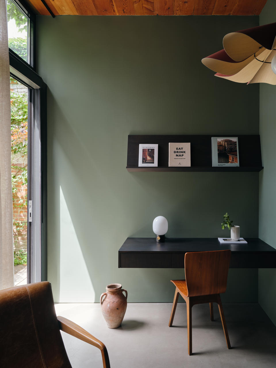
A good neutral tone should be one that instantly calms and relaxes you. An ideal choice then is a tone that is reflective of the outdoors; of green fields, harvest and bounty.
'Earthy olive introduces an element of tranquility into a space, fostering a serene atmosphere,' says designer Dara Huang. 'It connects inhabitants with the natural world, making it a good choice for those seeking to infuse their living spaces with a touch of organic beauty.'
If a plain olive feels too flat, you could consider a color that has warm undertones of yellow or brown to it. Plus, many colors go with olive green, making it a versatile shade to play with.
'I find the muted green shade, such as olive green with a subtle hint of yellow undertone, to be exceptionally neutral,' says Kashi Shikunova, director at Yam Studios. 'The toned-down hue creates a sophisticated, timeless feel while the touch of yellow tone adds warmth, making it an ideal base that harmonizes effortlessly with various furnishings and complementary accent colors.'

Night on Earth
Price: $75 for 3 litres
To give spaces a grounded and cocooning feeling, choose this earthy, dark olive green. This color looks great when paired with blue and grey.
2. Sage green

Pastel living rooms, bedrooms, or kitchens radiate a soft, cool, and beautifully modern energy. Plus both mid-tone and darker colors work well with pastels, and help create a stylish, crisp, and vibrant interior.
'We've always considered green to be neutral,' says Cherie Lee, founder of Cherie Lee Interiors. 'A color reflected in nature, our eye is so accustomed to seeing this color in a multitude of backdrops so it doesn't jump at us, rather blends harmoniously with the environment it's placed in. Soft pastels work in any scheme.'

Teresa's Green
Price: $40 for 3 litres
Choose this mid-aqua, almost-pastel tone to imbue your space with warmth and softness. Consider drenching walls in this calming and therapeutic tone, that still feels cheerful.
3. Dark blue
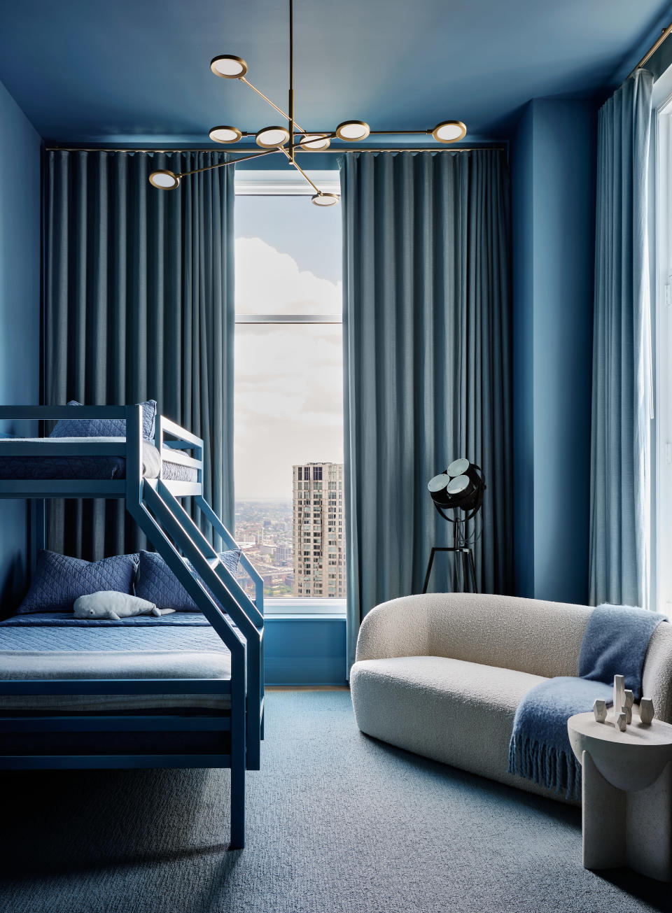
Gone are the days of treating dark tones with wariness. As homes are becoming bolder and more modern, deeper, darker colors are taking over as neutral paint tones, and amongst them, designers recommend a dark blue.
'This all-blue bedroom was designed as an immersion in color,' says Nicole Ficano, director of Interior Design, Associate at Workshop/APD. 'Tying in the hue from the sky outside, we used the same monochromatic scheme that can be found throughout this penthouse apartment, but with a playful spin. The painted ceiling adds height and drama to the space while contrasting pieces like the white boucle sofa feel grounded.'

Drawing Room Blue
Recommended Primer & Undercoat: Dark Tones
Price: $40 for 3 litres
If you don't mind going a bit bold, then this rich blue is an inspiring color to use as a neutral. It works particularly well alongside black and green tones. When contrasted with all white on woodwork, it gains a regal edge.
4. Dusty pink
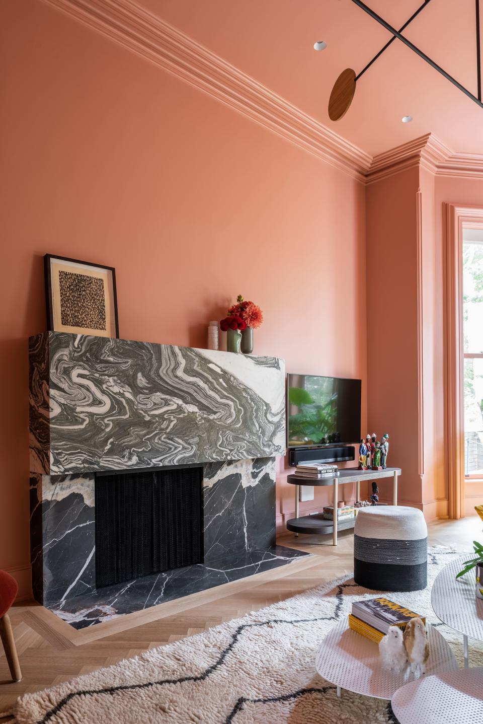
Dusty pink is a gentle, subdued shade with a nice, beige undertone and soft violet notes. Unlike pastel, dark, or bold pink, which can seem too overwhelming, this tone is cleaner and brighter in comparison. The shade is mature, sophisticated, and elegant, and allows for a wonderful layering of other tones, as many colors go with pink.
'At the moment we are working on a home where we are proposing Little Greene's Masquerade; a nice, dusty pink,' says Cat Dal, founder of Cat Dal Interiors. 'This creates warmth in a north-facing room and depth without being too 'sweet'. It's rather a grown-up pink, that works as a neutral backdrop with a variety of richer colors in our furniture and accessories (burgundy & navy).'

Pink 07 Matt
Type: Water-based paint
Price: $70 for 3 litres
This muted, subtle pink has a natural touch and can be used as a neutral in homes. It looks especially good with woodwork and can pair well with most other colors.

