Everything You Ever Wanted to Know About Amber Color
The amber color doesn’t get enough credit. Outside of glass jars and vintage casserole dishes, you rarely see homes that take advantage of this warm and versatile color. Even the slightest touches can light up a room with a glowy energy.
“Amber can appear lit from within,” says color expert Diana Hathaway. “Throwback palettes from the ’60s and ’70s are bringing amber back into our decorating consciousness — but unlike the muted organic colors of that era, the new amber has more clarity and presence.”
Whether your space is decked out in industrial details or rich in mid-century modern vibes, this hue can give any aesthetic a warm upgrade. So without further ado, here’s everything you need to know about the color amber.
What Color Is Amber?
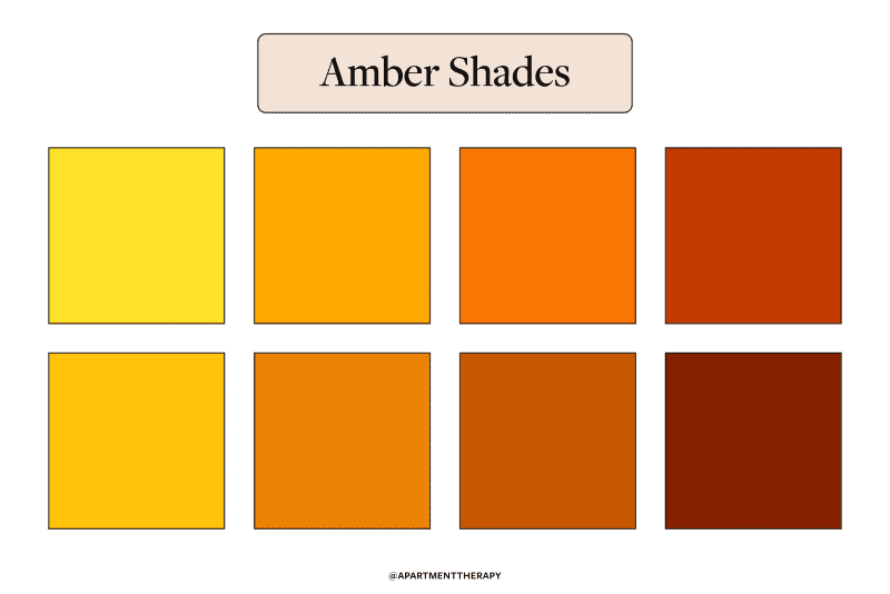
Amber straddles the line between yellow and orange with its golden, honey-like tones. According to interior designer Alexandra Cooper, the color gets its name from the rich hue of fossilized tree resin, which can range from a dark brown to a brighter yellow. Most designers consider amber to be the color code #FFBF00.
What Color Does Amber Look Like?
Per Cooper, amber is closest to yellow, orange, and brown on the color wheel. You’ve likely confused it with burnt orange, caramel, honey, or even rust. But Hathaway says that amber is a much more easygoing shade to implement.
“Shades of rust often have a red tone that makes it tough to decorate with,” she says. “And burnt orange can easily become too bright within a color palette. Amber is warmth without heaviness.”
Interior designer Liz Goldberg thinks that amber’s hint of brown puts it right between her firm’s two other favorite warm hues: ochre and terracotta. Like those shades, amber also has an earthy feel, only with a touch more elegance.
What Colors Go With Amber?
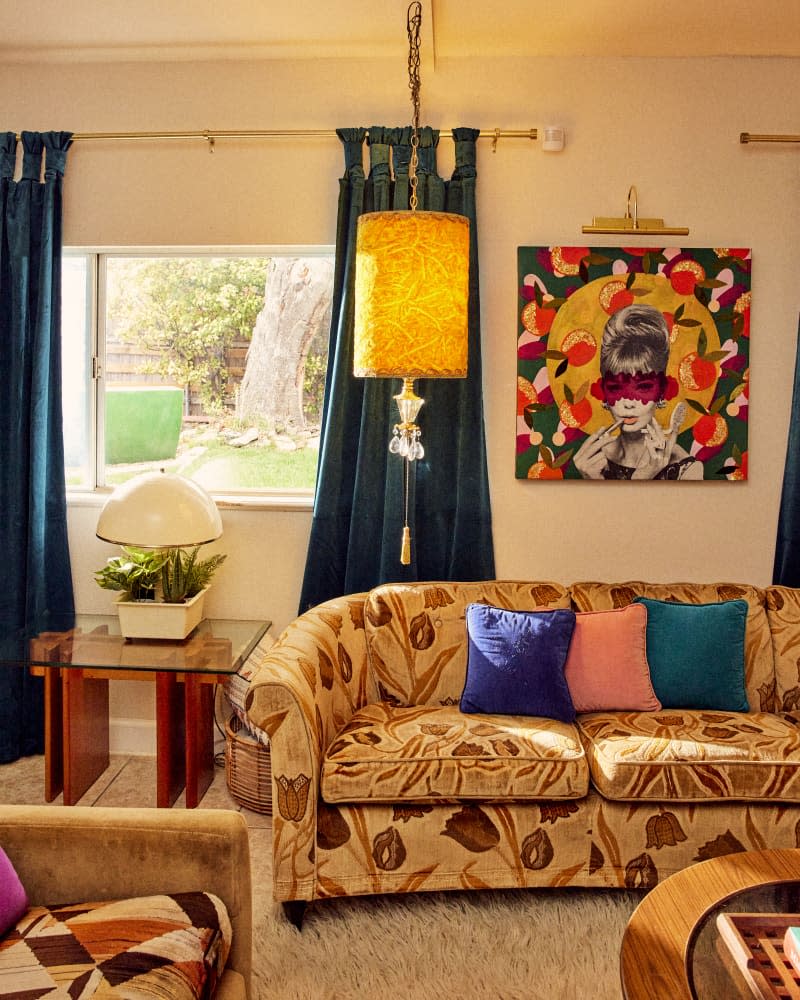
Amber + Teal
The warm tones of amber and the striking cool of teal are a match made in color heaven, especially if you love decorating with vintage or bohemian accents. “This saturated blue-green provides a brilliant contrast to amber’s warmth,” says designer Pamela Williams. “It will bring out its golden glow while adding elegance to the palette.”
Amber + Cream
If your vibe is less bold contrast and more subtle harmony, then turn to everyone’s favorite neutral: cream. Cooper says the neutrality will balance out the warmness of amber and keep the space feeling light and airy.
Amber + Deep Green
Nothing makes amber pop quite like the deep, moody tones of green. Goldberg says she loves pairing the warm tones with earthy colors (taupe and brown included) to bring out the organic quality of amber. It’ll give the room a natural, grounded feel.
Amber + Greige
Although they may be on opposite ends of the color theory wheel, Hathaway says warmer grays, such as deep greige and charcoal, pair nicely with amber.
“Brown and black are great with amber, and your best gray should have that same undertone,” she says. “If someone would like to pair amber with an existing gray, their best chance for success is a gray without a blue undertone that is clear and crisp, not muted or cloudy.”
How to Decorate with Amber Color
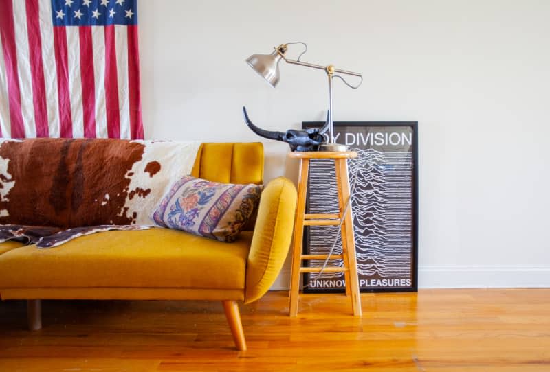
Use it as an accent.
The easiest way to start playing with amber’s fire is to add it as a decorative accent color. It can be low-cost and noncommittal yet make a big impact — aka a cheat code for making your whole room feel alive.
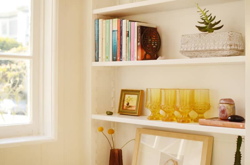
“Implement small decorative accents such as vases, pillows, art, rugs, glassware, and smaller objects,” Cooper says.
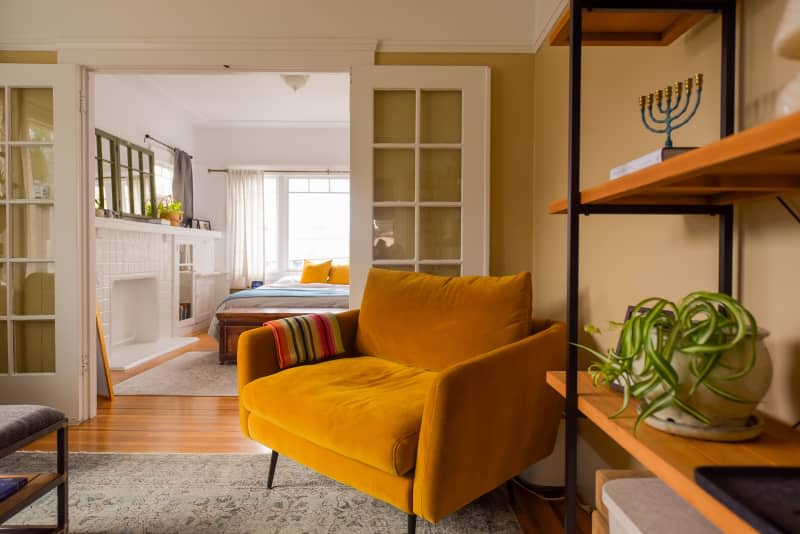
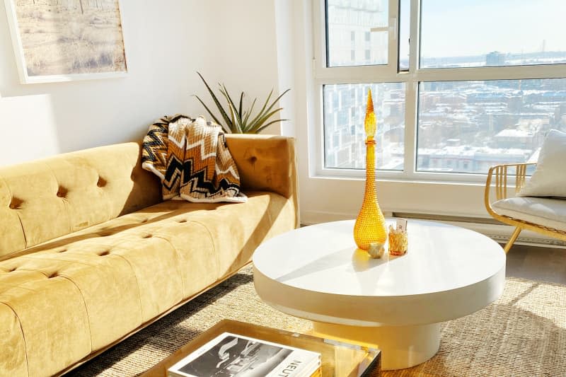
Make it a statement piece.
If you do want to go big (and bold), Hathaway suggests incorporating amber into your home’s textiles to play into its natural luxury vibe.
“This is a color that was born to become a velvet sofa, drapes, or bedding,” she says. “In the kitchen, amber is beautifully expressed in a tile backsplash, backlit solid surface, or stone counter.”
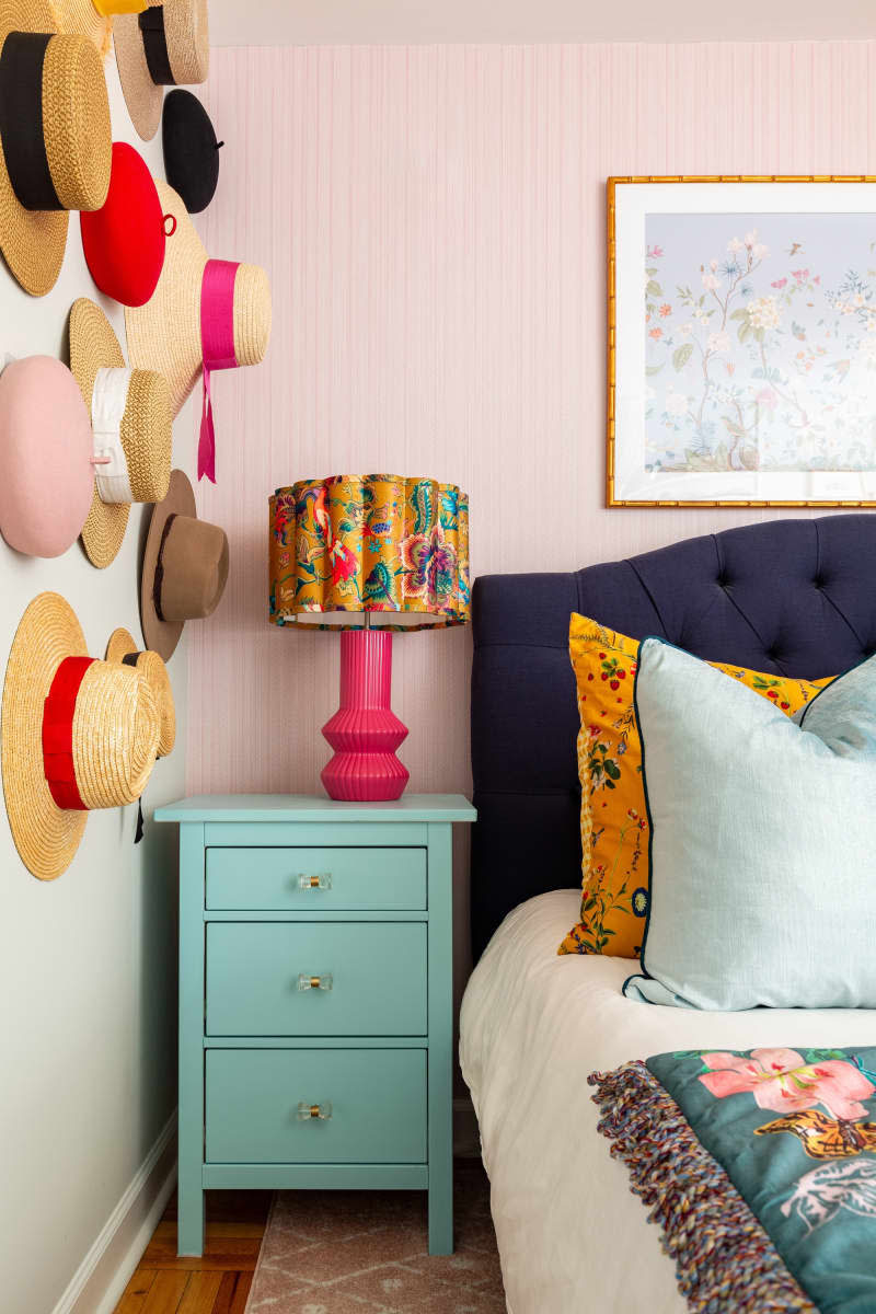
Upgrade your lighting.
Nothing creates a cozy atmosphere quite like amber-toned lighting. Whether you hang a pendant or add a set of lamps, Goldberg says the warm glow sets an elegant mood.
“Lighting is the jewelry of a space,” she says. “Think of it like putting on your earrings after you pick out your outfit. It’s a great way to dress up a room.”
Pair with a natural element.
Amber was a staple in the ’70s, where palettes of yellow, orange, and brown reigned supreme. Cooper encourages leaning into that sense of nostalgia and vintage charm by pulling in natural elements like wood, jute, and rattan through furniture and decor pieces.
Add it to a contrasting color palette.
We love a bold contrast moment, but it’s so easy to overdo it. Williams says to keep it in check by incorporating about 30% amber into a predominantly cool palette for balance. It’ll highlight the warmth of the tone without overpowering the rest of your color scheme.

