Every Single Pantone Color of the Year Since 2000
With Pantone's Color of the Year for 2024, the company is celebrating the 25th anniversary of its Color of the Year program. Every year since the program's inception in 1999, Pantone has tapped into our collective values through color—capturing a moment in time, while also looking toward the future. While it's easy to recall the most recent selections, like Peach Fuzz and Viva Magenta, color trend followers might not remember, or ever have known, what came before the latest picks. If you're eager for a rundown of Pantone's past Color of the Year selections, we've laid them all out. Ahead, dive into Pantone's color history to learn not only what the colors look like and are named, but also what the specific qualities and meaning of each shade are. It all started with Cerulean blue—join us as we work our way back to that!
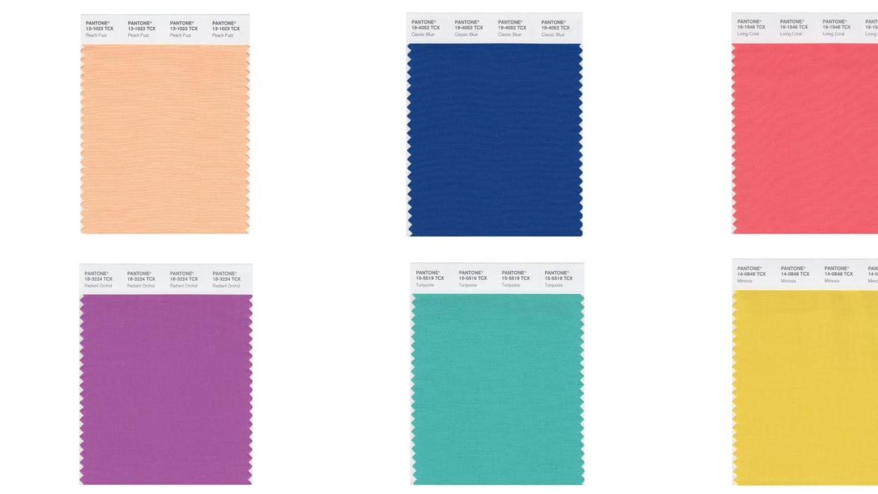
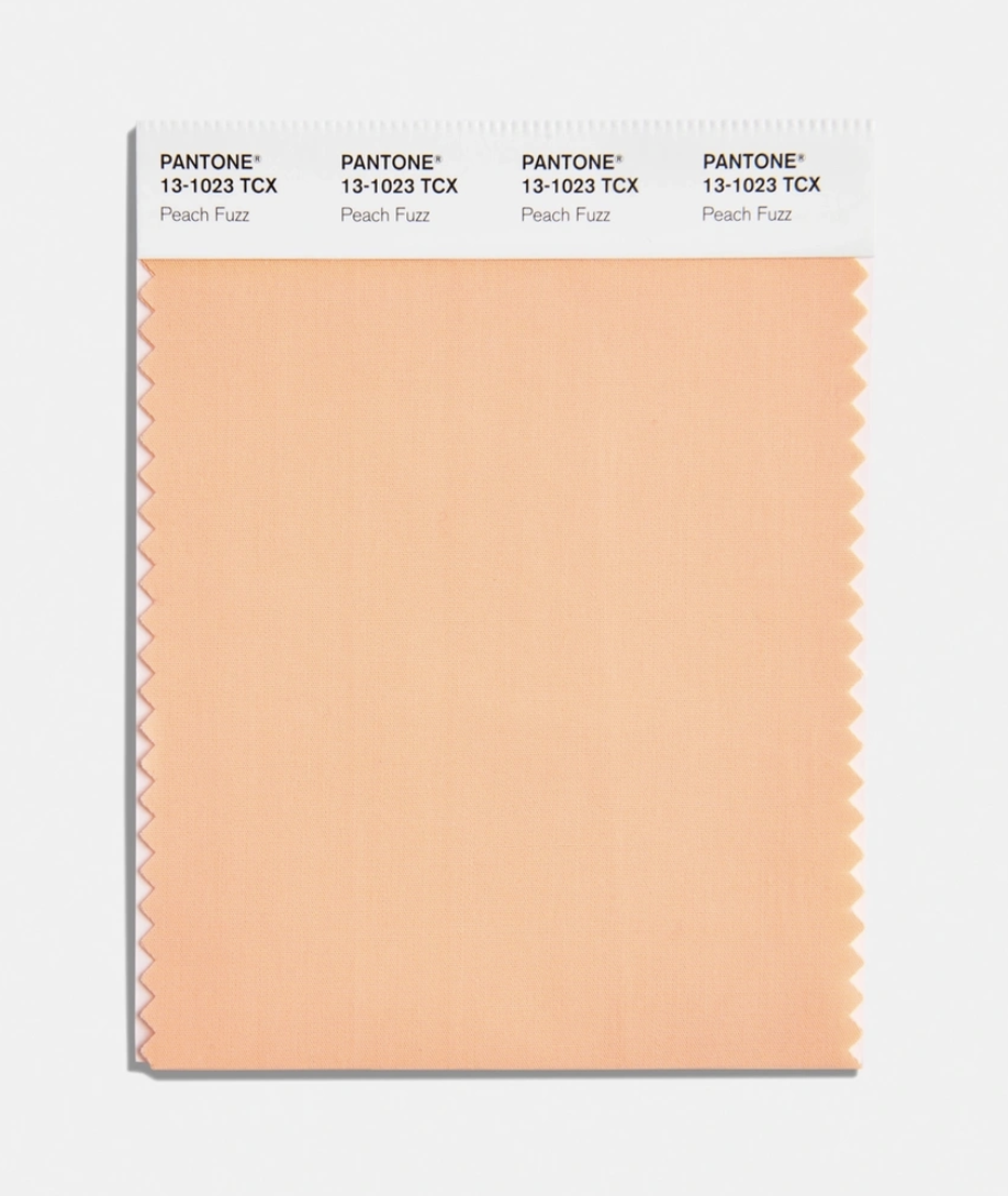
2024: Peach Fuzz
A light, delicate shade that sits between pink and orange, Peach Fuzz marks the 25th anniversary of Pantone's Color of the Year program. This soft, heartfelt hue expresses the desire to nurture kindness, compassion, and connection—all while fostering a deep coziness as we seek a peaceful future. Find more about the meaning behind the color here.
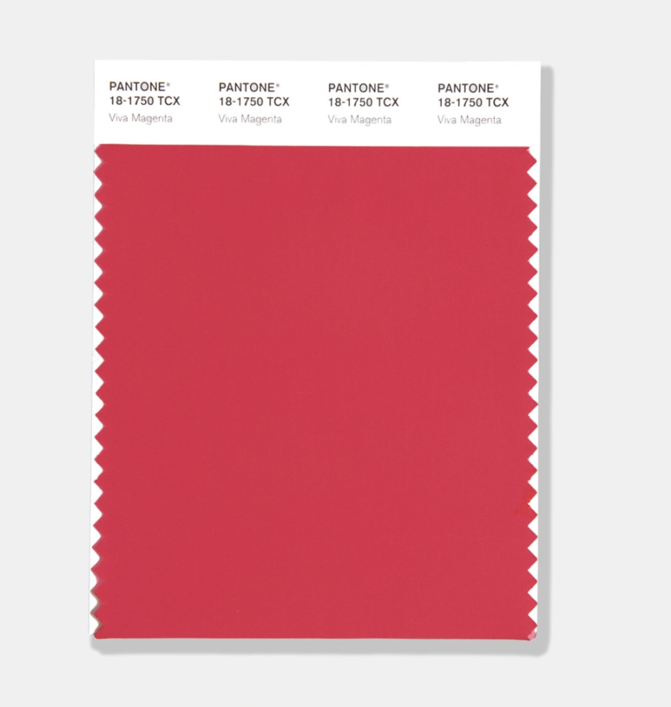
2023: Viva Magenta
Viva Magenta is inspired by the red of cochineal, one of the most precious natural dyes, which is also one of the strongest and brightest in the world. The crimson-red hue is statement-making yet not overpowering, leaving room for creative interpretation. Learn more about the color here.
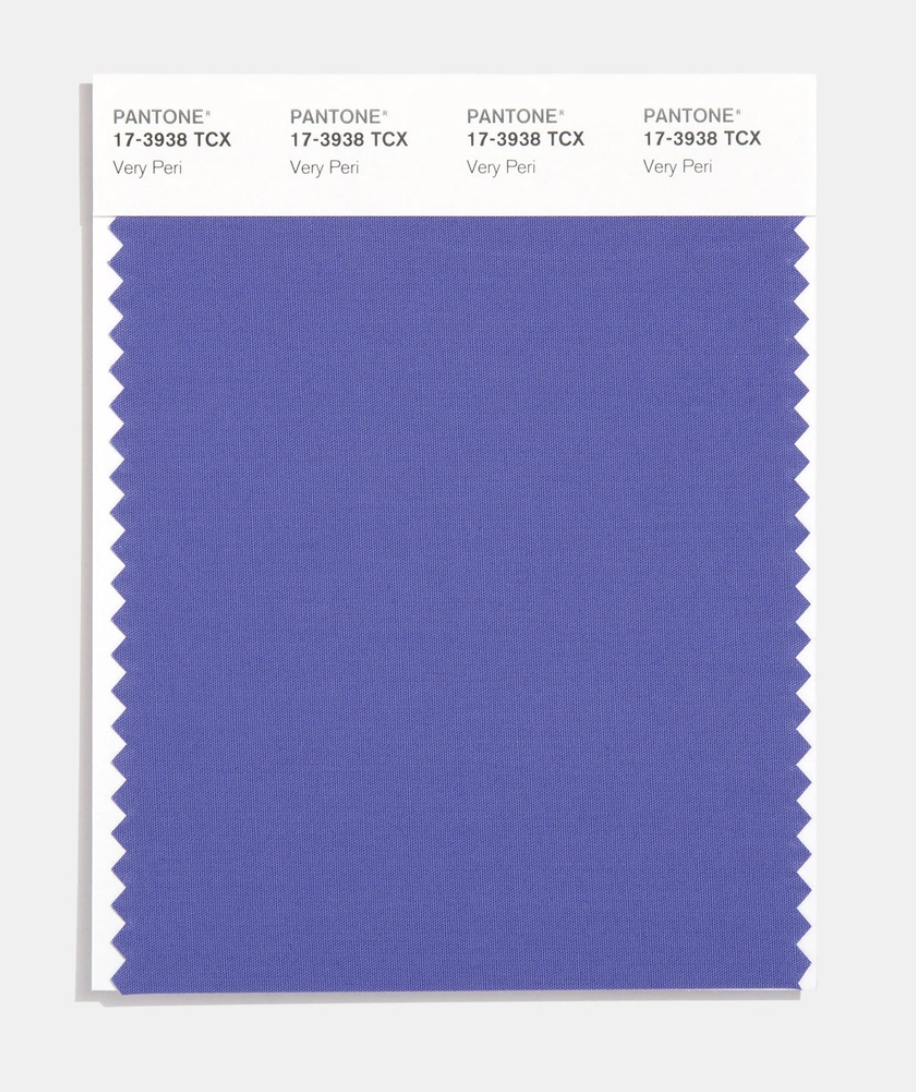
2022: Very Peri
Pantone dreamt up an entirely new shade called Very Peri for 2022. It's a dynamic periwinkle blue that boasts a warm violet-red undertone. The futuristic-feeling color illustrates how color trends in the digital world are manifested in the physical world and vice versa. Eager to incorporate it into your home? Get some inspiration here.
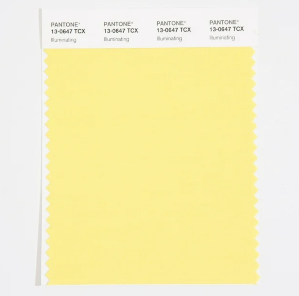
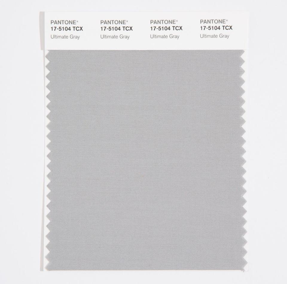
2021: Illuminating and Ultimate Gray
For the second time in Pantone's Color of the Year program history, the company chose two colors for a single year.
Illuminating, described by Pantone as "a warming yellow shade imbued with solar power," oozes with cheer. It's a bright but not overwhelming yellow. When paired with Ultimate Gray, the combination signals resilience and hopefulness.
2021: Illuminating and Ultimate Gray
The other of Pantone's two colors of the year for 2021, Ultimate Gray is a versatile color reminiscent of pebbles on a beach. Pantone describes the hue as having "solid and dependable elements, which are everlasting and provide a firm foundation."
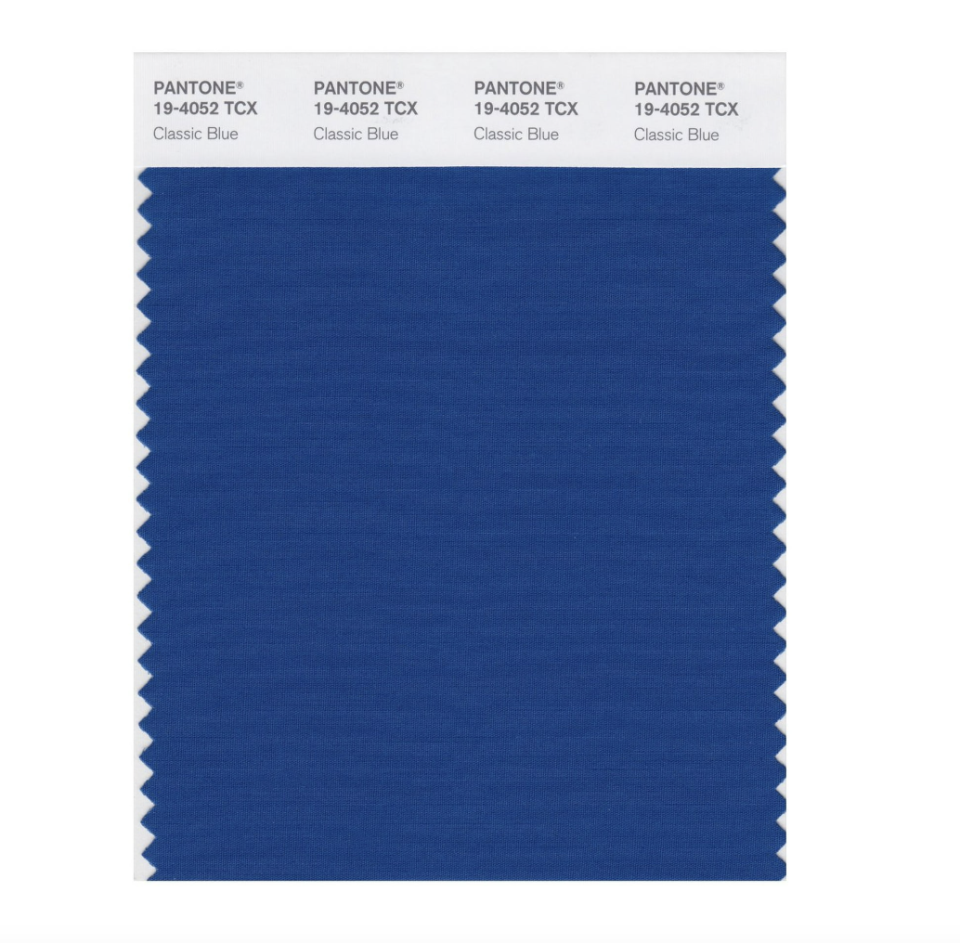
2020: Classic Blue
Classic Blue is exactly what you'd expect it to be: an enduring, timeless shade that's simple yet elegant. The dependable hue is the color of a late afternoon autumn sky, of graduation gowns in June, of your favorite sports team's jerseys. It's worn-in blue jeans, and what could be more classic than that?
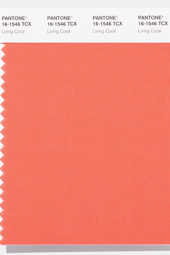
2019: Living Coral
An animated coral with a golden undertone, Living Coral is an energizing shade that offers warmth, comfort, and nourishment in a constantly changing environment. With a buoyant quality, the color also promotes playfulness and is connected to nature through the coral reefs in the sea.
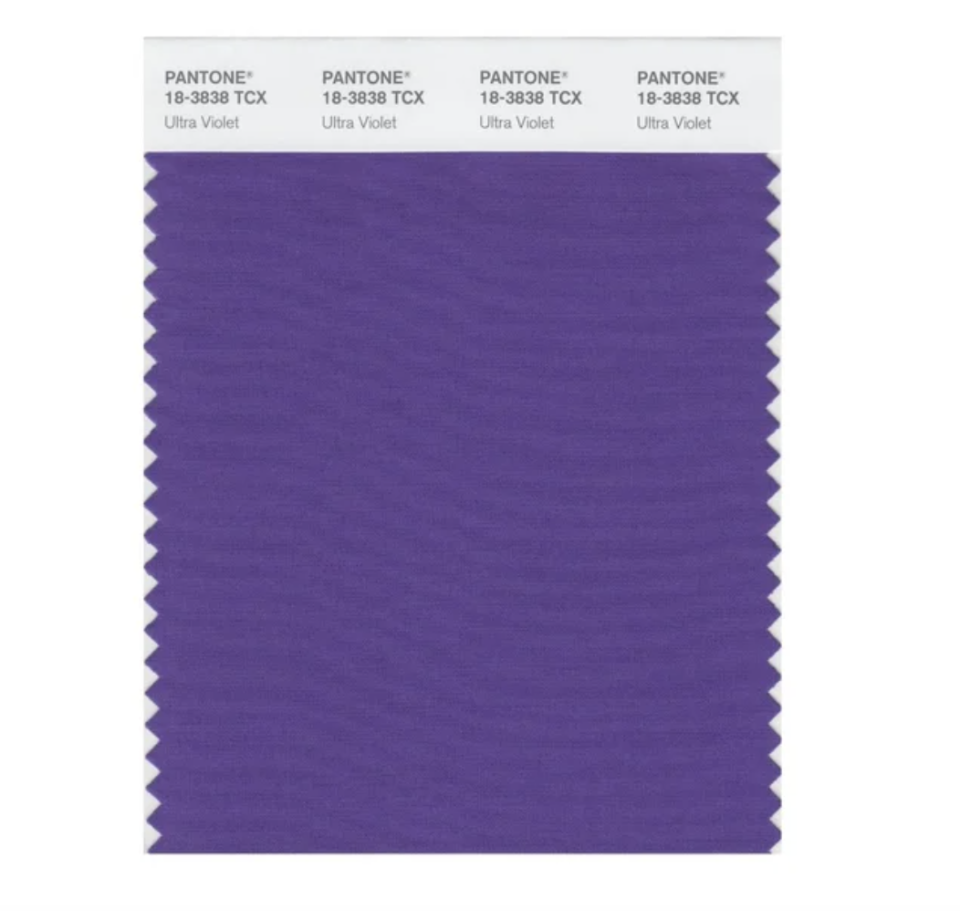
2018: Ultra Violet
According to Pantone, Ultra Violet is a "dramatically provocative and thoughtful purple shade" that "communicates originality, ingenuity, and visionary thinking." The color evokes a hint of fantasy and is reminiscent of the limitless night sky. It symbolizes non-conformity and pushing boundaries. Learn how you can use it in your home without going overboard here.
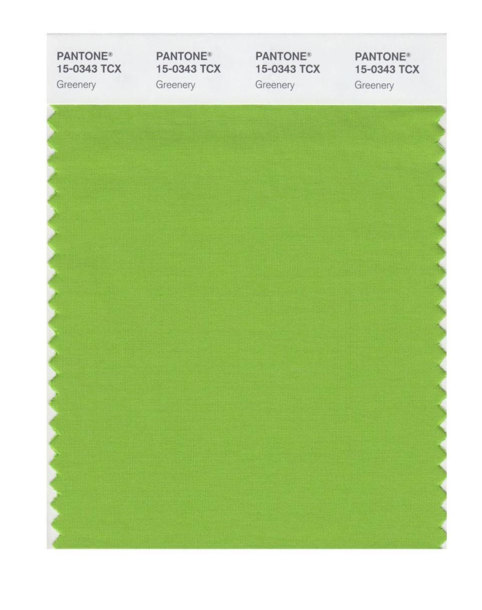
2017: Greenery
Perhaps the brightest shade of green ever to be named a Pantone Color of the Year, Greenery represents refreshment, rejuvenation, and rebirth. The zesty, yellow-green shade is nature's neutral. Here, learn more about how, in 2017, the color was prevalent in everything from interior design to fashion.
2016: Rose Quartz and Serenity
For the first time in Pantone's Color of the Year program history, the company chose two colors for a single year.
As a soft, light pink, Rose Quartz is a persuasive yet gentle tone that symbolizes compassion and composure. The delicate color is like a warm embrace. When paired with Serenity, it promotes peace and balance.
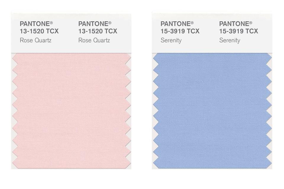
2016: Rose Quartz and Serenity
2016's other Pantone Color of the Year, Serenity is a cool blue color that, the company said, "comforts with a calming effect, bringing feelings of respite and relaxation even in turbulent times." When paired with Rose Quartz, the combination challenges traditional perceptions of color as it relates to gender.
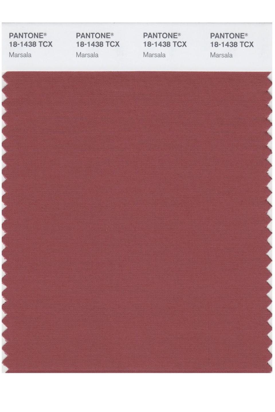
2015: Marsala
Like a robust, earthy red wine, Marsala is a universally appealing red-brown color. It can be incorporated into a range of interiors, whether you're after a sophisticated look or a laid-back atmosphere. Ultimately, it encourages creativity and experimentation.
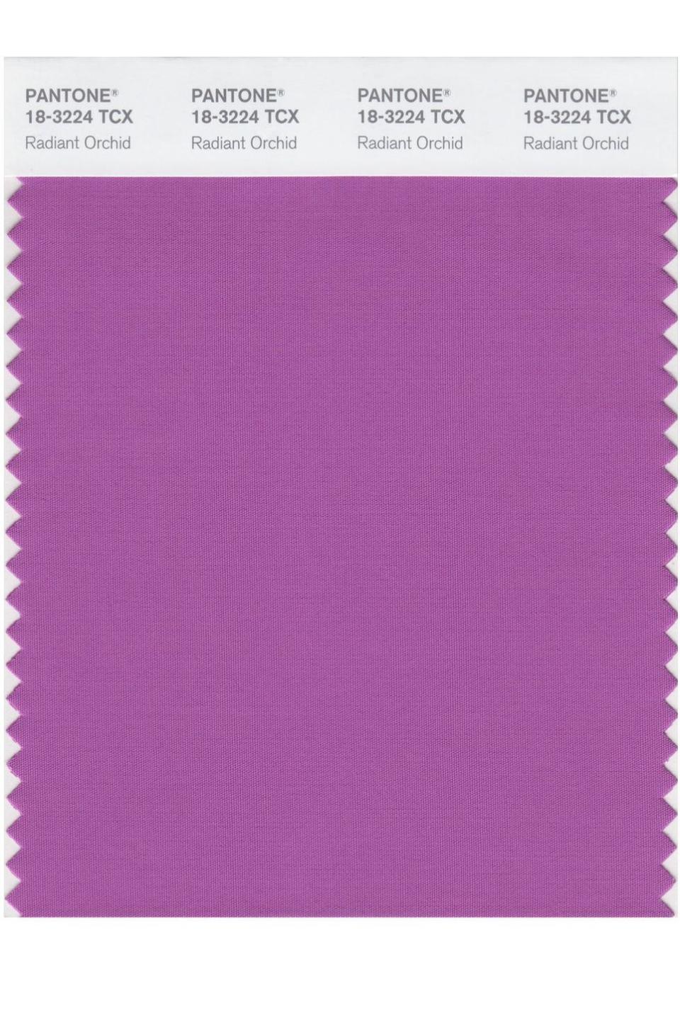
2014: Radiant Orchid
Radiant Orchid is a blend of fuschia and purple. Said to inspire confidence, happiness, and love, the enchanting color is uplifting, bold, and hard to resist. Radiant Orchid is especially nice when paired with olive, deep hunter greens, turquoise, light yellows, and neutrals.
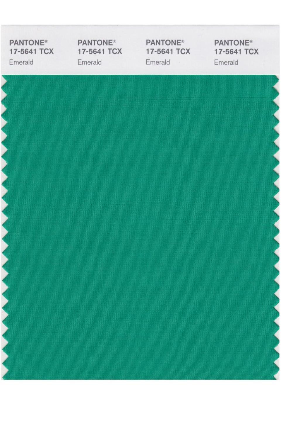
2013: Emerald
A vivid green, Emerald enhances well-being through balance and harmony. Reminiscent of the coveted gemstone, Emerald is perceived as luxurious. But it also represents beauty, new life, growth, renewal, and prosperity. For centuries, the color has also been used to symbolize unity.
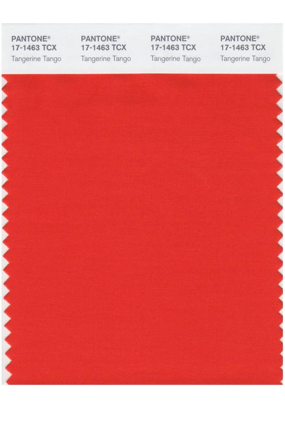
2012: Tangerine Tango
As the best color in a really good sunset, Tangerine Tango provides the energy boost that's needed to recharge and move forward. The fiery red-orange has a lot of depth to it, making it magnetic and welcoming.
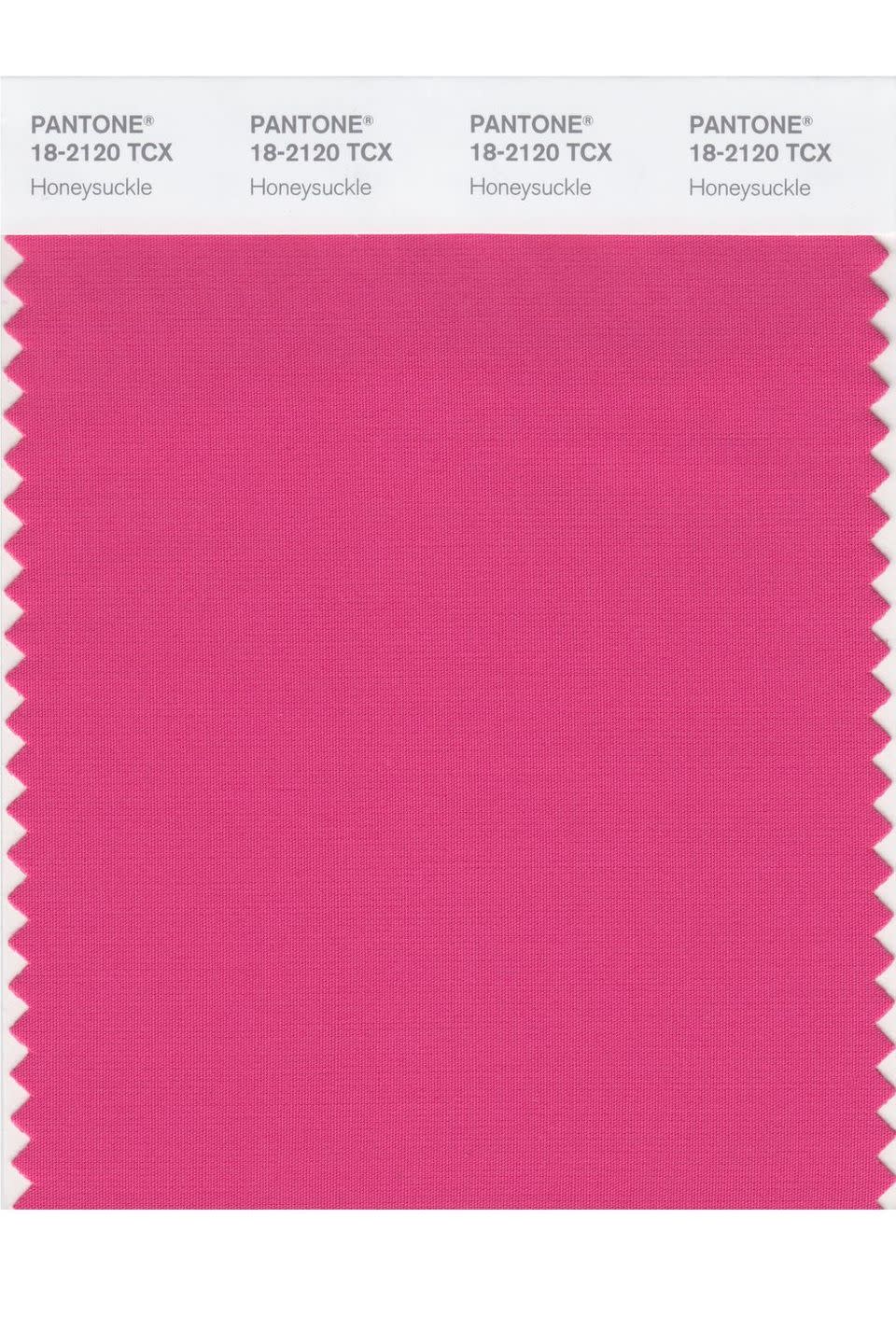
2011: Honeysuckle
Honeysuckle is a dynamic reddish pink that uplifts spirits and instills confidence. An attractive color found in nature, Honeysuckle also evokes a rush of nostalgia for the carefree days of spring and summer. When used as a wall paint, the color is a conversation starter. As an accent color in fabrics, kitchenware, or small appliances, it'll infuse any space with optimism.
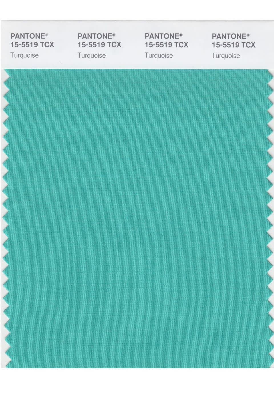
2010: Turquoise
Serene and invigorating, Turquoise is the best of blue and green. Similar to tropical waters, the soothing color inspires a comforting escape from the troubles of everyday life. Possessing both warm and cool tones, the hue pairs nicely with a range of colors from neutrals and reds to deep blues and yellow-greens.
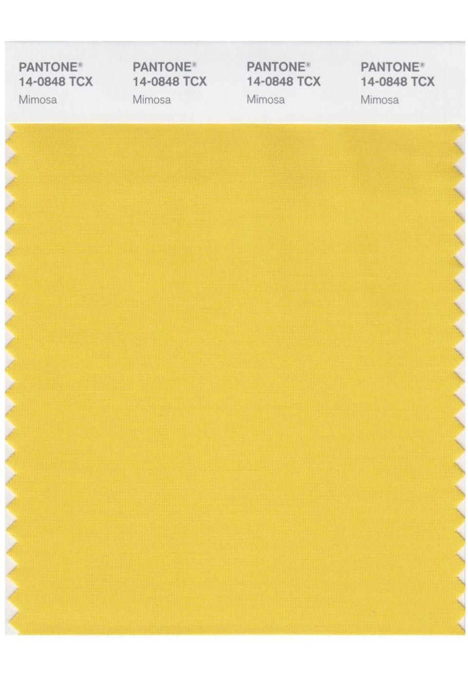
2009: Mimosa
During a time of economic uncertainty, Mimosa expressed hope and reassurance. The warm, engaging yellow possesses the nurturing characteristic of the sun while speaking to enlightenment and sparking the imagination. It's nearly impossible to look at the yellow and not feel a sense of joy.
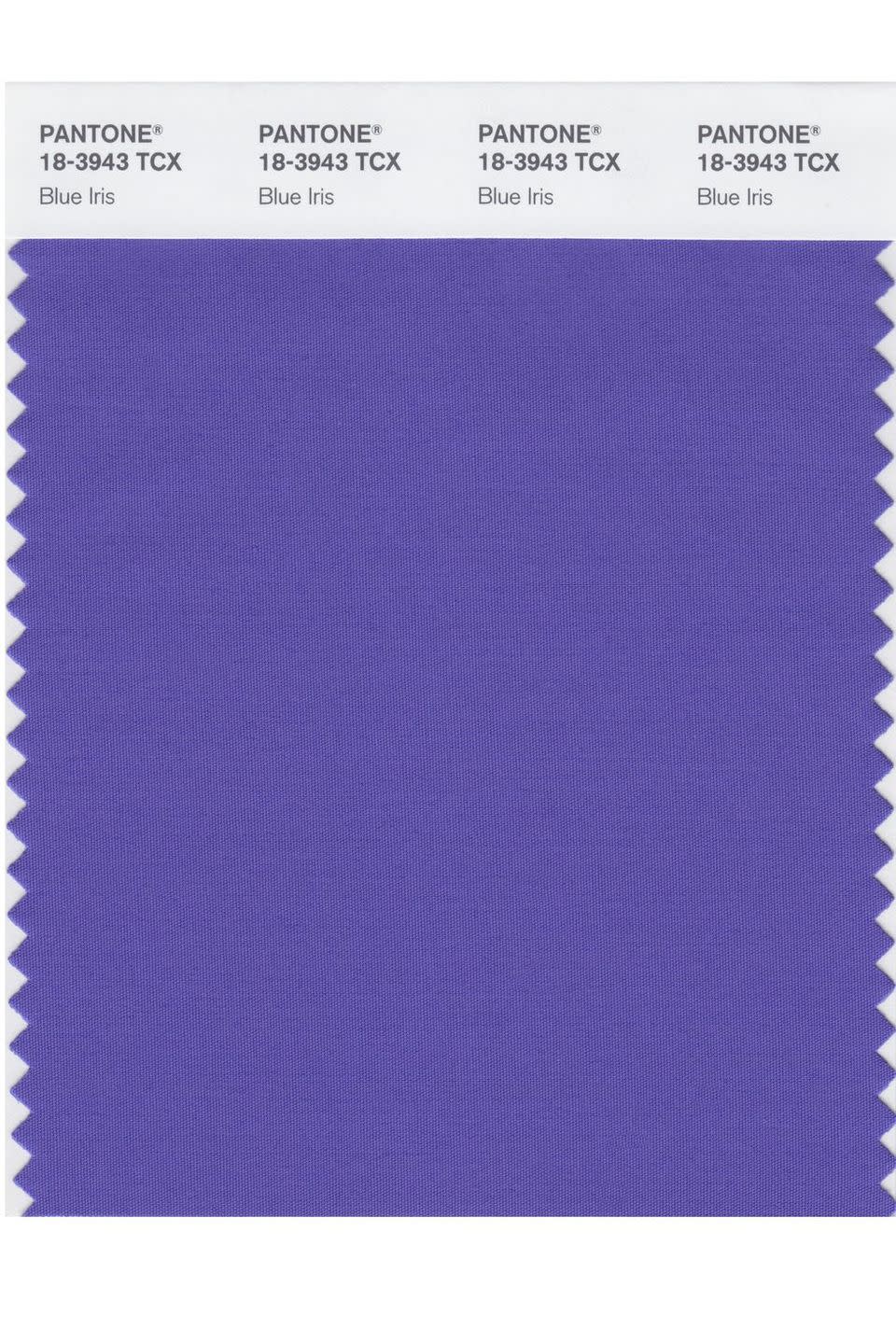
2008: Blue Iris
Blue Iris combines the stability and tranquility of blue with the mystical qualities of purple. The blue-purple balance brings reassurance and excitement, but it's also strong and dependable. Pantone suggests artfully complementing Blue Iris with deep plums, red-browns, yellow-greens, grapes, and grays.
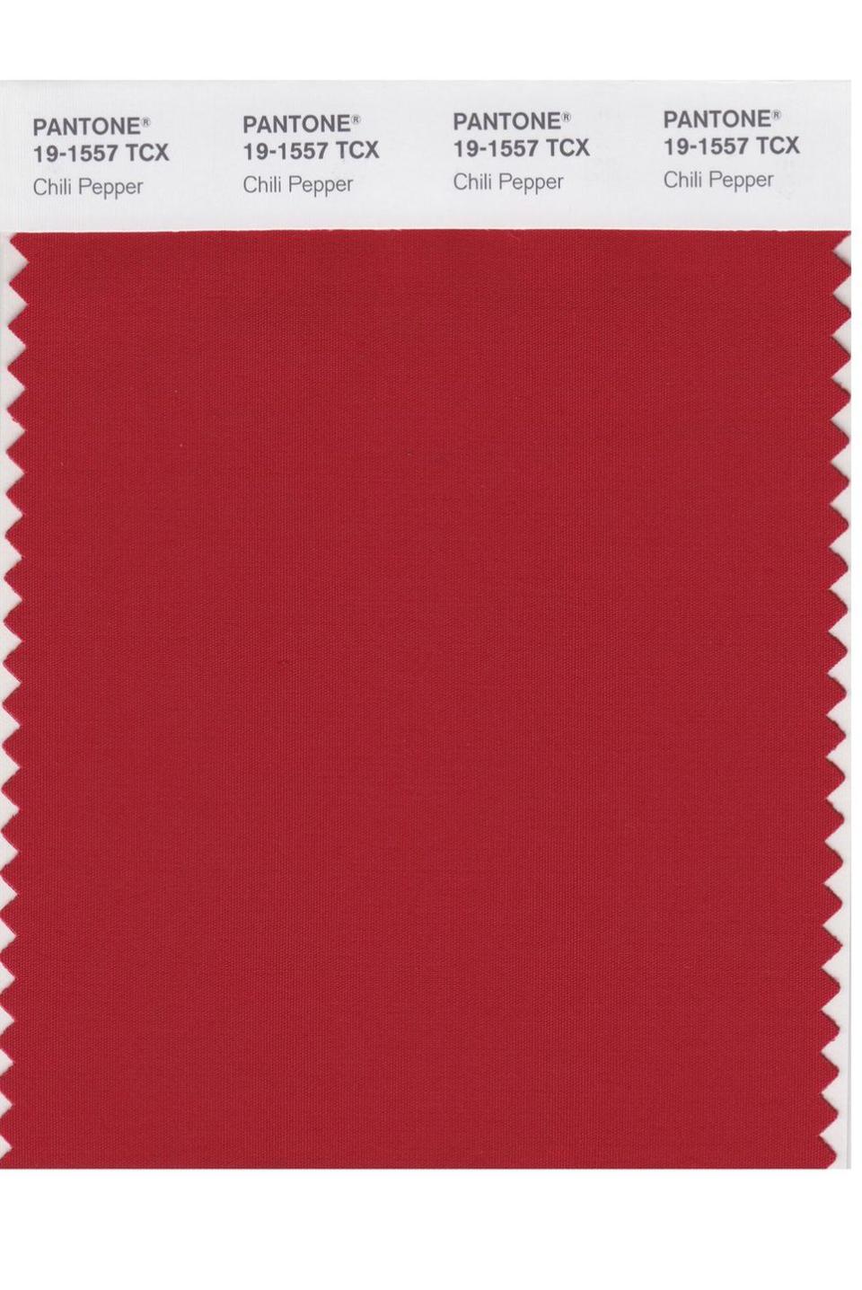
2007: Chili Pepper
A deep, spicy red, Chili Pepper is bold, sophisticated, and enticing. The color embodies a variety of moods including the spirit of adventure, love, passion, and even danger. But no matter what it signals, the hue can't be ignored.
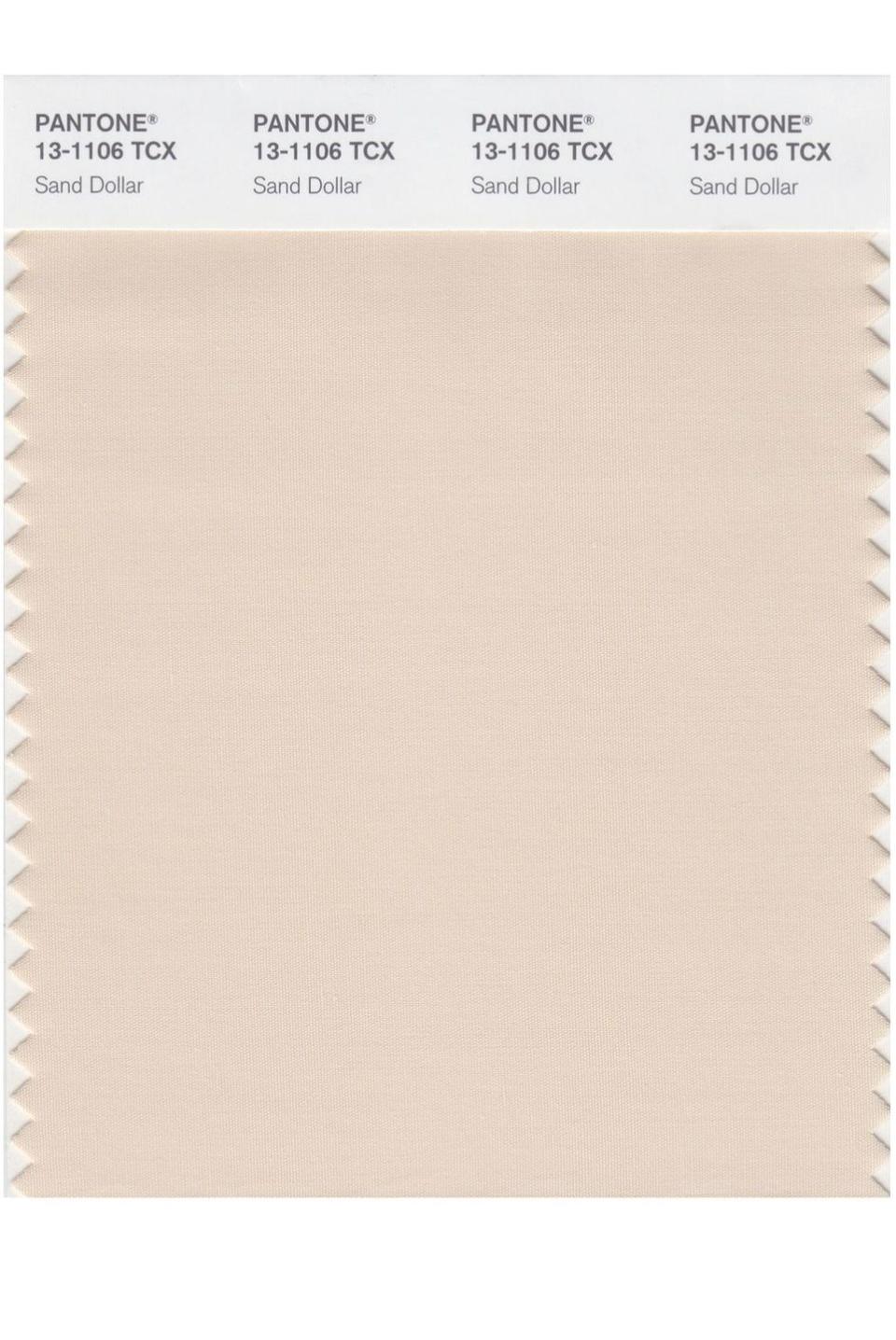
2006: Sand Dollar
A natural neutral, Sand Dollar is a warm shade that relaxes and soothes the nerves. It recalls beaches where the soft sand, soothing waves, and warm sunlight create the perfect outdoor atmosphere to unwind.
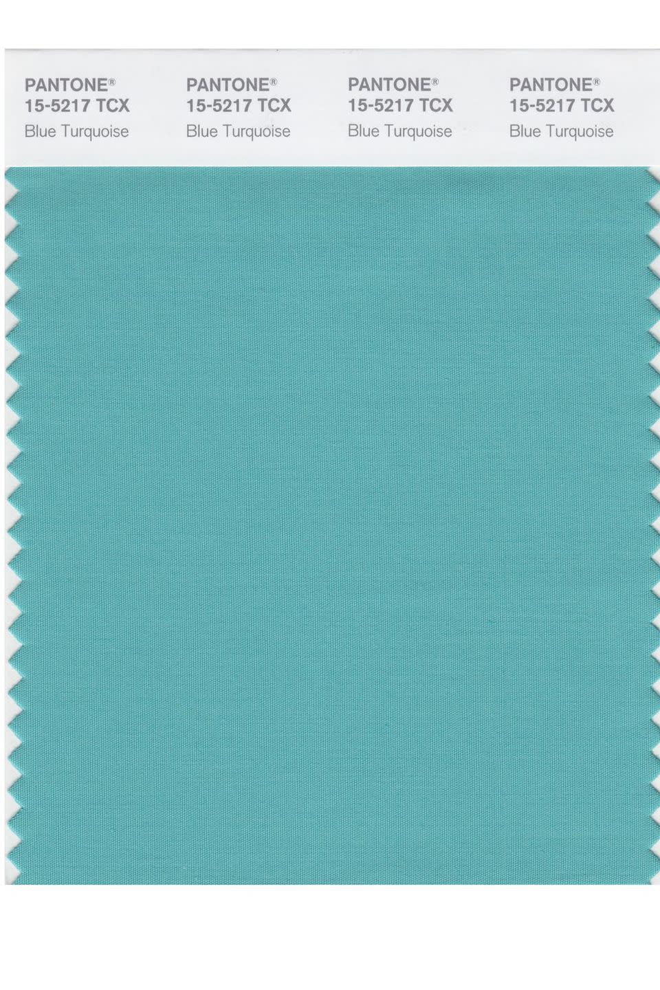
2005: Blue Turquoise
Like a true turquoise, Blue Turquoise takes inspiration from the sea. But this shade has less green in it, making it a cooler tone. The calming, reassuring color transports the imagination to a seaside paradise on a nice, summer day.
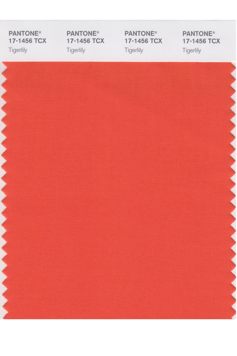
2004: Tigerlily
Tigerlily is inspired by the flower it's named after. A mix of red and yellow, the color encourages boldness and creativity. While the fiery color is statement-making, it still has a welcoming quality to it.
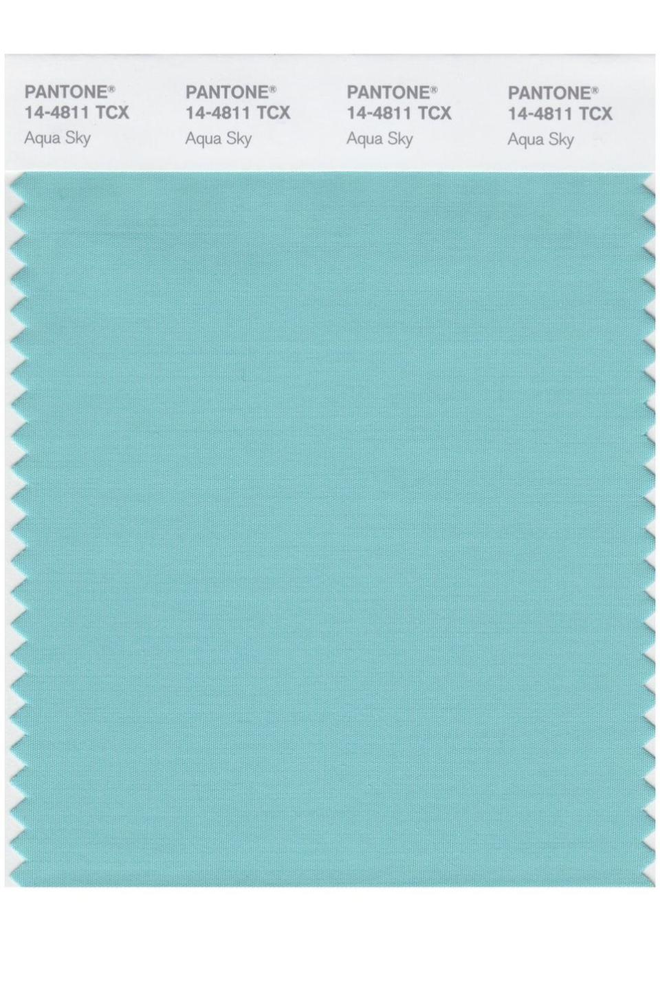
2003: Aqua Sky
In 2003, blue-green Aqua Sky was chosen to inspire serenity and hope. While soft and calm, the hue exudes just enough energy to be exciting. It's the color of fresh, clean ocean water that makes you want to jump right in.
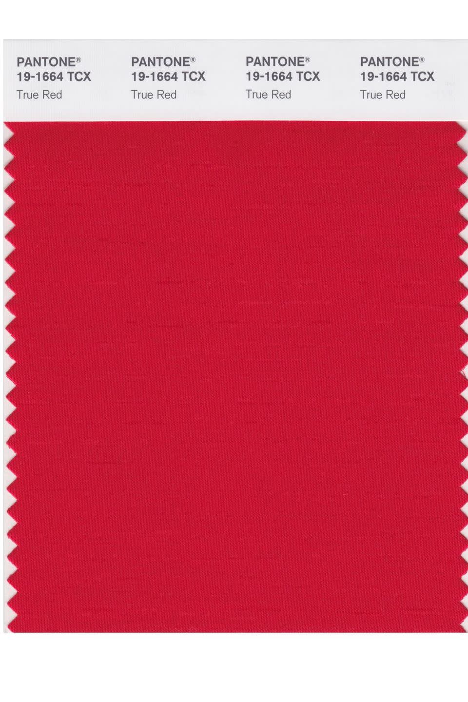
2002: True Red
Following the tragic events that took place on September 11, 2001, True Red was chosen as a patriotic remembrance. The vivid red is strong and powerful, representing all of the courage that was shown that day. The color also signals love and passion.
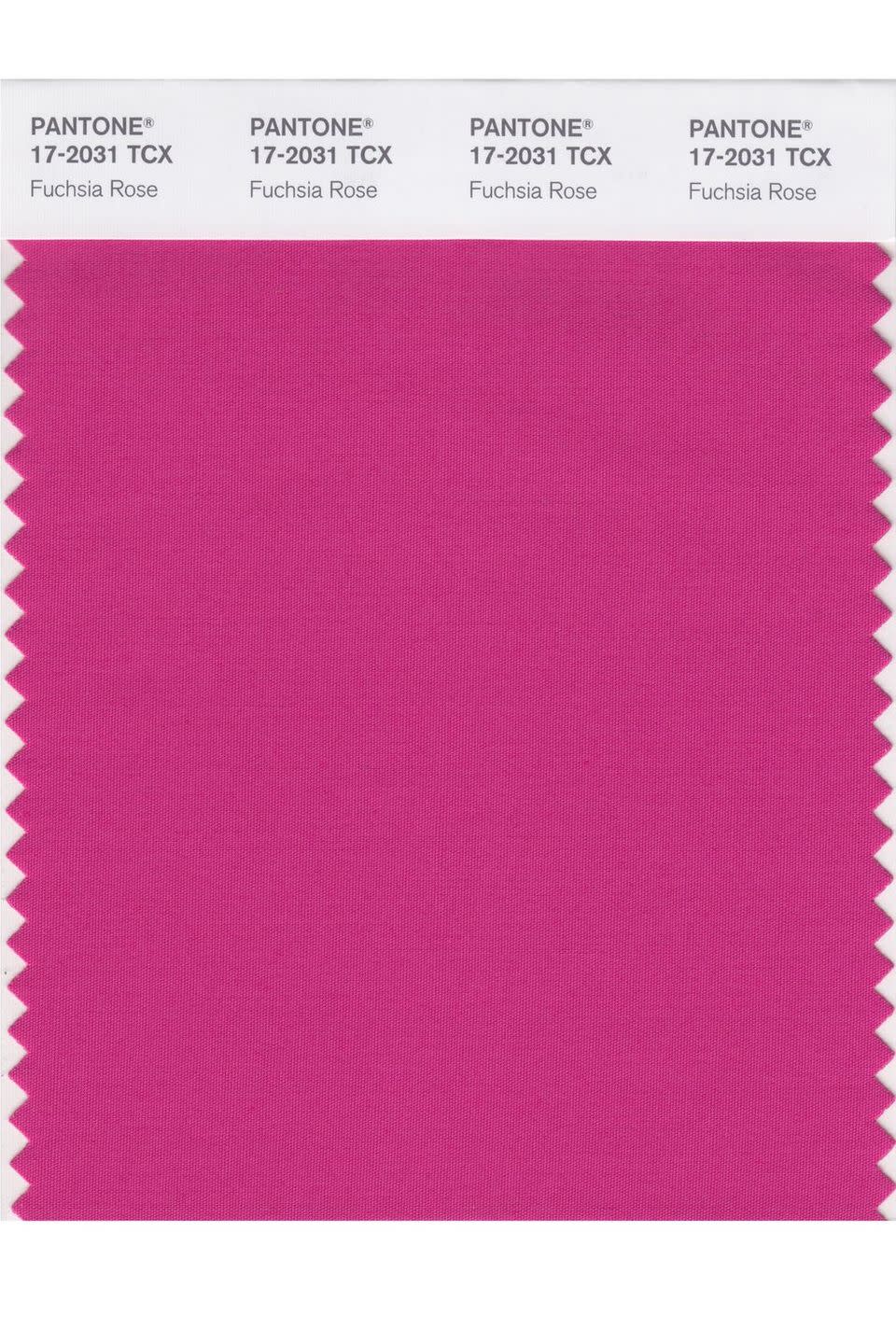
2001: Fuchsia Rose
A bright, feel-good color, Fuchsia Rose is daring and intense, yet warm and enduring. Found in flowers, the vibrant pink hue is dynamic. It's eye-catching in everything from interior design to fashion.
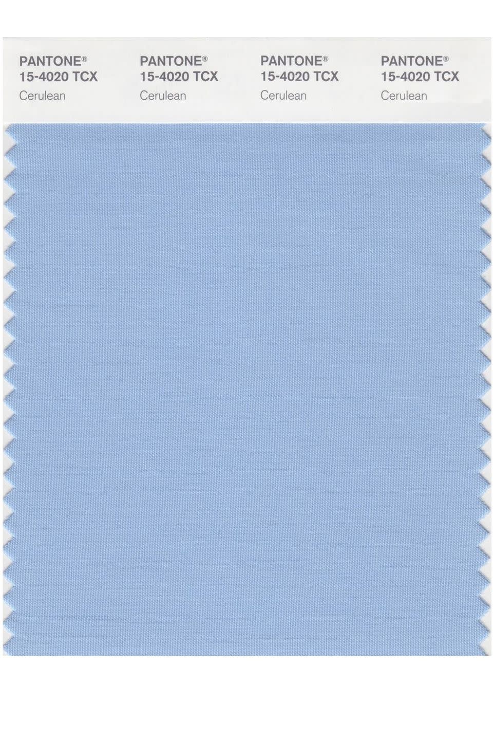
2000: Cerulean
Cerulean, a powdery blue, was selected as Pantone's first-ever Color of the Year, which also set the tone for the new millennium. Blue was chosen because the color is widely popular. This particularly welcoming shade also promotes relaxation.
You Might Also Like

