New England football kit gets a "modern twist" (and it's not going down well)
Earlier this week, Nike launched the new England football kit for this year's European Championship. The new design is a dramatic departure from the typical red and white, and as with any change, some fans aren't happy.
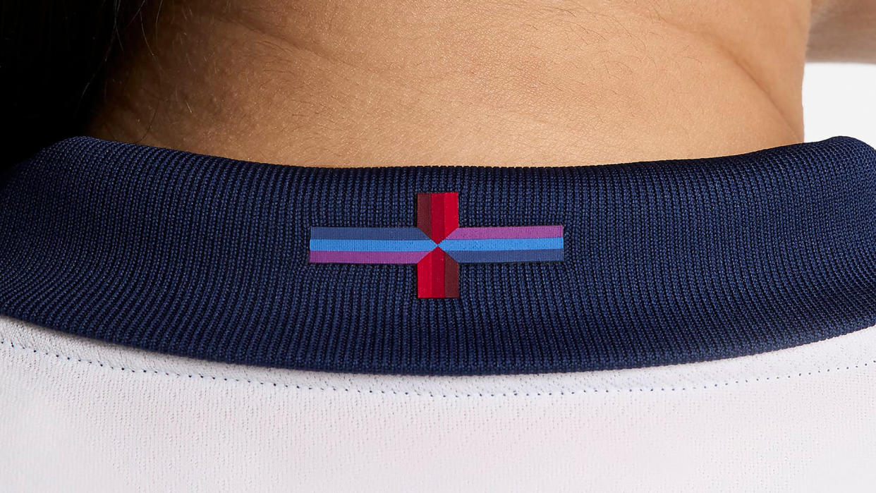
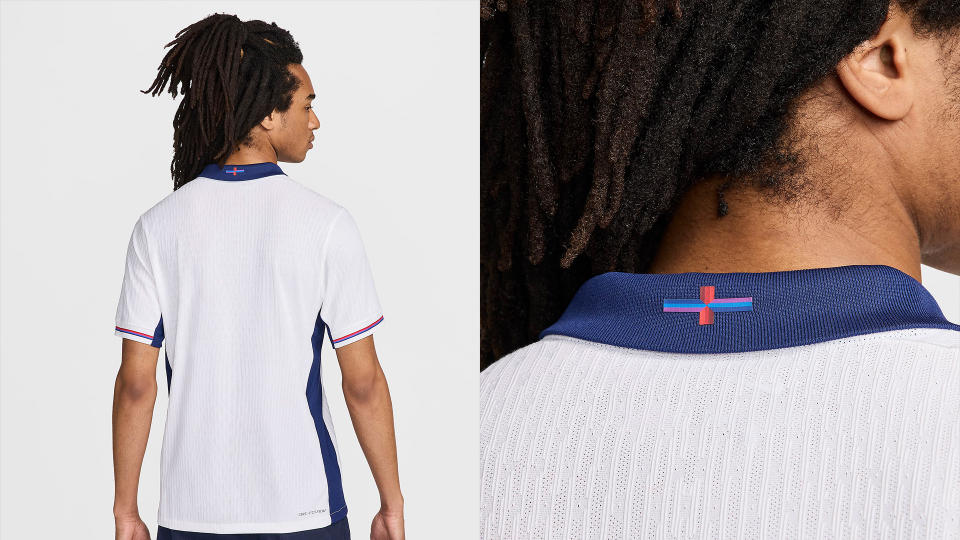
The issue arises from the colour redesign of England's traditional St George's flag, which now features a gradient blue and purple striped design. Sports logos are incredibly important to fans and England supporters are no different – they're not shy to voice their strong opinions.
In an X post, Nike shared that the new kits were created to "celebrate football heroes of the past with a modern twist". That "modern twist" proved unpopular with devout fans, who felt that the St George's flag had been wrongfully altered in defiance of tradition. Among the outrage were fans commenting "not my flag", while one X user called it, "An insult to England."
The reimagined flag is inspired by the new away kit design, which features a rich purple colour. While the new flag still features the traditional red, the addition of the blues and purple gives the new design a strange look – perhaps more fitting to an airport lounge than a national football team. Nike says the design references the training kit of the 1966 World Cup winning team, which was a deep blue and featured blue, red and white stripes along the edges.
Some, like Sam Hoey, design lead at Designit, think it's a misstep. "Nike and its design team – not to mention the FA, which signed this off – took a misstep in underestimating the power of a logo to evoke long-held, deeply felt allegiances. It’s curious given how much stock Nike puts into its own brand narrative," says Sam, who also adds that there would be outrage if Nike gave the stars and stripes a makeover for the US kit.
"At best, you could argue that in the process of design brief, reviews and iterations, the team got carried away (albeit in the wrong direction). What’s more likely is that this is an instance of how the power balance between brand sponsors and organisations like the FA has shifted so that something as central to national identity as the flag has not been flagged, questioned and put straight before a stitch was sewn," says Sam.
Regardless of the backlash, so far it seems Nike has no intentions of reverting back to the flag's traditional colours. Designs come and go, and it's clear that not every new look is going to score with fans. It's undoubtedly a sleek and contemporary refresh (whether fitting or not), but it seems some fans are more concerned with maintaining legacy over looks.
For more news on the beautiful game, check out the leaked football club logo that was heavily criticised by fans. If you're after more sporting design, take a look at our collection of the best and worst national football team logos.

