Elon Musk's xAI logo triggers massive design debate
- Oops!Something went wrong.Please try again later.
Tesla, SpaceX and Twitter owner Elon Musk has been blowing hot and cold over AI. He was an early investor in OpenAI, the maker of DALL-E 2 and Chat GPT, but then pulled out. Most recently he was saying AI was dangerous. Now he's launched his own AI company, xAI, to save us.
The new company already has a logo, and it's causing quite some debate. While some are admiring the simplicity with which it represents xAI's name in just three straight strokes, others think it's a botched job and as hard to read as Musk's stance on AI tech (see our pick of the best AI art generators to explore current AI tools for image creation).
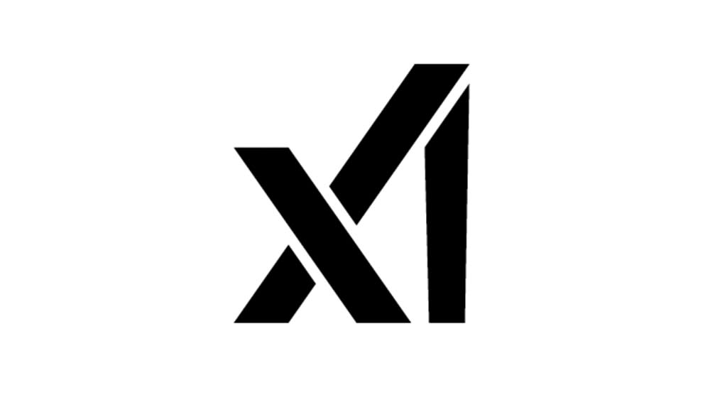
Musk's xAI logo

At first glance, Musk's new logo can be easily misread if you don't already know the company name, looking as much like X1 as xAI. The logo does have its fans, who have praised the efficient use of lines to write out the company name. Some are even seeing it as the third in a trilogy of classic Musk "logos that tell a story", up there with the SpaceX logo and the Tesla logo, which is absolutely not an IUD.
The X does perhaps slightly reference the SpaceX logo, but even among fans there's debate about how the xAI logo should be read. Some think the vertical line (the 'I') forms one of the lines of the 'A', while others think the 'A' is formed in the bottom portion of the 'X'. Meanwhile, some think the logo looks suspiciously like that of the cryptocurrency protocol Algorand.
Every logo has a unique story 🎨 pic.twitter.com/ENew1LKsLVJuly 13, 2023
Interesting how the brain perceives things differently. Take the @xai logo. Image 1 is how I see xAI in the logoImage 2 is how @cb_doge sees xAI in the logo. Which do you see? 1, 2, or something else? https://t.co/umIfEQ5078 pic.twitter.com/KhfjmL6y64July 14, 2023
Did you notice @xai has a similar logo to @Algorand? I like it. Both of them clean and simple. :) pic.twitter.com/sVc4G3HYHzJuly 14, 2023
Others have noticed what they think is a 'mistake' in the new logo design that needs to be fixed. If you look closely, you'll see that that 'I' isn't straight but tapers outwards as it rises. That's irritating some people.
#xAI Logo observation I suppose the I of Intelligence is growing... am I right?#ElonMusk @xai @elonmusk pic.twitter.com/o0iY5DEvWpJuly 13, 2023
When I saw Elon Musk's new AI company xAI logo I feel something was wrong, and I was right I fixed it.. if you didn't notice a different sorry only professional designers can see it 🌚 pic.twitter.com/BTOng2UujBJuly 13, 2023
I don't believe in logo design rules per se, although we do have some in our guide to how to design a logo. I suspect the tapering is intentional in order to create more separation between the base of the 'I' and the diagonal line of the 'X' (some people are making more metaphorical readings, suggesting that it's to communicate that with xAI the 'intelligence' part of 'artificial intelligence' will grow, but that feels like a generous interpretation).
Announcing formation of @xAI to understand realityJuly 12, 2023
It's not yet clear what exactly xAI will do. In his tweet announcing the company's launch Musk said merely that the company's objective will be to "understand reality". Quite a mission statement. He's also claimed that the company, which appears to reference the name of his own son, X Æ A-12 Musk, will be "pro-humanity”.
That's reassuring given all those anti-humanity companies out there. But the logo feels a bit cold and difficult to read for such a 'pro-human' approach. A "Sharp, empty void with no true symbolism whatsoever," was one of the most crushing verdicts on Reddit.
See our selection of the best AI art tutorials and our basic guide to how to use DALL-E 2 to learn about how text-to-image AI models work.

